Moroccan and French vibes in a 2 rooms apartment

It’s been some time since I posted any project of mine. I don’t usually seek clients who would need an interior design proposal from me for 2 reasons: 1. I’m pretty reluctant about convincing others what is beautiful, and 2. how much their interior design would be worth. All my projects so far were strictly for friends who trusted me to come up with a budget-friendly concept. Anyhow, you know me, I love the Nordic style, everything that is Scandinavian, and of course, I cannot resist to vintage pieces. This is exactly why was hard to work on the project I’m writing right now.

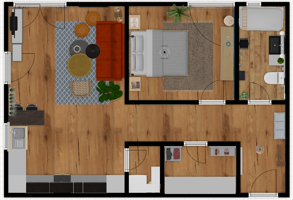
This is a 1 bedroom apartment, with an open space living room combined with the kitchen, 1 bathroom, and a small wardrobe. It’s a newly built block, having the apartment on the ground floor. The owner is an extremely nice lady (you know, those kinds of people who are born to be nice to everybody) to whom I could not say “no” after she explained what kind of style she would like to have for the apartment. The basic idea was around Moroccan style with French vibes, a lot of black & white, and orange. I could do French countryside style, but I have nothing to do with the Moroccan style, hence the challenge on this project.

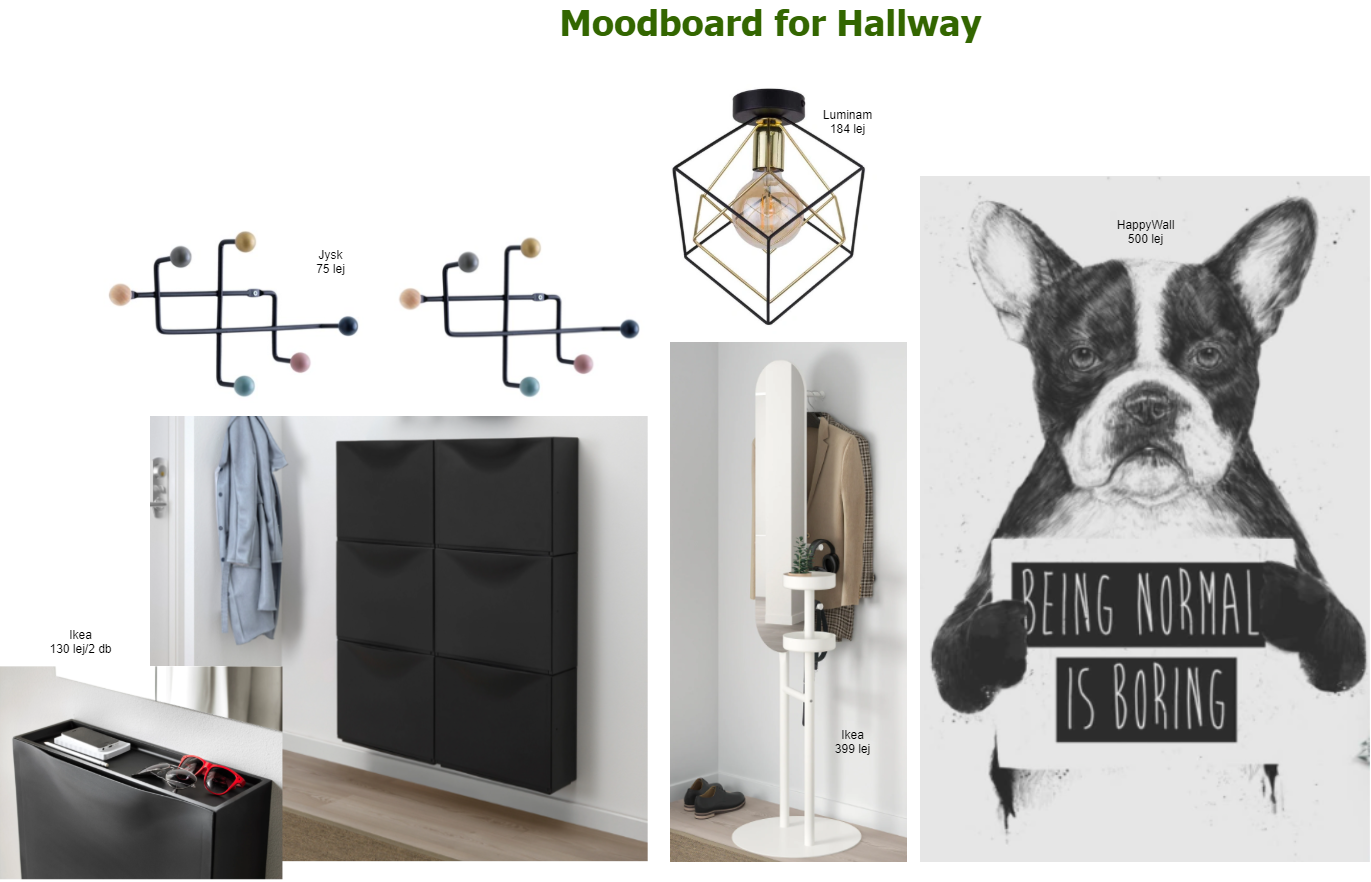
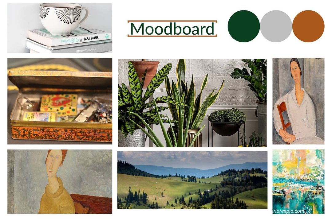
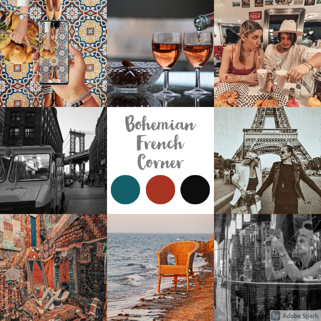
As usual, I was aiming for a mood board that would reflect the apartment’s feelings. The owner provided great pictures, just look at those color palettes! Sadly, when I was running through the color palette generator, the software could not identify the 3 dominant colors due to the overcrowded images. We ended up with dark turquoise, dark orange, and black.

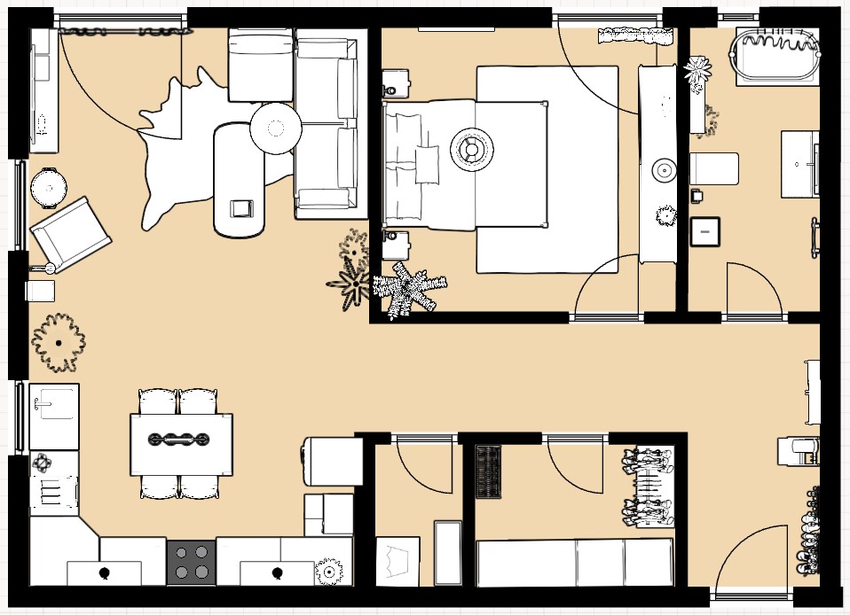
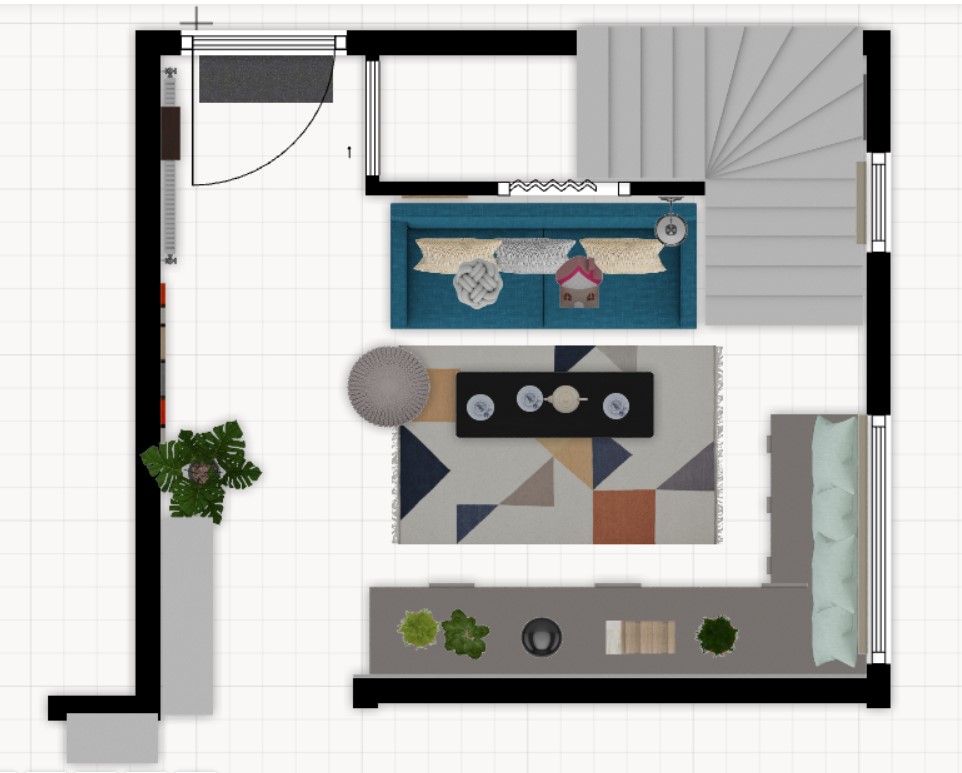
I don’t like over-furnished interiors, so I stick with the Nordic concept of avoiding having too much stuff in the apartment. I’ve created the 2d planning to see what and where to fit to meet the expectations for everyday needs.

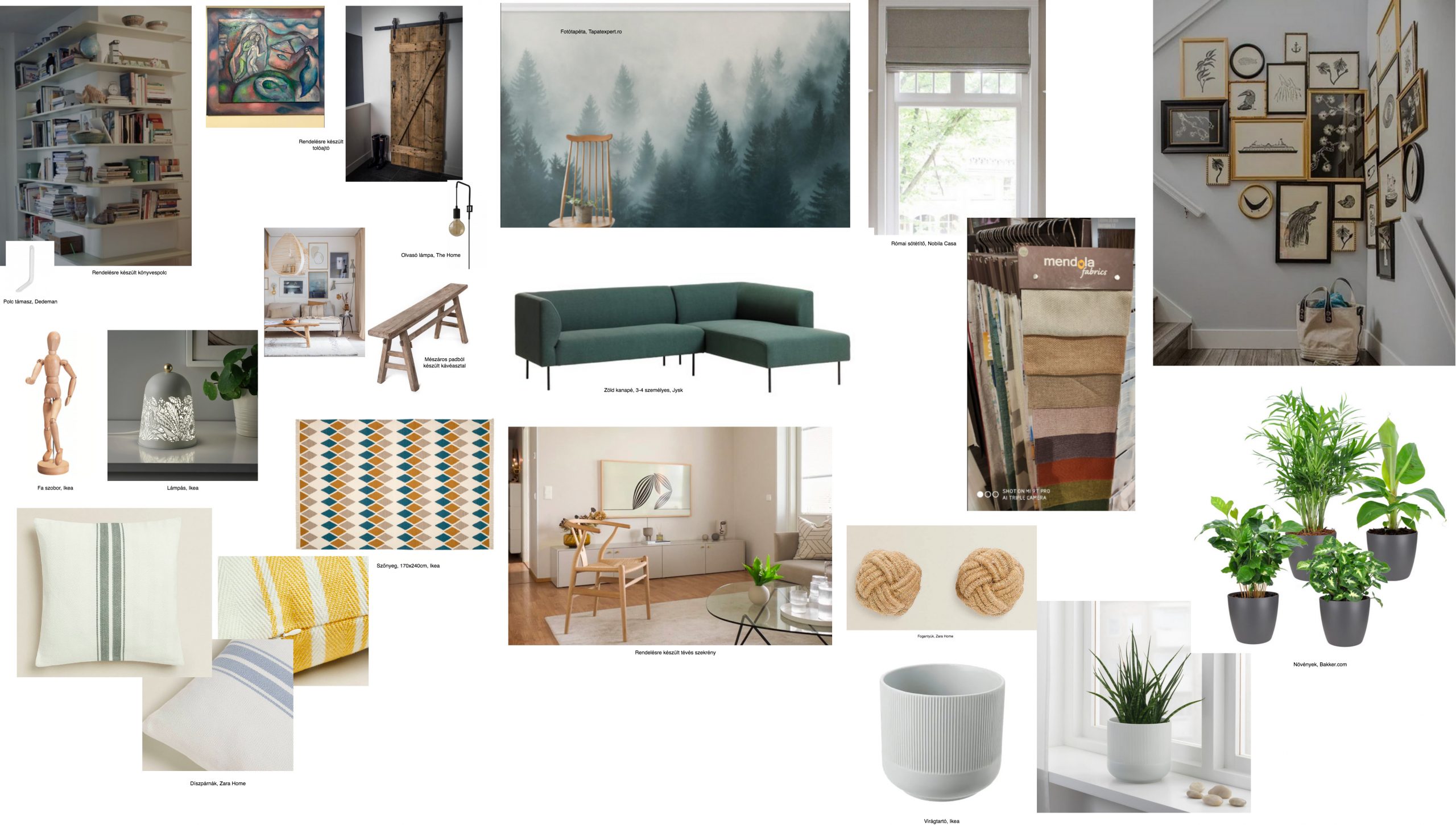
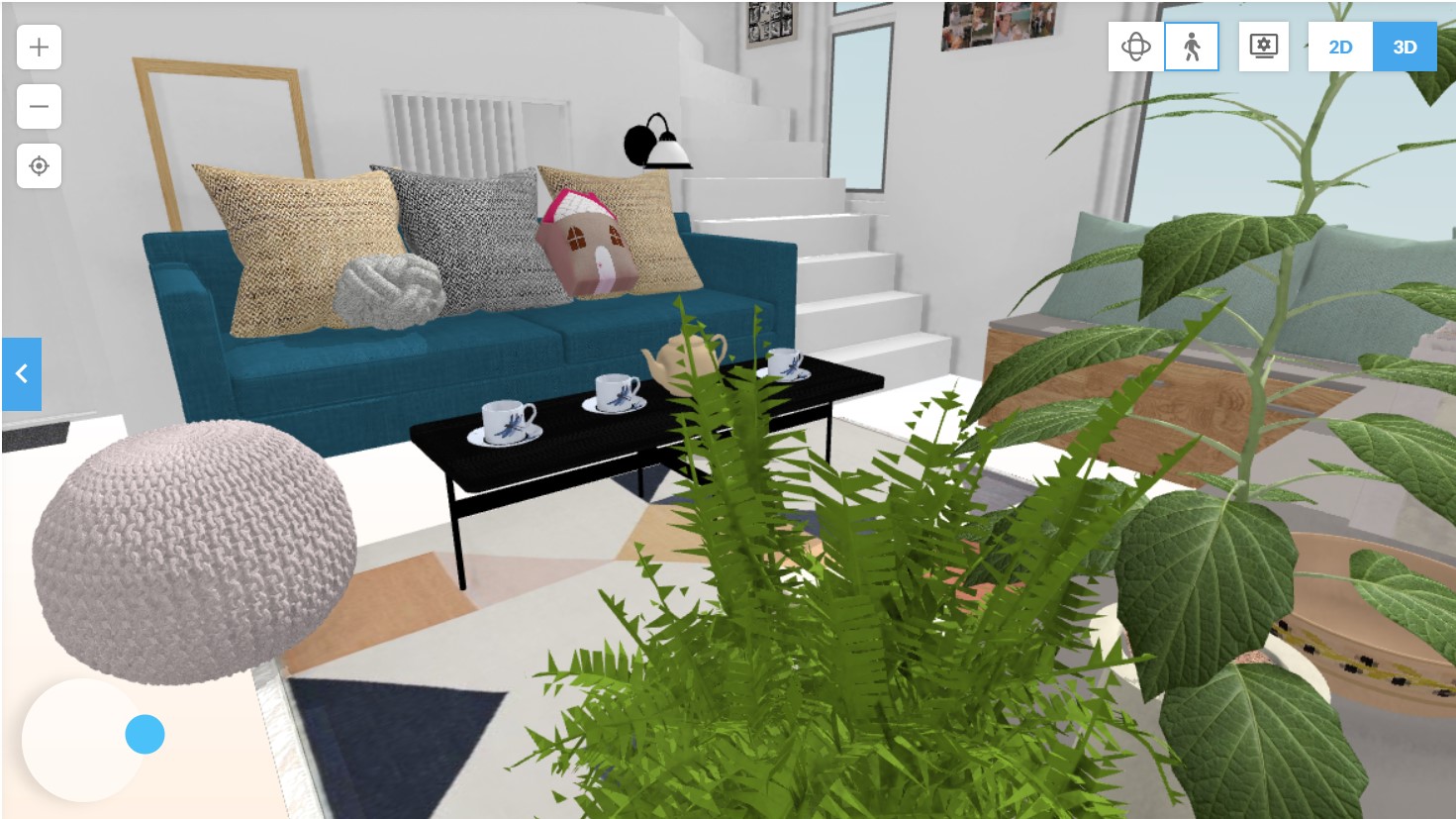
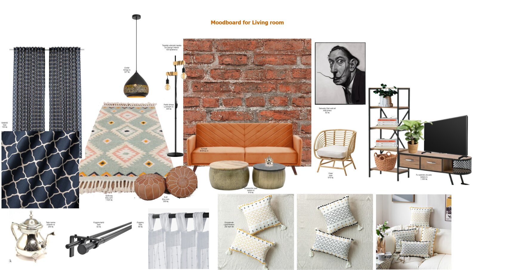
The mood board of the living room reflects the requirements from the owner, more precisely to have a brick wall behind the sofa, to have Moroccan elements like the lighting, coffee tables, carpet, and to have a black & white portrait of a famous person. These, all together, are giving a great bohemian vibe.

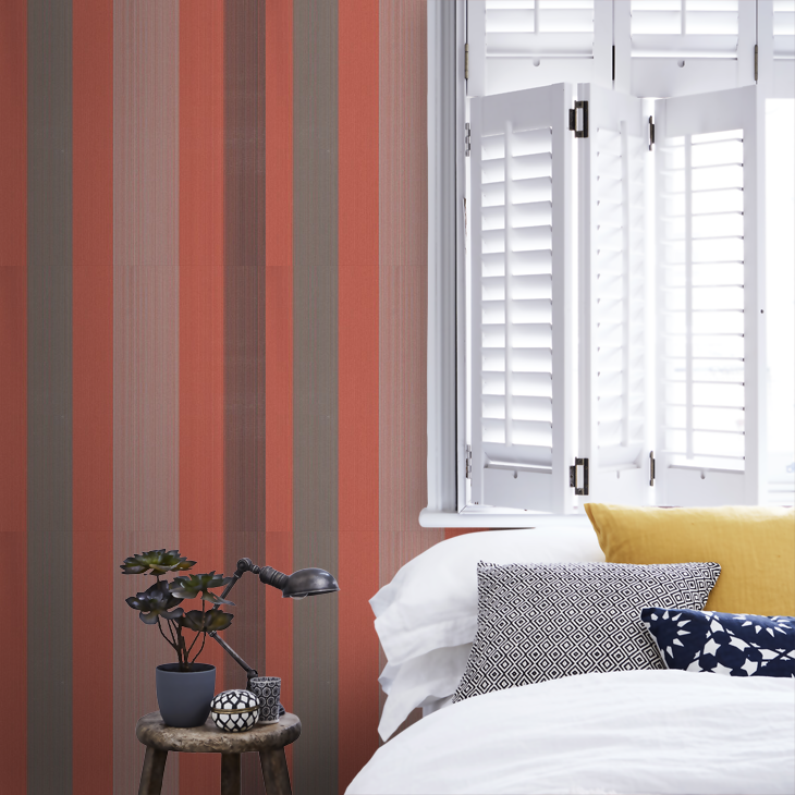
I guess the bedroom is the most Moroccan room in the whole apartment. Since it’s only a 12 sqm room, I wanted to have a wow effect with the Arabic wallpaper that adds extra depth to the place, and it has the impression of a large, open window.

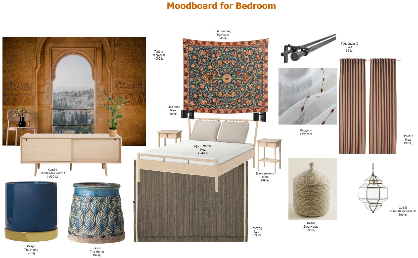
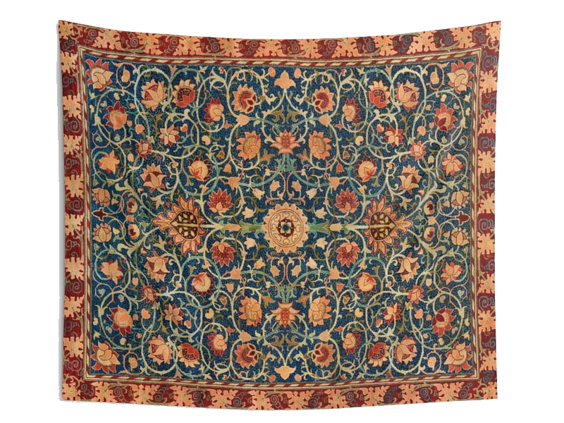
The tapestry behind the bed is a Dreemzia piece from Etsy.com. Unfortunately, this one is no longer available, but you can find many more beautiful, vintage, handcrafted tapestries.

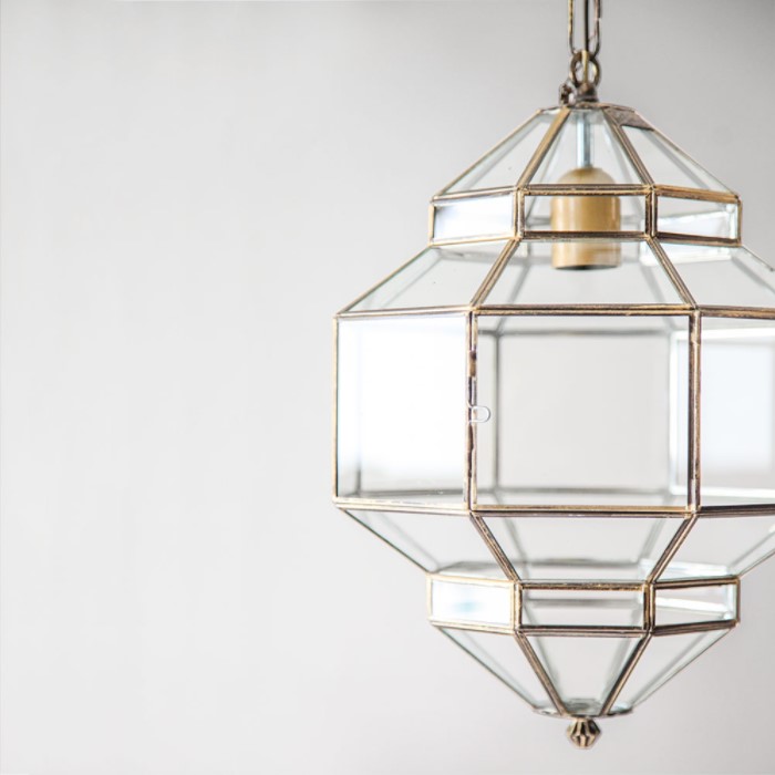
The pendant is a Granada Lanterns product available on L’aviva home. Although it’s not a typical Moroccan lamp, it’s more about imitating the diamond’s shape, still, it has its Eastern style notes. I adore that it’s made of colorless transparent glass, somehow it seems minimalistic to me.

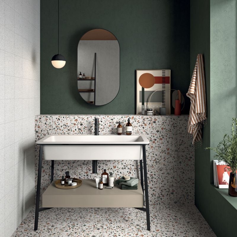
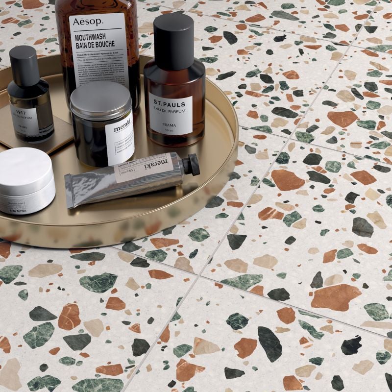
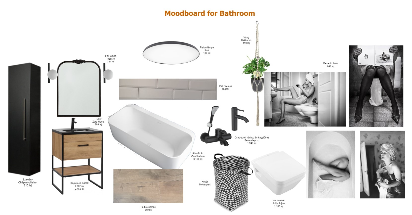
The bathroom had to be fully French, so I went for the black & white combination, making sure that there is enough room for a gallery wall with glamorous photos.

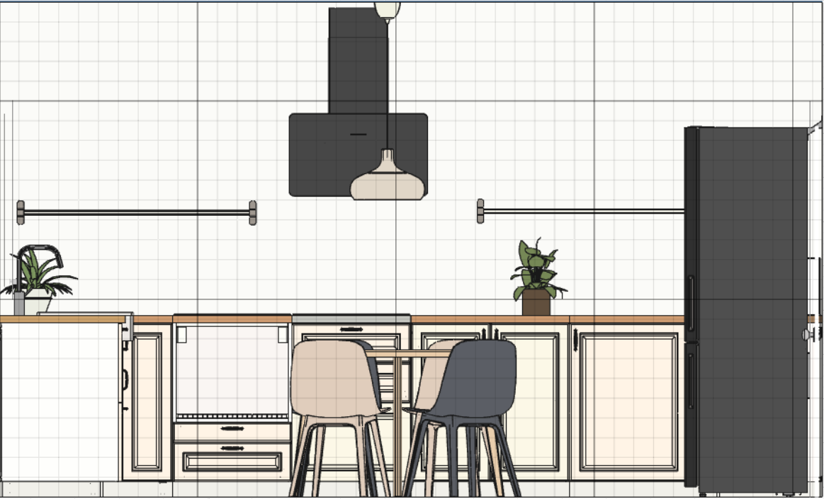
We had some headaches with the kitchen since we needed to incorporate all the electronics without turning into a piece of overcrowded furniture. The upper cabinetry will be black with glass doors to add an extra trick to the furniture. I’m not fully convinced that this is the final way to go, so let’s consider my 3D plan as a draft for the kitchen šŸ˜‰


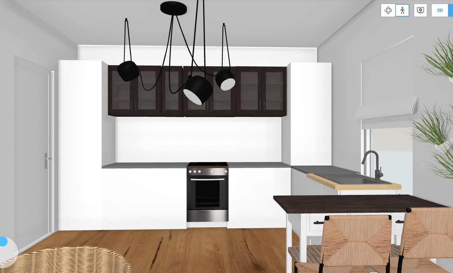
Photo credits: 1. Mood board created by focalpoint.ro based on the images provided by the customer, top and bottom middle photos used from Adobe Spark; 2., 3., 4., 7. & 8. All created by focalpoint.ro; 5. Dreemzia; 6. L’aviva home

Continue Reading

Design proposal for an Earthy nest

A few weeks ago, I managed to finish one of the most “pressuring” design projects that I have had so far. This particular project that I calledĀ Earthy nestĀ (due to the color palette) suppose to be an apartment with a fresh, trendy look & feel, but still staying original, with as little possible commercial crap in it. The owner of this home is a young, demanding entrepreneur who meant this apartment for renting it out. Since he has a very sophisticated taste for vintage pieces and art, my Scandinavian obsession had zero value in this case. The budget for the interior design was ā‚¬10.000 without the construction expenses. For a 2 rooms apartment without too much luxury, this budget is pretty ok…even if I needed to turn upside down the internet to find the right things I imagined for it.

As a first step, I always start the design process by asking the “customer” to send me some personal photos having the same vibe as the potential feeling he wants to achieve in the apartment. The below mood board was created exclusively with the pictures received from the owner. After I scanned the collage with a color palette generator, it ended up with these 3 dominant colors. What a beautiful palette of earthy tones šŸ™‚

The next step is to do the 2D plan to see what where to fit. Since this apartment has a wardrobe and a pantry, I managed to keep everything decluttered, I truly hate overcrowded homes with too much furniture here and there.

For the living room, I had 2 requests from the customer: to have a green sofa in the sitting area and apply white brick wall decoration on one of the walls. I’ve managed to use a few vibrant colors too, like the mustard yellow lighting and the blinds with rust color and grey. I created a reading corner as well with the gorgeousĀ EKENƄSETĀ Ikea armchair. To have some industrial vibes, I used a blackĀ FJƄLLBOĀ TV cabinet from Ikea.

In the bedroom, there was a single requirement of having something with red or burgundy color for reflecting passion and love. I’ve used the red Farrow & Ball Chromatic Stripe wallpaper for the wall behind the bed. This way, I managed to meet the customer’s expectations, avoid overcrowding of the room and create a great focal point in the bedroom.

For the hallway, I’ve let my imagination go wild a bit by proposing a bold, hipster wallpaper fromĀ HappyWall. They can print customized wallpapers based on the buyer’s need, so you can set the width and the high you need. We have one too from them in my husband’s home office, and I’m super happy with the choice we made 2 years ago. I have to admit, although this seemed a good idea, this one did not go through the customer’s acceptance criteria, and we agreed that he will choose something else when getting to this point.

The bathroom was a real challenge in terms of finding a nice, not very common tile. This green-orange Terrazzo tile seems like a good fit to combine the moss green wall color. To avoid turning the bathroom into a cold interior, we’ll put tiles till mid-high (max. up to 1.5 m) on the wall and paint the rest in this earthy green. The customer is not 100% sure yet if he wants a bathtub or a shower, so we left that topic opened till the construction works start.

For the kitchen to create an airy feeling, I’ve recommended an open shelving approach instead of having top cabinetry. The furniture will be dirty white combined with black electronic equipment. The dining table will be in the middle of the kitchen for the impression of an existing kitchen island.

And of course, as usual, there is no design without a 3D plan to show around how the apartment will turn into a home. Navigating in the house it helps a lot to get the overall idea and to see the proportions of the furnished interior. I use Floorplanner as a planning software and it’s always helping me to turn into a realistic idea of what I actually want with an interior.

This home is not ready yet, it will take a few months till I can return to the blog with a photo shooting tour about the end results. I hope you like the proposal and I do believe that everything will turn 10 times nicer in the reality like on my mood boards.


Photo credits: 1., 2. & 3. focalpoint.ro, 4. Ikea.com, 5. Wallpaperdirect.com, 6. focalpoint.ro, 7. & 8. Alchemist.ro, 9. & 10. focalpoint.ro

Continue Reading

The Wolves’ living room inspiration

A couple of my good friends, let’s call them the Wolves couple, asked me to help them with some inspiration for their living room. Luckily I know them well, so right from the beginning, I knew what kind of style and mood I should recommend for their living room. Usually, interior designers start with getting to know better their customers, their lifestyle, current homes, etc.

I did something similar with the Wolves too, regardless of how well I know them, I needed more information on the functionality of the living room, color palette they would like to use, style, and everything that is currently used in the room and should stay there even with the new design. As a first step, I requested the husband and the wife to send me separately (without consulting with each other) 3 photos that would reflect the feeling of the room. This could have been about anything. It was a fun exercise, and the result came out nicely. The below mood board was created with these pictures, and the color palette became obvious.

After the mood board was ready, it was easier to decide on the furniture, carpet, sofa, coffee table, gallery wall, bookshelf, and everything that had to be included in the room. I created a mood board plan to visualize the recommendations, along with a price list and URLs from where they can purchase the things suggested by me. The coffee table is just an inspiration, the Wolves have an old bench that was a butcher’s table, they found this on the flea market, and we decide to use it as a coffee table. With a little bit of restoration work, this table looks gorgeous with its vintage shine. For the main wall, instead of a regular bookshelf, I suggested a huge wallpaper and nothing else…a real focal point of the room.

They provided me the exact sizes of the room, stairs (there is a stair from the living room to the upper floor) and windows, so I could create a 2D and a 3D plan for a better understanding of the redesign proposal.

I work in Floorplaner, and navigation is possible (as in all 3D rendering software) in the room, so you can feel the proportions and see the actual big picture.

It was important to have a bookshelf, even if this wasn’t on the main wall, where the wallpaper was imagined. I decided to put this on one of the corners of the room which is an open space leading to the kitchen. This way the empty corner is used too, without interfering with the rest of the design plan.

To have a Tv in the room was important too. Don’t hate me for this, but I recommended one of the most beautiful Tvs in the world, the Samsung Frame. It is the perfect camouflage for hiding your Tv. I know, it’s expensive…I know it. This goes perfectly on a gallery wall, but in our case, we will have to find the right combination of the art displayed on the Tv and the wallpaper’s pattern, as the Tv will be placed on the main wall.

As an inspiration for furniture and Tv, I used this Finnish home found on My Scandinavian Home. We also managed to squeeze in a reading nook next to the window where I proposed a bunch of pillows and Roman blinds of Mendola Fabrics from Nobila Casa. No curtains this time.

The Wolve’s house if full of vintage stuff (real vintage pieces from flea market or from their grandparents) and Nordic pieces from Ikea. The general feeling of their home is very hygge and warm, and I did my best to stay in this mood with the living room’s design as well. They are in progress with this, I will come back with the actual results when they are ready with it (hopefully they won’t kill me that I just promised to show around their living room).

I hope you get inspired by this. In case something specific captured your attention, drop me a message and I will provide more information on that.


Photo credits: 1., 2., 3. & 4. Created by me/focalpoint.ro, 5. Pinterest, 6. Danila’s @indivisualstyle IG feed, 7. focalpoint.ro

Continue Reading