It’s been a while since my last post, I know. It was a combination of multiple factors, like a tricky medical condition, lack of inspiration, laziness, you name it. But today, I decided to post an interior discovered recently that amazed me a lot, something special not necessarily in the Scandinavian style we are used to on my blog.
The Vintage Brutalist interior is designed by Moore House Design, a studio based in New York City and Rhode Island. This creative team travels through the USA designing beautiful residential homes or boutique hotels. Too bad that we are so far away, it would be nice to have them closer and get inspired from a near perspective.
The owner of this house, located in Rhode Island, desired an interior dominated by Brutalism, also known as Brutalist architecture/movement, a style that bumped up in the 1950s among the reconstruction projects of the post-war era. The mission of the design team was to combine brutalism with vintage using custom built-in solutions to give uniqueness to the place. It worth to go through the before&after pictures to see how many elements they managed to keep during the redesign process. I always appreciate designers who try to keep things or re-use elements, after all, this means sustainability.
Let’s take a deep dive, and I’ll comment under the pictures what I love in this house.
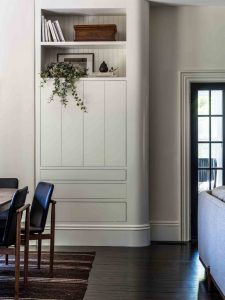
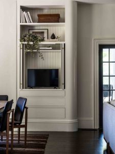
I find this curved shelf/cabinet a genius idea to hide the television. It is so elegant to hide the Tv when not using it.
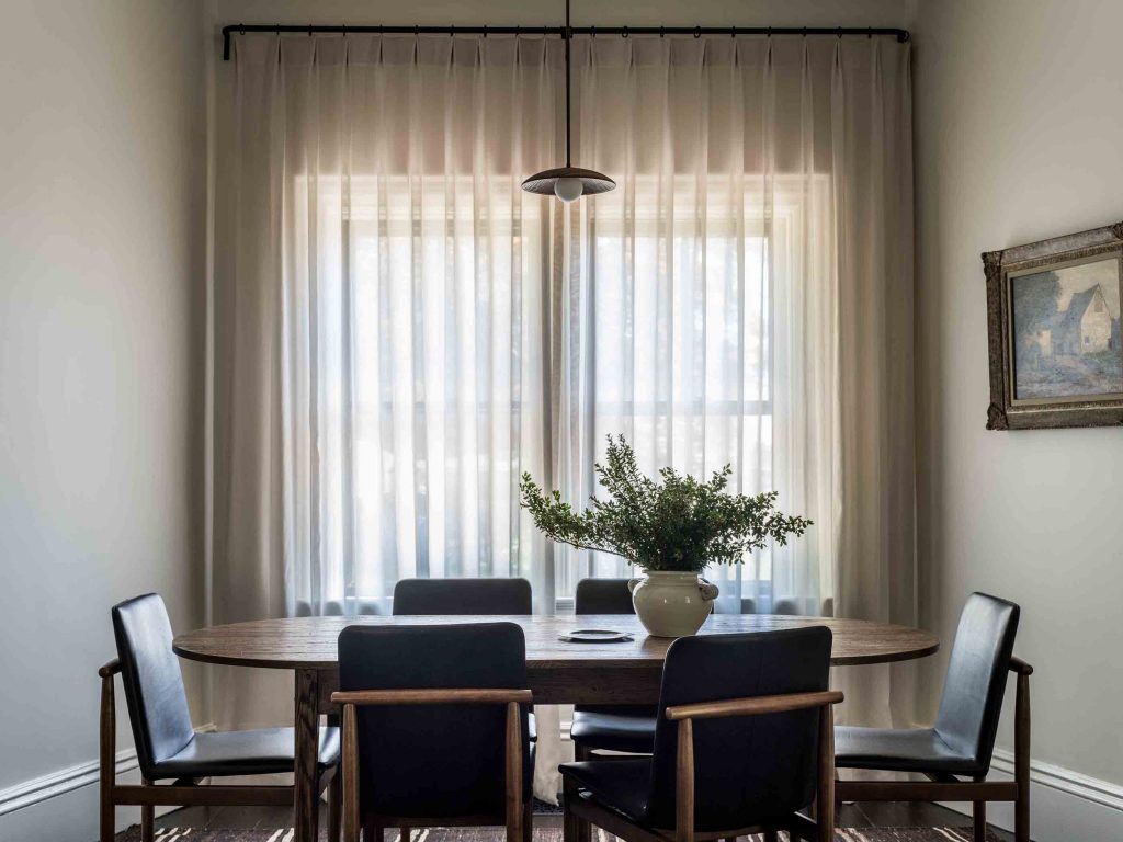
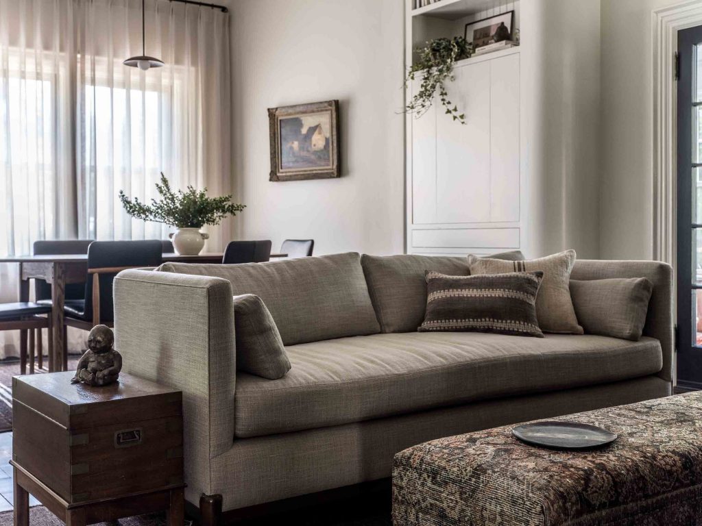
The dining area is a combination of vintage and classic pieces, following the curvy lines of the cabinet from above and the lines of the walls. The dining table is a custom furniture designed by Moore House and paired it with refurbished leather dining chairs.
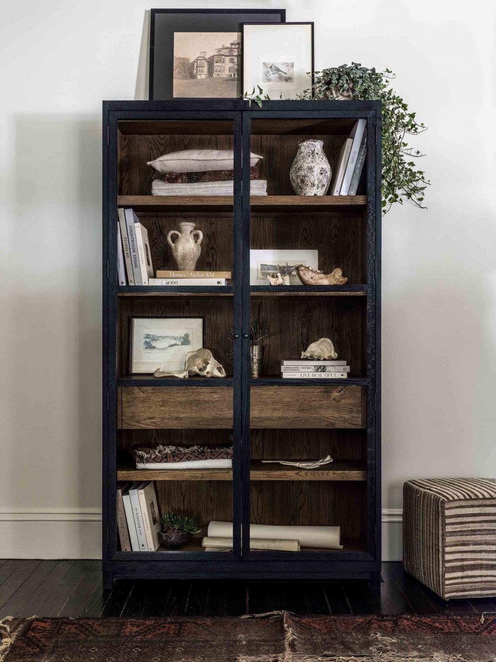
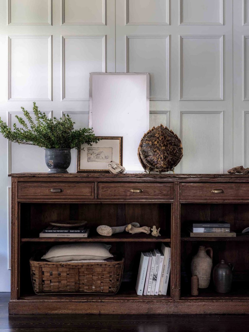
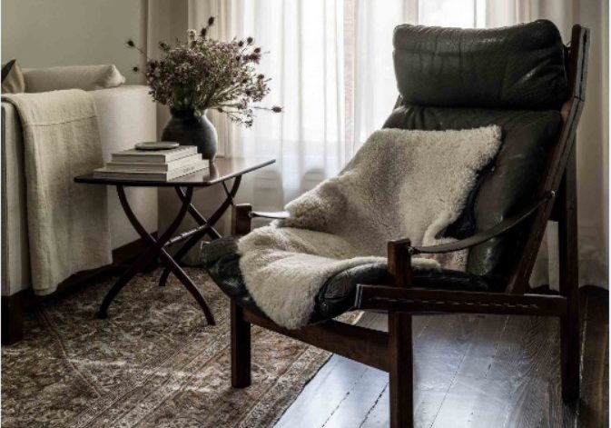
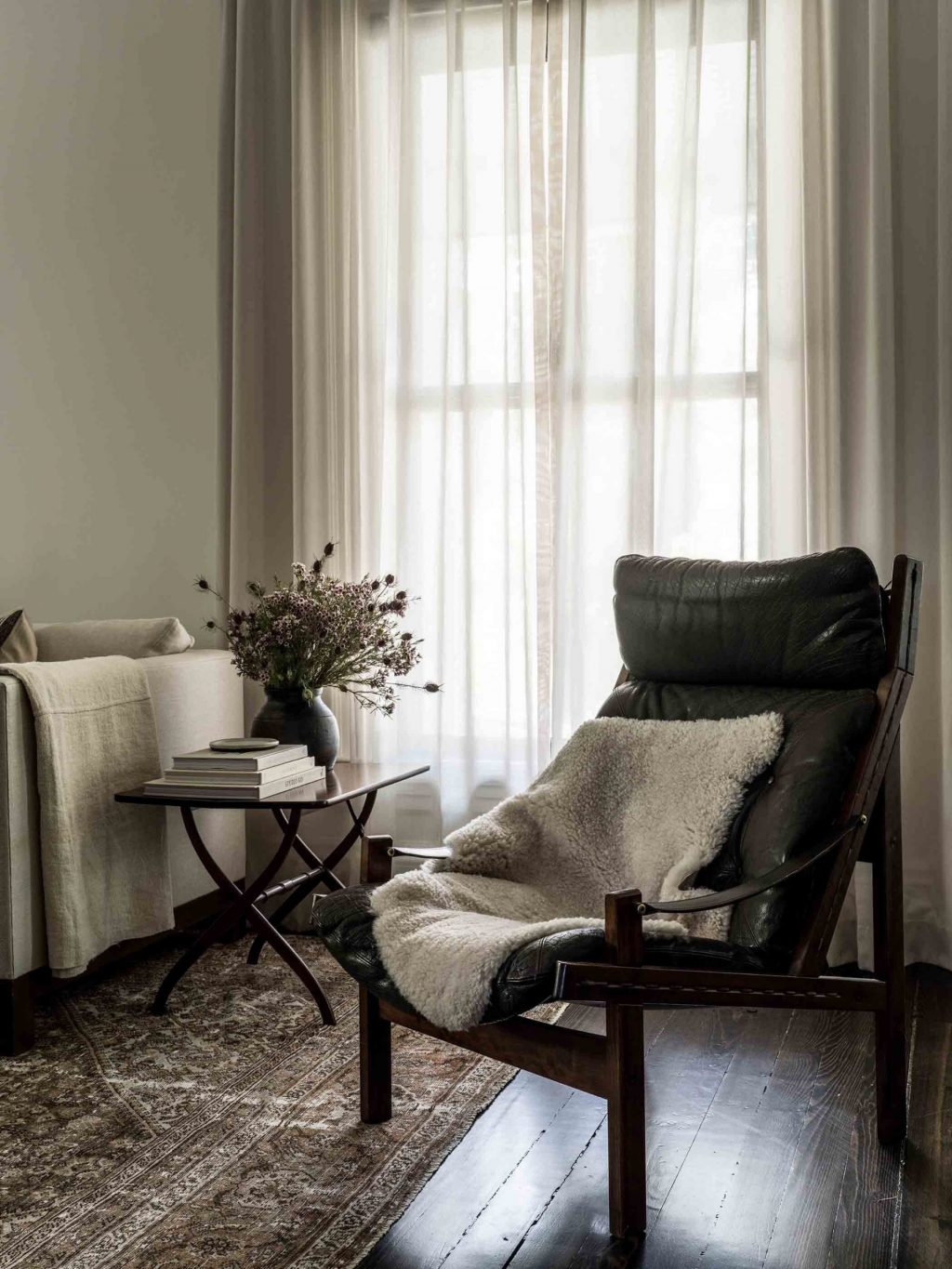
The red line of the house is this dark brown color present in every room of this interior. The below arm chair is a Hunter Easy chair designed by the Norwegian designer Torbjørn Afdal for Bruksbo. Throwing a sheepskin on it turns the chair into a hygge Scandinavian comfy spot.
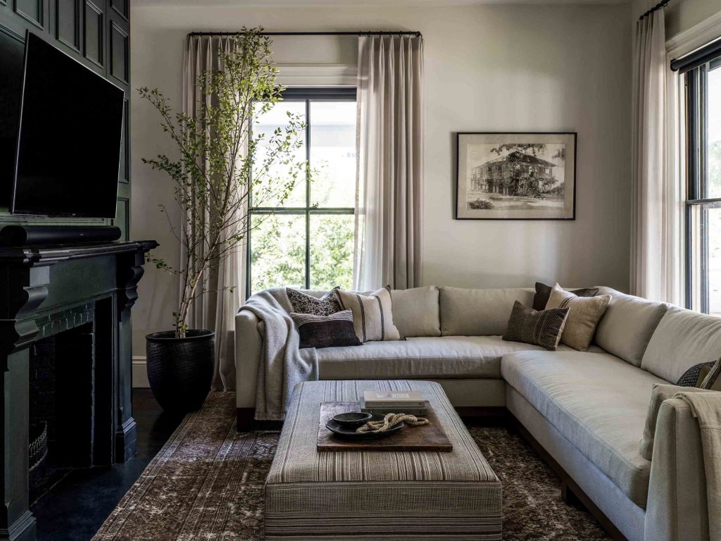
The sitting area is next to the entryway which caused quite a lot of challenges to harmonize the whole place. The paneled fireplace painted in black was kept from the original design.
The vibe of this house is so masculine, the dark red line gives a calm feeling to the interior. Everything seems so characteristic, like when you are not afraid of using some bold design elements, massive furniture, and dark colors. This is definitely an out-of-ordinary interior on my blog 🙂
Photo credits: Erin Little Photography for M House

