The Wolves’ living room inspiration

A couple of my good friends, let’s call them the Wolves couple, asked me to help them with some inspiration for their living room. Luckily I know them well, so right from the beginning, I knew what kind of style and mood I should recommend for their living room. Usually, interior designers start with getting to know better their customers, their lifestyle, current homes, etc.

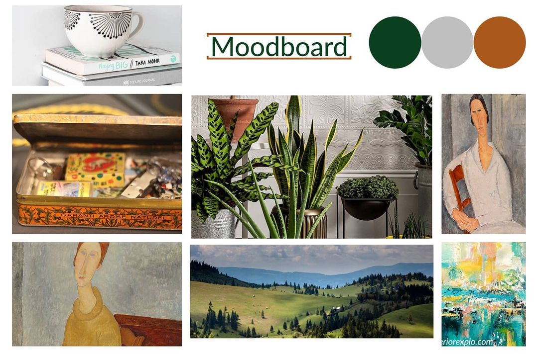
I did something similar with the Wolves too, regardless of how well I know them, I needed more information on the functionality of the living room, color palette they would like to use, style, and everything that is currently used in the room and should stay there even with the new design. As a first step, I requested the husband and the wife to send me separately (without consulting with each other) 3 photos that would reflect the feeling of the room. This could have been about anything. It was a fun exercise, and the result came out nicely. The below mood board was created with these pictures, and the color palette became obvious.
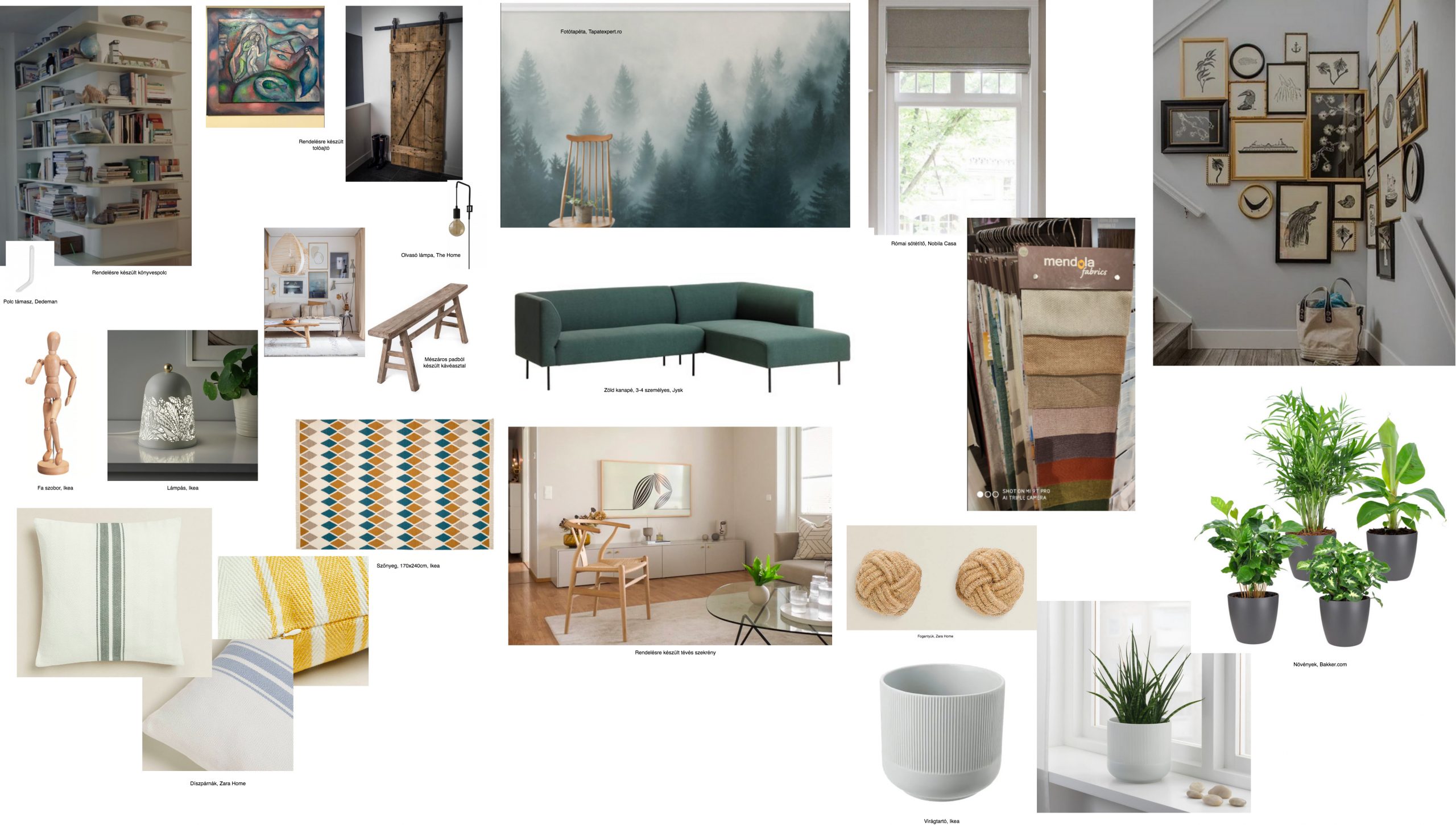
After the mood board was ready, it was easier to decide on the furniture, carpet, sofa, coffee table, gallery wall, bookshelf, and everything that had to be included in the room. I created a mood board plan to visualize the recommendations, along with a price list and URLs from where they can purchase the things suggested by me. The coffee table is just an inspiration, the Wolves have an old bench that was a butcher’s table, they found this on the flea market, and we decide to use it as a coffee table. With a little bit of restoration work, this table looks gorgeous with its vintage shine. For the main wall, instead of a regular bookshelf, I suggested a huge wallpaper and nothing else…a real focal point of the room.
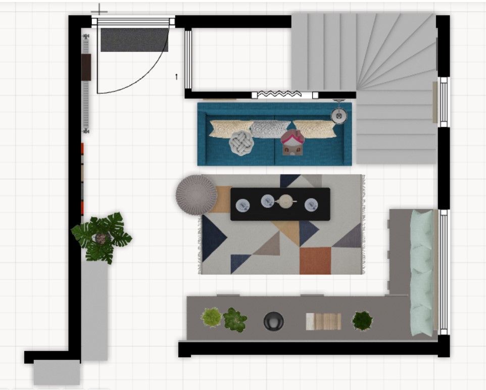
They provided me the exact sizes of the room, stairs (there is a stair from the living room to the upper floor) and windows, so I could create a 2D and a 3D plan for a better understanding of the redesign proposal.
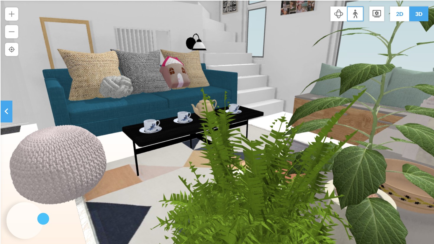
I work in Floorplaner, and navigation is possible (as in all 3D rendering software) in the room, so you can feel the proportions and see the actual big picture.
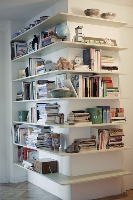
It was important to have a bookshelf, even if this wasn’t on the main wall, where the wallpaper was imagined. I decided to put this on one of the corners of the room which is an open space leading to the kitchen. This way the empty corner is used too, without interfering with the rest of the design plan.
To have a Tv in the room was important too. Don’t hate me for this, but I recommended one of the most beautiful Tvs in the world, the Samsung Frame. It is the perfect camouflage for hiding your Tv. I know, it’s expensive…I know it. This goes perfectly on a gallery wall, but in our case, we will have to find the right combination of the art displayed on the Tv and the wallpaper’s pattern, as the Tv will be placed on the main wall.
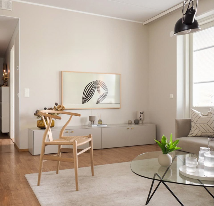
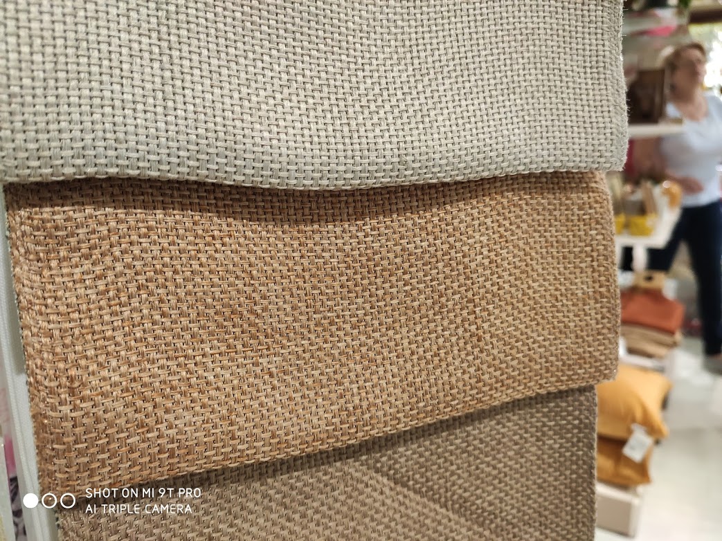
As an inspiration for furniture and Tv, I used this Finnish home found on My Scandinavian Home. We also managed to squeeze in a reading nook next to the window where I proposed a bunch of pillows and Roman blinds of Mendola Fabrics from Nobila Casa. No curtains this time.
The Wolve’s house if full of vintage stuff (real vintage pieces from flea market or from their grandparents) and Nordic pieces from Ikea. The general feeling of their home is very hygge and warm, and I did my best to stay in this mood with the living room’s design as well. They are in progress with this, I will come back with the actual results when they are ready with it (hopefully they won’t kill me that I just promised to show around their living room).

I hope you get inspired by this. In case something specific captured your attention, drop me a message and I will provide more information on that.


Photo credits: 1., 2., 3. & 4. Created by me/focalpoint.ro, 5. Pinterest, 6. Danila’s @indivisualstyle IG feed, 7. focalpoint.ro

Continue Reading

The beautiful world of local ceramics

Ceramics are the small pieces that can make a home cozier. When I see a nice piece of ceramic decoration (whatever that is, a mug, a cup, a vase, a bol, etc.), I always try to imagine where would it fit the best in my home. I follow quite a lot of Nordic ceramists on Instagram, unfortunately, most of them are not shipping to Romania, but at least I can enjoy online their marvelous creations. I will do a separate post on these talented people, but I felt that first, it would be nice to show some local ceramists who are enriching our lives with their products.

I knew right from the beginning of this interior design blog’s idea that I would like to write about local treasures as well. I even dedicated a separate section for them, hence the Local Treasures menu. I will try to promote here those who are not super famous, but would not hurt a little bit of publicity for them (not sure who needs more publicity right now – they or me? – being at the beginning of this journey). Anyhow, I’ve chosen 5 ceramists whose creations I find special by their simplicity and originality. I’m listing them in alphabetical order as I admire them equally.

1. Beart Ceramics from Ciumani (RO)/Gyergyócsomafalva (HU)

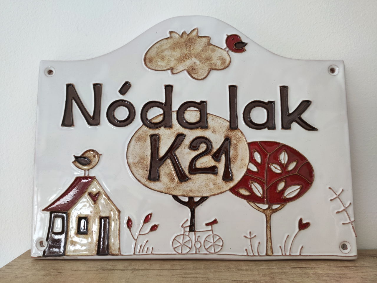
They are doing all kinds of mugs, honey pots, wall clocks, candle lights, jewelry, sugar pots, lightings, hanging lamps, and customized house numbers, like the one in the 2nd photo. I find it über original to have such a plate on your door. This one was a gift to us from some good friends.

2. Handmade by szei from Sighișoara (RO)/Segesvár (HU)

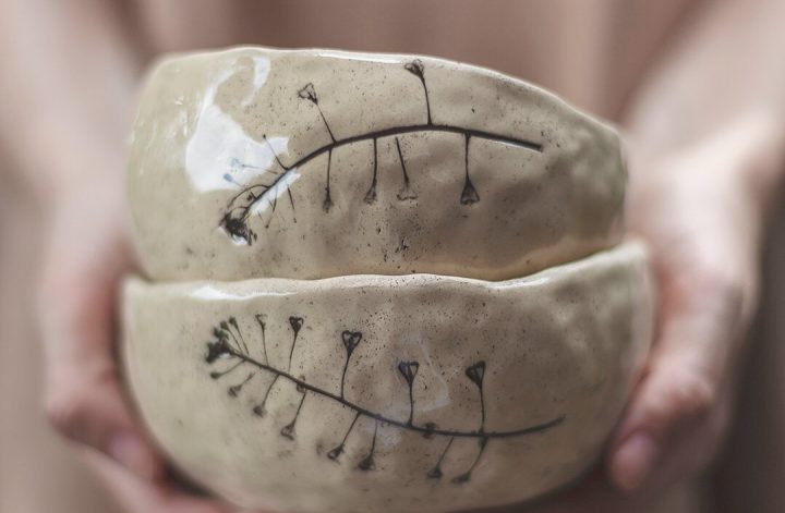
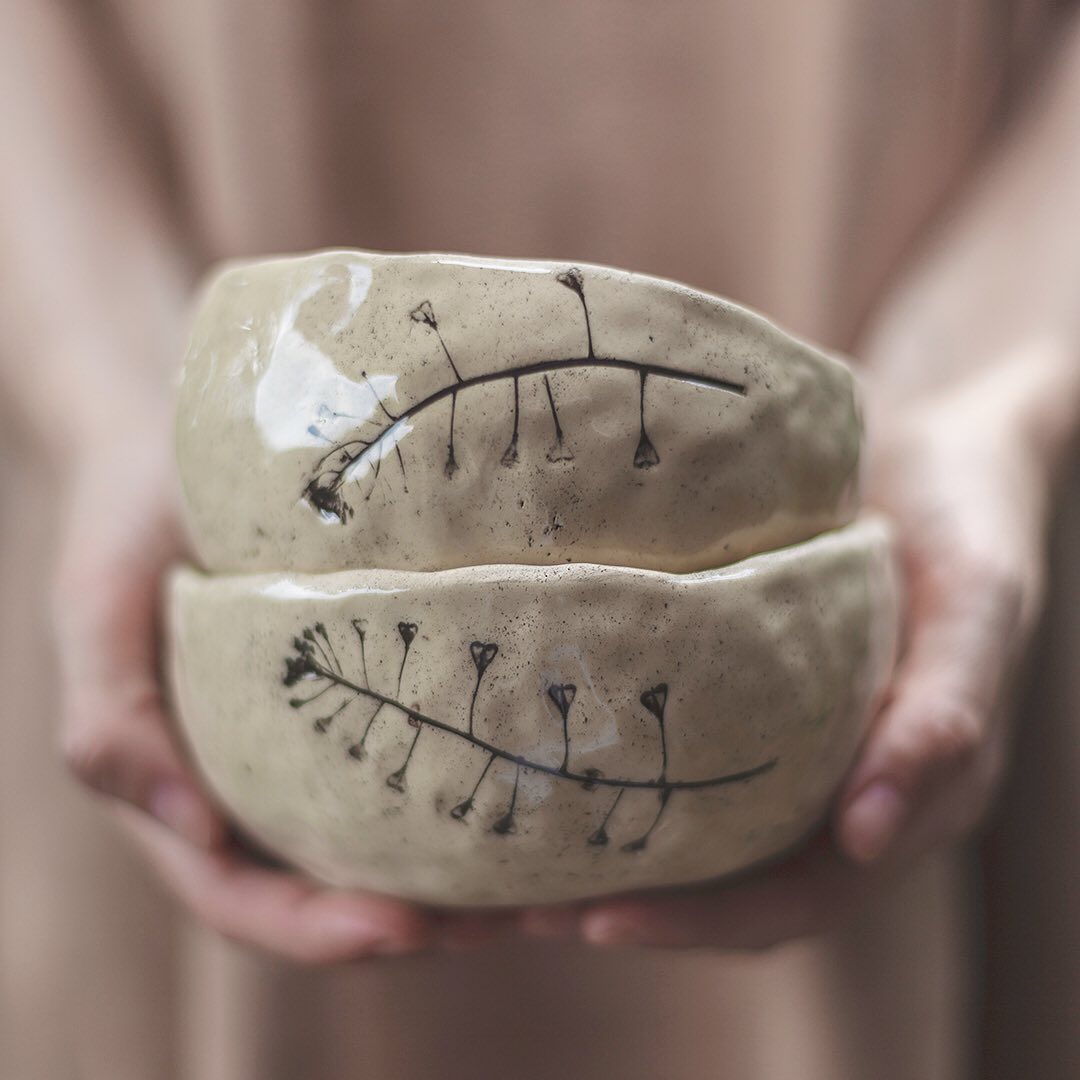
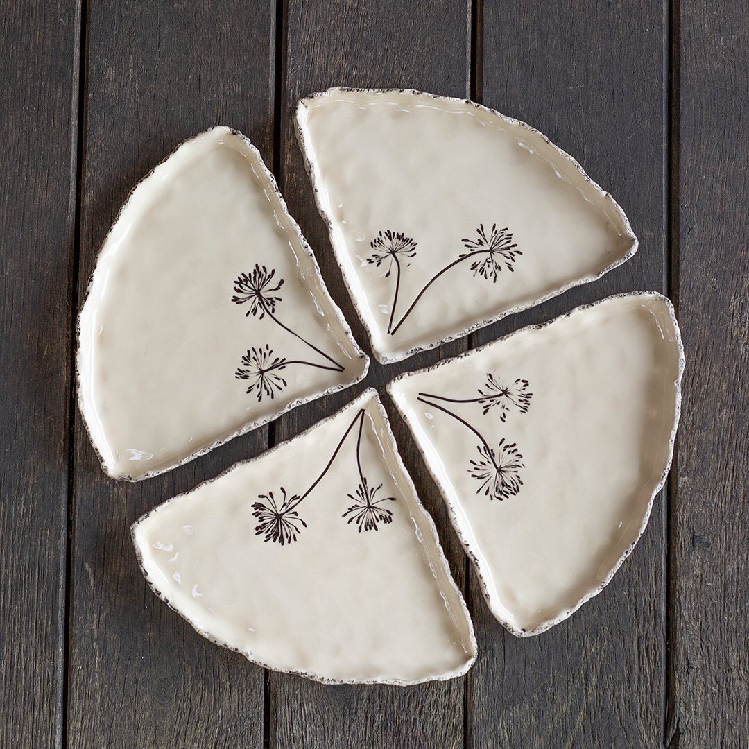
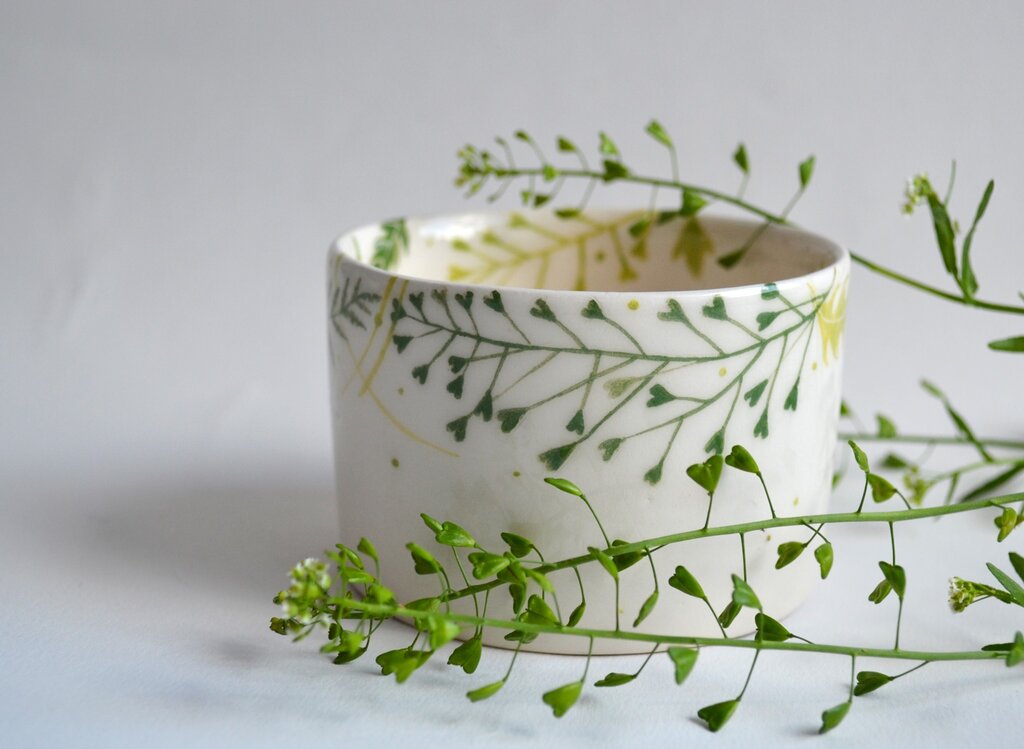
I found Iris’s wonderful world accidentally on the internet. When I look at her creations I see nature, I feel calm, I see a piece of clay turned into an imperfect beauty. Her creations are beyond being nice, I sense a lot of wabi-sabi vibe when admiring her plates, mugs, and spoons.

3. Lukker Ceramics from Târgu Mureș (RO)/Marosvásárhely (HU)

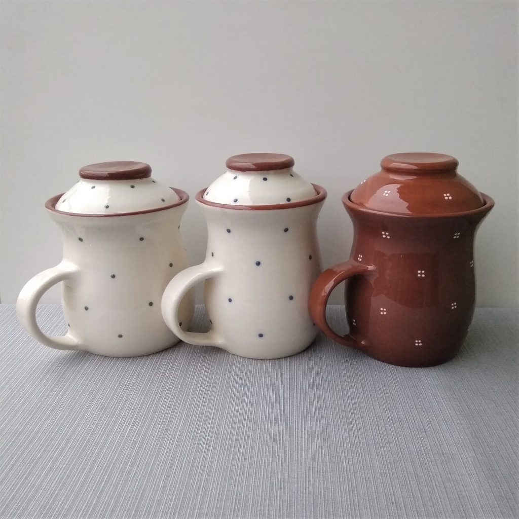
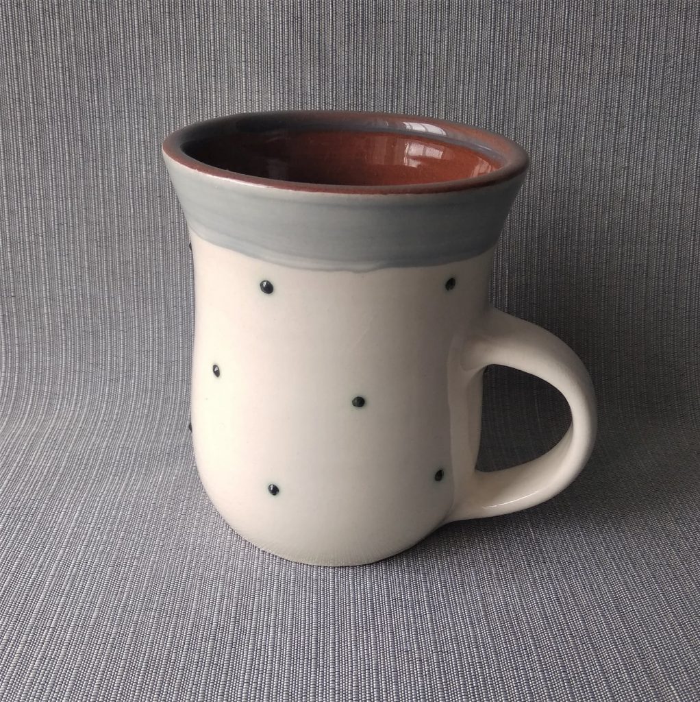
She’s from my hometown, do I have to say more? 🙂 I’m super happy to see such beautiful creations done in the city where I live. Her nice mugs and honey pots can be bought in the Blaze, a shop that sells only hand-made products from this region. These dots are breathtaking.

4. Mamu Ceramics from Cluj Napoca (RO)/Kolozsvár (HU)

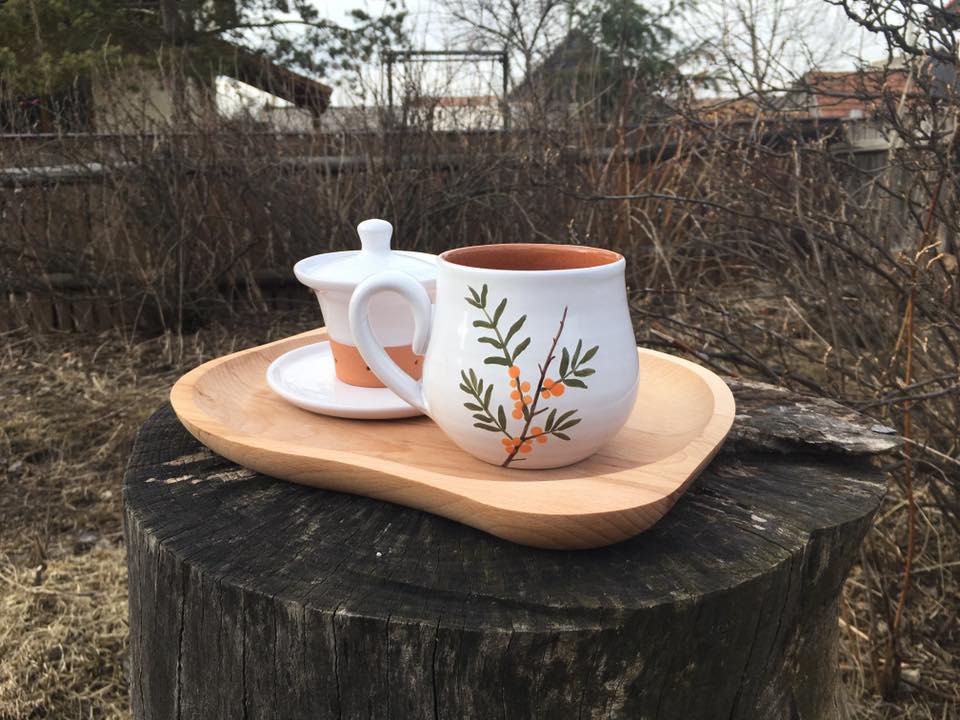
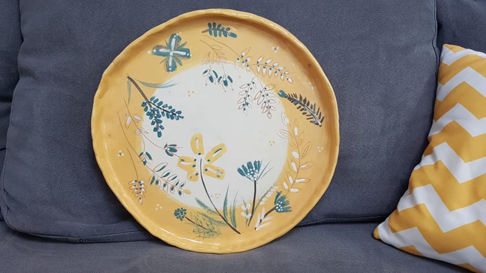
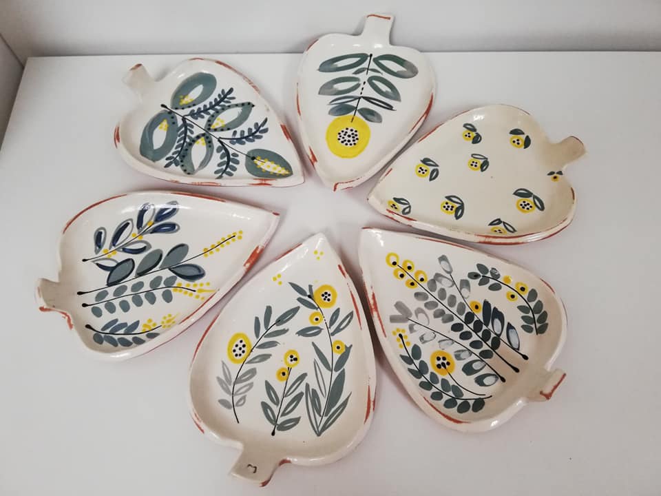
This happens when talent meets yellow and botanical patterns. I love every piece of Mamu with its flower specifics on the ceramics. It’s like bringing spring or summer into your home, combined with the beauty of the nature that surrounds us, not to mention that the necklaces are unique pieces as well.

5. Oana Stoica Ceramics from București (RO)/Bukarest (HU)

What a beauty found in the capital of my country. Sometimes I have the impression that the world is full of talented people with a refined sense of simple things. Oana is creating ceramics with clean lines and pastel colors, but she is also bold enough to use more vivid colors in her creation.

If you know somebody whose ceramics would worth to be presented on my blog, do not hesitate to drop me a message. I would be more than happy to write about other talented people too.


Photo credits: 1. Beart Ceramics, 2. focalpoint.ro, 3.&4. Handmade by szei, 5.&6. Lukker Ceramics, 7.&8. Mamu Ceramics, 9.&10. Oana Stoica Ceramics

Continue Reading

A nice one-room apartment in Göteborg

It was not an easy decision about my first home tour. I wanted something specific to the Nordic style that I would like to promote here on my blog, I wanted something different from the interiors we are used to in my region. I opted for an apartment listed by Entrance, a Swedish real estate agency I admire a lot.

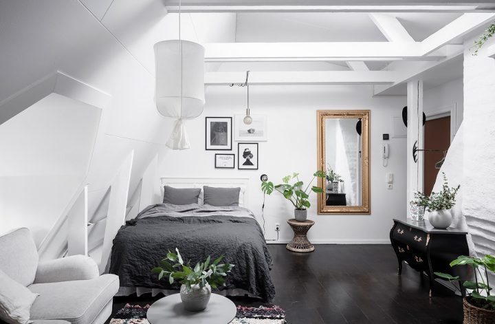
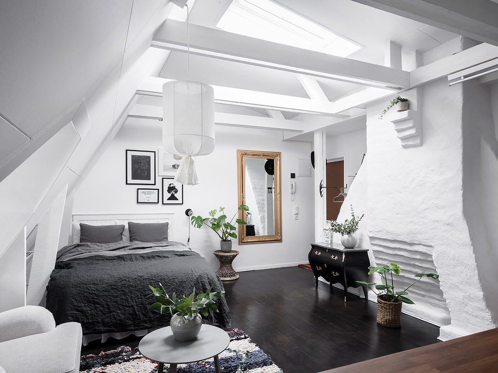
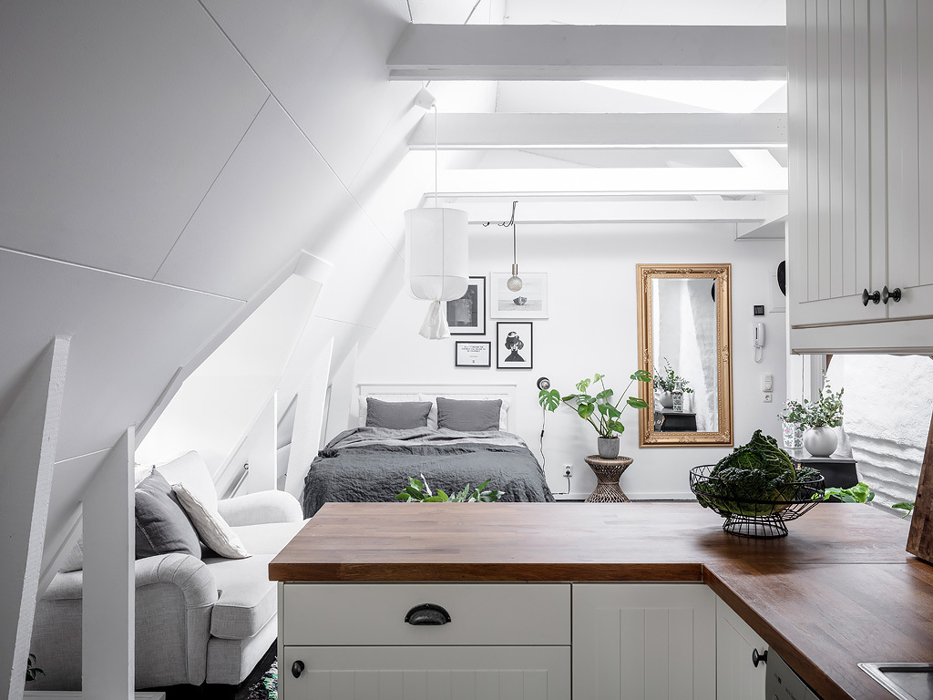
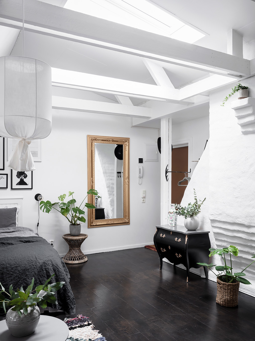
Swedish people are famous for their talent to maximize small places and turn into livable apartments. No wonder why Ikea became so popular for their solutions for storage, foldable furniture and practicality. This 1 room apartment in Göteborg (Gothenburg) has everything a person would need for a decent life: a bedroom, a reading nook, home office, wardrobe and an open floor plan kitchen to the living room. All this only on 31 sqm. The apartment has an incredible vibe due to its Velux skylights, the visible beams and its height ceilings.

The imperfection of the right hand side wall makes the room even more beautiful. The gorgeous commode and mirror takes me back to the midcentury period when these classy pieces were very popular, I wouldn’t even dare to assume that the commode might be from a different century. Either way it’s a great focal point of this living room.

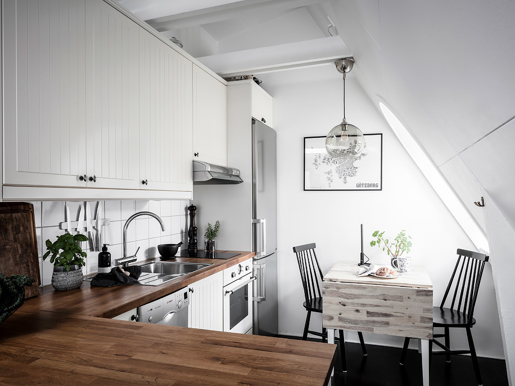
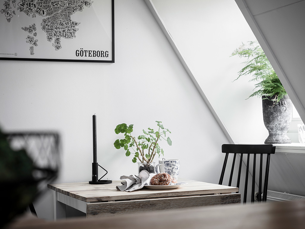
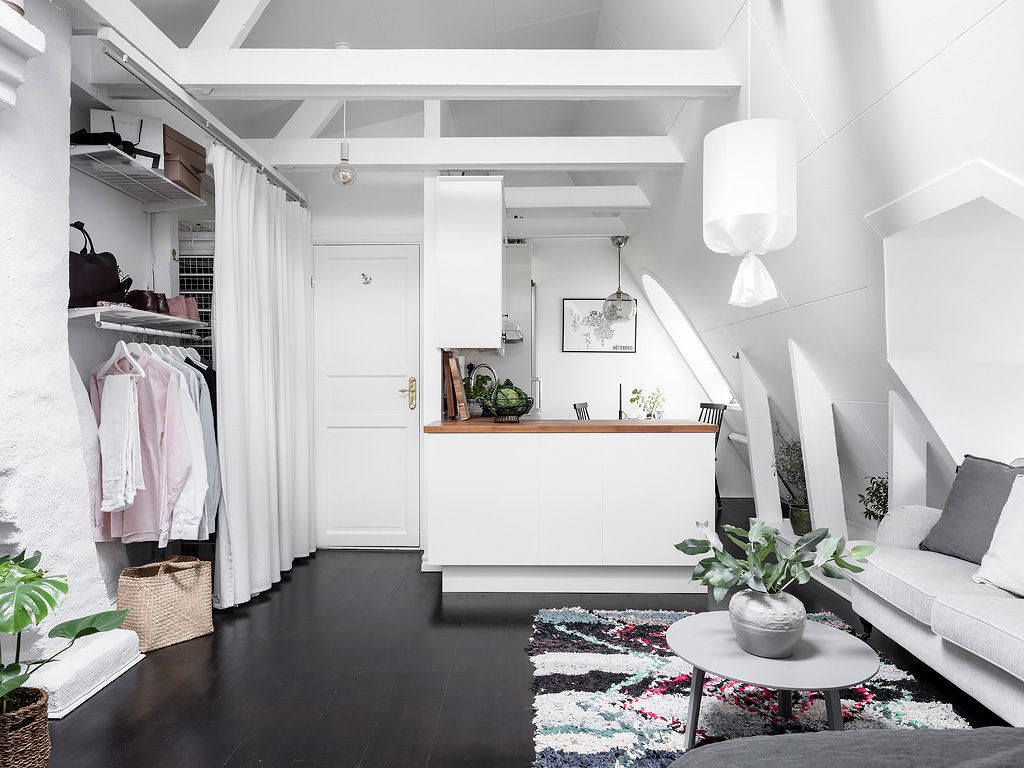
The kitchen is well-structured and clean thanks to the bright color cabinets. The dining table is even foldable so more people can join the dinner. If I’m not mistaken, the light is from Ikea.

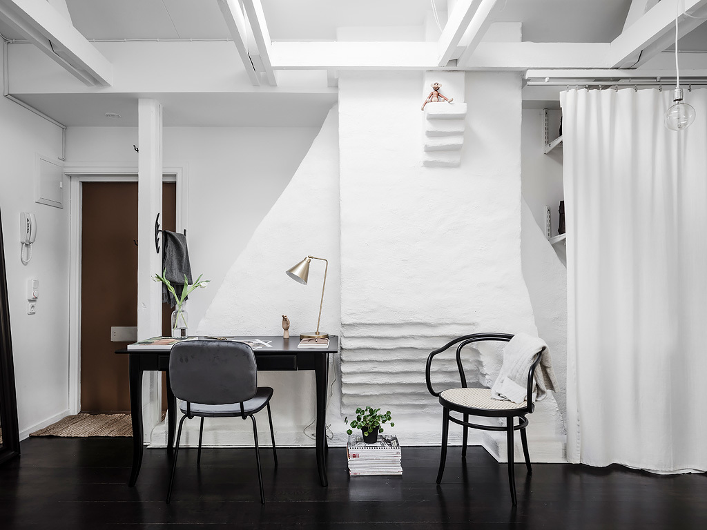
Home office in one of the corners of the living room. This is a perfect spot where to work on these strange days when we have to do remote work.

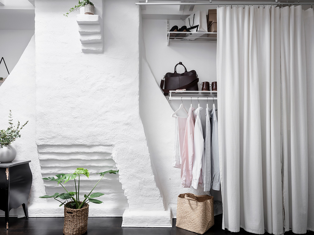
I particularly love the reading nook under the bay window. This is a perfect spot to hop in with a good book and a tasty coffee. The lighting above the table is a koushi pendant lamp, a very popular piece in the Nordic countries. You can find original lighting, but you can also DIY if you are handy. The wardrobe is an Elfa system hidden behind a white curtain, a genius idea when you are short on space, and this solution perfectly serves the storage instead of a large closet that wouldn’t fit here.

I hope you enjoyed the tour, I for sure did.


Photo credits: Thank you Entrance for letting me share these photos done by Anders Bergstedt.

Continue Reading