It’s been some time since I posted any project of mine. I don’t usually seek clients who would need an interior design proposal from me for 2 reasons: 1. I’m pretty reluctant about convincing others what is beautiful, and 2. how much their interior design would be worth. All my projects so far were strictly for friends who trusted me to come up with a budget-friendly concept. Anyhow, you know me, I love the Nordic style, everything that is Scandinavian, and of course, I cannot resist to vintage pieces. This is exactly why was hard to work on the project I’m writing right now.
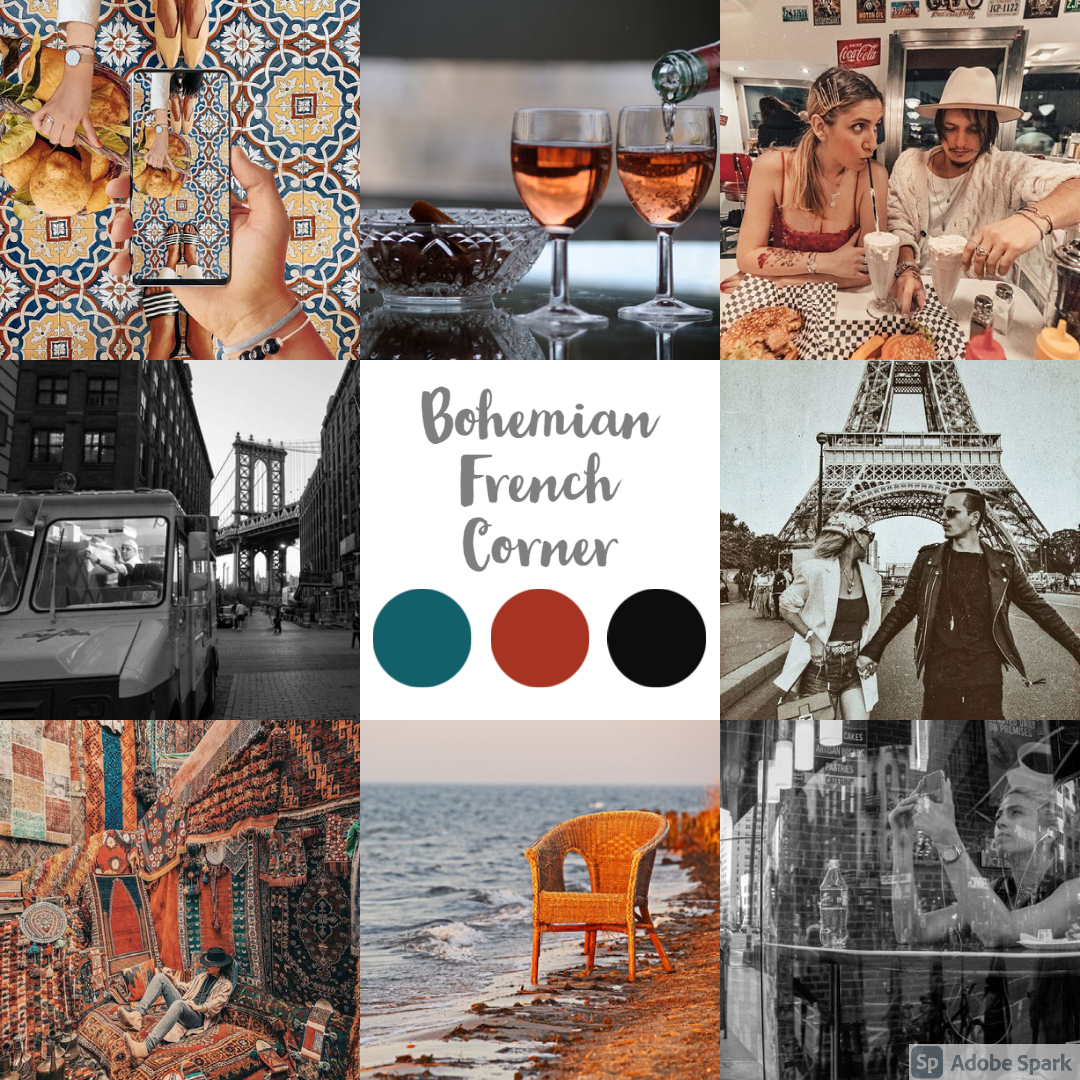
This is a 1 bedroom apartment, with an open space living room combined with the kitchen, 1 bathroom, and a small wardrobe. It’s a newly built block, having the apartment on the ground floor. The owner is an extremely nice lady (you know, those kinds of people who are born to be nice to everybody) to whom I could not say “no” after she explained what kind of style she would like to have for the apartment. The basic idea was around Moroccan style with French vibes, a lot of black & white, and orange. I could do French countryside style, but I have nothing to do with the Moroccan style, hence the challenge on this project.
As usual, I was aiming for a mood board that would reflect the apartment’s feelings. The owner provided great pictures, just look at those color palettes! Sadly, when I was running through the color palette generator, the software could not identify the 3 dominant colors due to the overcrowded images. We ended up with dark turquoise, dark orange, and black.
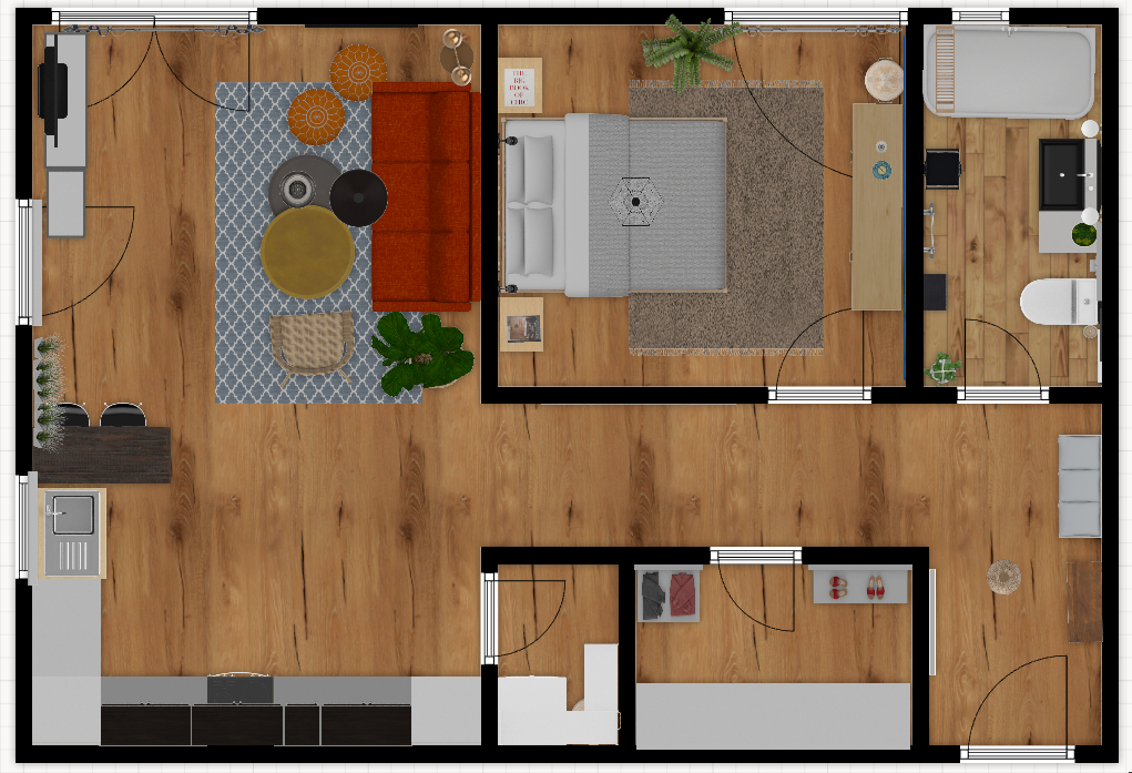
I don’t like over-furnished interiors, so I stick with the Nordic concept of avoiding having too much stuff in the apartment. I’ve created the 2d planning to see what and where to fit to meet the expectations for everyday needs.
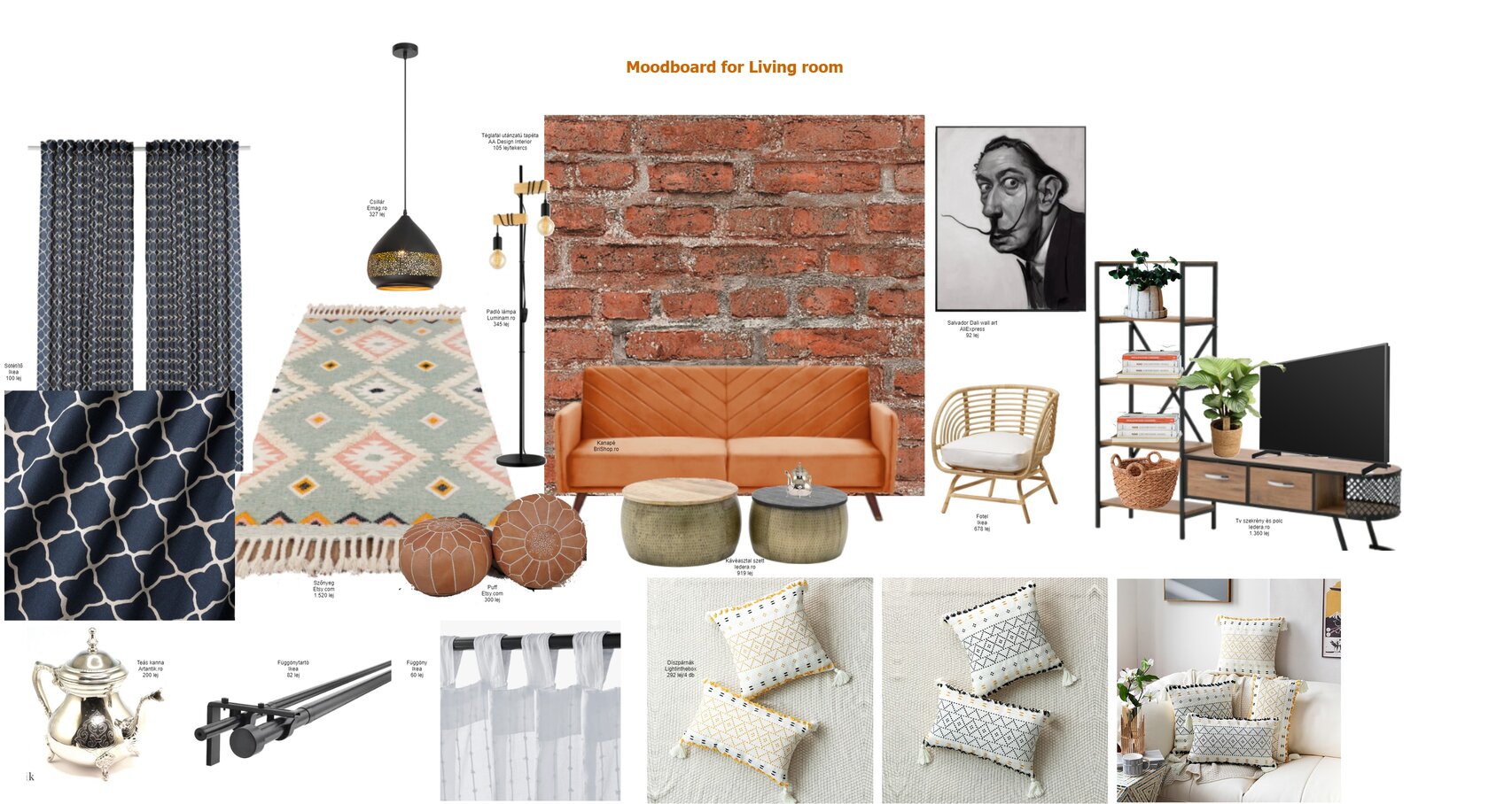
The mood board of the living room reflects the requirements from the owner, more precisely to have a brick wall behind the sofa, to have Moroccan elements like the lighting, coffee tables, carpet, and to have a black & white portrait of a famous person. These, all together, are giving a great bohemian vibe.
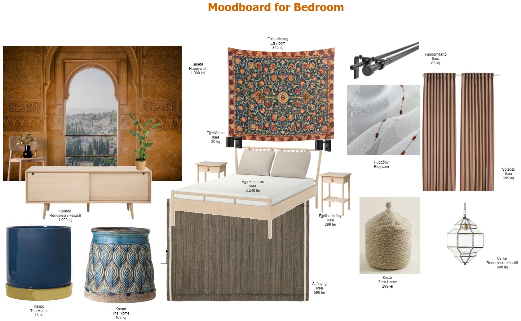
I guess the bedroom is the most Moroccan room in the whole apartment. Since it’s only a 12 sqm room, I wanted to have a wow effect with the Arabic wallpaper that adds extra depth to the place, and it has the impression of a large, open window.
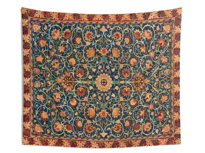
The tapestry behind the bed is a Dreemzia piece from Etsy.com. Unfortunately, this one is no longer available, but you can find many more beautiful, vintage, handcrafted tapestries.
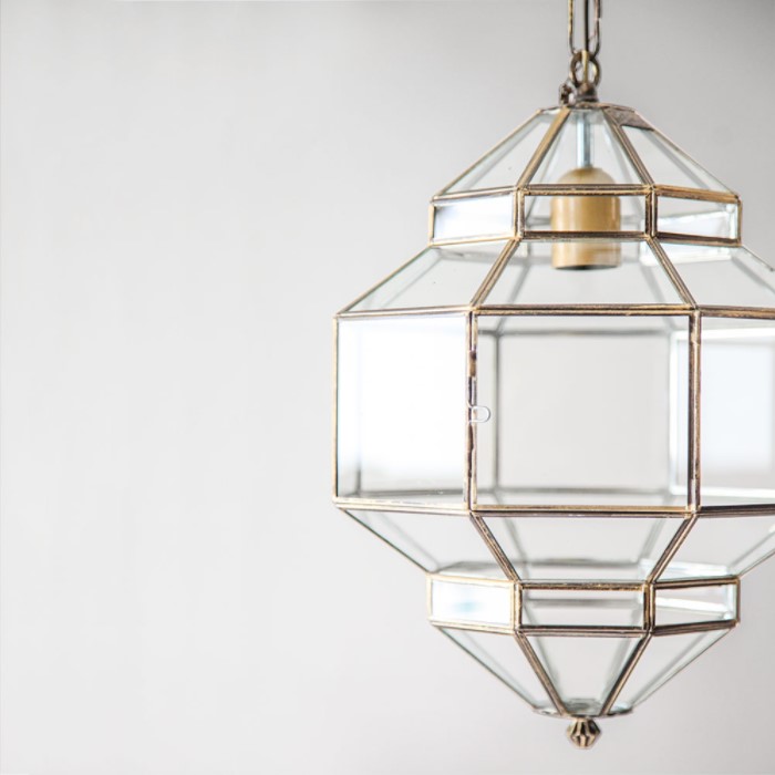
The pendant is a Granada Lanterns product available on L’aviva home. Although it’s not a typical Moroccan lamp, it’s more about imitating the diamond’s shape, still, it has its Eastern style notes. I adore that it’s made of colorless transparent glass, somehow it seems minimalistic to me.
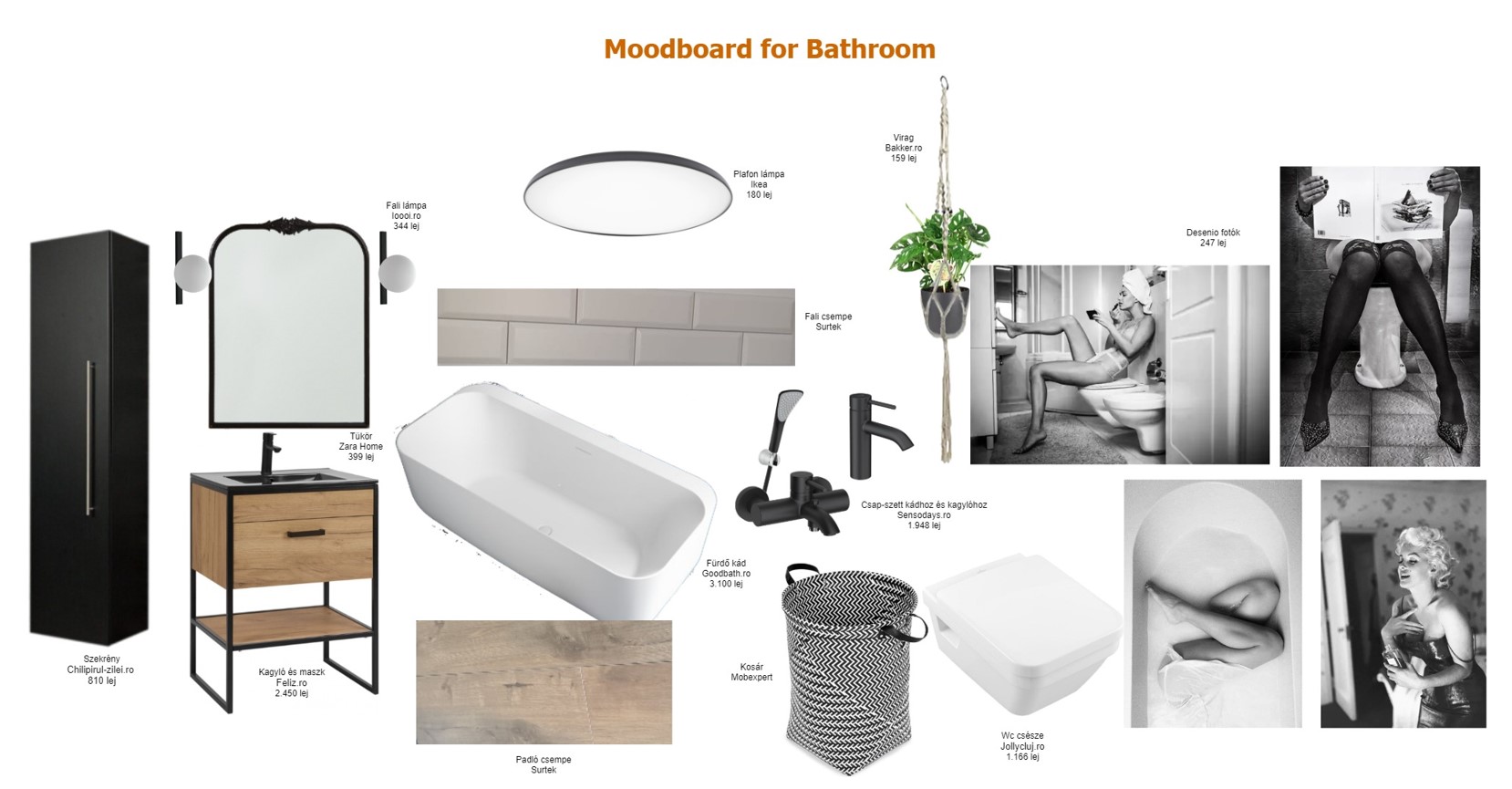
The bathroom had to be fully French, so I went for the black & white combination, making sure that there is enough room for a gallery wall with glamorous photos.
We had some headaches with the kitchen since we needed to incorporate all the electronics without turning into a piece of overcrowded furniture. The upper cabinetry will be black with glass doors to add an extra trick to the furniture. I’m not fully convinced that this is the final way to go, so let’s consider my 3D plan as a draft for the kitchen 😉
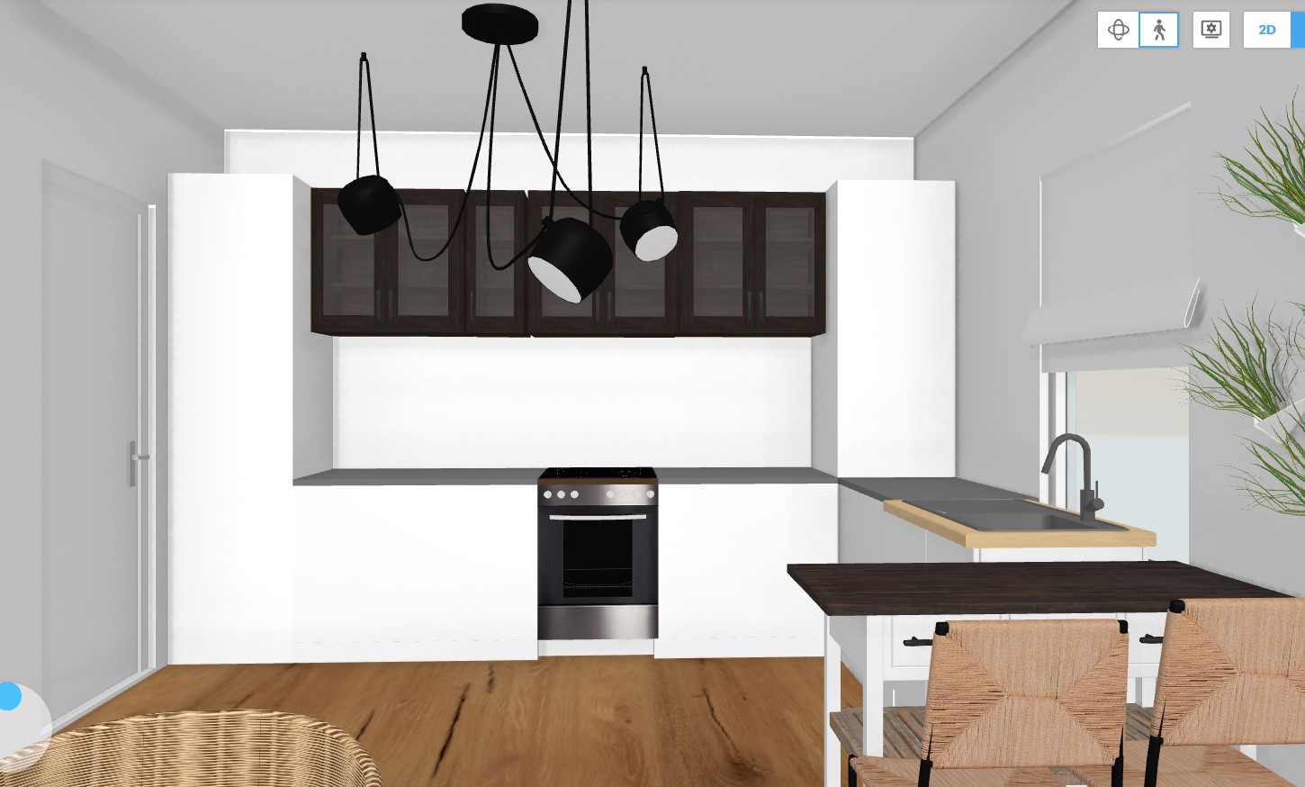
Photo credits: 1. Mood board created by focalpoint.ro based on the images provided by the customer, top and bottom middle photos used from Adobe Spark; 2., 3., 4., 7. & 8. All created by focalpoint.ro; 5. Dreemzia; 6. L’aviva home


