Another week in Hamburg, another home tour from Germany

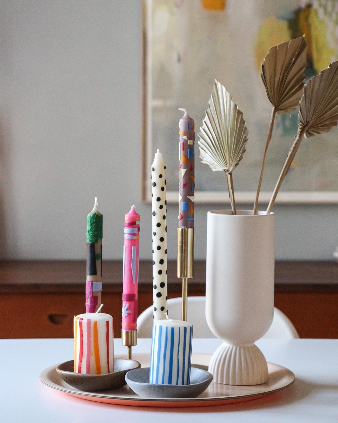
TGIF! Finally! My favorite day of the week because the weekend is here, and a new home tour gets up on my blog. While digging deeper on Instagram, by coincidence, I found another beautiful apartment in Hamburg. So 2 weeks in a row, we stay in Germany for interior inspirations…of course with Scandi vibes. I am grateful to Steffi for letting us inside their old house built in 1910, taking a tour, and admiring their home full of refurbished and new pieces. On top of the many mixing ideas, we also get some DIY inspo for personalized candles, more on this here, it’s a cool idea of getting unique pieces on your coffee table.

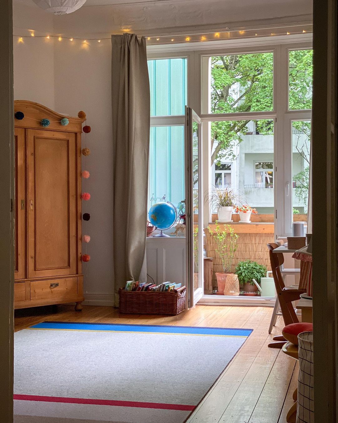
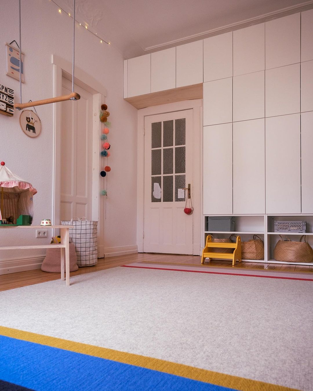
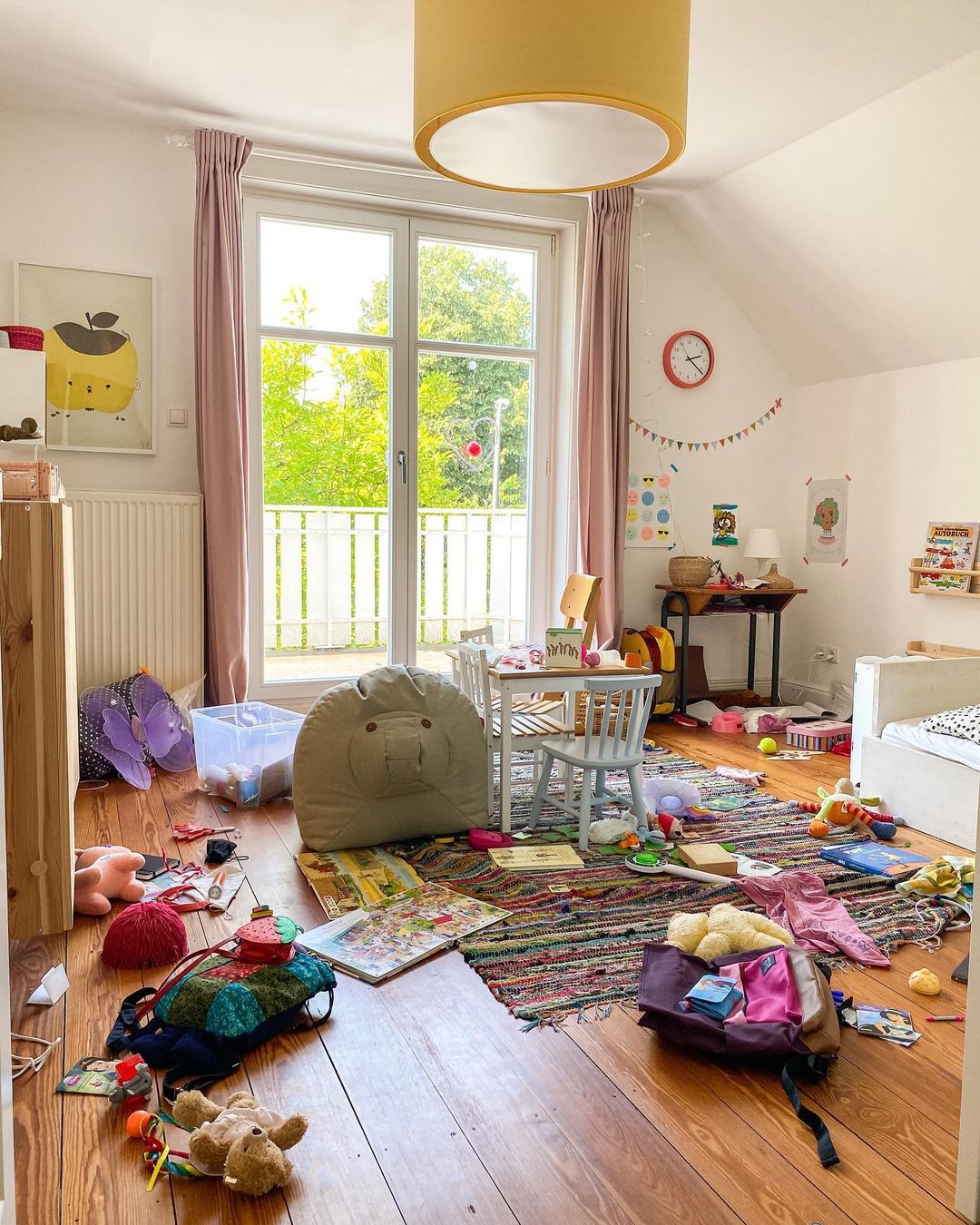
Steffi lives in this house with her husband and their 3 children, no wonder why their home looks so joyful, happy, and homey. I like those interiors that show you also the “natural face” of things, instead of looking so neat from every corner of it. The children’s room was a “must-show” item when I was deciding on pictures. But let’s take the tour and admire the details.
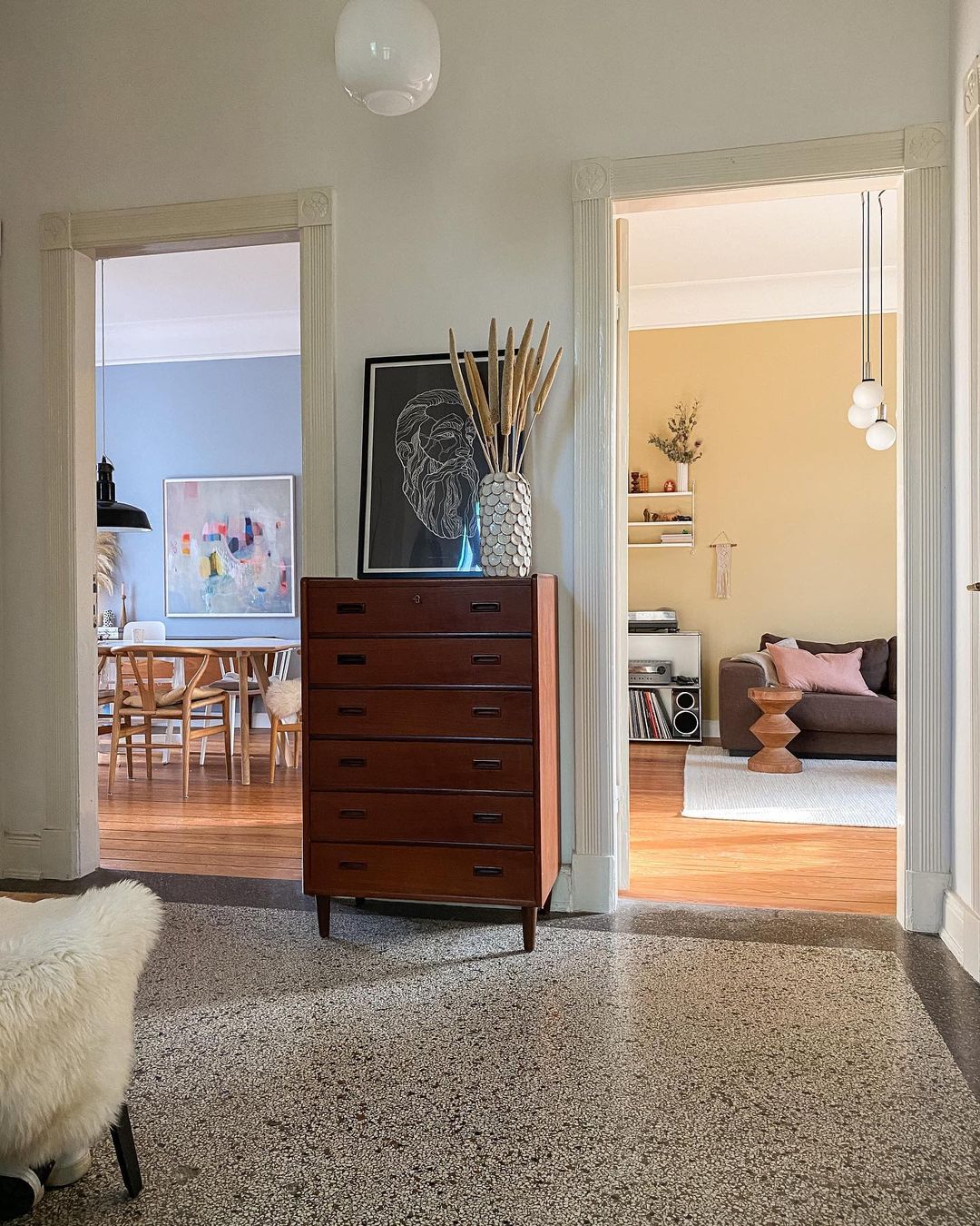
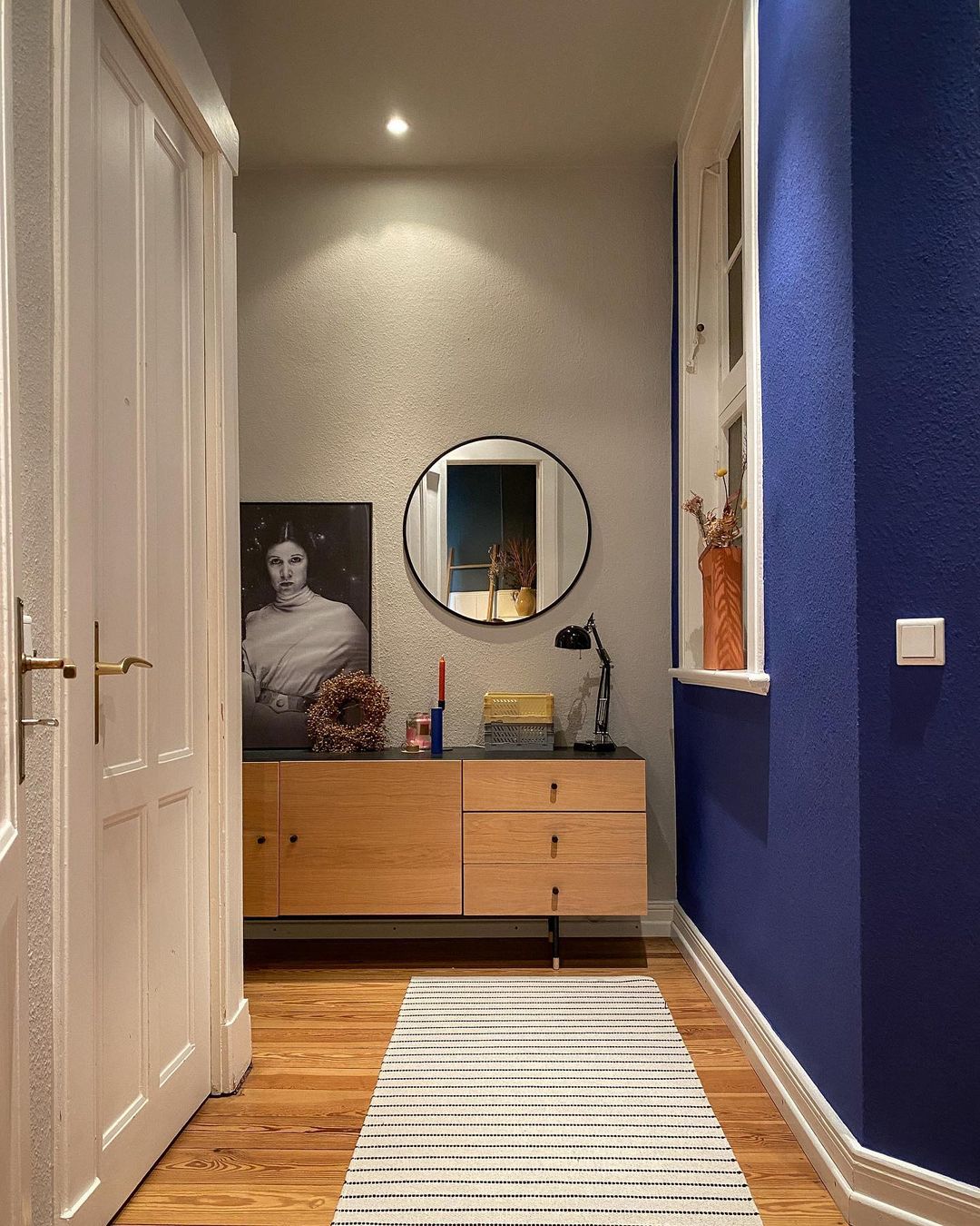
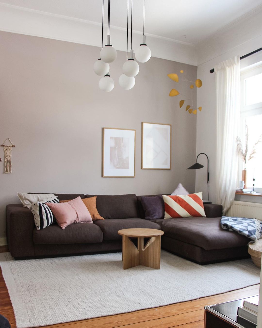
The hallway looks amazing with its original floor and the vintage drawer. Check out those door jambs, must be from the previous century for sure. In the living room, there is a lot of natural light which is an instant winner. I sport an Arum wall lamp in the corner by Ferm Living.
The DIY candles I’ve mentioned earlier. These were made by Steffi’s children, no wonder why they look so funky. Some real unique pieces.
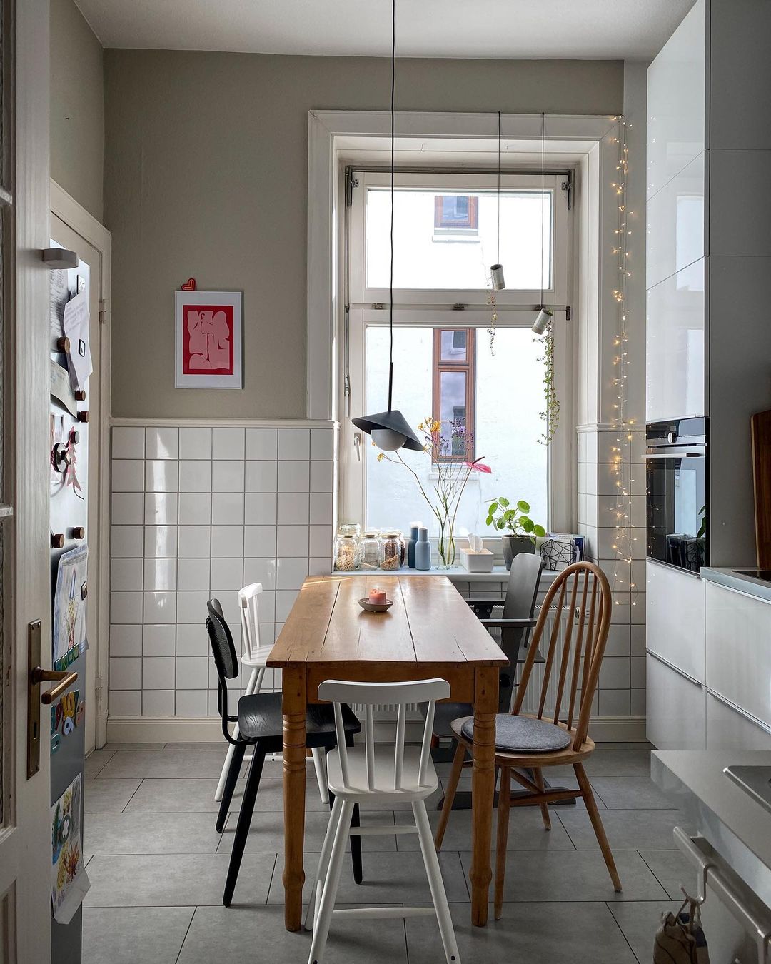
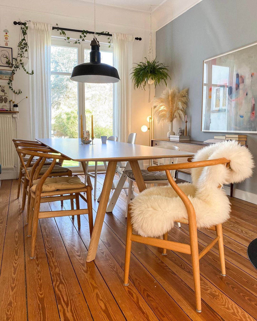
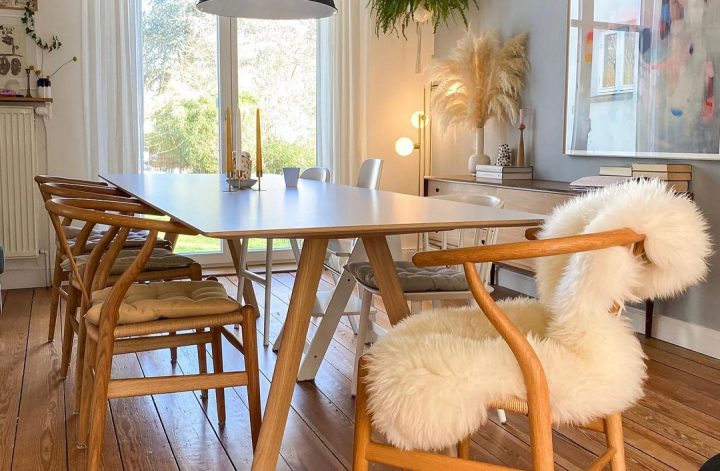
The dining area is between the kitchen and the living room, full of natural light as well. The real focal point is the Wishbone chairs, of course. As I mentioned many times, my favorite chairs. This family managed to purchase these, one by one, and they were super happy when things started to get together. After all, these chairs are not cheap, so we’re talking about some investments here.
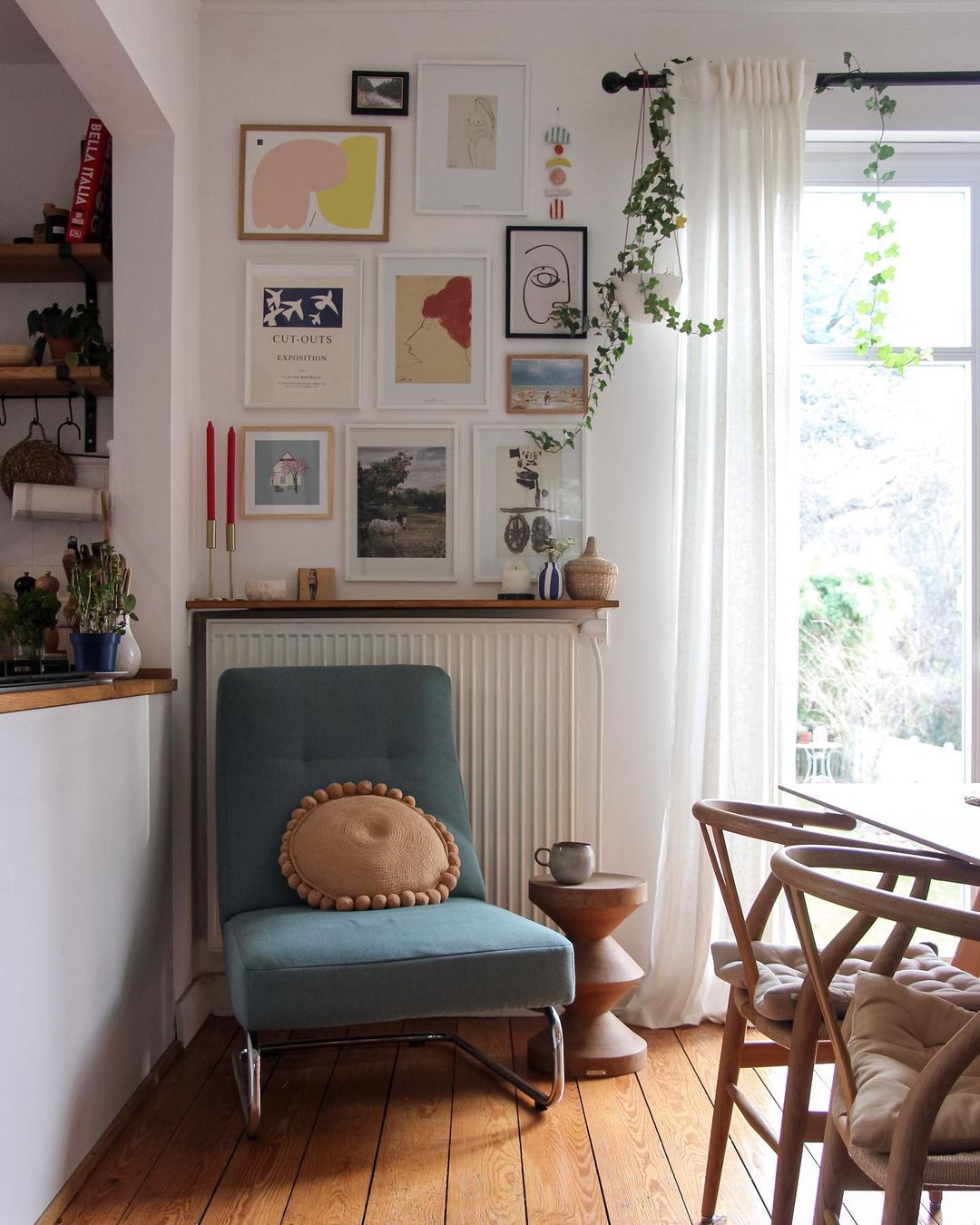
Reading corner next to the kitchen and dining room, or more a “stop by” spot of the place for a good coffee or a book…what a great way to hide the radiator and boost it up with a gallery wall.
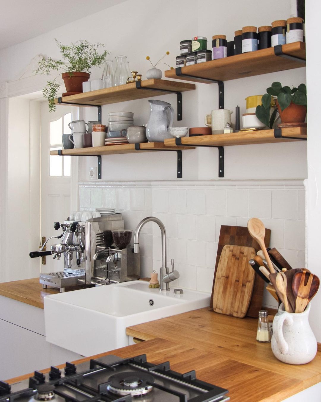
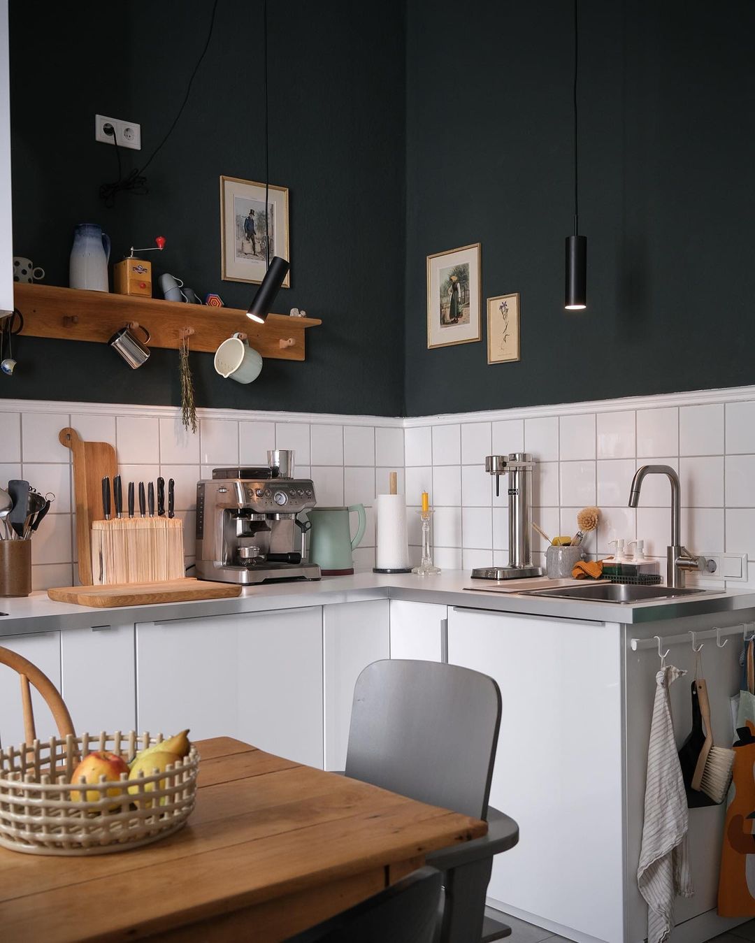
Open shelving in the kitchen with a lot of great coffee cups. Below is the children’s room in its natural way of being. I see an Apple Papple poster on the wall by Fine Little Day, this is a popular piece of art in Scandinavian homes.
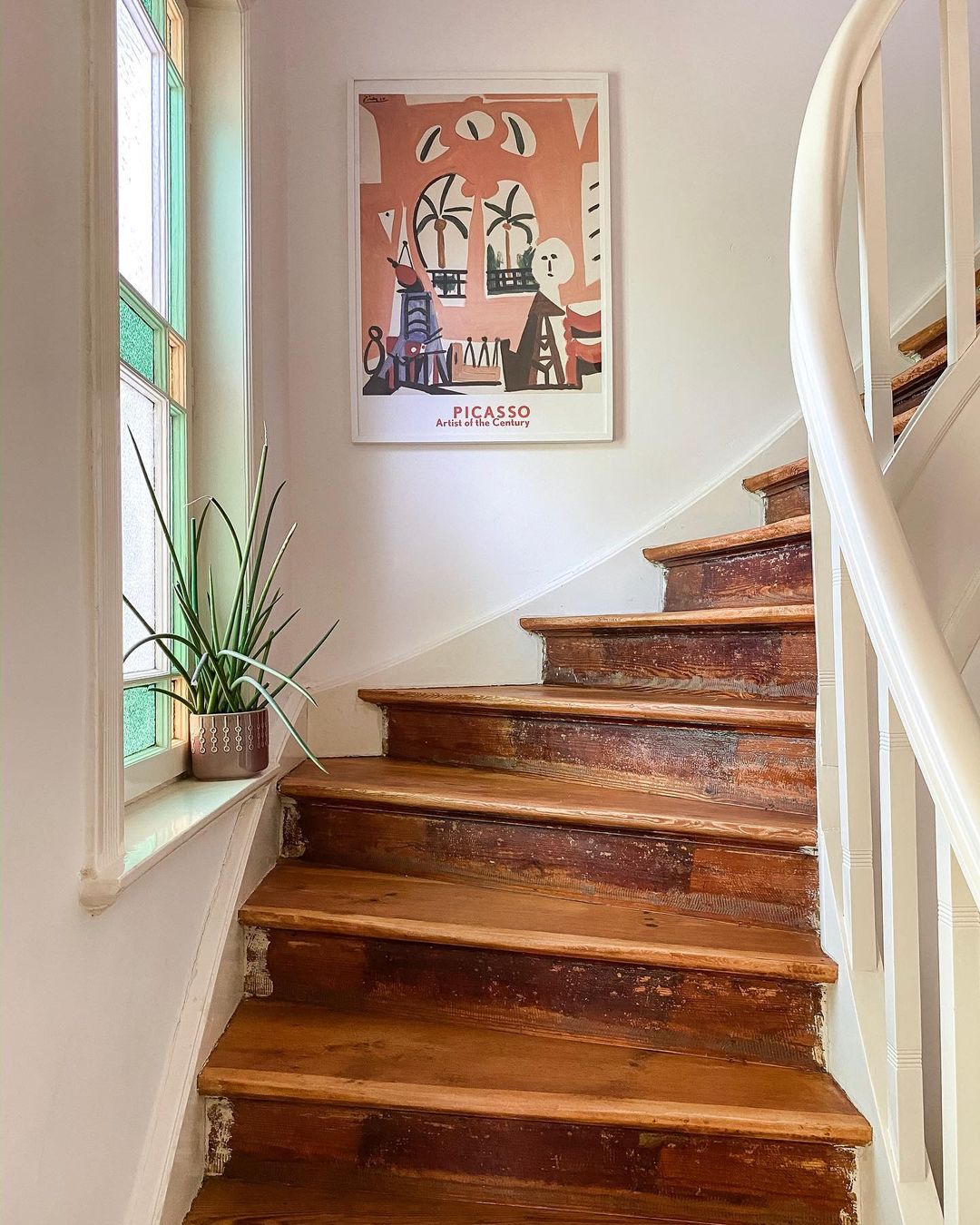
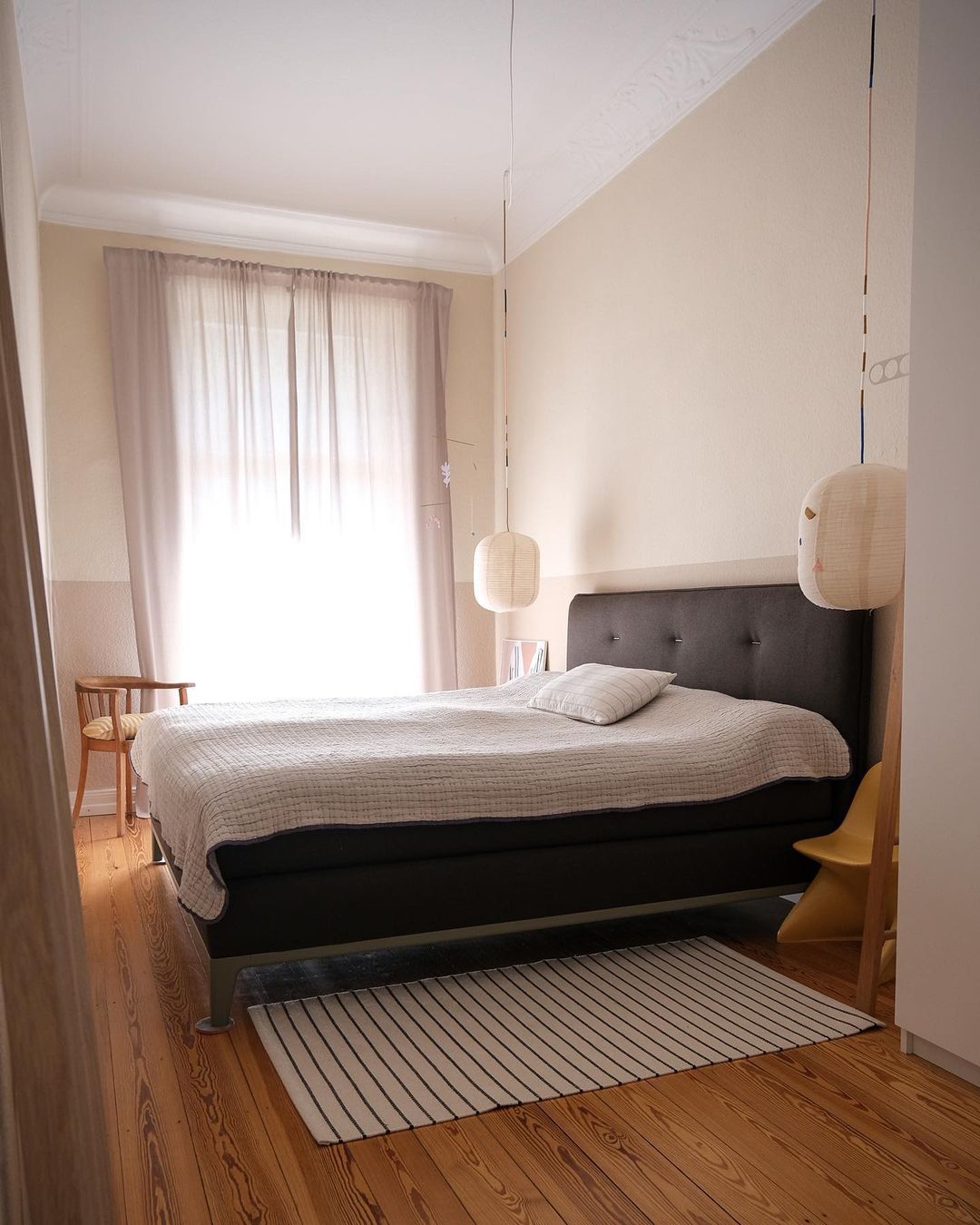
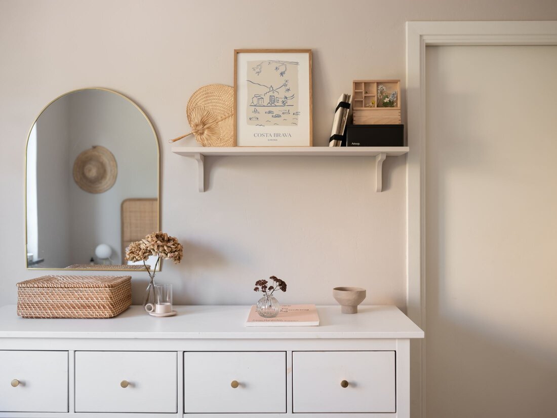
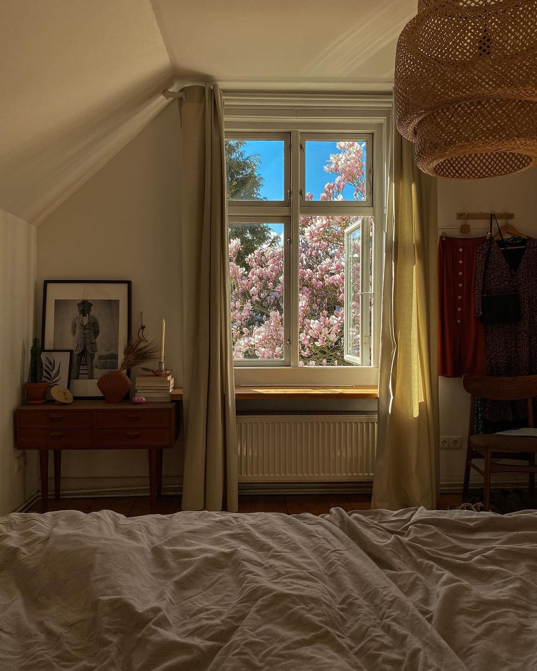
The stairs were sanded and refurbished till they get their original look back. I say these look marvelous, with the white wall and handrail. The bedroom has a great few, especially in the spring. I spot here a vintage drawer and a Sinnerlig Ikea pendant.
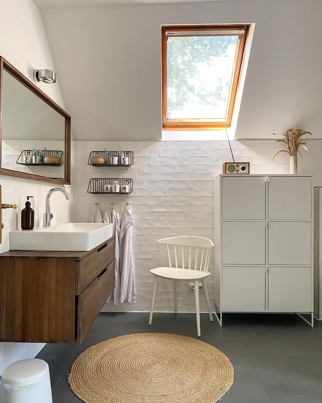
The bathroom is fantastic, with the old drawer below the sink, with its grey&white tiles and the minimalistic white cabinet that gives some modern vibes to the place. What a great way to mix different styles.
If you liked this tour, do not hesitate to check out Steffi’s IG feed as she has a nice backyard too, and many other beautiful spots in her home.

That’s it from me this week, my friends, see you next week with another home tour, this time with a local treasure, a cabin from Maramureș 😉


Photo credits: @heyheyhaus – shared with her friendly permission


Continue Reading

A 170qm German interior with Scandi vibes

This week, my friends, we are traveling away from the Scandinavian region. I found a beautiful interior in Hamburg with some Scandi vibes that turned into a “must-see” home to me. This 170 sqm home belongs to Anne Dirfard, an interior blogger and digital creator of the 170qm Instagram feed and 170QM blog.

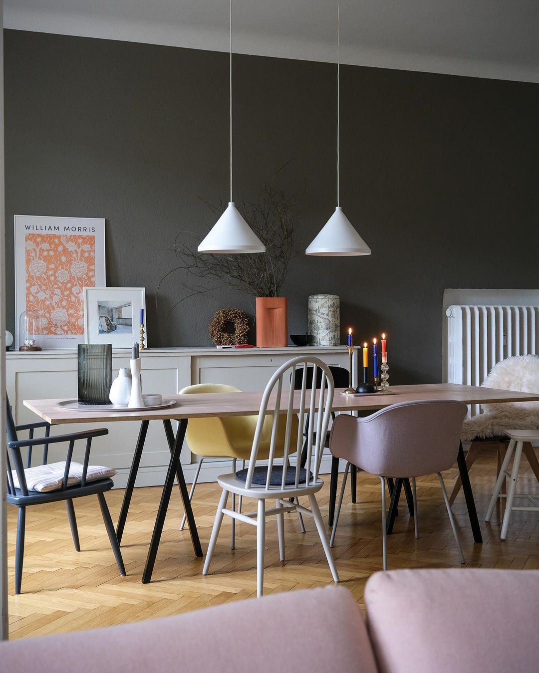
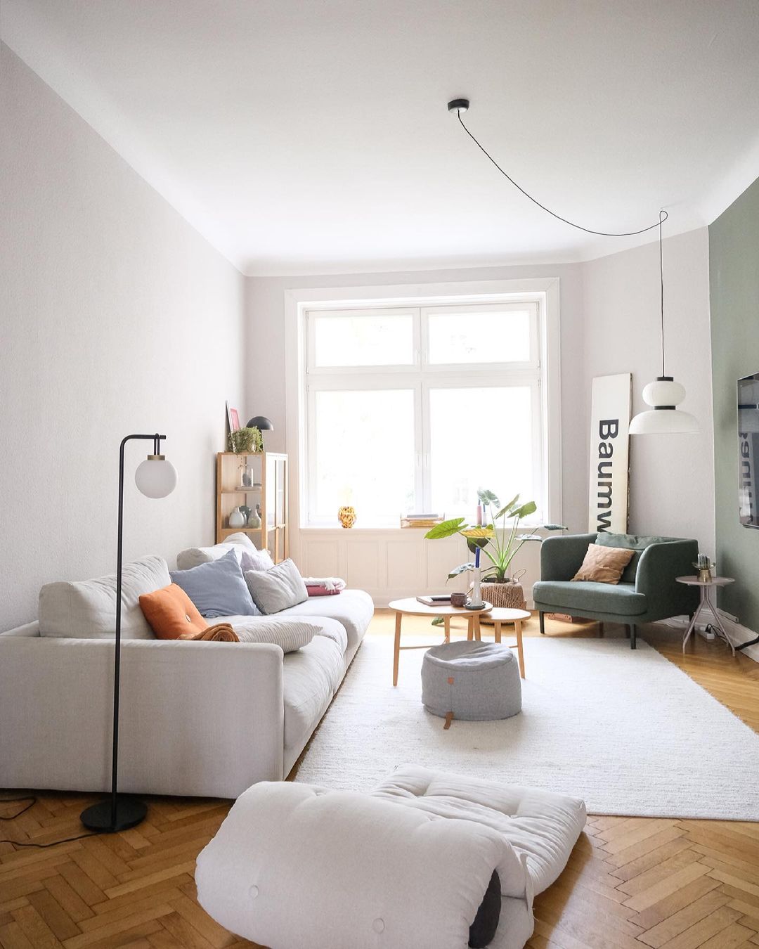
I love the dark colors on some of the walls that add more depth to the rooms. The tiles in the kitchen are one of my favorites. These were very trendy in my region in the ’70-’80, especially that you could not find other models ;). Their vintage vibes are undeniable, and to be honest, I’m not sure why these are no longer popular here (I might have a hint, but that would be too rude to tell about on the blog). The dining areas in the kitchen and next to the living room (what a luxury, having two dining areas) are charming due to the mix of chairs, such a cool thing to use to add extra charm. In the living room, the sage green wall adds accent to the Tv area, and we all know how hard it is to design the proper Tv area. I’m not sure what is the focal point of the reading corner, the sage green armchair, or the Formakami pendant, up to you to decide on this.

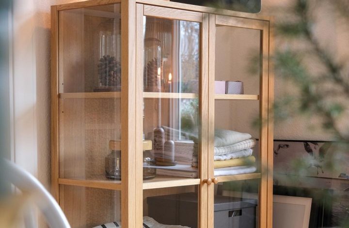
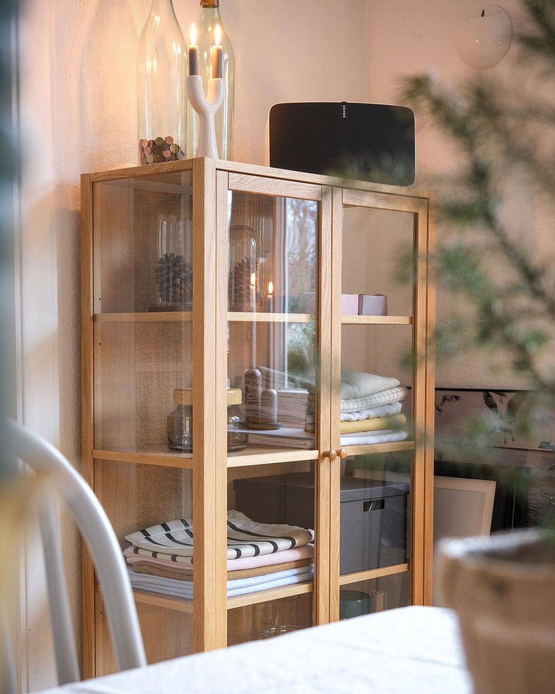
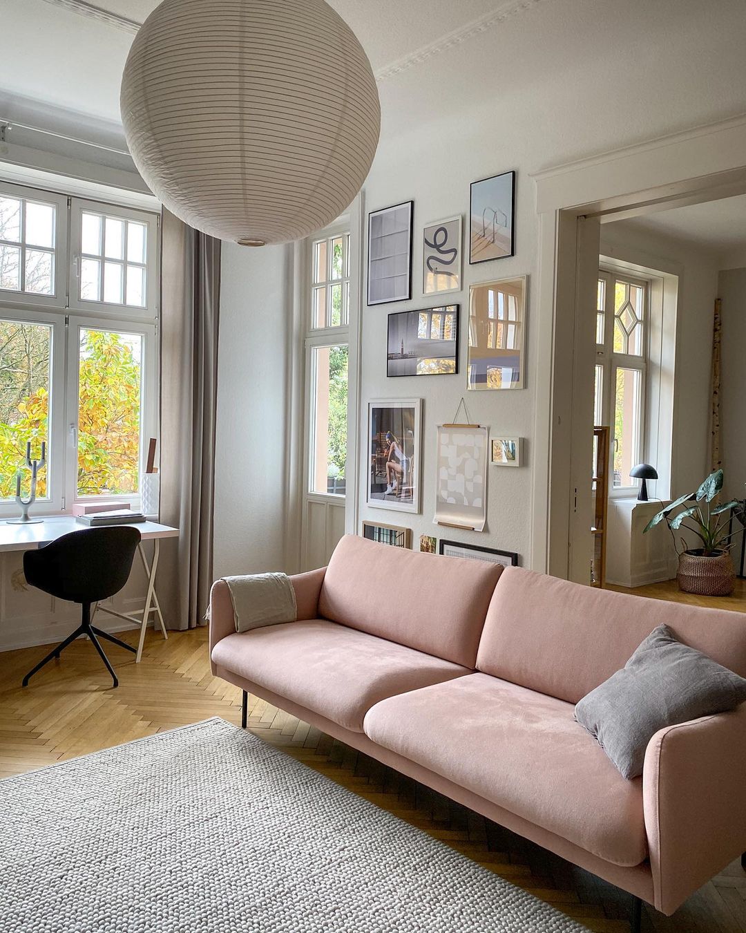
Is there anything that captured your attention? There are so many in my opinion, that it’s hard to choose one, for example, the dark blue wall in the hallway, the powder pink sofa in the living room, the vintage closet, or the storage above the door in the kids’ room, or the minimalistic bedroom. The kids’ room is a winner to me. I love those children’s rooms that show creativity by adding original pieces, like this one having that nice vintage closet. Did you observe by any chance the glass cabinetry full of treasures? We have one too (I know I take shitty photos, my next project is to attend an interior photography course) in our kitchen, and this is where I keep all my loveable ceramics. So happy to have it 🙂

Hope you like the tour, I definitely do!


Photo credits: Anne Dirfard IG @170qm – shared with her friendly permission
 

Continue Reading

A bright apartment with a cute bathroom

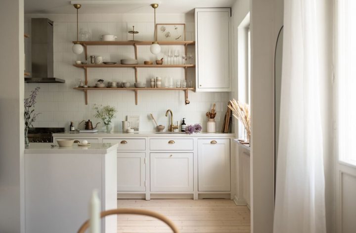
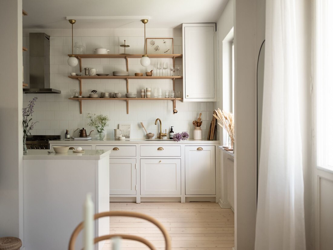
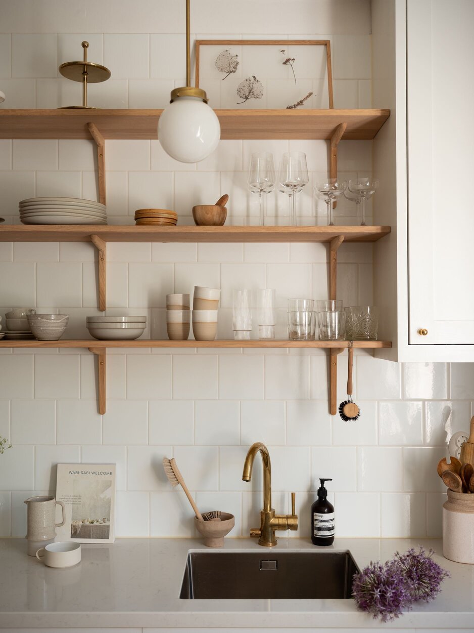
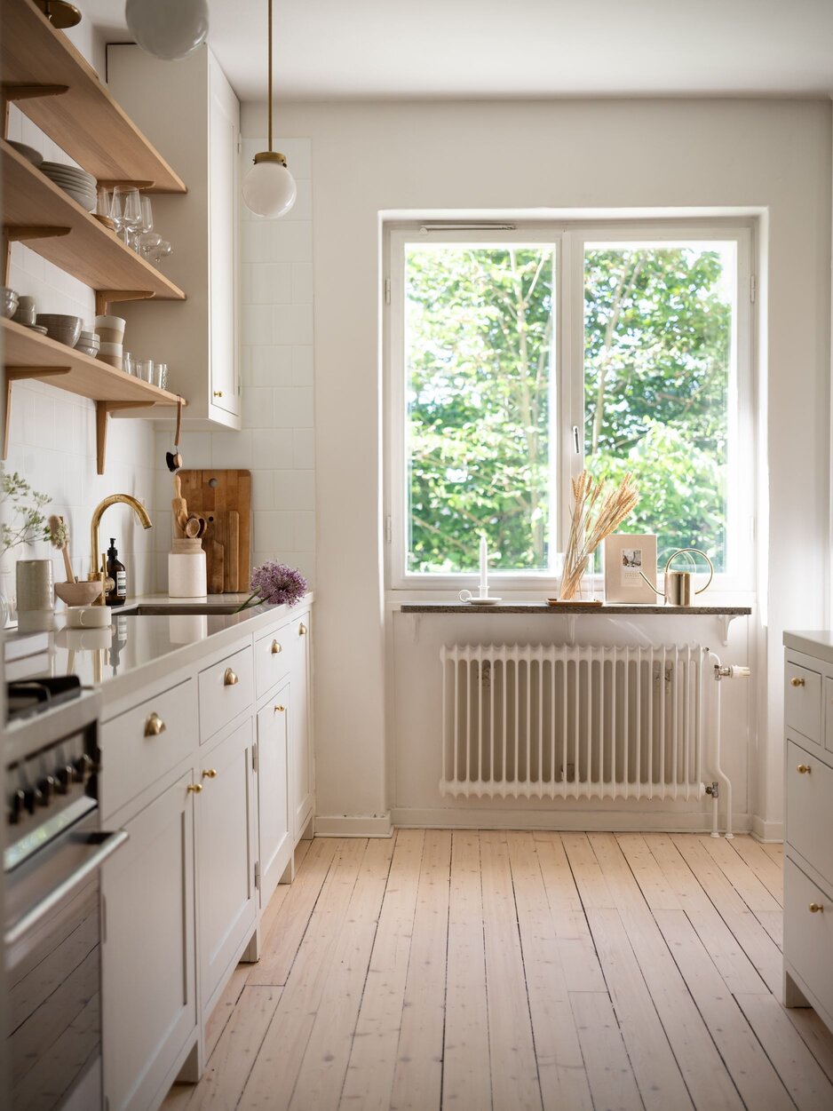
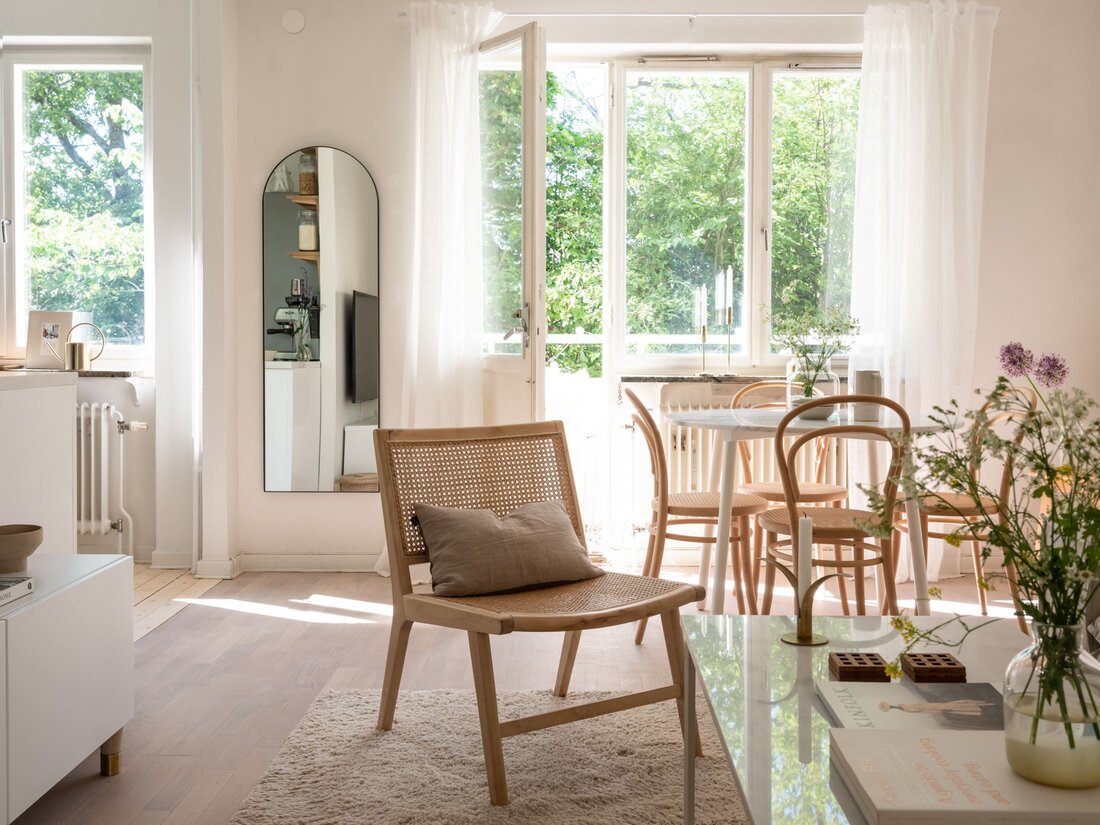
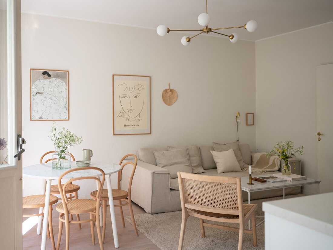
When searching for inspiration for my blog, sometimes it happens that I find interiors where I love everything. This is the case with this 48 sqm Stockholm-based apartment too, I love every corner of it. The white Scandinavian Shaker Kitchen with its doors made of solid pine and painted with linseed oil is a timeless design that will “resist” as a strong focal point in the world of interior design. Those tiny golden buttons totally convinced me to love this bright kitchen. The open shelves go hand in hand with the pine floors and add a natural tone to the place. It might be funny, but what I love the most is the radiator, what a great vintage piece. I hate nowadays radiators, we have the same in our house, but they are ugly as hell.

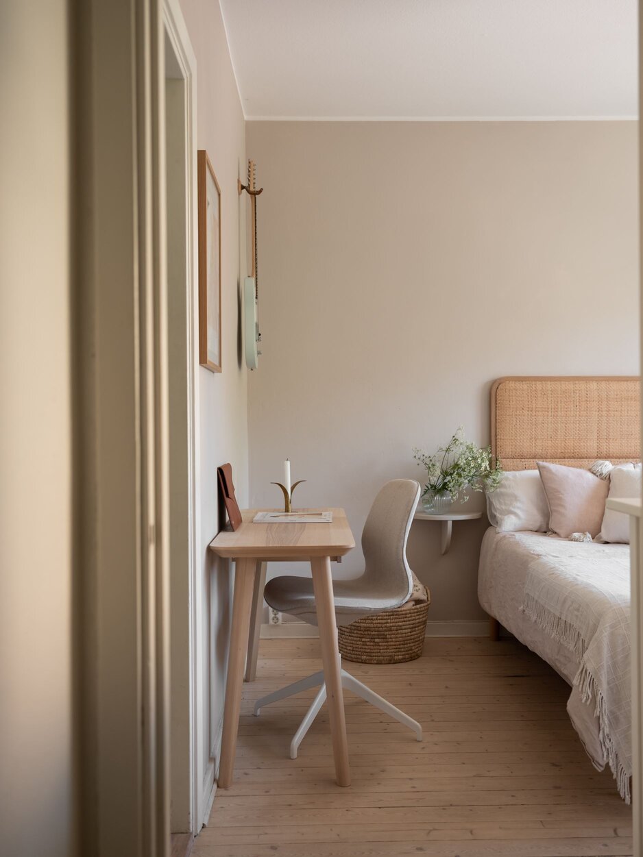
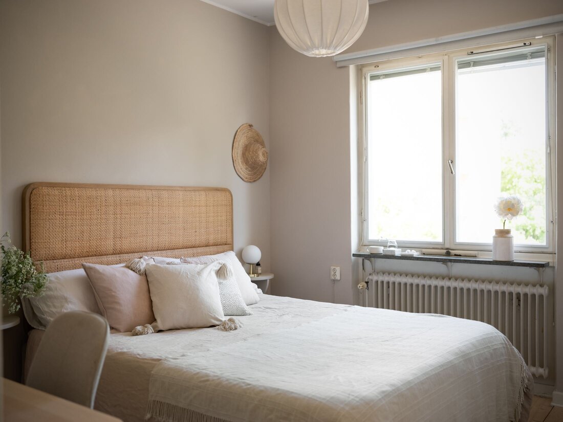
What a nice idea of combining a small desk with the bedroom, turning the home office into a cozy corner. The white drawer is an Ikea piece, with golden handles/buttons that make the whole furniture much nicer than the original one. We have it too in our bedroom, but we kept it with the black buttons, now I wonder, maybe it would be a good idea to change those. The beige office chair is from Ikea too, totally fitting into the natural tone of the room. The walls are painted into transparent pink from Jotun‘s Lady Collection.

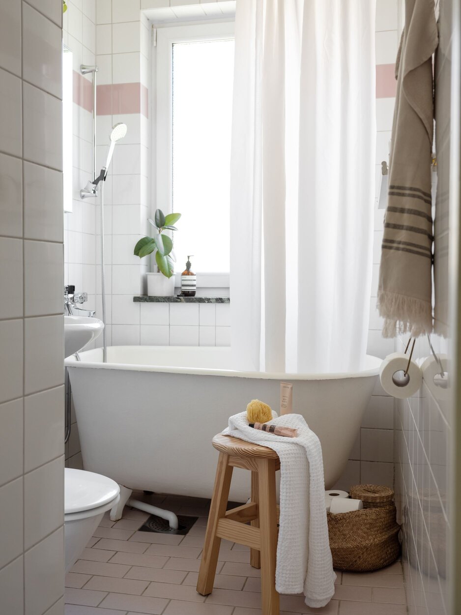
This is the sweetest, the tiny little bathroom I’ve recently seen on the world wide web. If this house would be empty, having only the bathroom, I would be totally into it to buy it. The kitchen is a great extra, a real beauty too, but when I saw the bathroom I knew, I must share this on my blog. Nothing kitschy, with its simplicity combined with a touch of pink (I bet you didn’t observe the top line of pink tiles 😉 ), this bathroom with its bathtub is everything you need. It’s the definition of coziness.

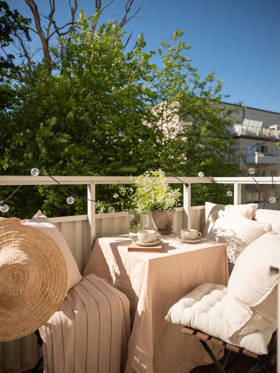
As usual, there is an outdoor space too, a small terrace to get some fresh air and let the natural light flowing into the apartment. Tiny spaces never scare away Swedish people, they can turn these into some hygge corners. This small terrace is a nice spot to have a glass of wine at night staring at the stars or having a cup of coffee in the morning sunbath. Either way would work for me.
This apartment was for sale for a few days, but till I managed to get some time to write my blog post, boom, it got solved. Anyhow, admire it as it’s a great source of inspiration.


Photo: Johansson
Styling: Lindholm

Photo credits: Historika Hem, shared with kind permission.

Continue Reading

Why I love ED’s home collection

In this week’s blog post, we travel outside of the Scandinavian region to which my readers are usually used to. We step into the wonderful world of ED’s home collection, a USA-based lifestyle brand founded in 2015 by the American comedian and Tv host, Ellen DeGeneres and Christopher Burch, the CEO of Burch Creative Capital.  

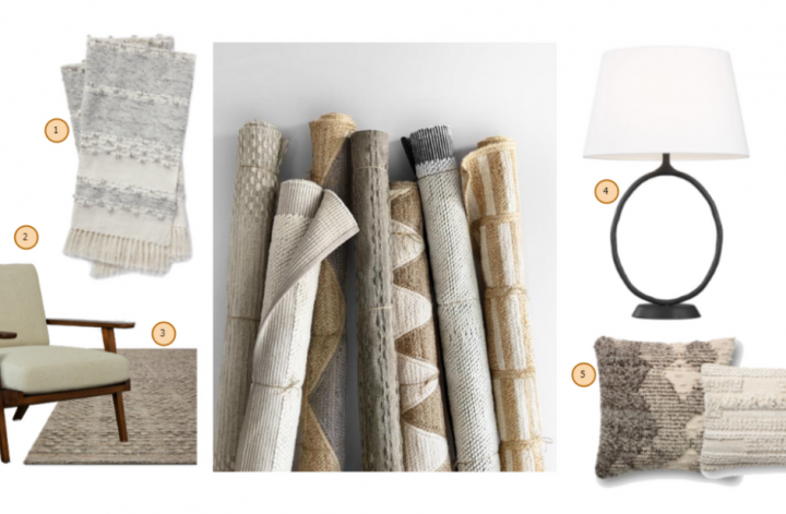
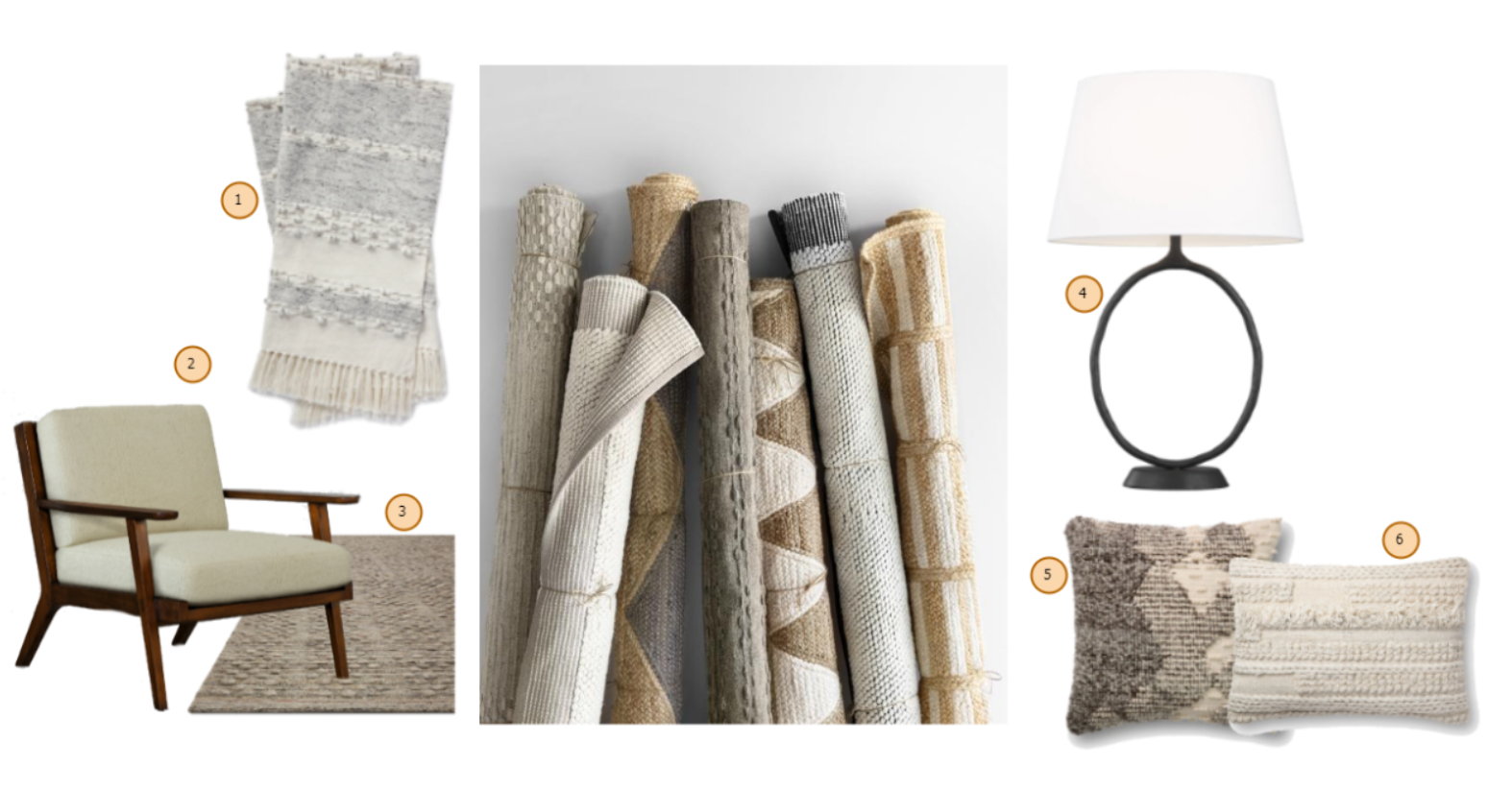
I’ve discovered ED by Ellen DeGeneres home collection a couple of years ago and I spotted instantly a few pieces that I could place almost anywhere in our home. You know me if something is with earthy tones, using natural raw materials and it’s handcrafted, it’s a winner to me. This is what I love the most in ED’s home collection, they managed to combine multiple styles, bohemian with minimalistic, natural with sophisticated, vintage with modern, covering a huge area of desires in terms of interior design. They have a nice collection of pillows and rugs, all very natural pieces with great color combinations.

Unfortunately, they don’t ship outside of the USA yet, but you can contact them (see the FAQ section, point 16.) for considering adding your country to their international list when they’ll start worldwide shipping. I’ve created a small collage with my favorite pieces of the moment. Enjoy!


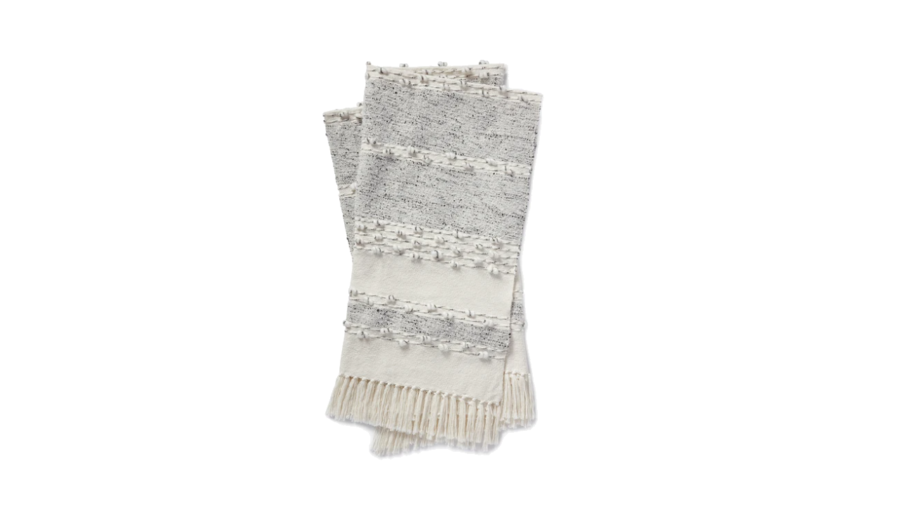
1. Akir Throw Blanket crafted by Loloi

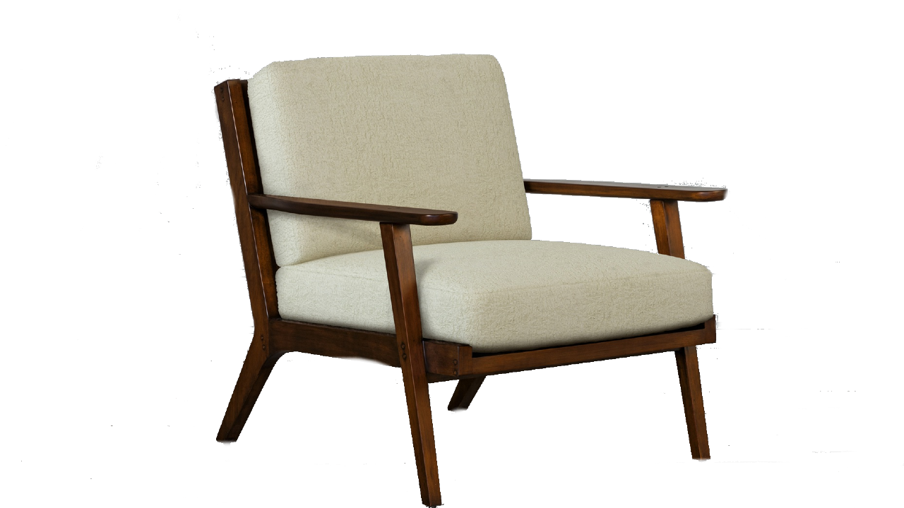
2. Mildas Chair by EJVictor


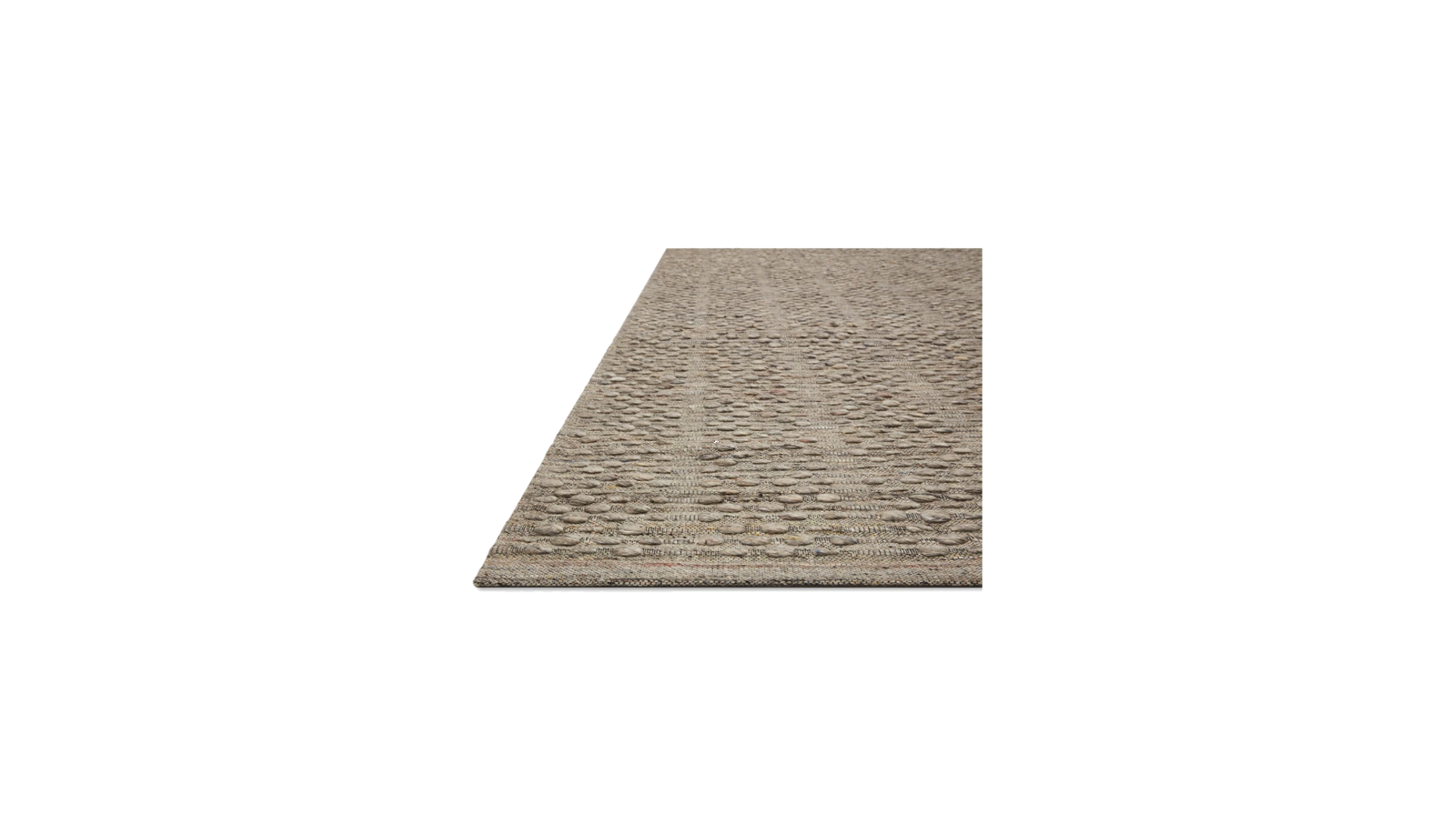
3. Burbank Woven Rug crafted by Loloi

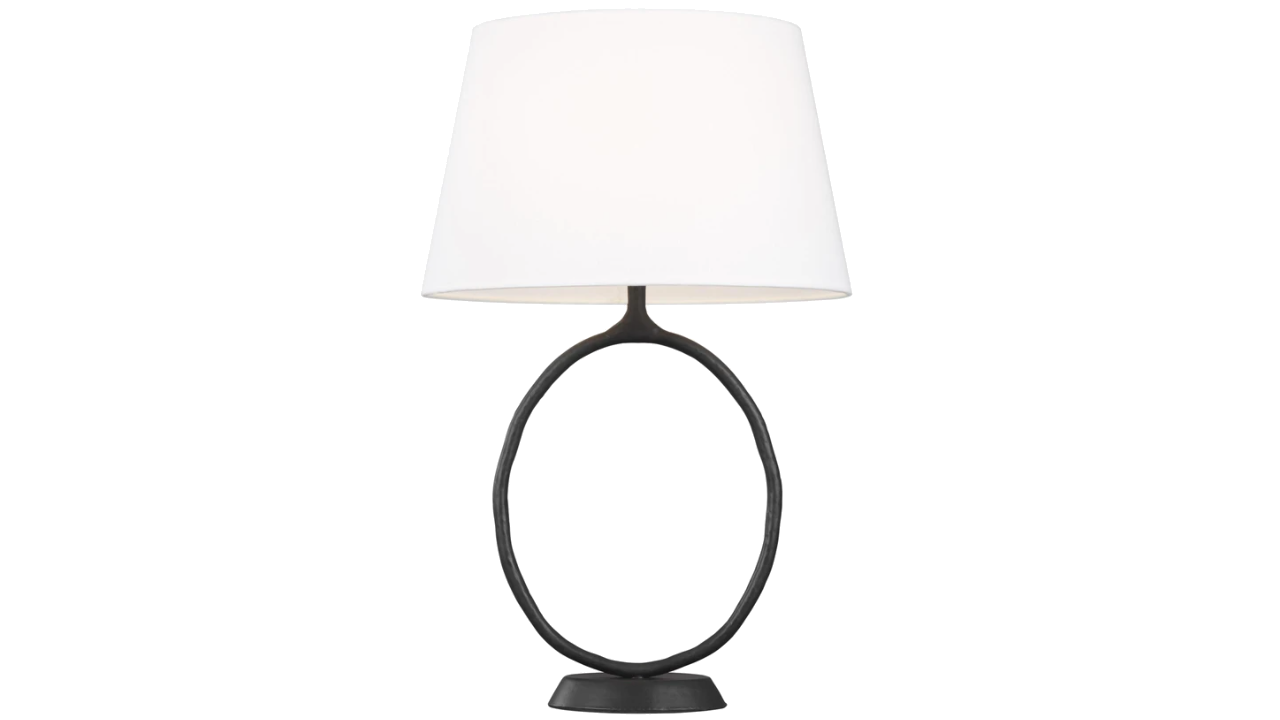
4. Indo 1 Table lamp crafted by Generation Lighting

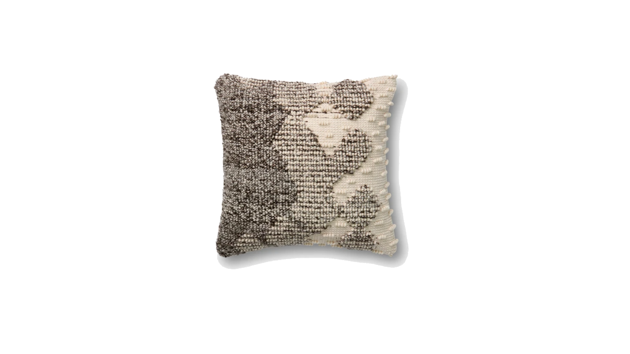
5. P4002 Looped Ombré pillow crafted by Loloi

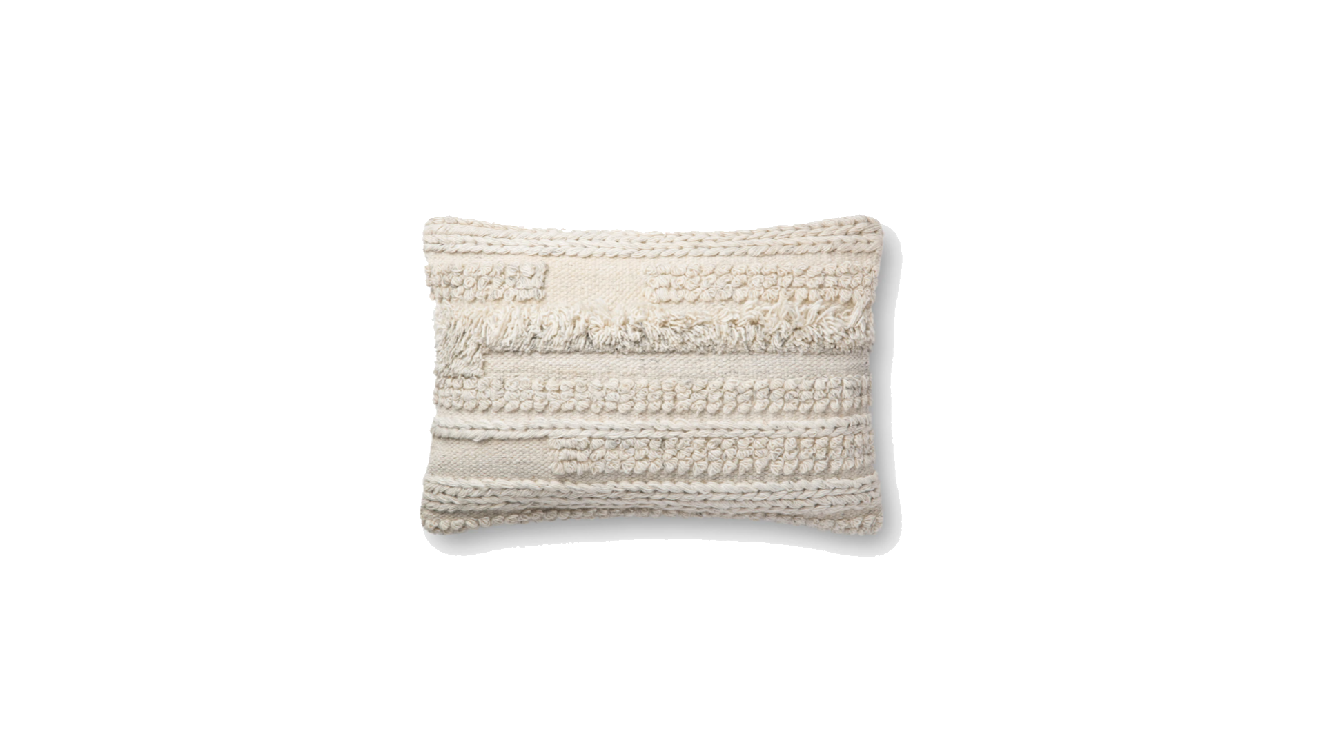
6. P4083 Braided Tapestry pillow crafted by Loloi


Photo credits: all product photos used in this collage by @ED by Ellen DeGeneres


Continue Reading