Cabin ANNA, the perfect solution to be in sync with nature

It’s been one year since I launched my blog. In this time, I had the chance to show you some really nice interiors thanks to the generous people I contacted for allowing me to take a peek inside their homes. I’m more than grateful for this. Thank you for enriching my small blog with your beautiful interiors 🙂

This time I found a treasure in the real sense of the word. I feel that this cabin idea is in perfect sync with me and the way I feel about being in harmony with nature. No wonder why my husband and I bought a house next to the forest.

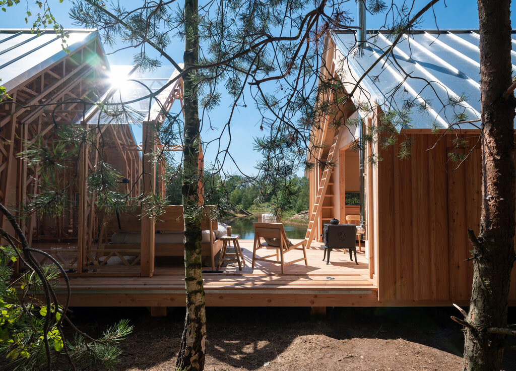
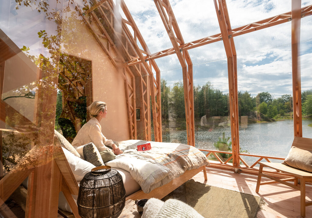
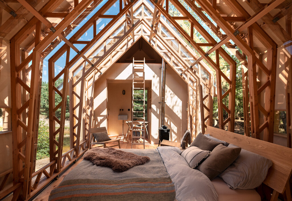
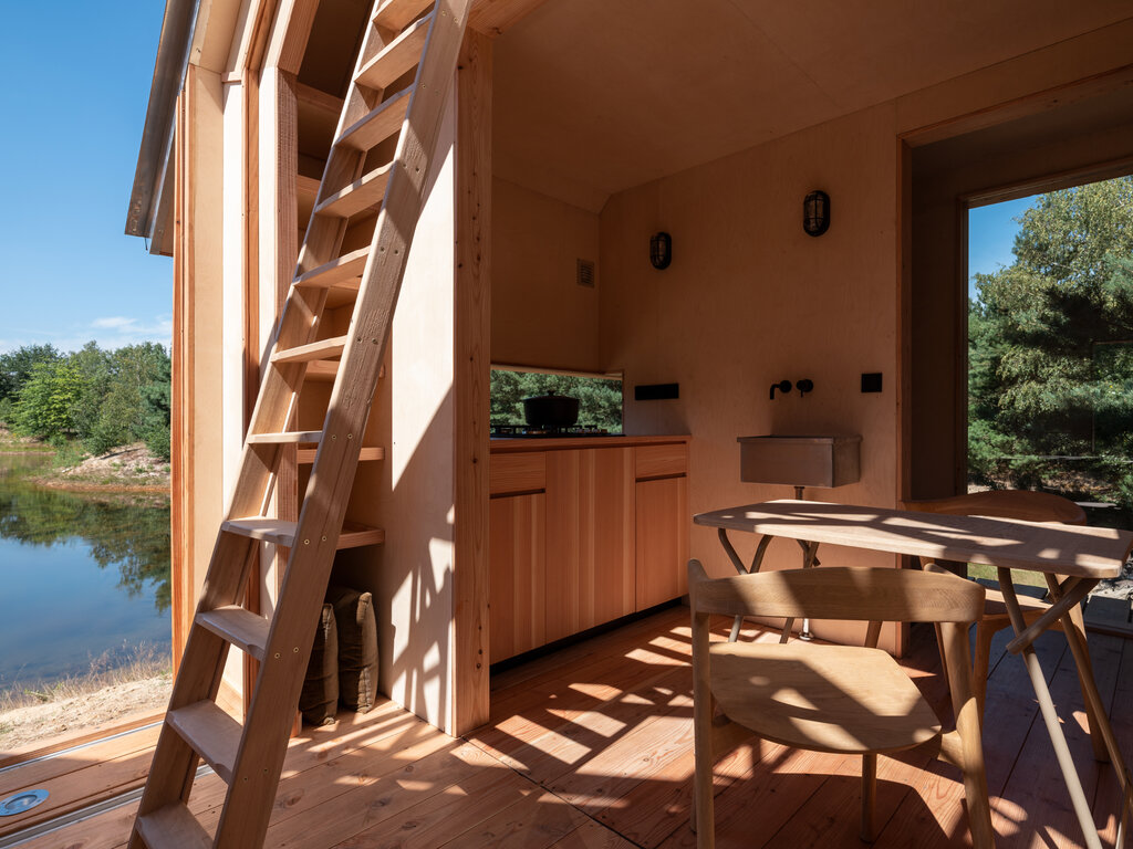
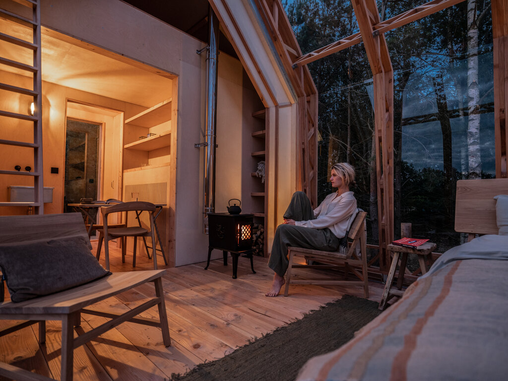
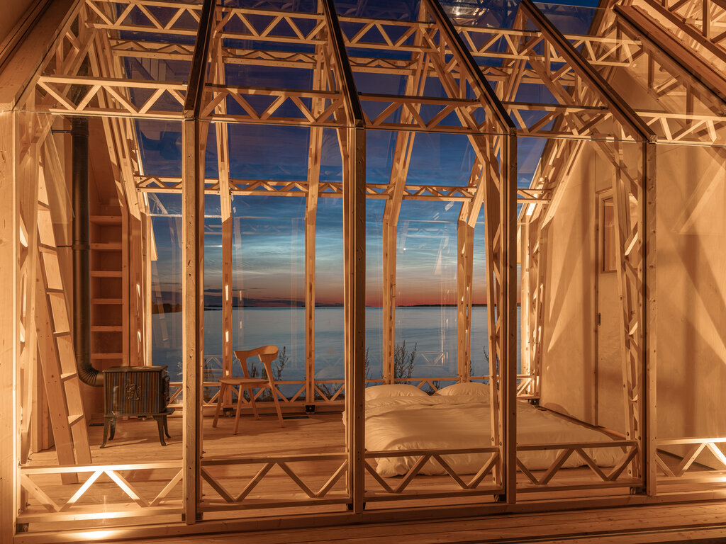
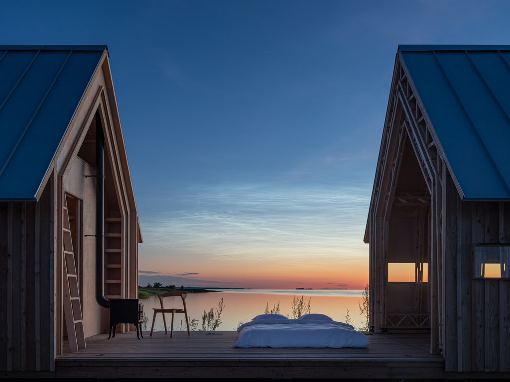
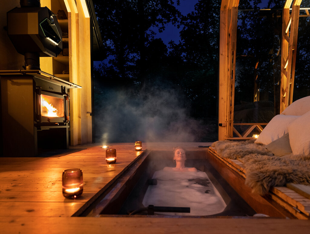
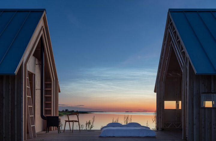
Cabin ANNA is an idea born out of a personal project of building a small garden house in the backyard of Caspar Schols’ mother, the Dutch designer, and architect who developed this cottage idea in 2016. Since then, this cabin has become a award winning architectural masterpiece winning The Project of the Year at the 2021 Architizer A+Awards’ Architecture. What makes this small cabin so special is that it’s built on a structure with two flexible shells as external walls, supported on rails. Depending on your mood or weather, you can move the shells as you like, either turning the bedroom into an outdoor terrace or a spa spot with a hot tub under the sky, or leaving the shells closed and enjoying the natural light coming in if the weather is chilly. What a genius idea to be in perfect sync with nature!
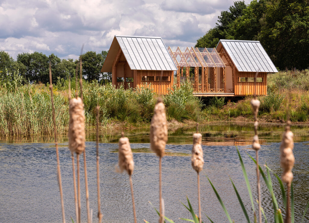
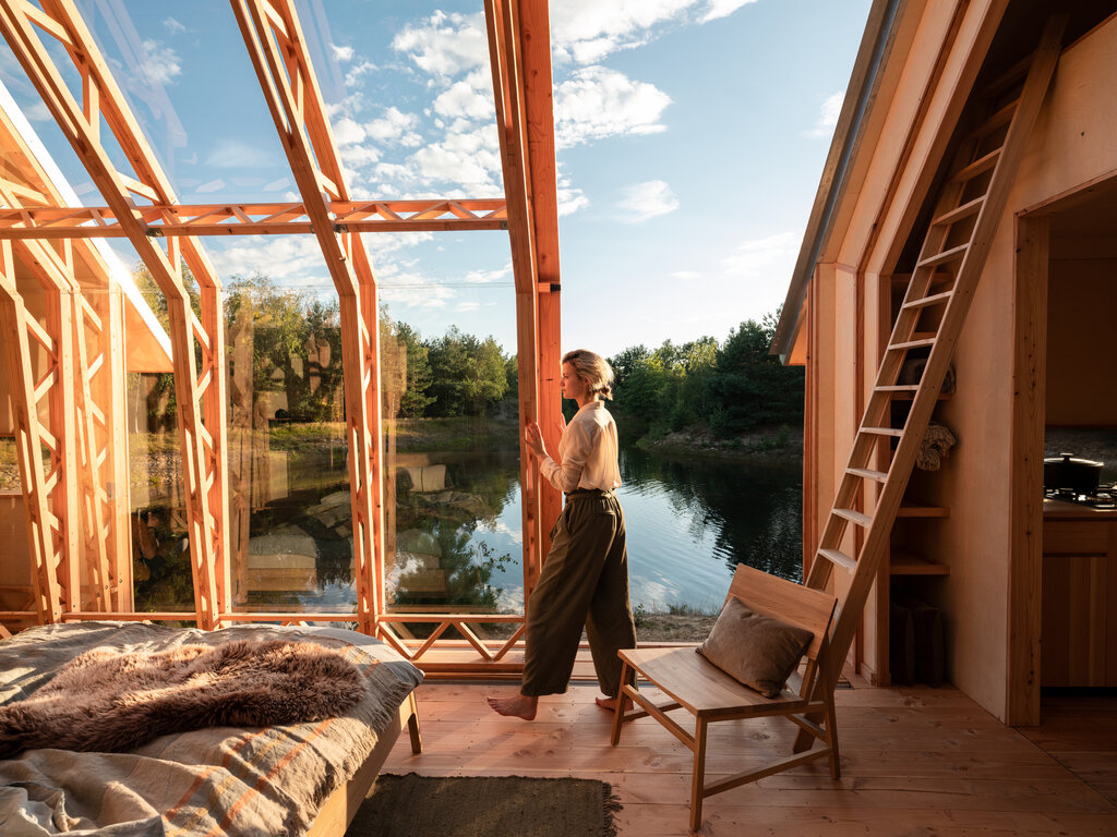
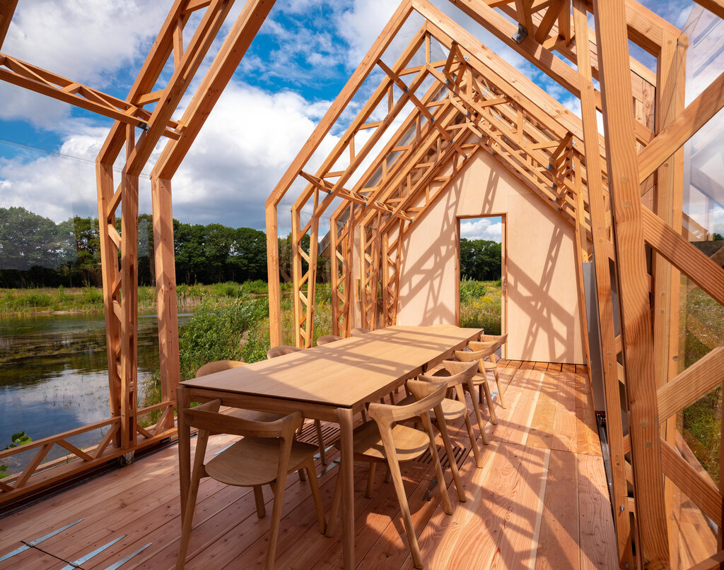
The ANNA Meet is a slightly different idea then the one from above, the ANNA Stay. This second model, the Meet, has 4 flexible shells allowing you to move 4 external walls as per your needs. This cabin is for family gatherings, small weddings, business meet-ups (if your company is aiming for a natural environment) or even office space. I would say it’s a perfect solution for all kind of group activities, being so close to nature it’s only a booster for your productivity and creativity.
If you are in The Netherlands and would like to try one of their cabins, you can book a stay on Holenberg.com by choosing one of the ANNA experiences. In case you would need more information on pricing, models, materials or transport, do not hesitate to contact the Cabin ANNA team here. For further pictures feel free to check their IG feed, I can assure you that it’s full of magical moments.


Photo credits: TĂ”nu Tunnel and Jorrit ‘t Hoen – shared with the cordial permission of Cabin Anna

Continue Reading

A one-room interior in neutral tones

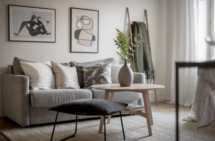
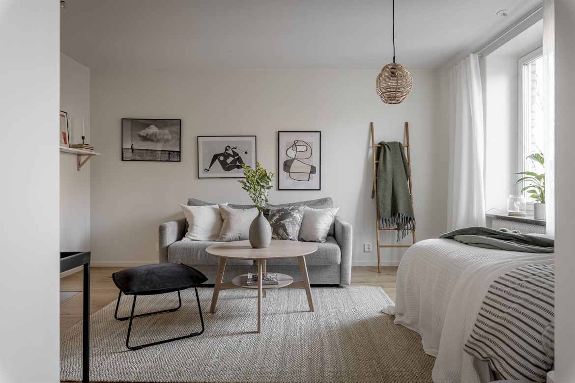
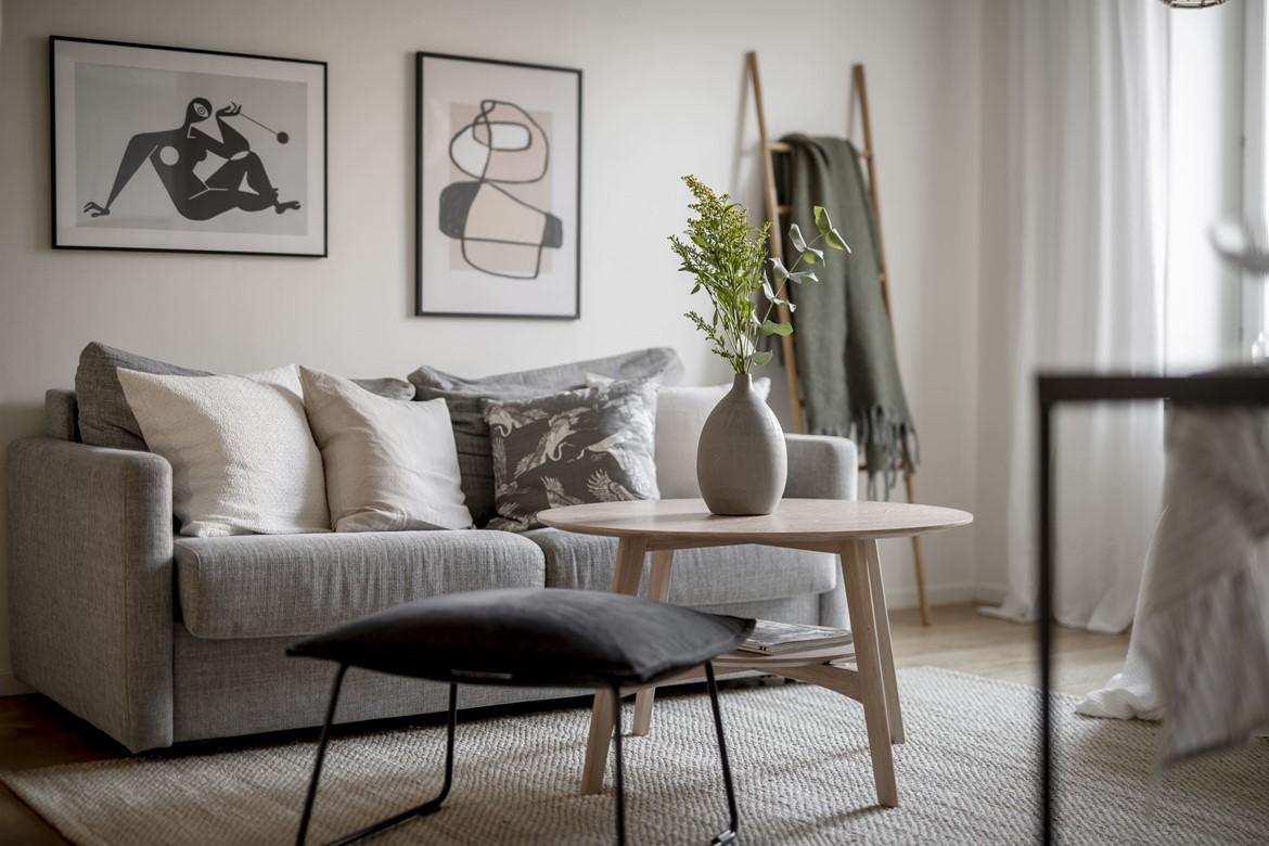
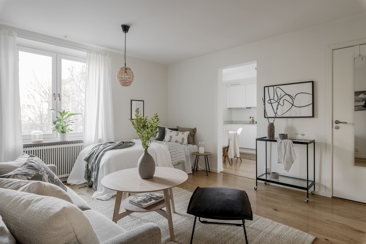
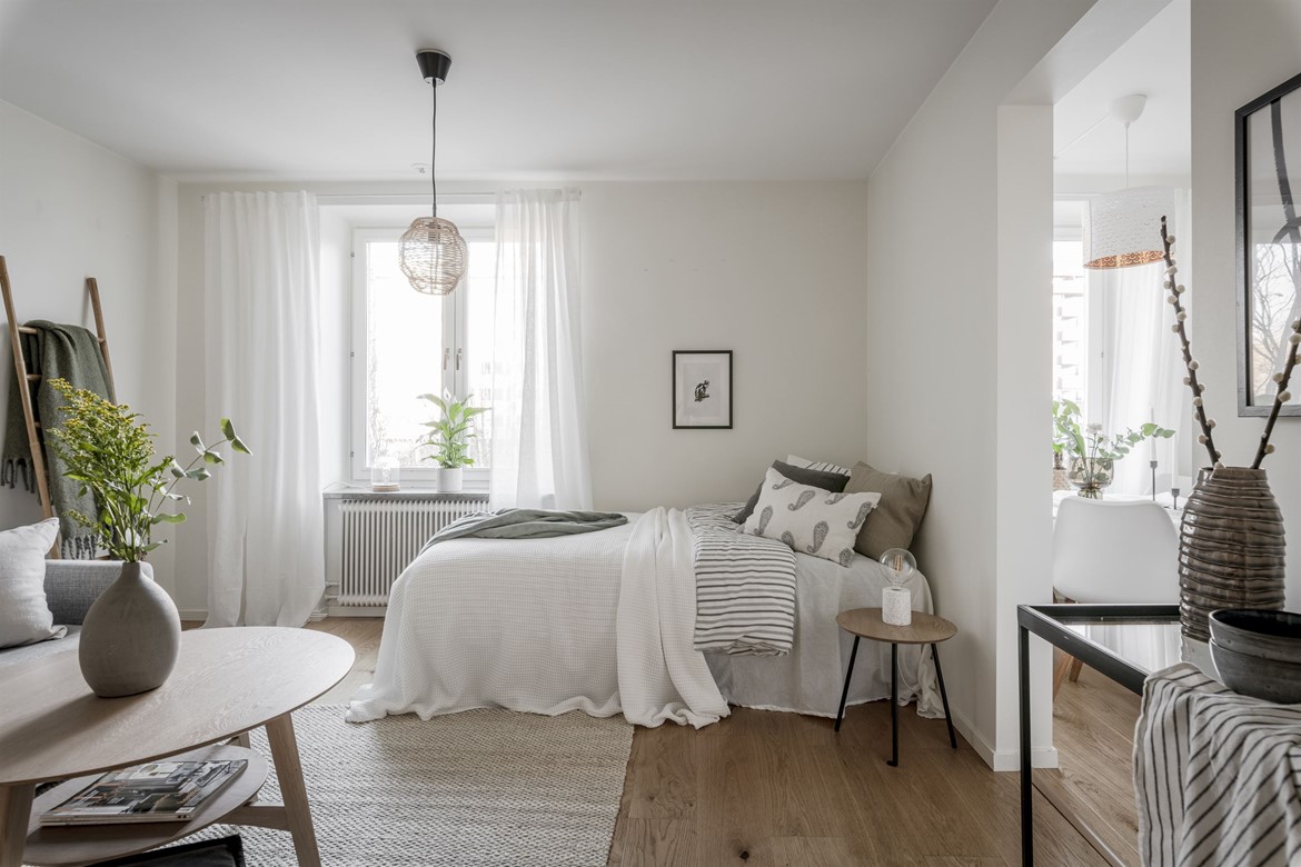
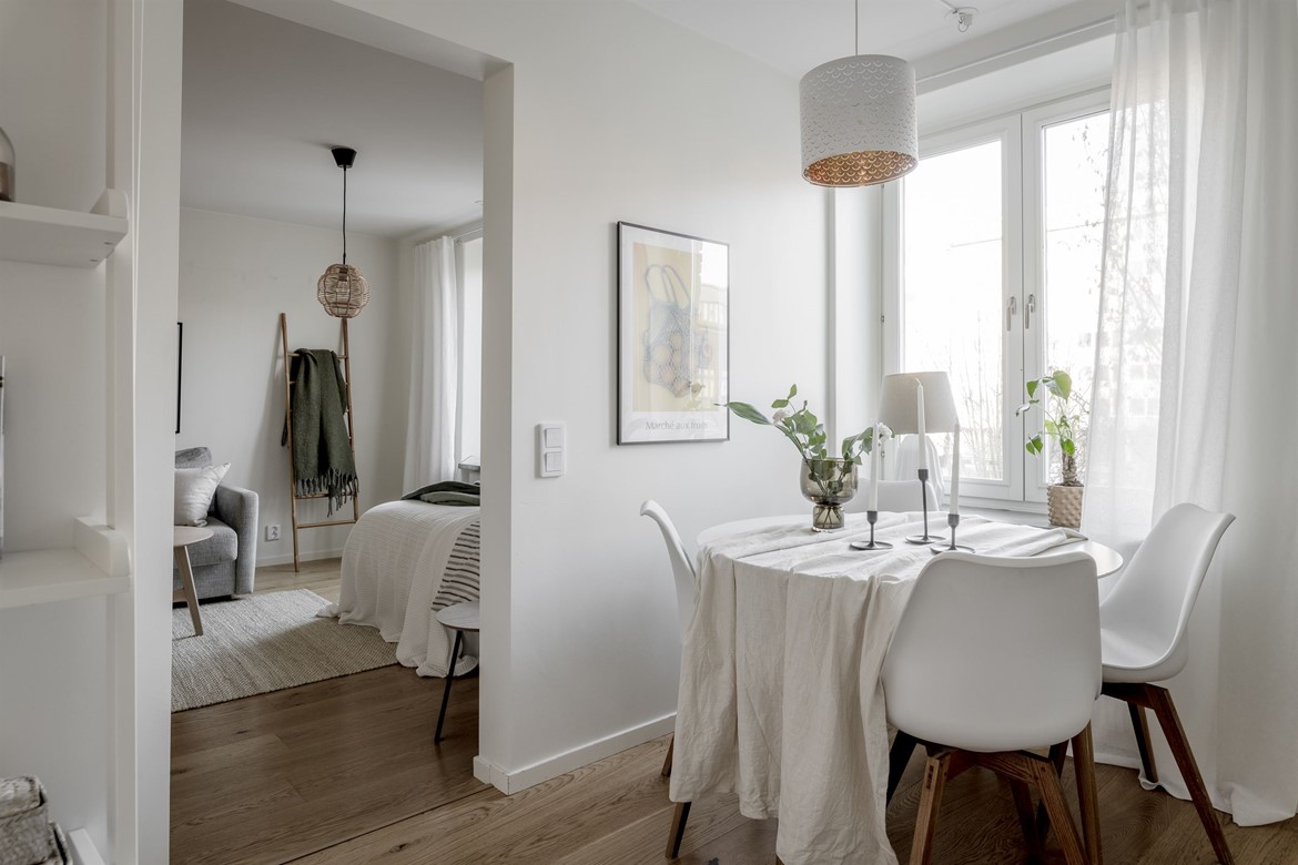
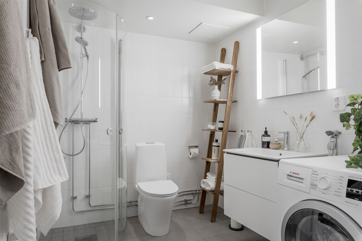
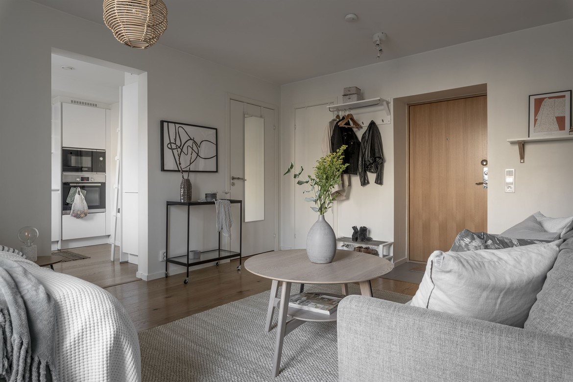
I love simplicity, in every possible way, in fashion, in interior design, in people’s personality, basically everywhere where I can sense clear logic, basic values, and no sign of kitsch. When I was looking for inspiration for this blog post, it was my first instinct to choose this super simple, one-room Swedish apartment. It has everything that a person can need, it’s subtle, with neutral tones, and these all together give a calm vibe to the interior.
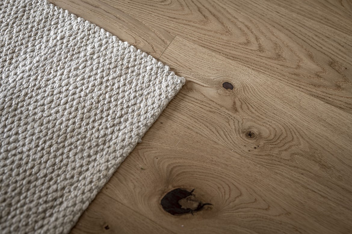
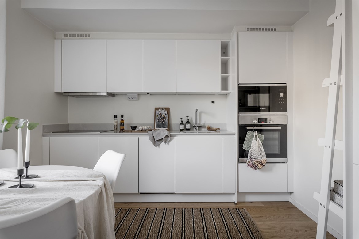
What particularly caught my attention is the coffee table, the floor (wow!), the abundant natural light, the minimalistic white kitchen cabinets from Nobilia, and the white tiles in the bathroom. I already mentioned a few times that I like how Nordic people design their bathrooms. They keep it as simple as possible but still super stylish and fresh. The color combination in this interior is the ultimate winner, the grey, the beige, the white, and the black go hand in hand together.

This apartment is 33.2 sqm, and it’s in the famous city of Gothenburg. It will be soon for sale, so if you are interested in getting an apartment in the birthplace of the Volvo cars, this is the city you need to be 😉


Photo credits: Lundin.se – shared with kind permission

Continue Reading

When a home is full of vintage finds

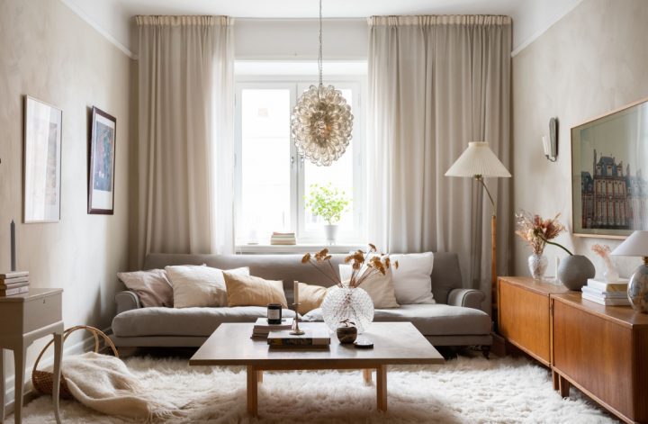
When a home is full of vintage finds, the whole vibe of the interior gets a magical vibe of ages. I admire those people who have the talent to harmonize an interior’s design with vintage pieces. I think it’s pretty challenging to find the right furniture on flea markets and still keep the red line in the apartment.

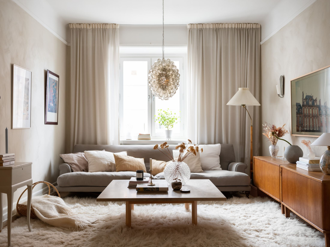
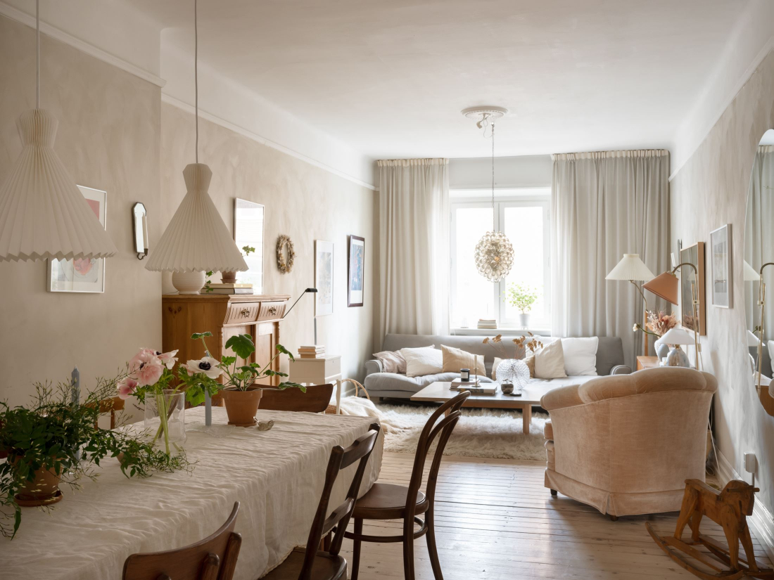
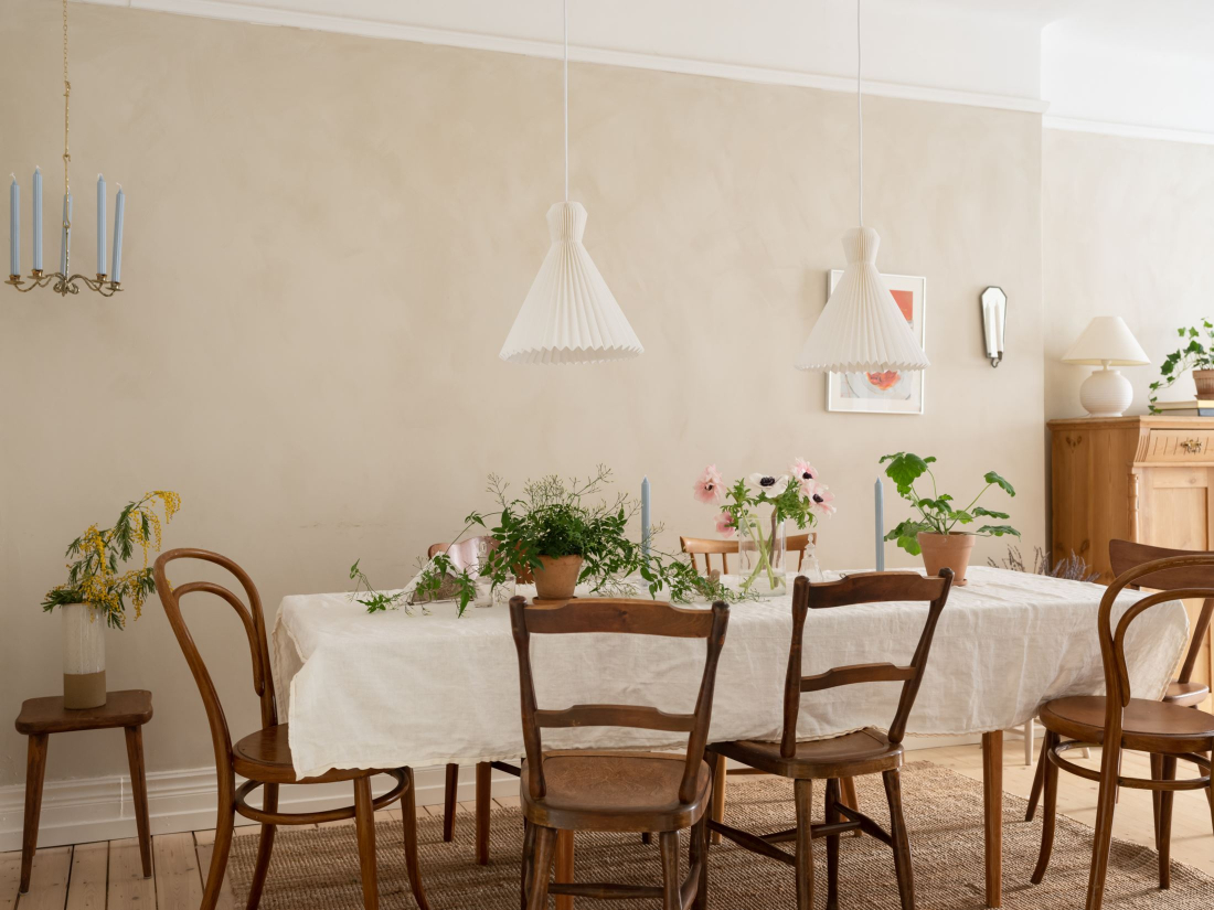
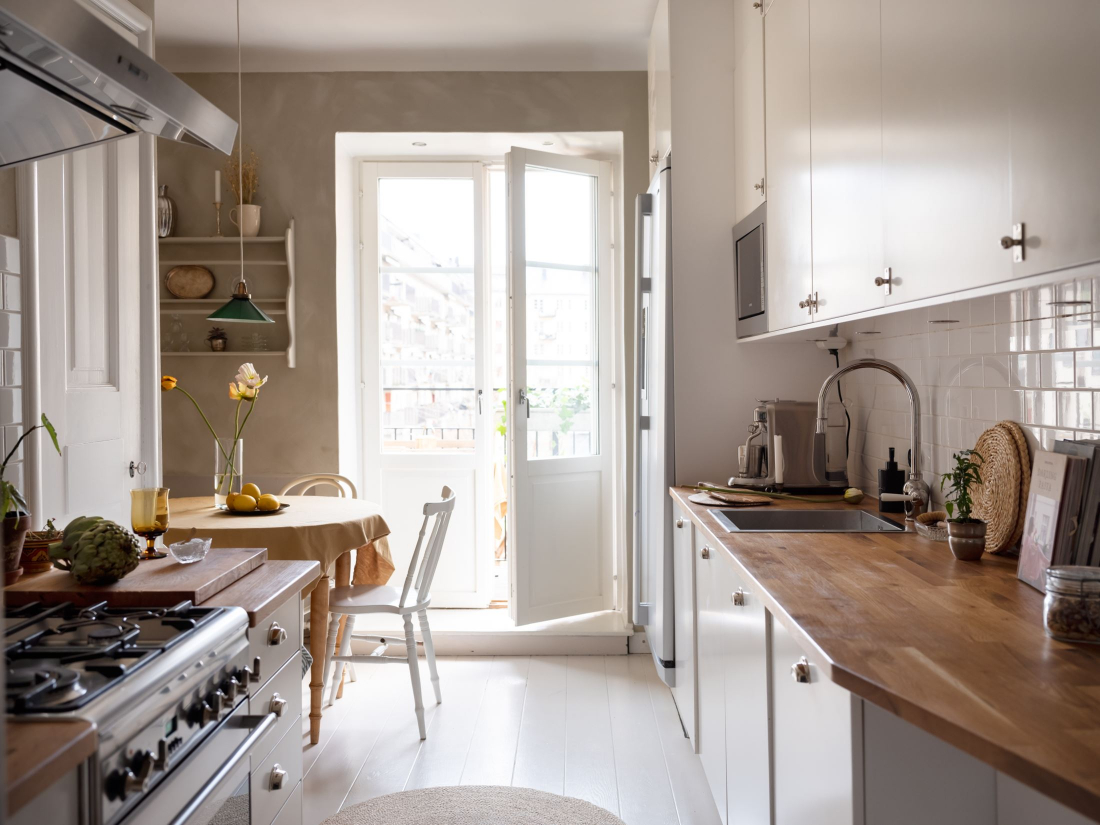
This 64 sqm apartment in Stockholm has this special vibe, with the earthy brownish tones, with the fluffy carpet in the living room, with the glass elements, like the chandelier and flower vase on the coffee table, and of course the vintage furniture, everything seems so appropriate together. The owners put every piece so well together. I love the dining area with all the second-hand Thonet chairs and greenery. The kitchen’s focal point is the small balcony with a view of the main street. What a lovely way to have breakfast in the fresh air!

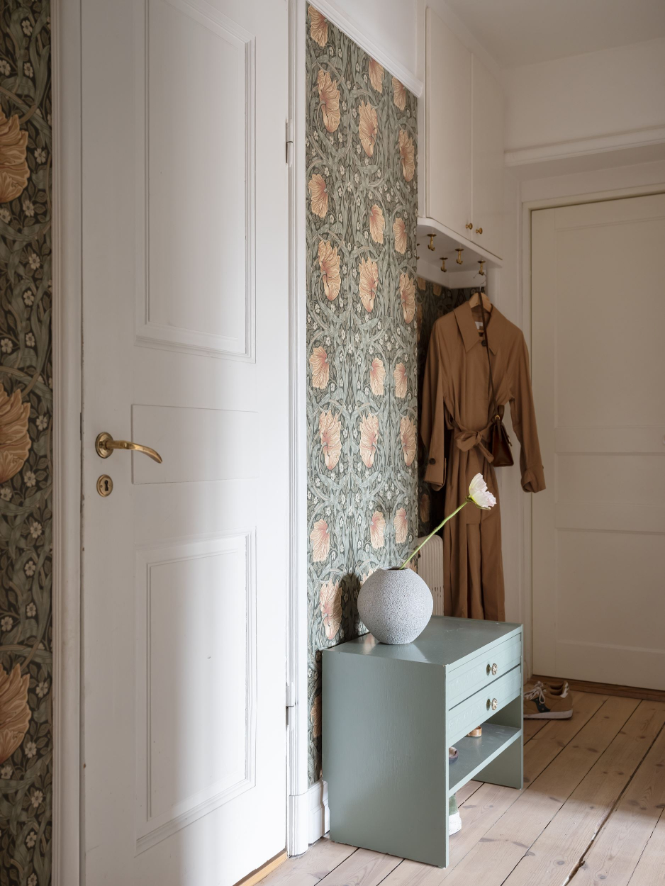
The bathroom totally amazed me with its French vintage design, I particularly like the red and white floor tiles combined with the chic bathtub. The hallway’s design is boosted with the famous William Morris wallpaper which gives a super stylish feeling to the space. Got inspired already? See you next week with another inspirational article.


Photo credits: shared with the cordial permission of Historiska Hem
Found via My Scandinavian Home with thanks 🙂

Continue Reading

A light apartment with eclectic chandeliers

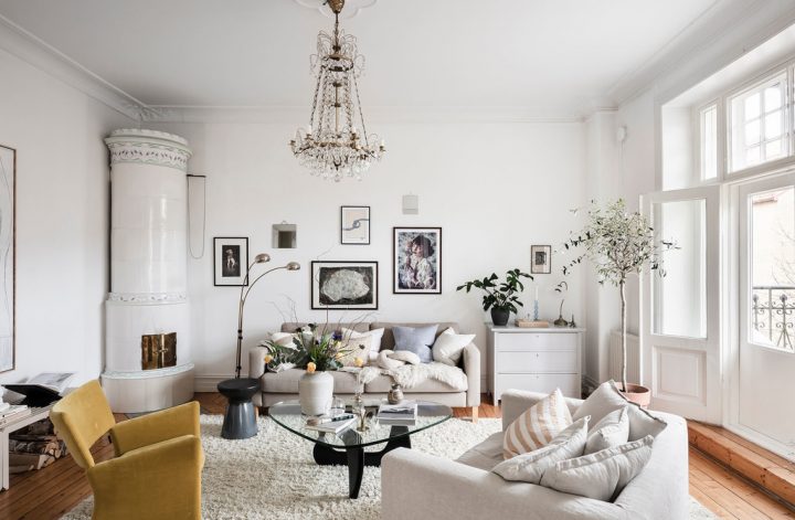
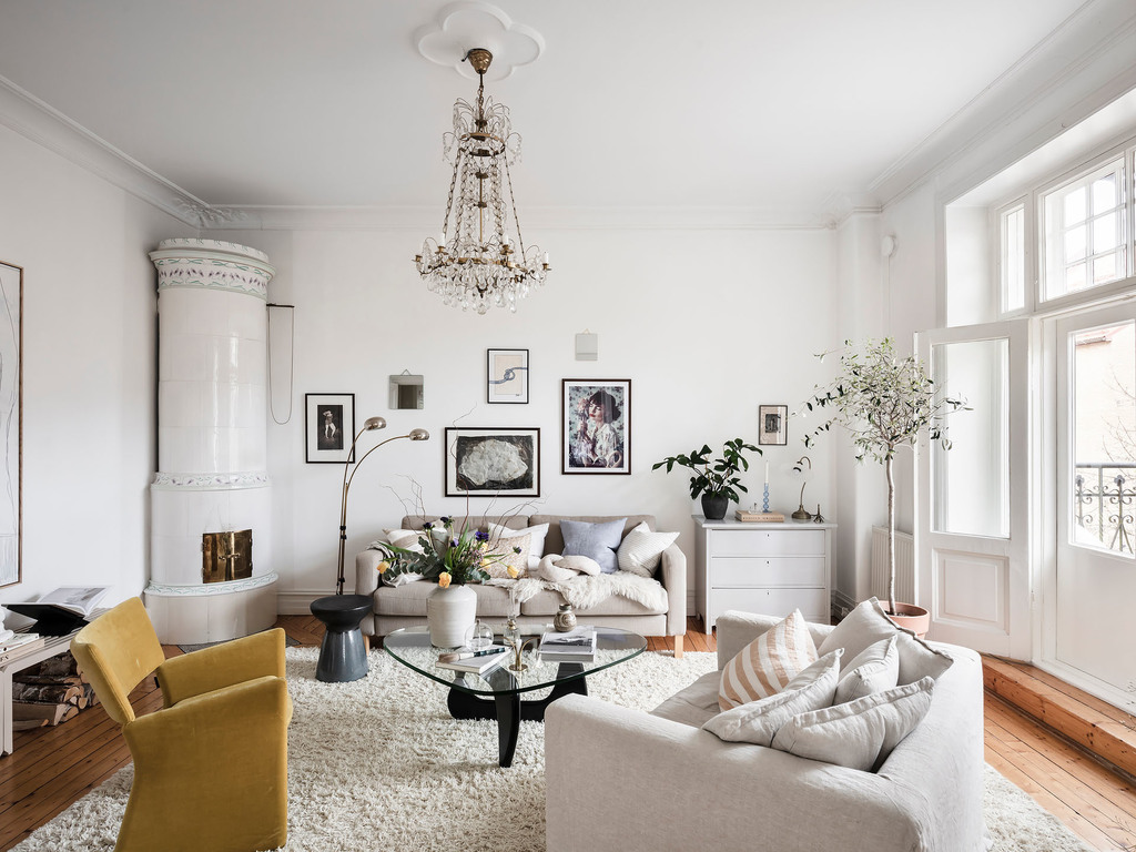
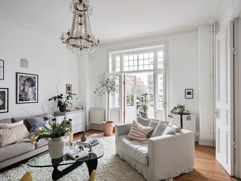
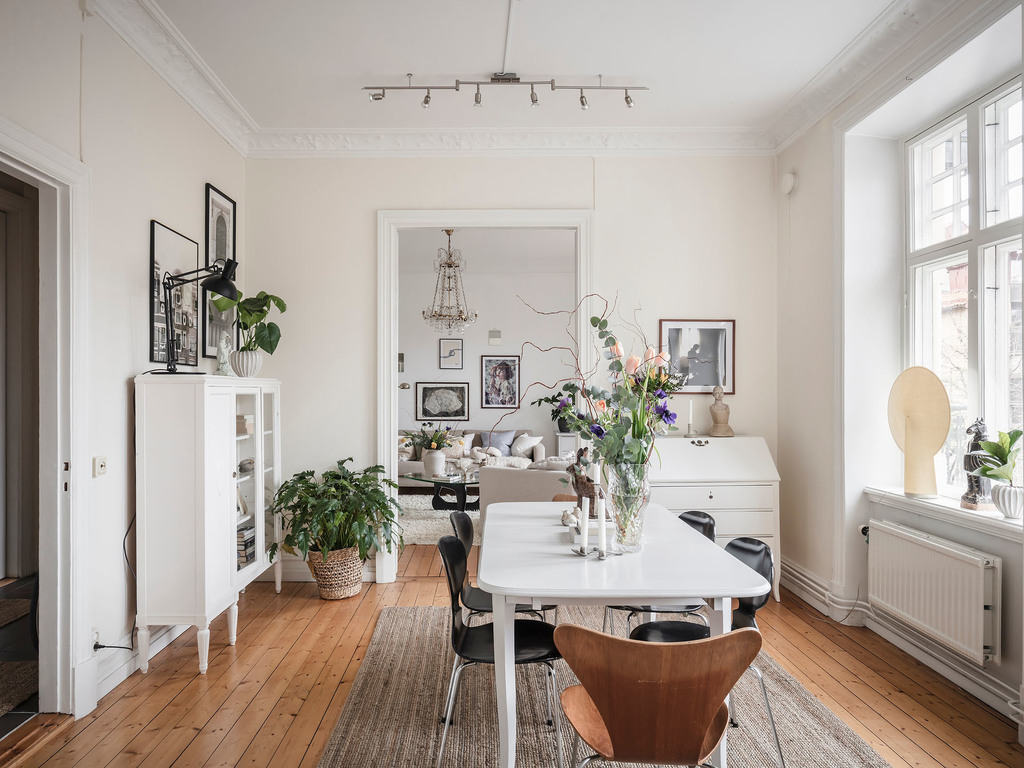
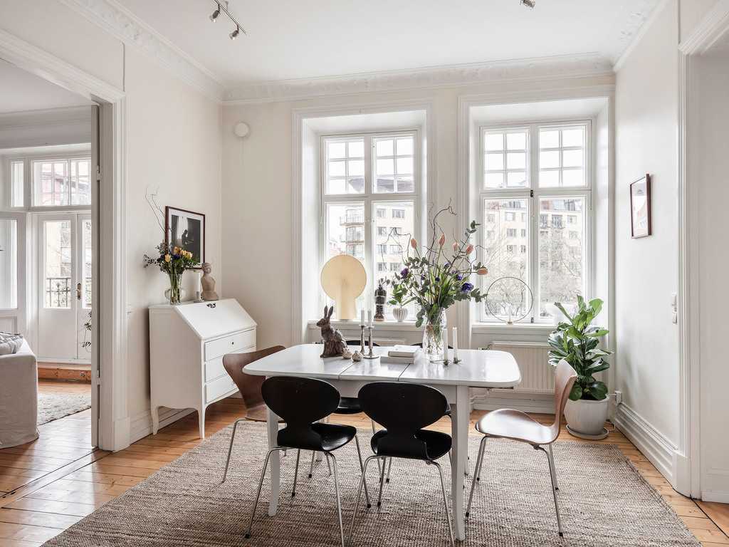
I will always envy those interiors that have wall-to-wall, floor-to-top windows letting the abundance of daylight in. Nothing can compete with natural light, and this apartment’s owners paid great attention to restoring and repainting all the windows during renovation. The 3 room home became a light interior with air design, combining simple lines with eclectic elements. The stove from the living room is the ultimate winner next to the chandelier that is the bulletproof focal point of the place. I particularly love the fluffy carpet and the simple ceiling ring, what an elegant element to be added to the place. The Coffee Table by Vitra. is a classic piece designed by Isamu Naguchi in 1944 and now

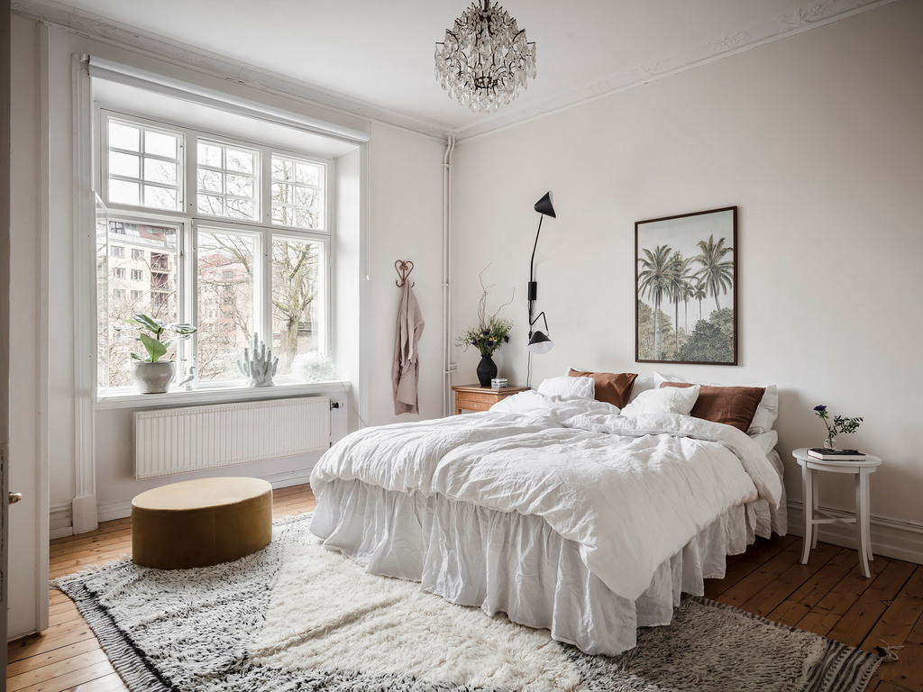
From the living room, you can go to the dining room, a pretty specious one I must say, boosted up with a great glass cabinet for books (a great idea to keep your books away from dust) and a gorgeous ficus lyrata. The bedroom is accessible from this dining room and it harmonizes with the living room having another eclectic chandelier and the same amount of natural light.

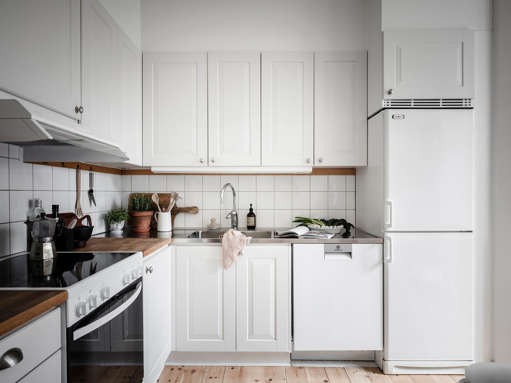
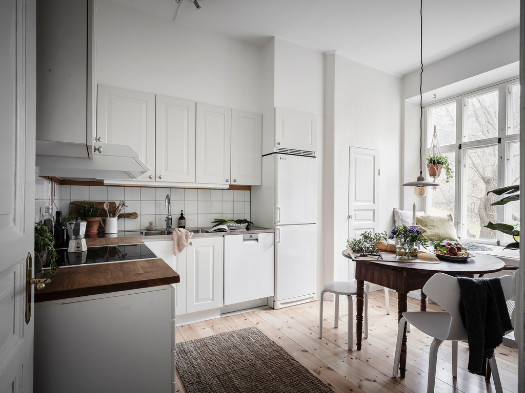
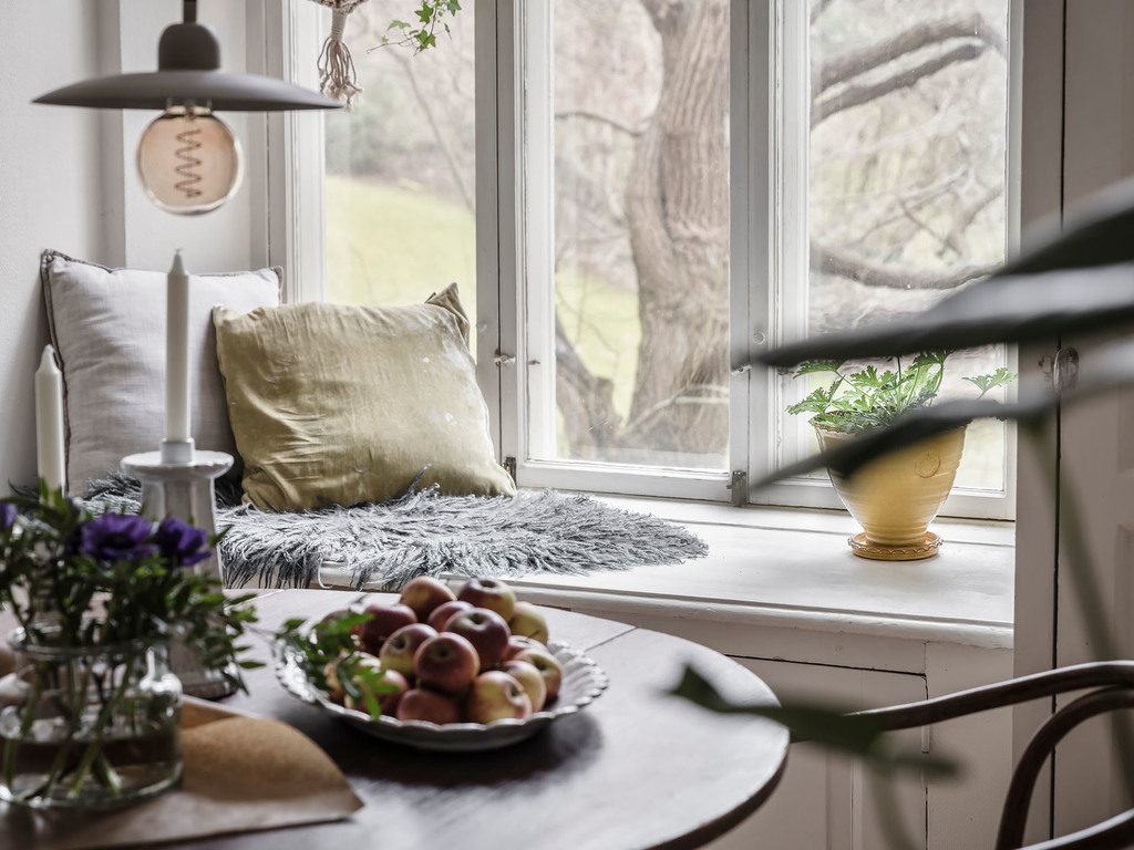
The kitchen follows the “less is more” principle by having simple, white cabinetry with minimalistic silver handlers. I love the reading nook next to the window, it’s the perfect spot where to hop in with a coffee and a good book. If you’ve read The Little Book of Hygge, you know why Nordic people are paying such great attention to building up a nook on the window sill.

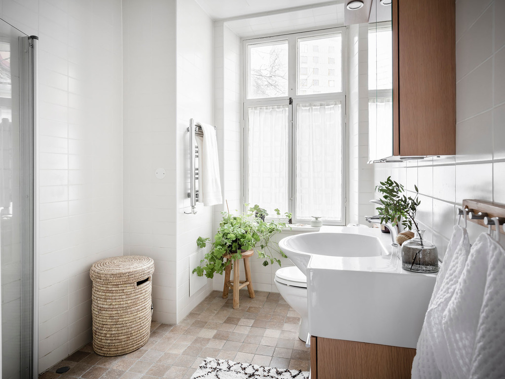
As usual, in Swedish apartments, the bathrooms are always simply designed. This turned out to be a nice combination of natural stone floor tiles and simple white wall tiles.

The apartment is for sale, it has 3 rooms plus the kitchen, having 86 mÂČ in total. From the living room, there is a small terrace to get some fresh air and to stay close to nature. I hope you got inspired by this tour, and in case you live in Gothenburg, do not hesitate to check it out by booking a real tour here.


Photo credits: @Entrance – shared with kind permission

Continue Reading

The Point, a heavenly spot in Tasmania

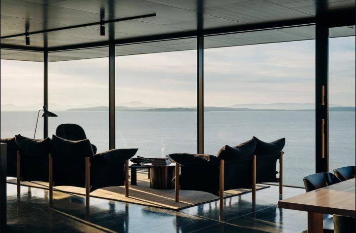
After seeing this video tour, I’ve decided that there is heaven on Earth, a bit far away from me, but it does exist. It is the first time I’m sharing an interior from Tasmania. The Local Project recently shared a video tour about The Point Tasmania, a rentable property on the shores of Frederick Henry Bay. The landscape is absolutely astonishing, and the architects tried to incorporate this building in the wild, untamed natural scenery.

I love the minimalistic lines and that they used 5 basic materials: concrete, glass, timber, steel, and stone. This gives such a warm look&feel to the whole house. The glass walls serve as windows assuring the incredible view over the Bay and always letting enough natural light into the interior. Every corner of this house is designed in a way to have a view over the water and to let abundant natural light flow in. Bedrooms, bathrooms, sitting areas, kitchen, literally every room focuses on the external natural beauty. If you come here, it’s time to put aside all your problems, and start contemplating.

This is not built based on a budget that we are used to in my region, I know that, but I guess it’s a perfect inspiration for getting in full sync with the natural landscape and stopping building all the ugly crap that we do in Romania.

Enjoy the tour and, by the way, you’re welcome 😉

 
Credits go to:
Architecture by Tanner Architects.
Interior Styling by Indi Beard.
Build by Cordwell Built.
Filmed and Edited by Cheer Squad Film Co.
Production by The Local Project.

Cover photo credits: @Stu Gibson/@Adam Gibson

Continue Reading

A charming attic apartment with tower room

Creativity on how to utilize spaces and the styling of interiors in Sweden is limitless and priceless. Alvhem is one of my favorite real estate agencies whose work I admire a lot. They usually style their interiors with Grey Deco Interiors, and I would move in into any of the houses styled by them, regardless if it’s a one-room apartment, a 3 bedroom interior, a house, or a villa. I love every single piece of their work, impeccable style, color palettes, furniture, originality, etc. you name it, they have it all.

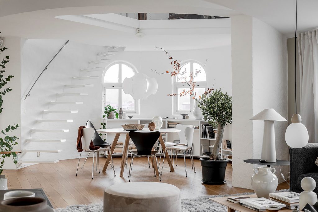
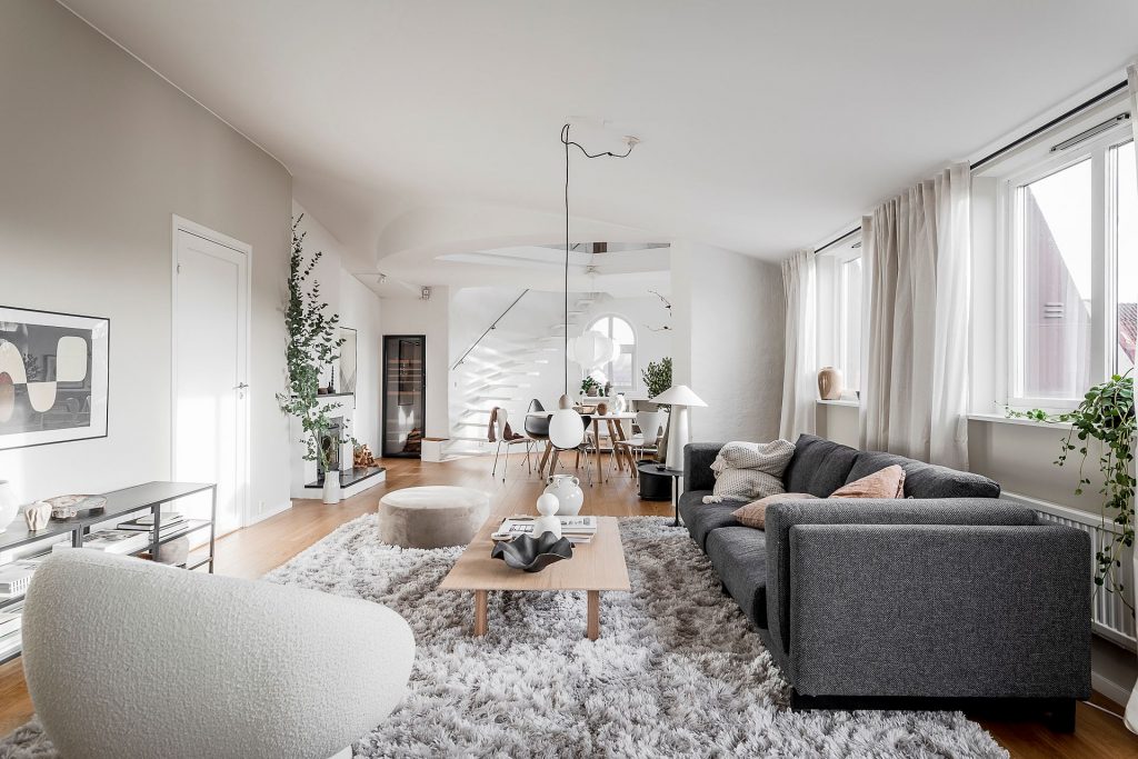
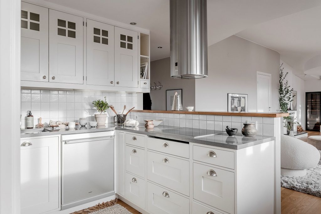
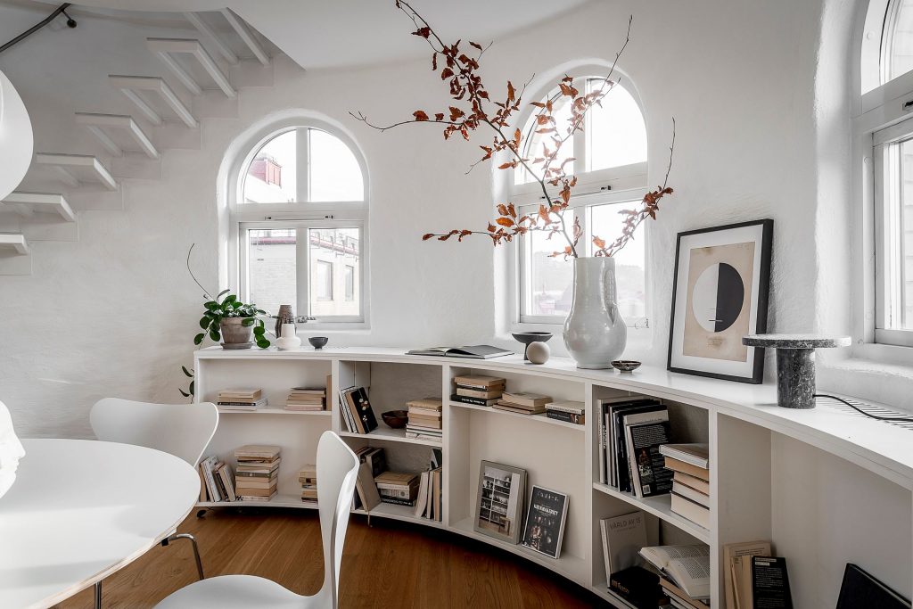
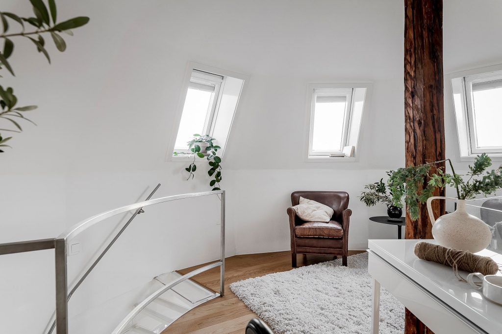
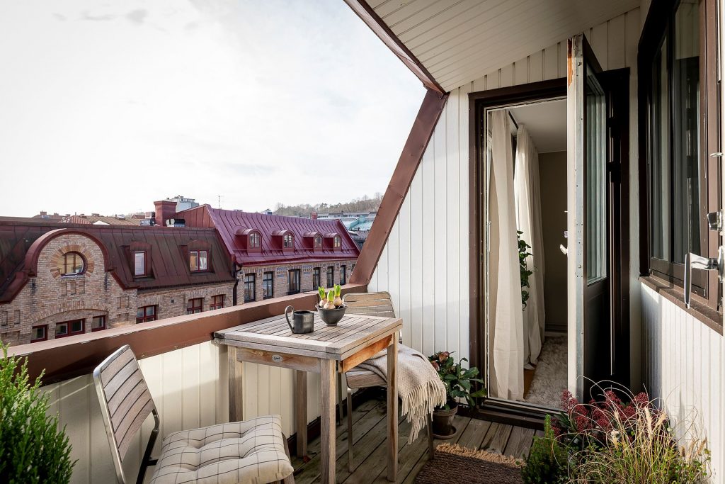
This attic apartment is a 3.5 rooms interior with an open kitchen to the living room, having a tower room, and an all-day sunny rooftop terrace. The view from this apartment is incredible thanks to the next-door neighbor of the Slottsskogen central park of Göthenburg, Sweden. The building dates back to 1902 which gives a charming feeling for the whole interior. It’s on the 6th floor of the building, but an elevator is available, so no issues in this department 😉 

The dining room is surrounded by a curvy bookshelf and a lot of daylight thanks to the turn-of-the-century windows. The dining chairs are the Series 7 by Arne Jacobsen, and the pendant light above the table is a Viscontea by Achille and Pier Giacomo Castiglioni. What a luxury having a working fireplace and a walk-in wine fridge next to the floating stairs.

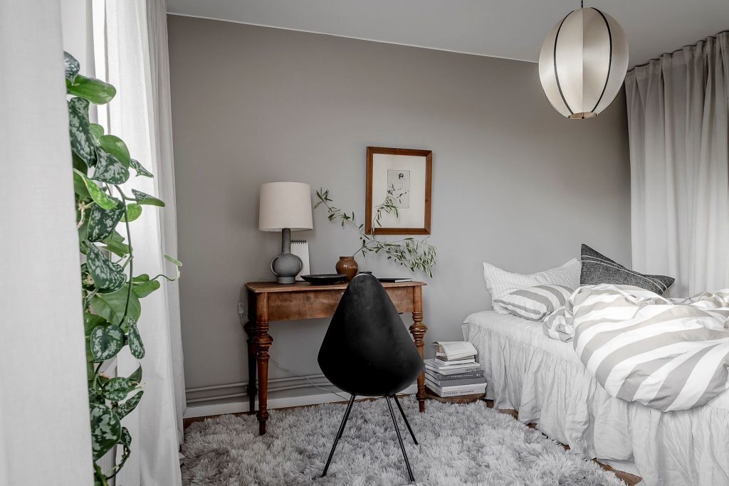
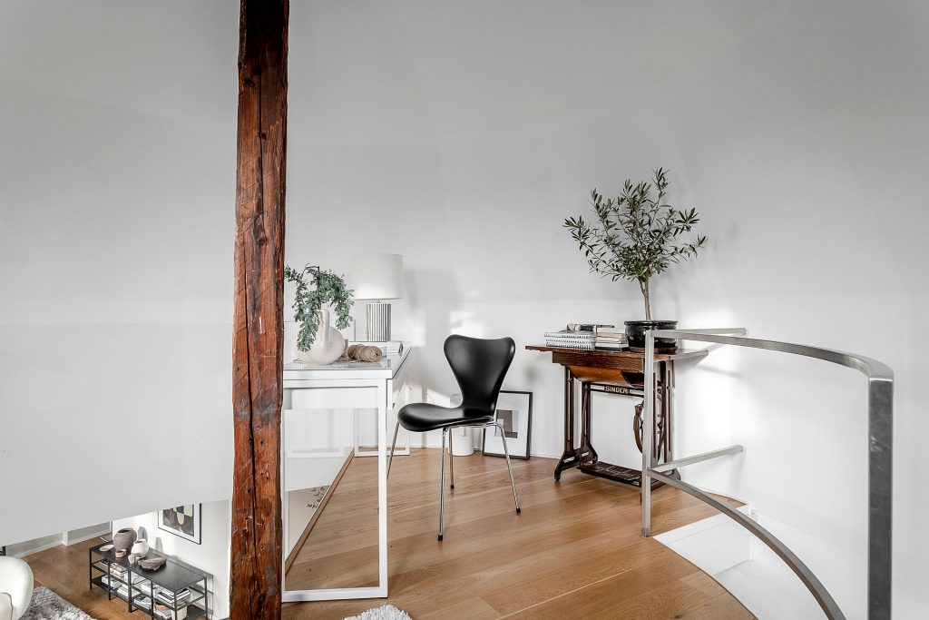
From the open kitchen, you can walk into the bedroom. I love the vintage desk combined with the Drop Chair designed by Arne Jacobsen for Fritz Hansen. From this small bedroom, you can go out to the rooftop terrace, a small one but a cozy one for real. What can you want more? Fresh air, sitting area, and a great view. Bring out your cappuccino and enjoy life.

The tower room is a real focal point in this apartment. It’s a combination of working space and leisure. The home office corner has some great vibes due to the vintage decoration. The beam pillars take you back to the beginning of the 20th century giving a historical feeling of this place.

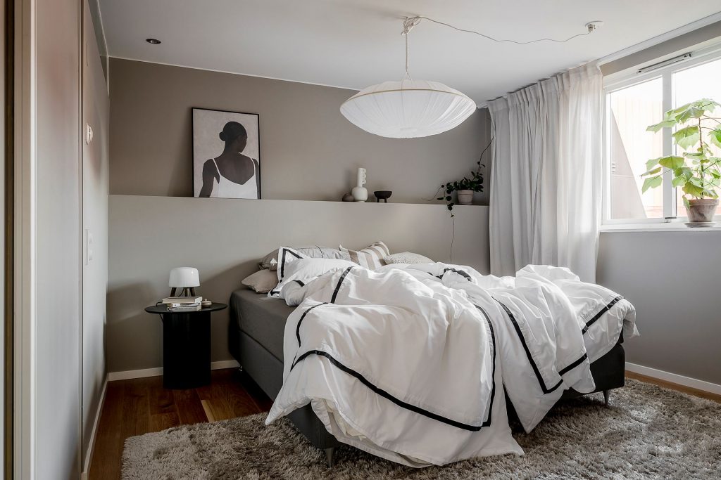
The top floor’s bedroom is a nude, earthy tones room (I love the wall’s color) having its focal point at the Gong Arche Silk ceiling light above the bed.

This apartment was for sale last year, and of course, it’s sold. No wonder why…most certainly the new owner is one hell of a lucky person purchasing this wonderful place. I hope, I inspired you by this beautiful apartment, see you next week with a new charming home tour.


Photo source & credits: @Alvhem

Continue Reading