The Charming cottage in the Carpathian Mountains

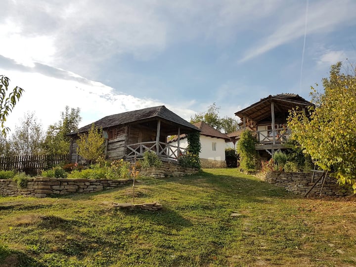
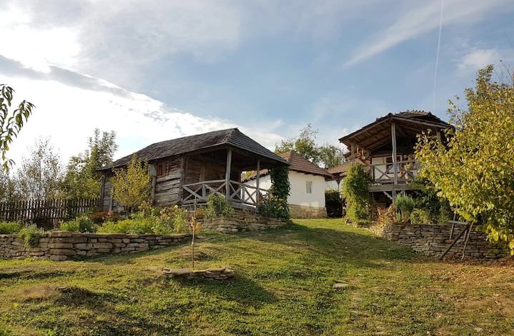
It’s been a while since my last blog post about a Local Treasure from Romania. When I’m looking for inspiration, I pay great attention to avoid kitsch, I rather go back to basics instead of presenting something that hardly fits into my “interior principles”. When I found this “Charming cottage in the Carpathian Mountains” (literally this is its name, how lovely, isn’t it?), I knew that this should be my next local treasure, especially that it’s located in a region from where I’ve never posted any interior, more precisely in Dâmbovița county, in Râu Alb de Sus, a small border village between Transylvania and Muntenia.

The owners, Cristina, and his French husband are living in Bucharest with their children keeping this as their own vacation retreat place. The country cottage consists of 3 small houses on a 15,000 sqm land, all 3 being separated with individual bathrooms, having a common, fully equipped kitchen and a hygge living room. In total there are 4 bedrooms, and the cottage can be rented on Airbnb.
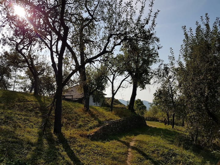
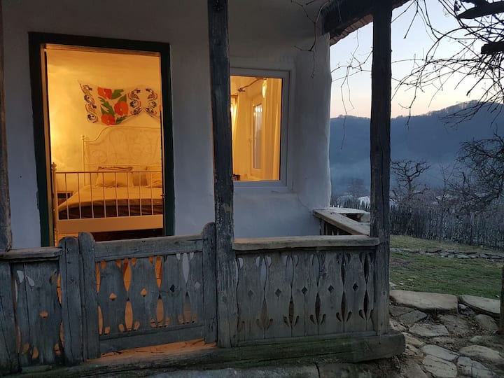
The most beautiful part of this place is that once purchased, the owners made a huge effort to recondition the old wooden elements, windows, doors, beams, and porch. They bought pieces from demolished houses and recycled old doors here and there, some of these doors are used as wall decorations instead of paintings.
Originally the living room was the barn where grain was stored in old times. The couches in the living room are from Ikea, the rugs and textiles are all specific to this region. Wooden decorations on the wall are objects from the original house kept by the owners.
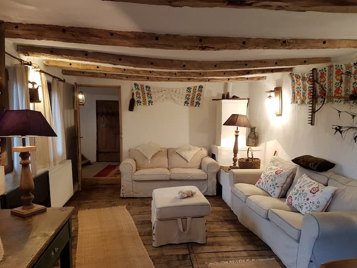
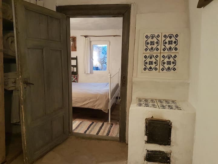
The tiles from the stove are hand-painted by a craftsman from Sibiu, who seems to be the last Mohican in creating these types of handcrafted tiles. I also know Teracota Mediaș, a company specialized in handmade terracotta tiles that are beyond being beautiful.
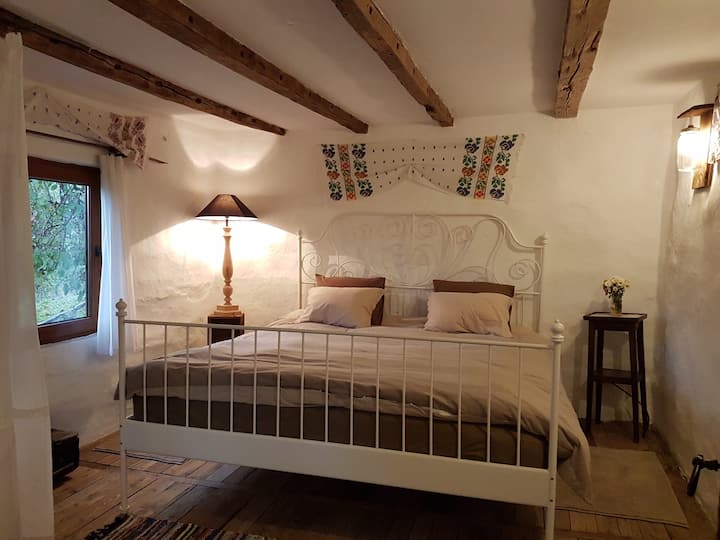
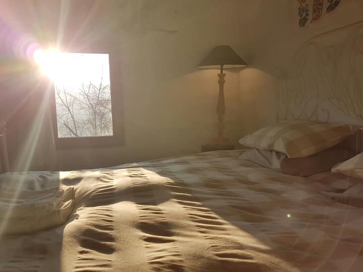
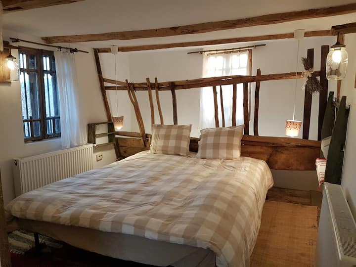
The beds from the bedrooms are the Leirvik models from Ikea available also in Romania. The walls are whitewashed and painted with ecological paints, keeping the authenticity of their surface.
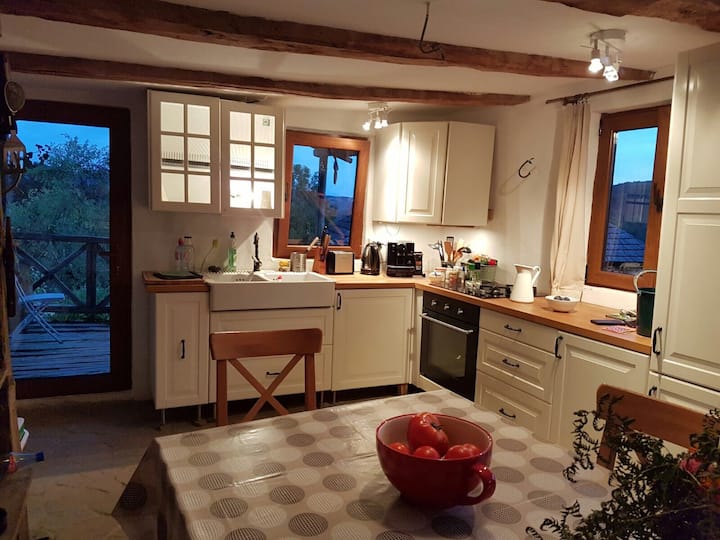
The kitchen is furnished from Ikea, having a very original dining area, you know, those types that our grandparents had back then. So, if you are looking for some nostalgia, this is the place you need to be.
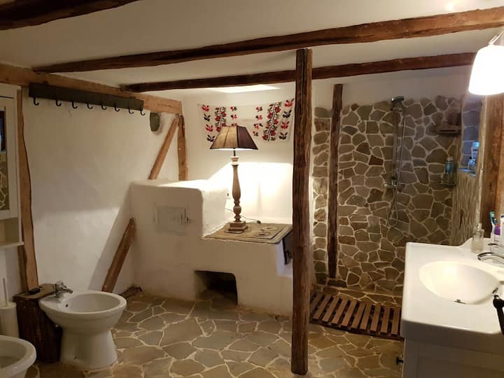
The main bathroom is fully functional, turned into a bathroom from the original kitchen, that is why the stove is there. By the way, this can be very handy during cold winters, listening to the fire cracking while you take a shower might be priceless.
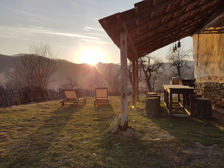
The guests have a free pass to the garden full of seasonable vegetables and fruits, the breakfast is included in the price, and it consists of local goodies like cheese, bacon, bread, fresh milk, etc. Isn’t this a lovely “back to basics” place? The owners have my deepest respect for their great effort in keeping the place’s authenticity. Thank you, Cristina for letting us into your lovely country cottage 🙂


Photo credits: @Charming cottage in the Carpathian Mountains – shared with kind permission

Continue Reading

10 beautiful bookshelves

This post is not a regular home tour, it is about beautiful bookshelves around the world. Since the last 4 days were about the 27th International Book Festival from Târgu Mureș, I thought it would be nice to share some inspiration for reading nooks and bookshelves. For those who don’t know, every year in November, we have this book festival in my city that turned out to be a wonderful cultural event for all of us. Book editors from this region and from abroad are invited to bring their latest publications, having the possibility of participating at book presentation events. Poets and writers are circling between the multiple cultural events, so everything has a real literary vibe.

My friends and I are copartners in this initiative, being responsible for the digital presence of this event, along with the cultural programs and activities for children. Since the pandemic, the last 2 years were pretty restrained due to the restrictions, but still we managed to organize the festival. I’m responsible for the website of the event, and I’m more than happy for being part of this great project. 

But let’s see those beautiful bookshelves I’ve piled up for you, dear reader, I hope you will find these as inspirational as I did.

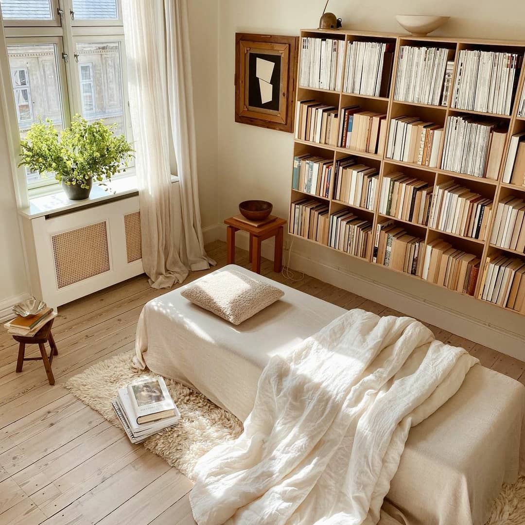
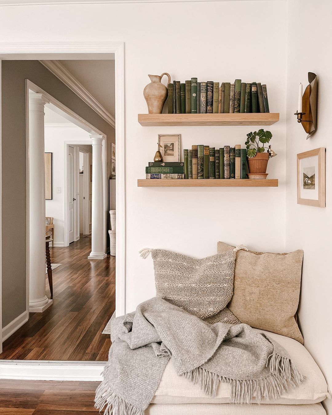
#1 A super comfortable daybed and a bookshelf hung on the wall (I love this idea) @simonepolk

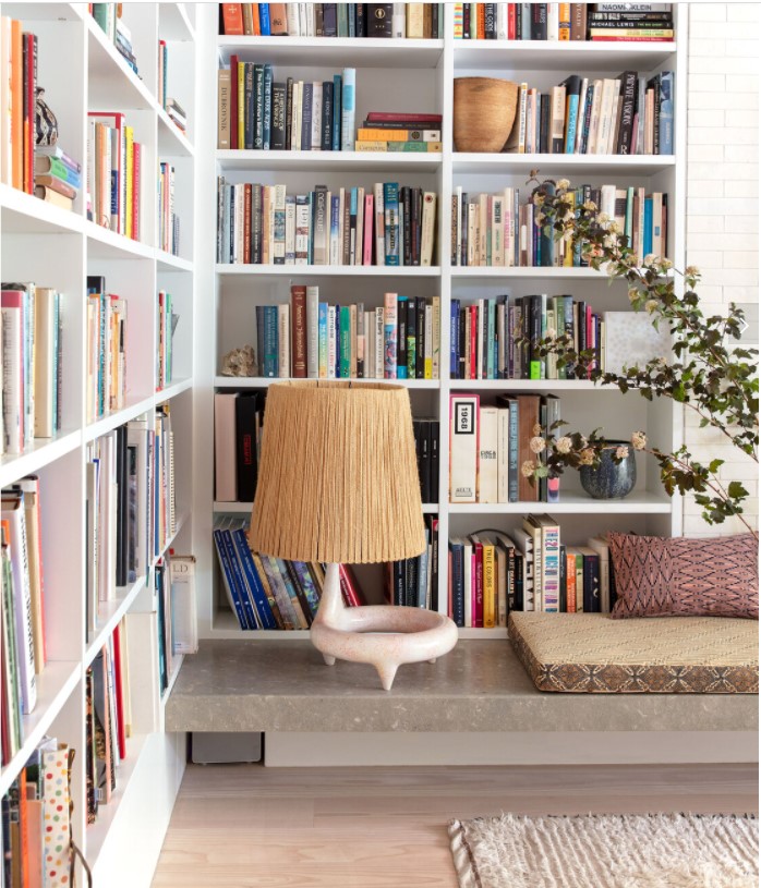
#2 A bookshelf in a home designed by Elizabeth Roberts, I love the ceramic lamp (unfortunately no clue about the brand), found via @archdigest

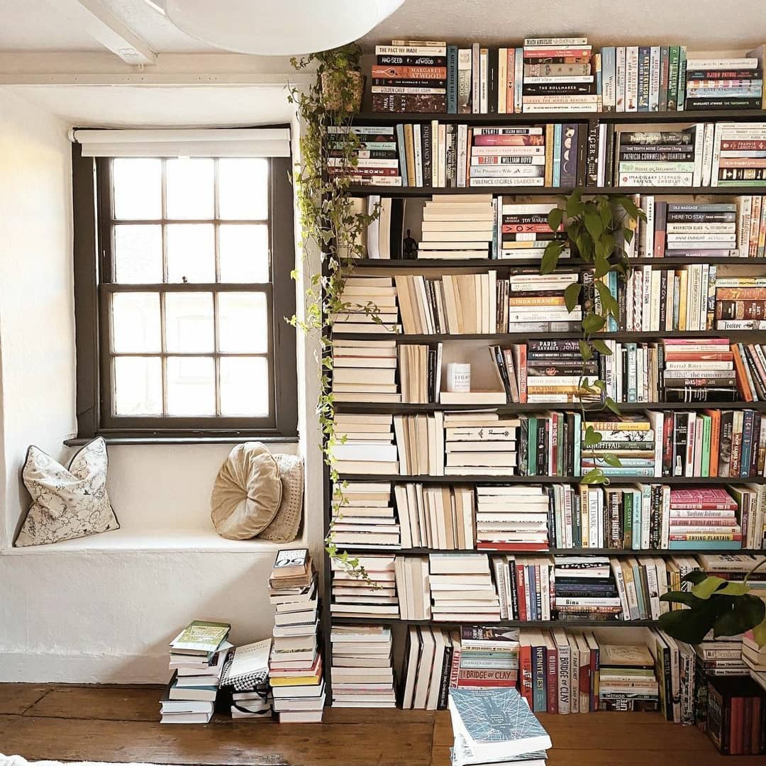
#3 Reading nook next to the window @thehalcyondaysofsummer

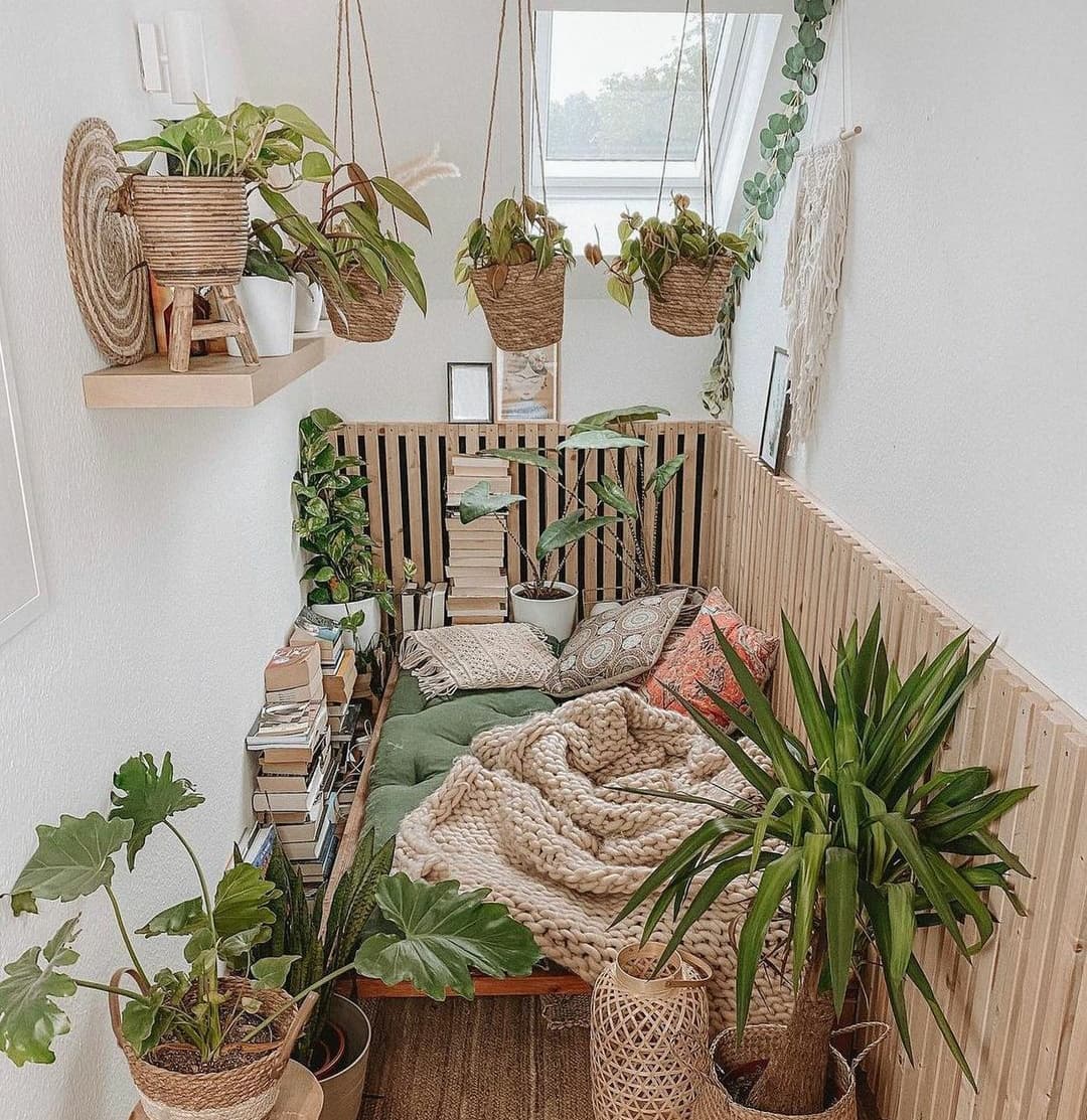
#4 A real urban jungle combined with books and a reading nook @wingardium.levanessa

#5 @i.tam.i.tu beautiful bookshelves whose home I featured last week on the blog

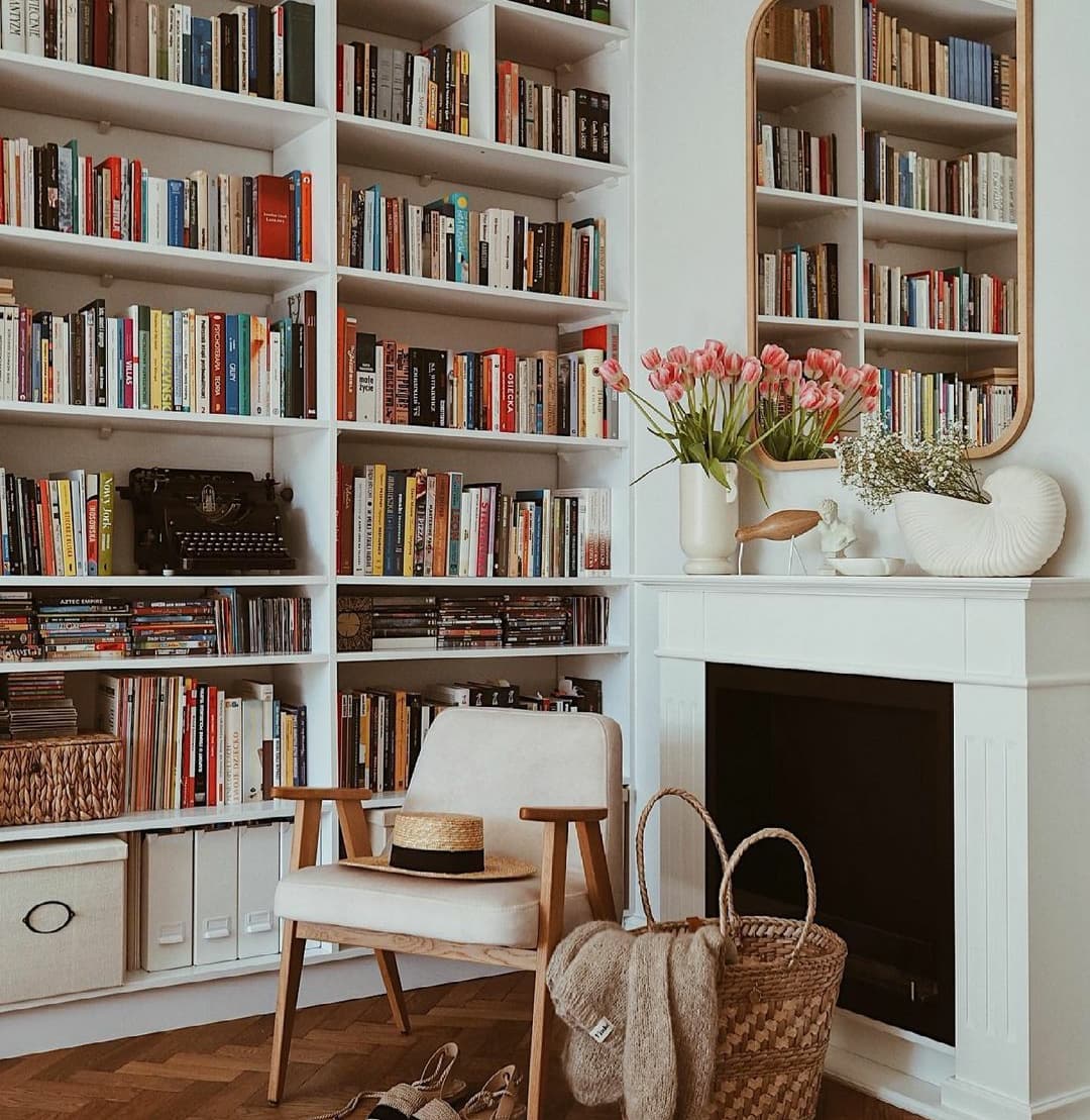
#6 A well designed bookshelf at @miascoziness, I love that big window 🙂

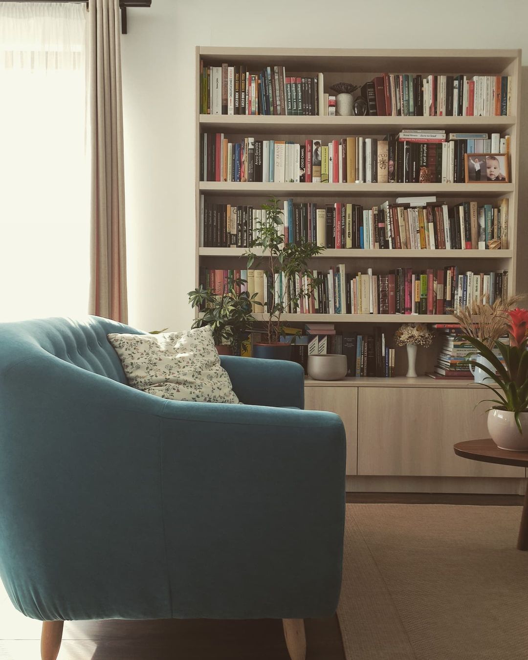
#7 @thistle.harvest small reading nook with vintage books, I featured this lovely home on the blog back in October, check it, they have a nice family story

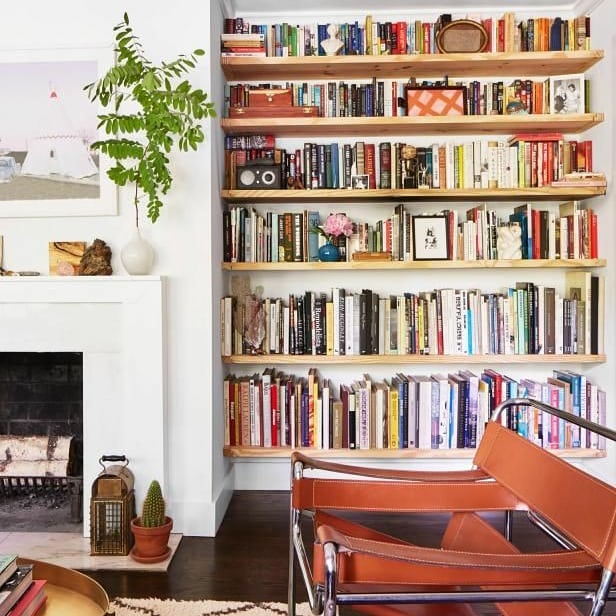
#8 Bookshelf with a Wassily Chair by Marcel Breuer, inspiration found @hgtvhome

#9 Bookshelf @hemmainteriors_com whose home I love a lot, especially that Matilda is a firm believer of sustainable interiors, having a lot of pre-owned items in her home too

#10 My bookshelf @focalpoint.ro


Photo source: all respected owners are linked in the references, the majority of photos (except #7, #9, #10) were found via @books.places.bookstores with thanks


Continue Reading

Five reasons why I’ve chosen this Polish interior

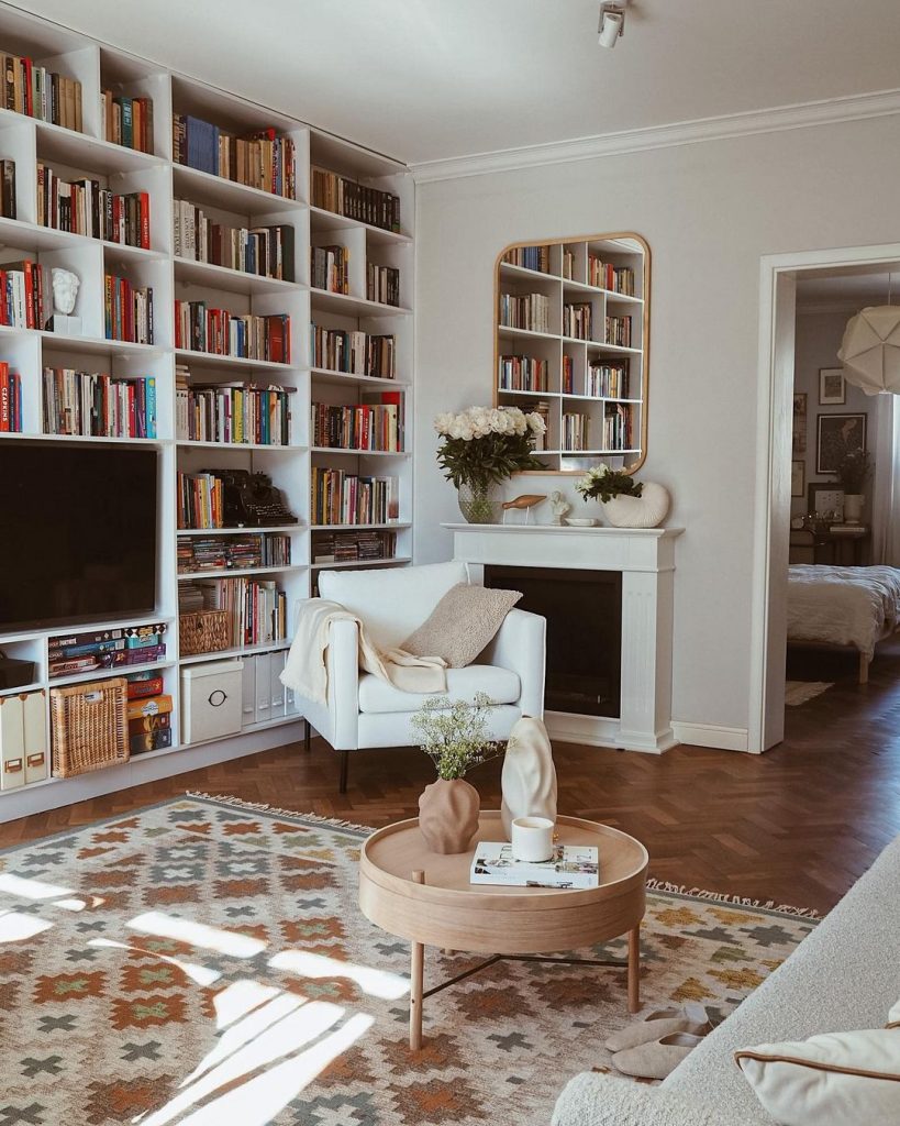
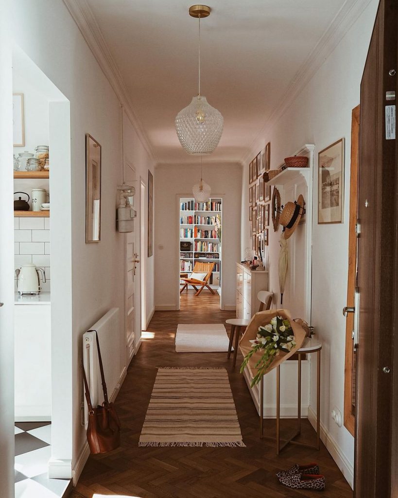
The weekend is almost ending now (writing this article on a Sunday evening), and it’s time to share another beautiful interior before it takes an end (damned Mondays). This week’s home is exceptional because it’s not in the Nordic countries, but still, it’s a total feast for the eyes. I’m happy that our trips on my blog take us now to Poland, as Justine’s home is in the Polish capital, Warsaw. I’ve been 2 times in this city, and I wouldn’t hesitate to go back there for the 3rd time.

I could enumerate many reasons why I’ve chosen her apartment for you, dear reader, but let’s see the most obvious ones.

#1 The Scandinavian style of the apartment

This interior has the Nordic hygge feeling and simplicity all over the place. This home has a gallery wall (that almost all Scandinavian homes do) mostly with pieces from Fine Little Day, it’s full of table-, floor-, and pendant lamps (this is a default in Nordic homes, lighting is vital for them), and the new meets the retro (pretty standard in Scandinavia). I always admire homes where the owners manage to combine old with new.
The white floor lamp is from Endon Lighting, the sofa is from the Polish manufacturer, Scandic Sofa.

#2 The classic Nordic design pieces here and there

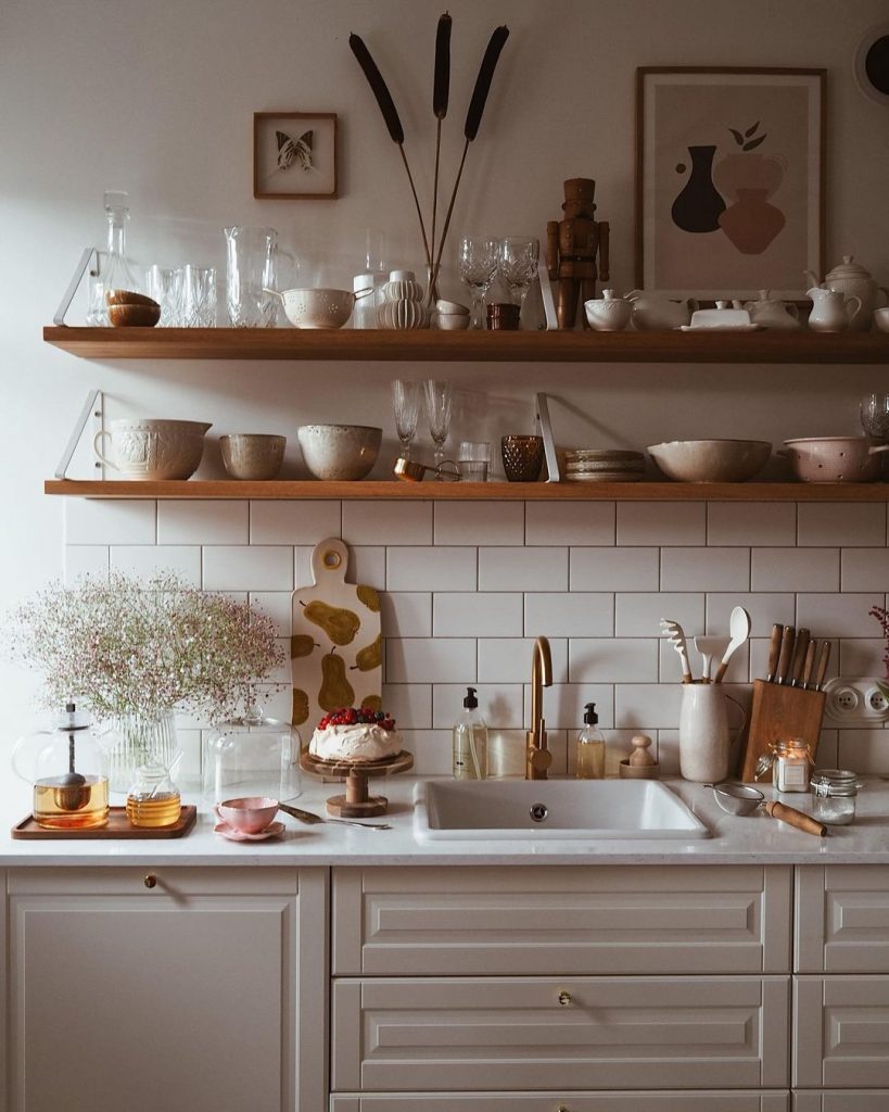
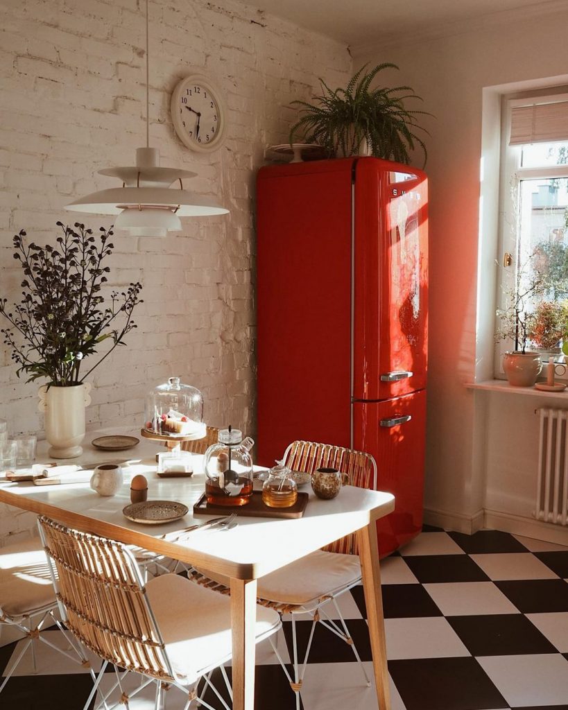
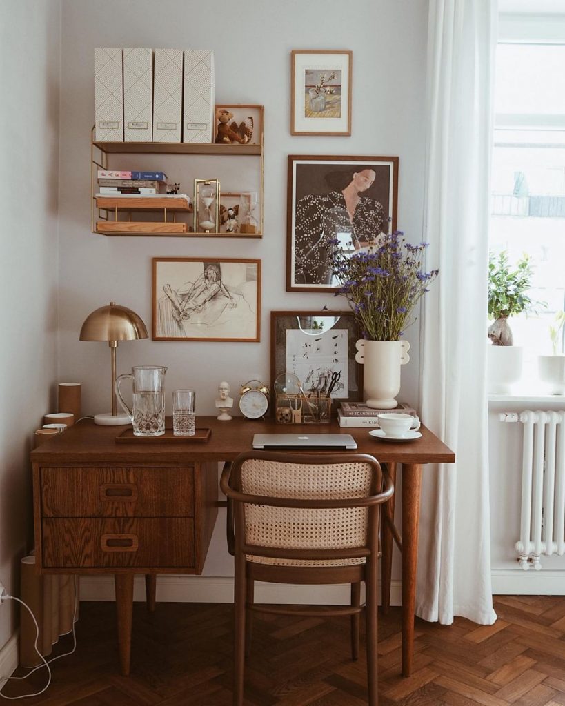
I can spot a few original interior design pieces, especially from Nordic manufacturers. Justine has an Arum Ferm Living table lamp in the living room, a Shell Pot from Ferm Living on her coffee table, a Shorebird from Normann Copenhagen at the fireplace, her coffee table looks like a MUUTO piece, but not sure, a Muses Ania vase from Ferm Living on her desk (see below the photo), a PH5 Louis Poulsen pendant above her dining table in the kitchen.

The white sofa is from Sits Furniture.

#3 The earthy tones and beige color palette

You know me, I love everything in natural colors, you can’t go wrong with the earthy tones. I love the brown, the beige, the white, the orange, the black, and the few green spots here and there. What a great combination of colors across the whole apartment.

#4 Vintage pieces as focal points

Let’s hold on for a second for this beautiful red Smeg refrigerator. I wanted the very same for our kitchen, but it simply did not go through my husband’s “filters”. What a pity, we needed to change the whole color palette in our kitchen after renouncing this fridge.
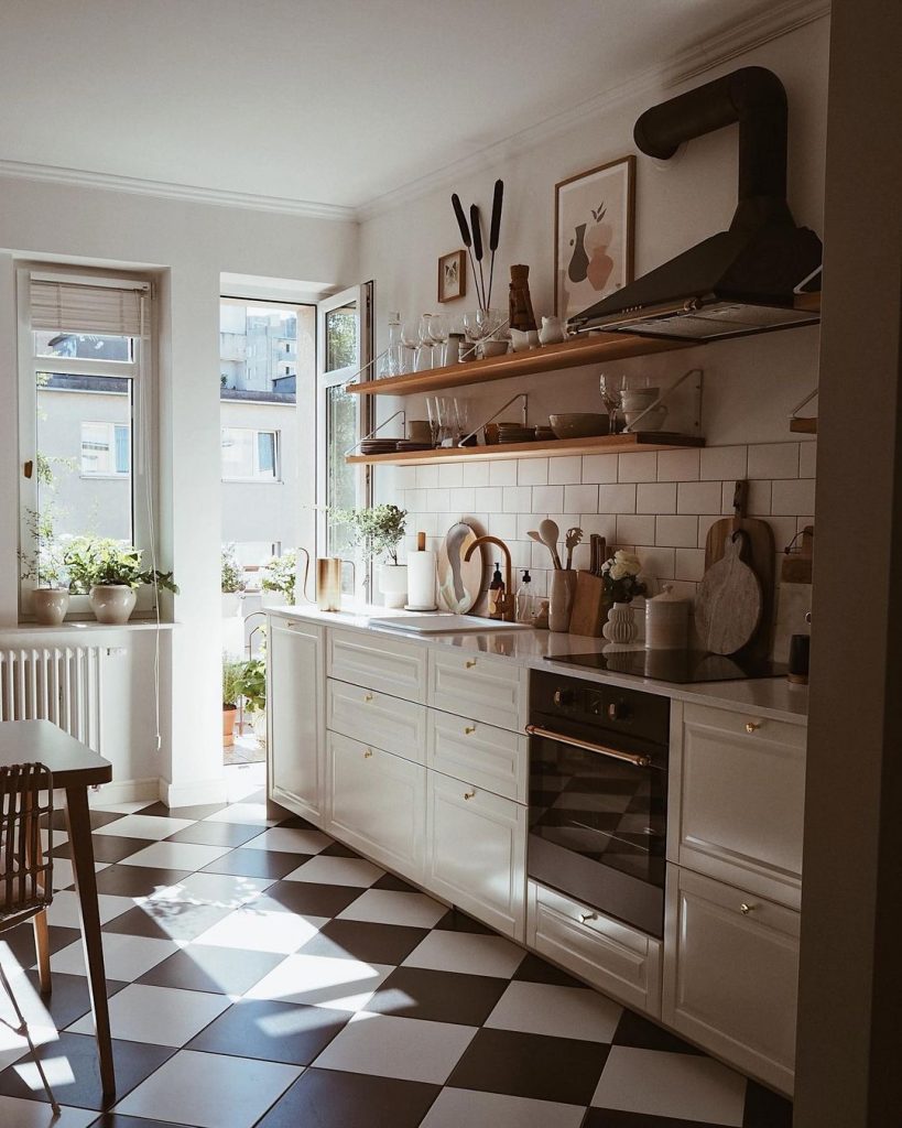
The black&white floor adds a great vintage vibe to the kitchen. The floor and the Smeg masterpieces are bulletproof combos for getting some retro feeling in the room. I also adore the vintage desk in the bedroom made by Pastform. Look at those gorgeous glass pendants in the hallway, I wonder who is the manufacturer 🙂

#5 French chicness from the kitchen and the bathroom

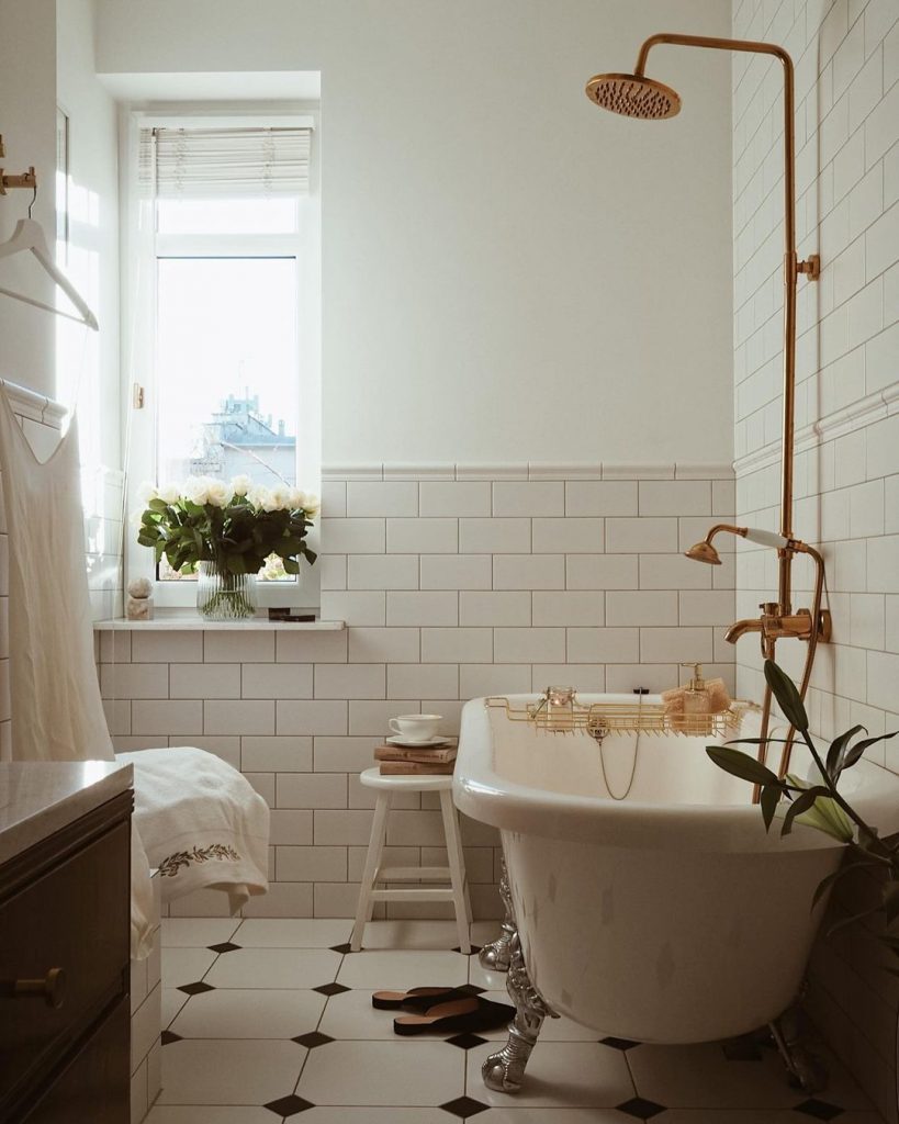
In my humble opinion, the black and white floor tiles in the kitchen are extremely in French vogue. I rarely see this type of floor in my region, I wonder why people no longer like simple black&white tiles. The bathroom is a French chicness of the house where the retro free-standing tub takes all the attention. The shower faucet is from Domn w Retro, it’s from copper and it will nicely age with time.

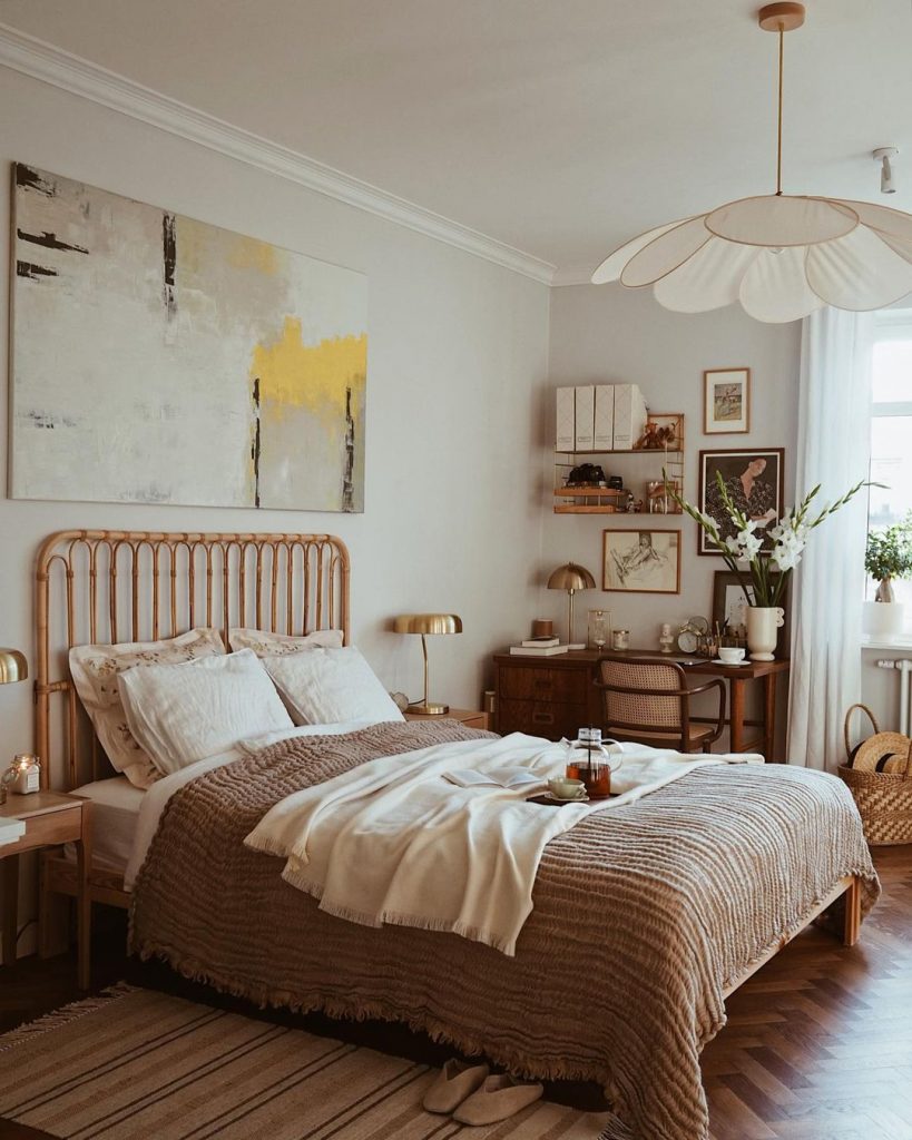
The nightstands are from Zara Home, and the pendant above the bed is from Georges.

What a great home! I’m so grateful to Justine for letting me show you around her interior. If you would like to see more similar homes, feel free to click on the Vintage my love and Warm interiors tags to get to the archive of my blog.


Photo credits: @i.tam.i.tu – shared with friendly permission


Continue Reading

Moroccan and French vibes in a 2 rooms apartment

It’s been some time since I posted any project of mine. I don’t usually seek clients who would need an interior design proposal from me for 2 reasons: 1. I’m pretty reluctant about convincing others what is beautiful, and 2. how much their interior design would be worth. All my projects so far were strictly for friends who trusted me to come up with a budget-friendly concept. Anyhow, you know me, I love the Nordic style, everything that is Scandinavian, and of course, I cannot resist to vintage pieces. This is exactly why was hard to work on the project I’m writing right now.

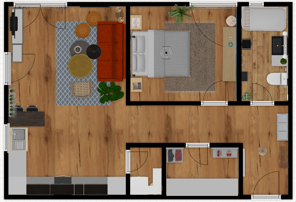
This is a 1 bedroom apartment, with an open space living room combined with the kitchen, 1 bathroom, and a small wardrobe. It’s a newly built block, having the apartment on the ground floor. The owner is an extremely nice lady (you know, those kinds of people who are born to be nice to everybody) to whom I could not say “no” after she explained what kind of style she would like to have for the apartment. The basic idea was around Moroccan style with French vibes, a lot of black & white, and orange. I could do French countryside style, but I have nothing to do with the Moroccan style, hence the challenge on this project.

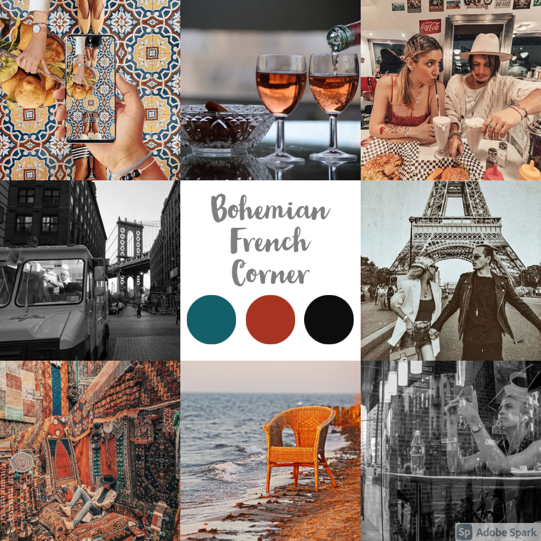
As usual, I was aiming for a mood board that would reflect the apartment’s feelings. The owner provided great pictures, just look at those color palettes! Sadly, when I was running through the color palette generator, the software could not identify the 3 dominant colors due to the overcrowded images. We ended up with dark turquoise, dark orange, and black.

I don’t like over-furnished interiors, so I stick with the Nordic concept of avoiding having too much stuff in the apartment. I’ve created the 2d planning to see what and where to fit to meet the expectations for everyday needs.

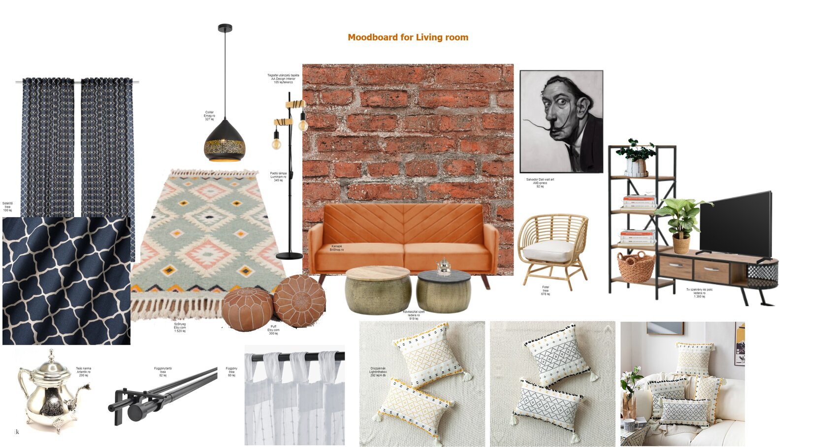
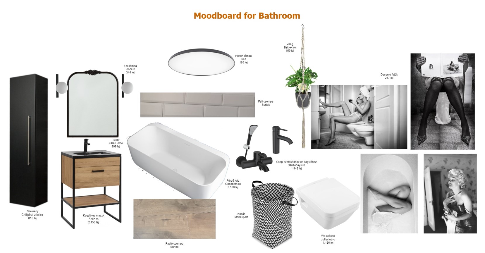
The mood board of the living room reflects the requirements from the owner, more precisely to have a brick wall behind the sofa, to have Moroccan elements like the lighting, coffee tables, carpet, and to have a black & white portrait of a famous person. These, all together, are giving a great bohemian vibe.

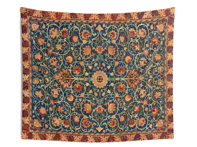
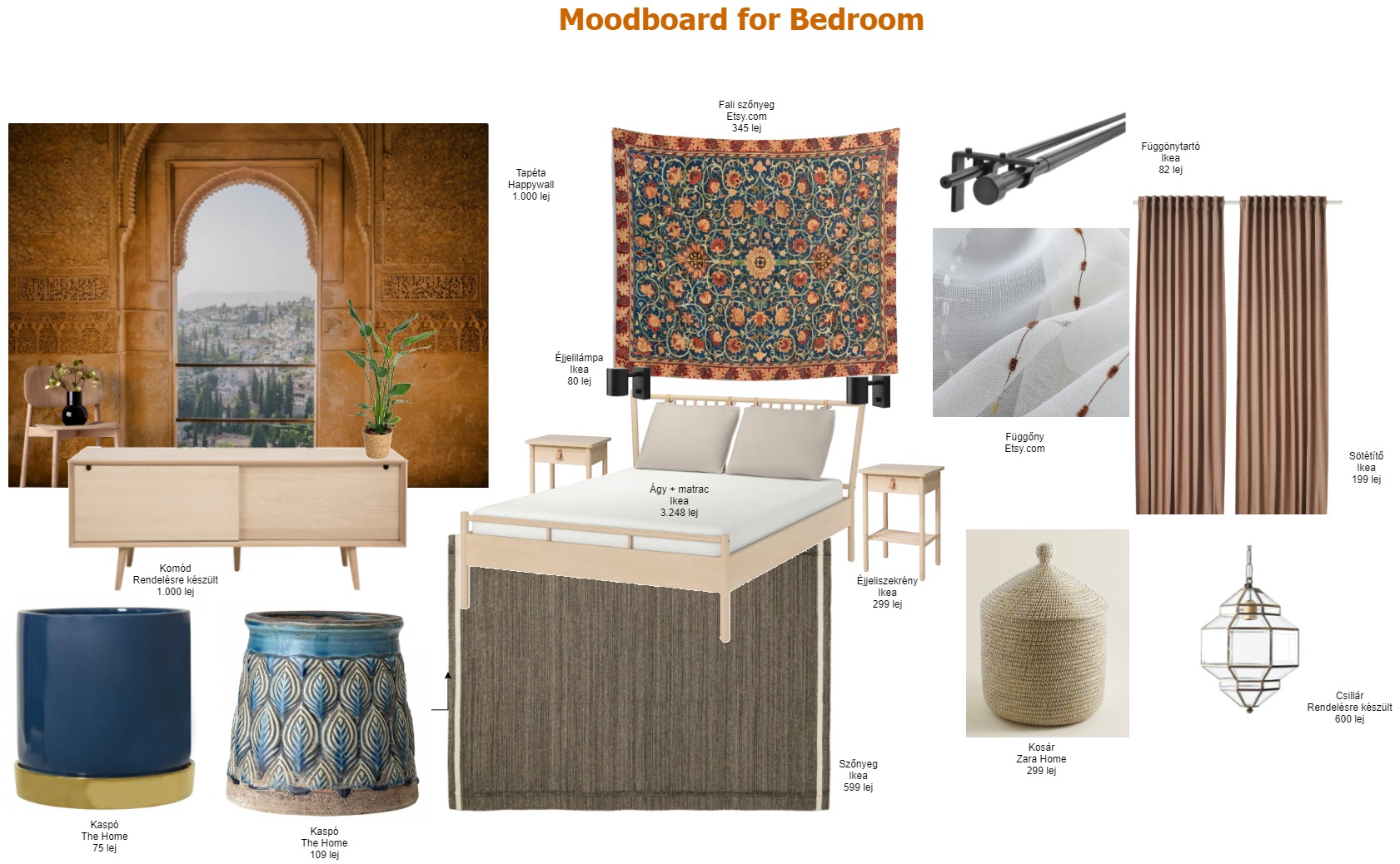
I guess the bedroom is the most Moroccan room in the whole apartment. Since it’s only a 12 sqm room, I wanted to have a wow effect with the Arabic wallpaper that adds extra depth to the place, and it has the impression of a large, open window.

The tapestry behind the bed is a Dreemzia piece from Etsy.com. Unfortunately, this one is no longer available, but you can find many more beautiful, vintage, handcrafted tapestries.

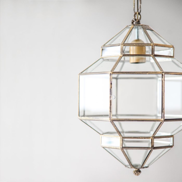
The pendant is a Granada Lanterns product available on L’aviva home. Although it’s not a typical Moroccan lamp, it’s more about imitating the diamond’s shape, still, it has its Eastern style notes. I adore that it’s made of colorless transparent glass, somehow it seems minimalistic to me.

The bathroom had to be fully French, so I went for the black & white combination, making sure that there is enough room for a gallery wall with glamorous photos.

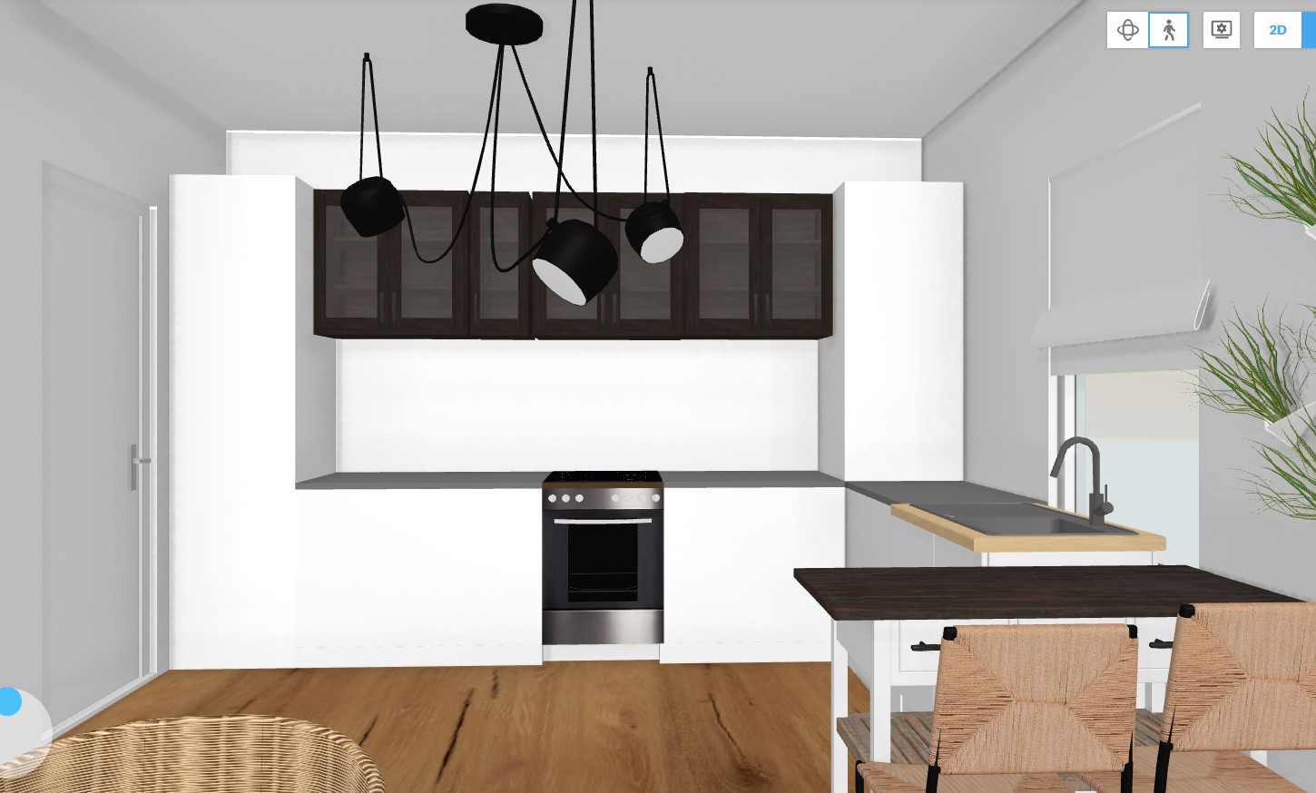
We had some headaches with the kitchen since we needed to incorporate all the electronics without turning into a piece of overcrowded furniture. The upper cabinetry will be black with glass doors to add an extra trick to the furniture. I’m not fully convinced that this is the final way to go, so let’s consider my 3D plan as a draft for the kitchen 😉


Photo credits: 1. Mood board created by focalpoint.ro based on the images provided by the customer, top and bottom middle photos used from Adobe Spark; 2., 3., 4., 7. & 8. All created by focalpoint.ro; 5. Dreemzia; 6. L’aviva home

Continue Reading

A home with beautiful neutral tones

Sometimes I have the feeling that beautiful stories find me without me doing any effort. As you know, the majority of the interiors shared on my blog are the homes of some nice people who I don’t know personally, but who are more than kind to let me showing around their interiors. This is the case also with Hannah, and her story has touched me deeply when I was doing my research on her blog. It takes a great courage to talk to the world about your infertility struggling and adoption of a child. If you have time, pour yourself a cup of coffee and read their beautiful story about how they became a family with their daughter, Collette. Such a nice story of people with pure souls.

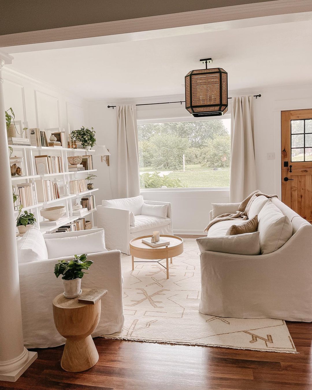
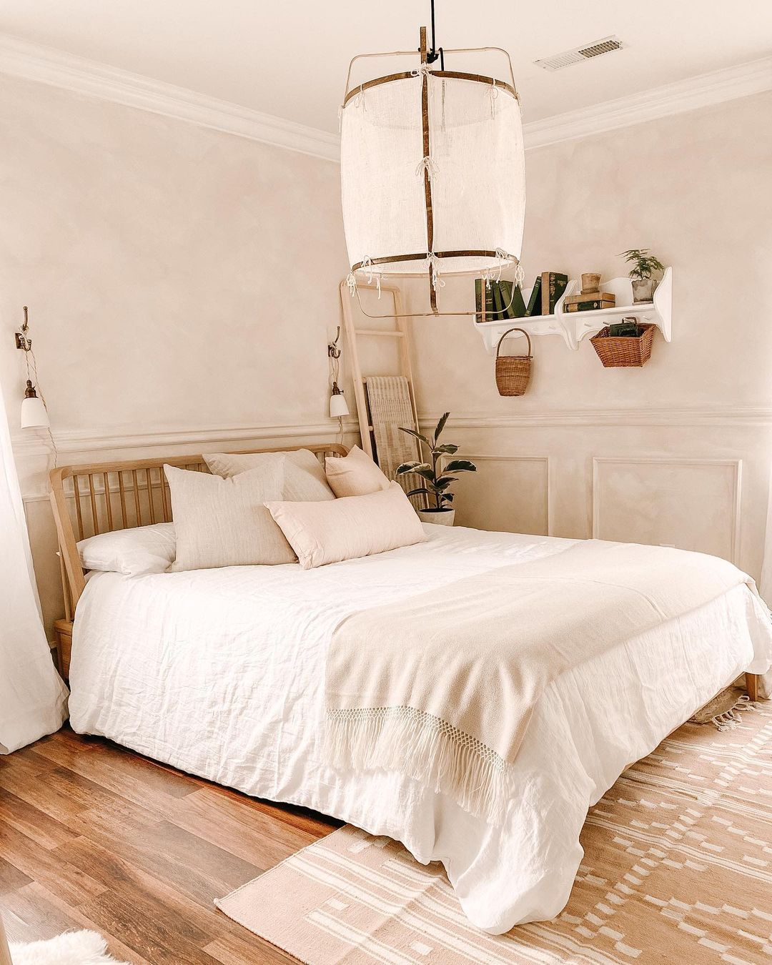
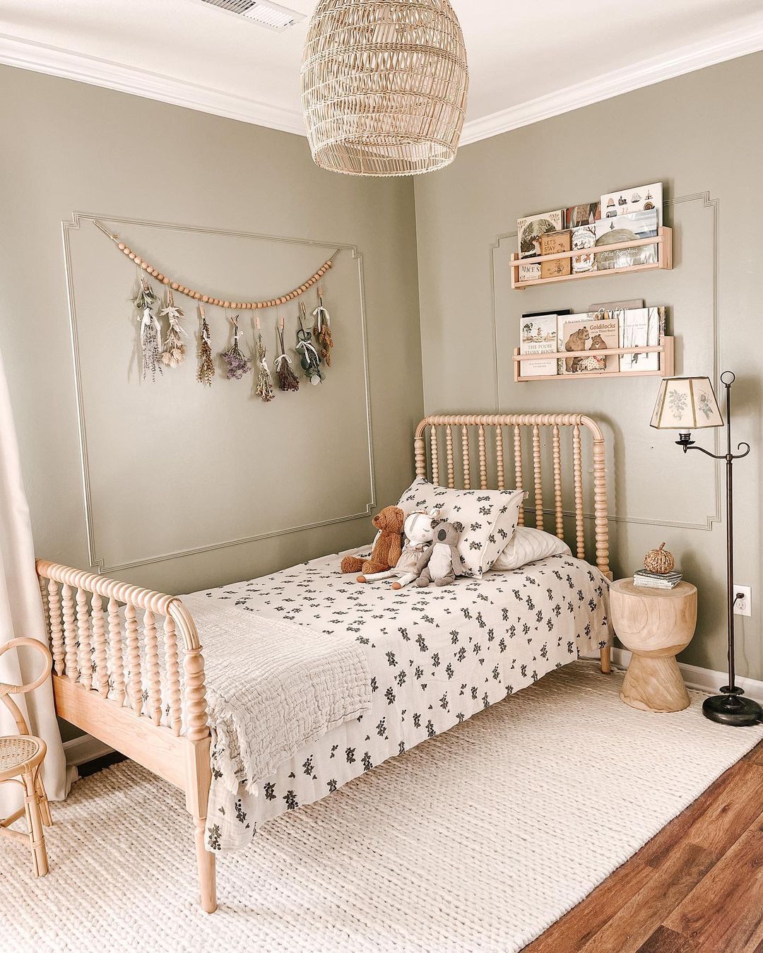
And now, let’s take a look inside Hannah’s home with super relaxed vibes, neutral colors, and lots of textures. No wonder why this home triggered my attention, as her style is a combination of many things I love, Scandinavian style with the Mediterranean and French countryside touches. Their inner pureness is reflected all over the place. Hannah is living in northern Alabama with her husband, Josh, and their daughter, Coco. They renovated the house where Josh grew up, turning it into a modern, relaxed interior.

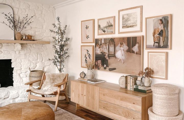
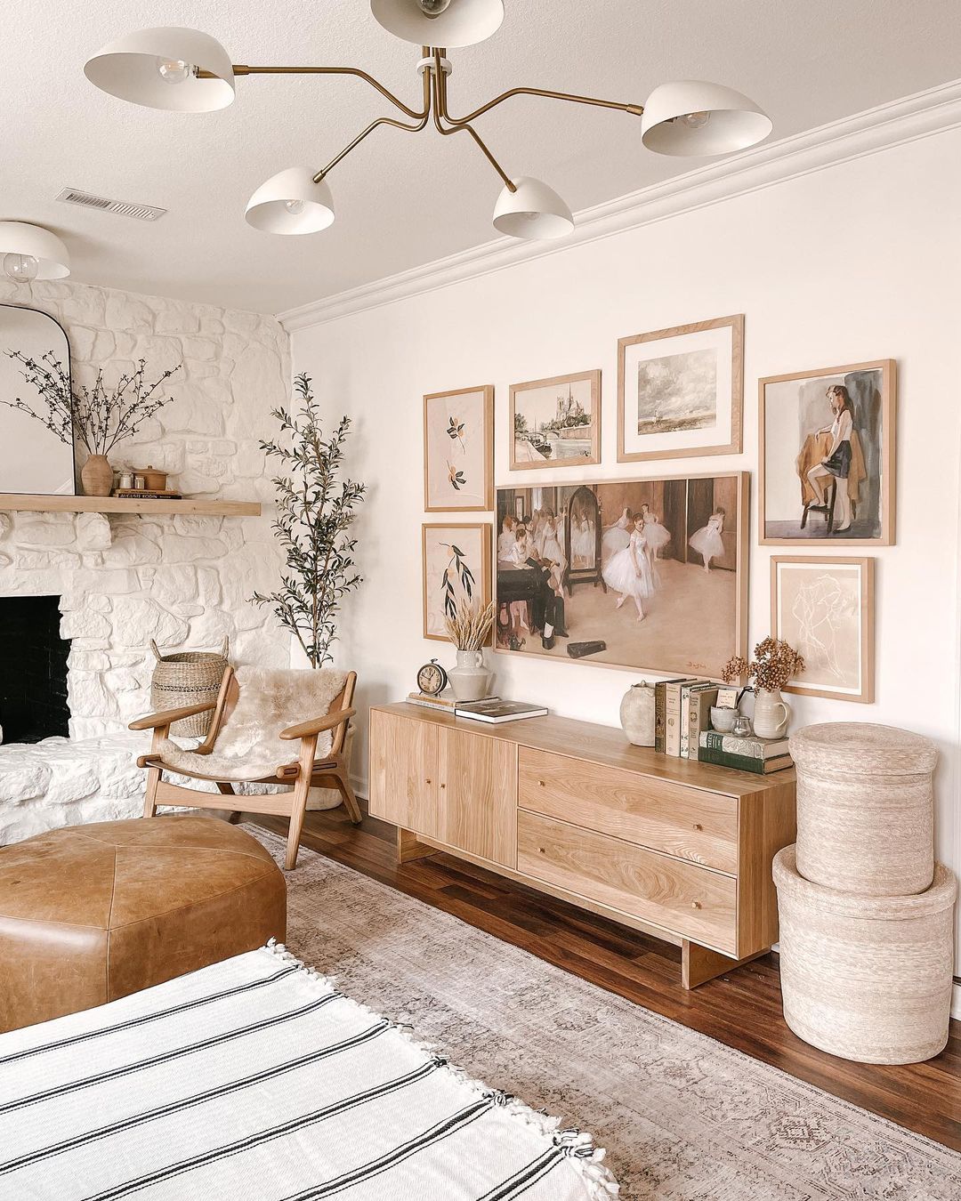
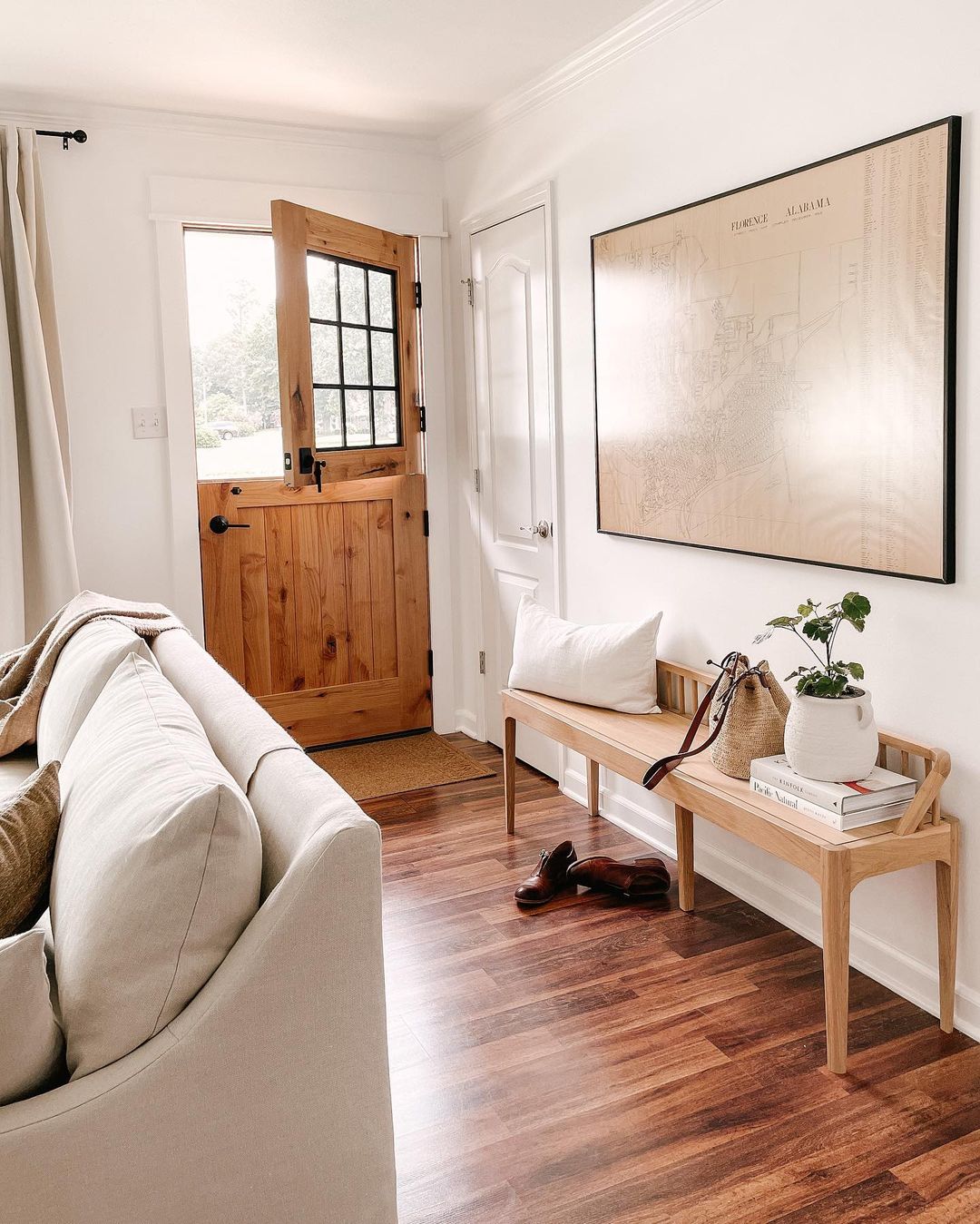
Their home is full of natural decorations, neutral colors, rattan baskets, and greenery. I love how they managed to incorporate the Samsung Frame tv on their gallery wall. Degas’ painting The Dancing Class turns out to be the best choice for perfectly fitting the Tv in the gallery wall’s style.

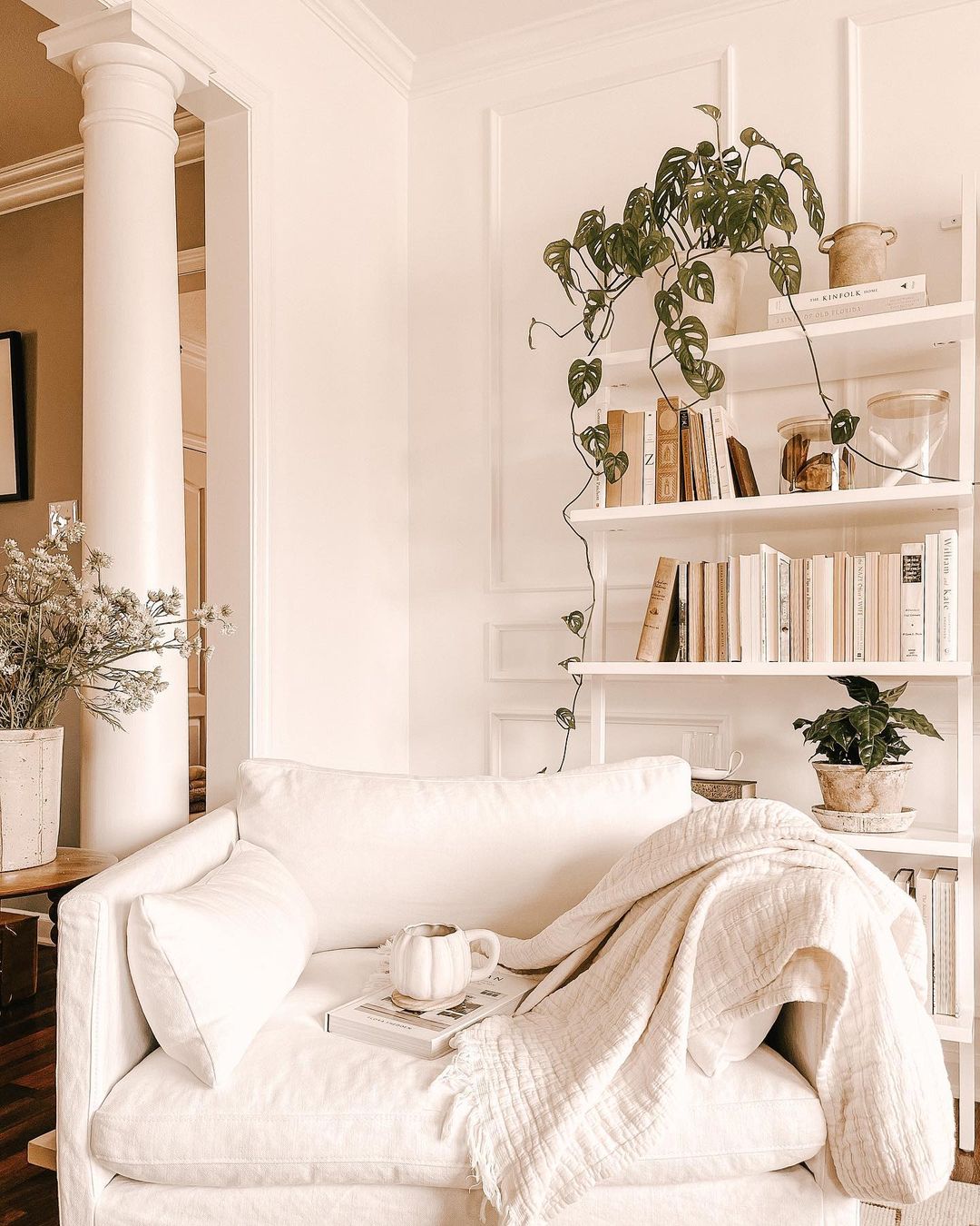
They created this reading nook during the Covid quarantine, and it turned out super nicely with their vintage green book collection. I could hop in right away with a good book, although I’m pretty ok with my reading corner as well 😉

The natural light is flowing abundantly in their living room. If I would have to define the focal point of this room, I could not do it, but according to Hannah the book shelf is the center of attention. The chairs are slipcovered and can be washed, no wonder why this was important to them when choosing this light color. The Gabriel chairs are from Sixpenny, the sofa is the Portola Slipcovered sofa from Lulu and Georgia. I think the coffee table, the wooden stool and the Evet rug from Lulu and Georgia are the perfect combination to get to this neutral living room.

The Z11 Black Silk White Pendant is the absolute focal point in their bedroom. The walls are lime washed and Hannah has chosen the Bone color from the German Bauwerk Colour. By the way, they are shipping worldwide, so do not hesitate to contact them if you fell in love with something from their color palette.

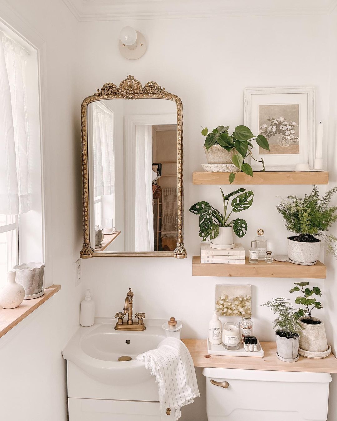
This is one of the most stylish, small bathrooms I’ve ever seen. It’s simply perfect. Most certainly, Hannah knows that the Devil is into the details 🙂

Their entryway is in full sync with the rest of the house. This beautiful door is a Farmhouse Dutch door from Rustica. The bench with its super clean lines is from Maker & Moss.

What a lovely home with warm vibes! I’m grateful to Hannah for letting me/us inside her house, but I’m even more grateful for the fact that her story found me in this period of my life 🤍
You can read more about their home and family life on her blog Thistle Harvest.


Photo credits: @thistle.harvest – shared with her kind permission
Continue Reading

Finally, a Danish apartment on the blog

After many beautiful Swedish apartments shared on the blog, it is time for an interior from another Nordic country. If I need to pick my favorite place after Malmö, I think I would easily go with Copenhagen, no wonder why we’ve spent our honeymoon in Malmö with a short escape to the Danish capital back in September 2019. This is my first Danish apartment shown on the blog, so I was grateful to Line when she confirmed that I can use her photos. Line has a personal blog merimeri.dk, an Instagram account with daily posts, and she’s also the PR manager of 2 traveling IG accounts, no wonder how she can be so creative with her posts.

She is living in this apartment with her husband and their two little girls, Nola and Evi. This is one of the reasons why I’ve chosen her interior to show it on the blog. I think I mentioned before, that I love those families who have homes full of joy, calm and real signs that actually somebody is living there. Anyhow, let’s dig into what I like the most in their lovely home.

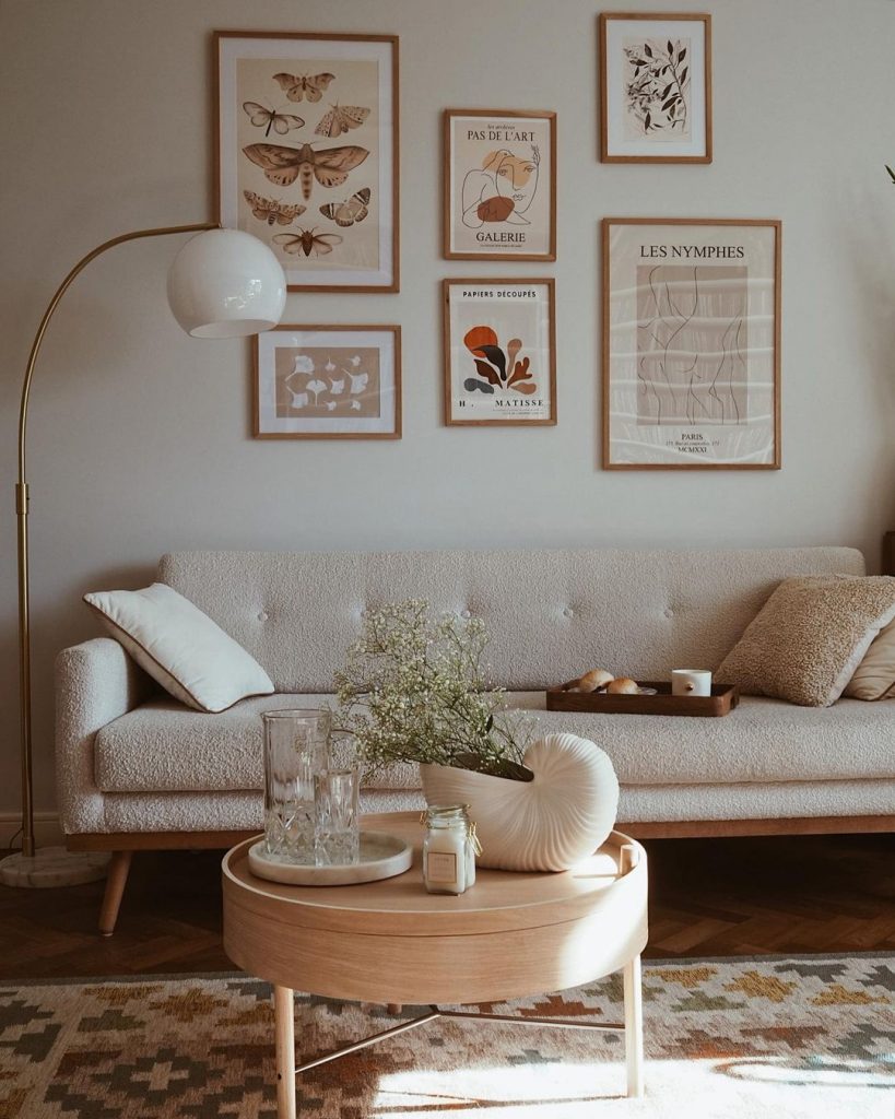
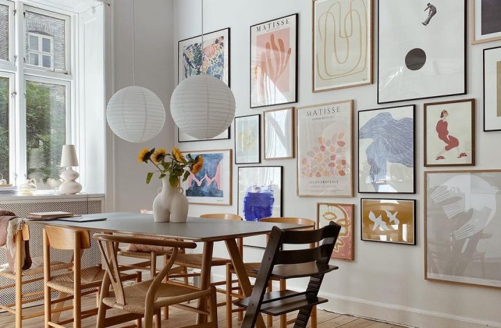
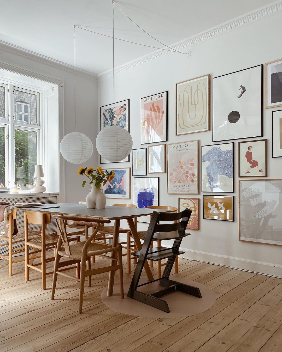
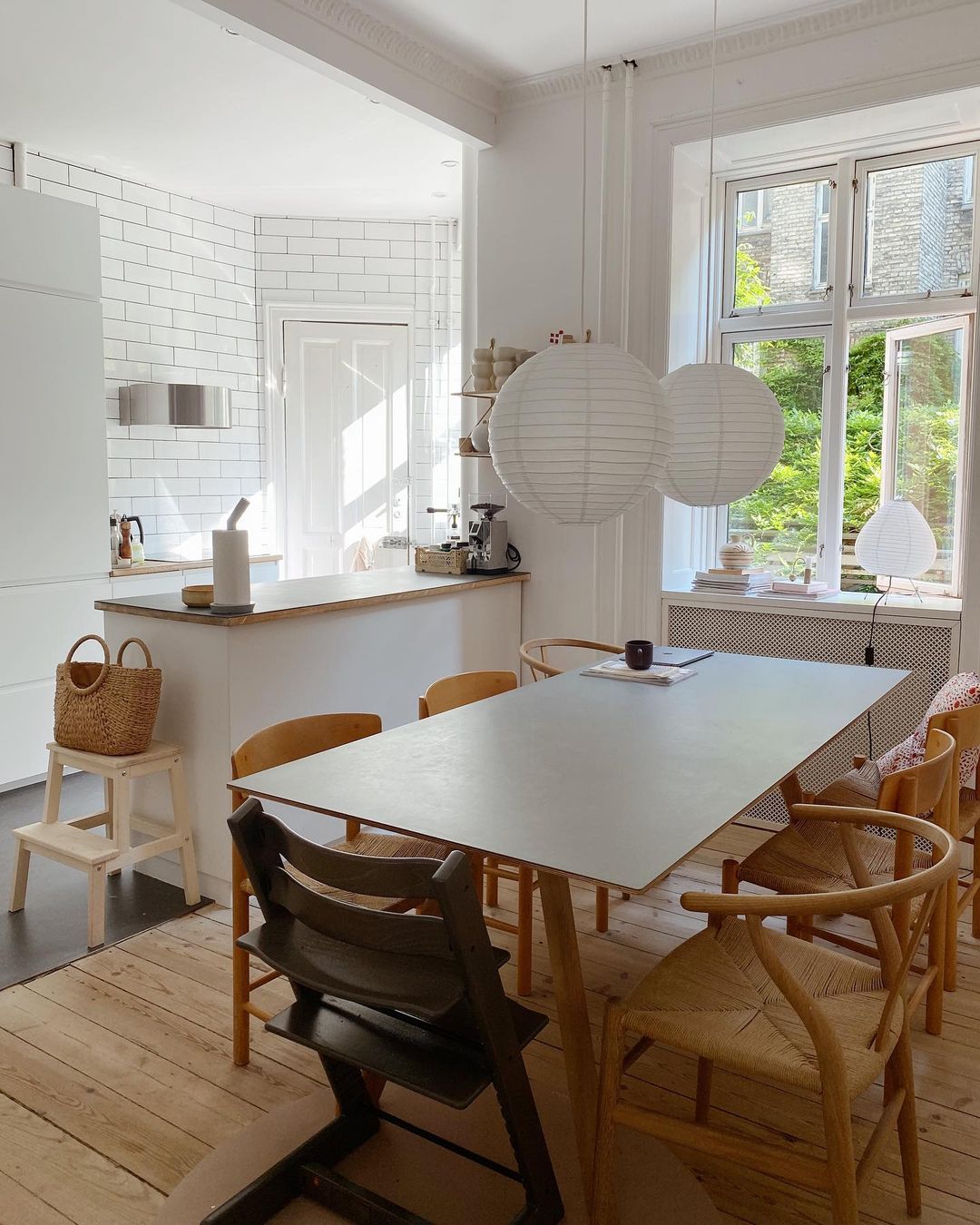
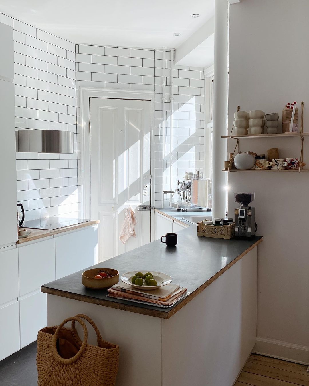
First things first, this gallery wall captured my attention instantly in their dining room. Many items on this wall are possibly from Papercollective, I particularly like the Matisse artworks. I’ve also spotted a Balustre table lamp that adds a cozy feeling to the windowsill. The Hay dining table is a perfect combination with the CH24 Wishbone chairs. This dining area is next to their kitchen that has a particular shape and I think they were super creative in terms of how to maximize the space.

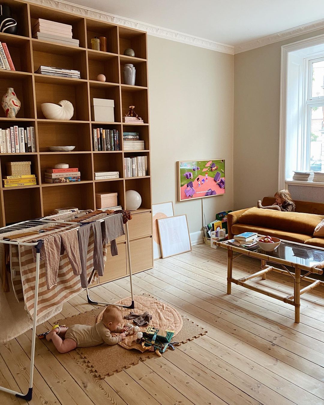
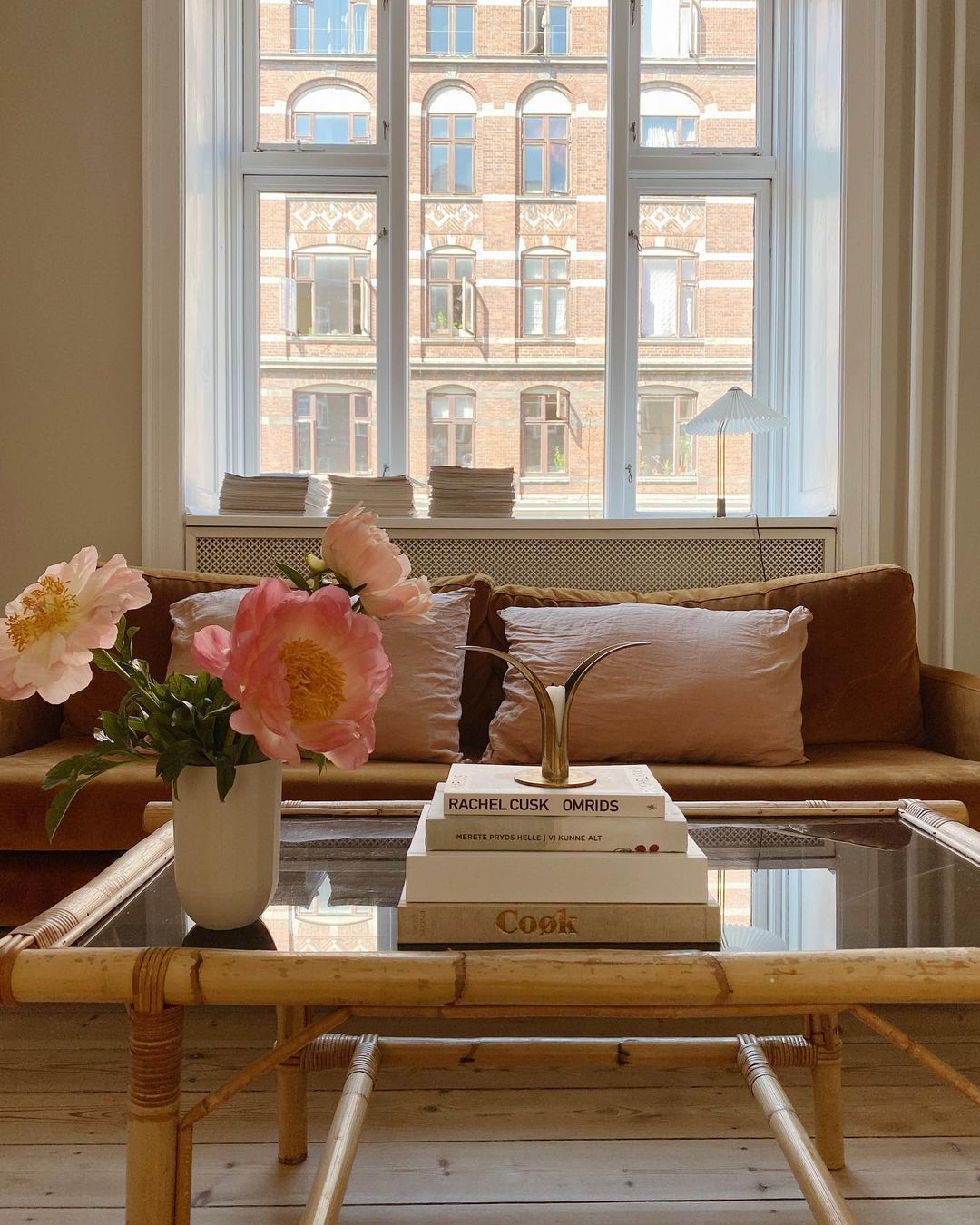
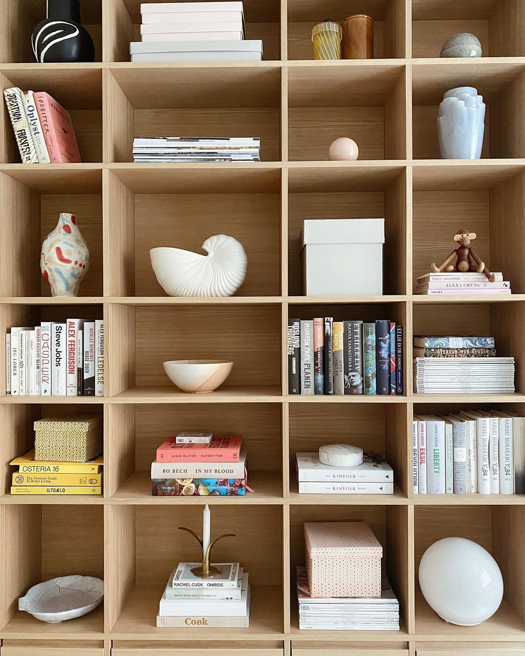
Their living room is full of natural light, books, and iconic design decoration pieces. I see a Ferm Living Shell Pot and the famous Finish Wooden monkey by Kay Bojesen on their bookshelf. On the bamboo coffee table, a Lily Candlestick by Skultuna is shining in every sense of the world. Finally, I see a traditional drier too, such a lovely picture of their everyday life. I have a similar one, and it’s one of my favorite household pieces. On the floor, you can see baby Evi, the youngest member of the family.

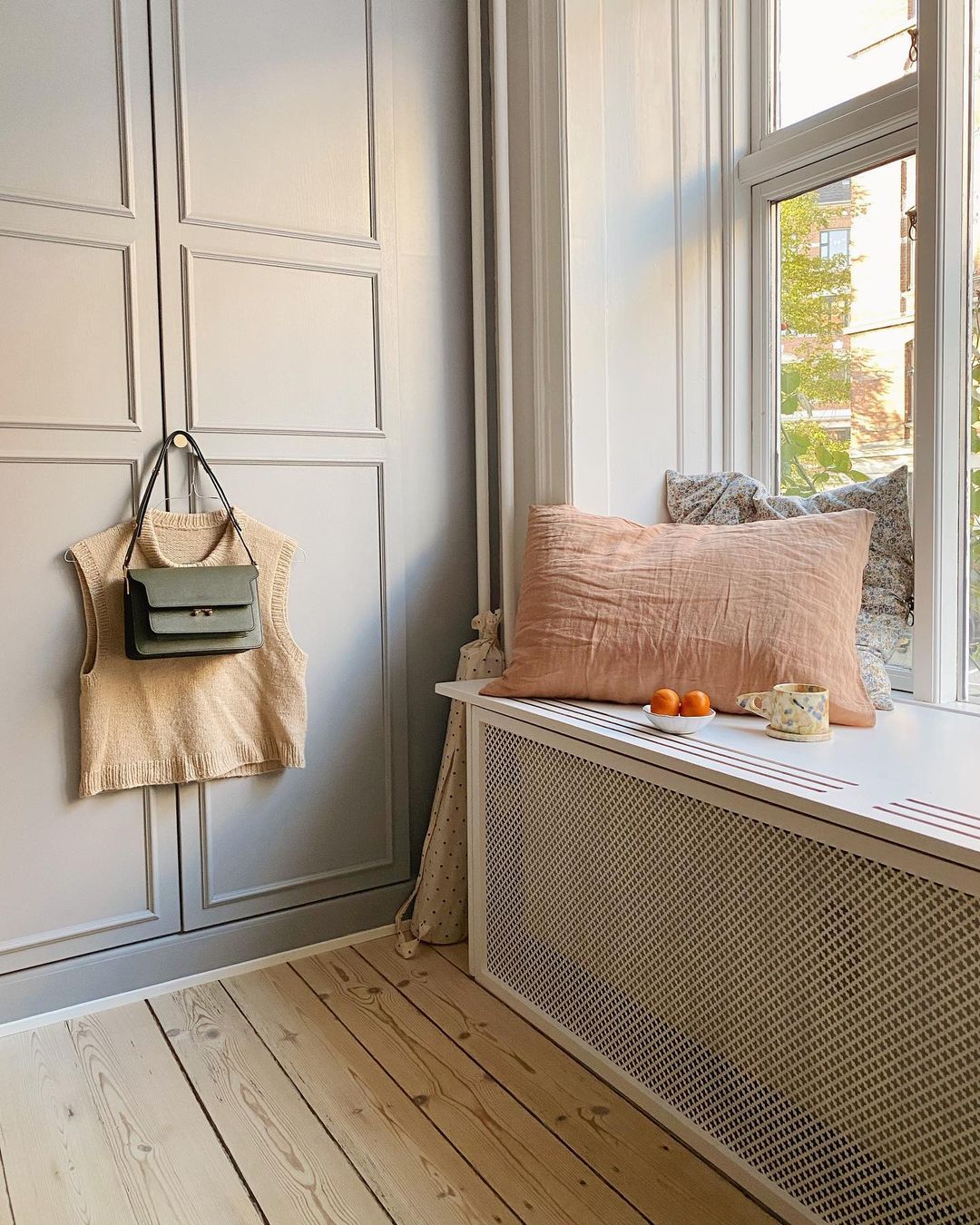
As you probably know, Nordic people prepare themselves for the long nights during the winter. Hopping up on the windowsill with a hot coffee and a good book, it’s just an instinct of them. This one is a good idea of how to enfold a radiator elegantly and create a hygge corner for darker days.

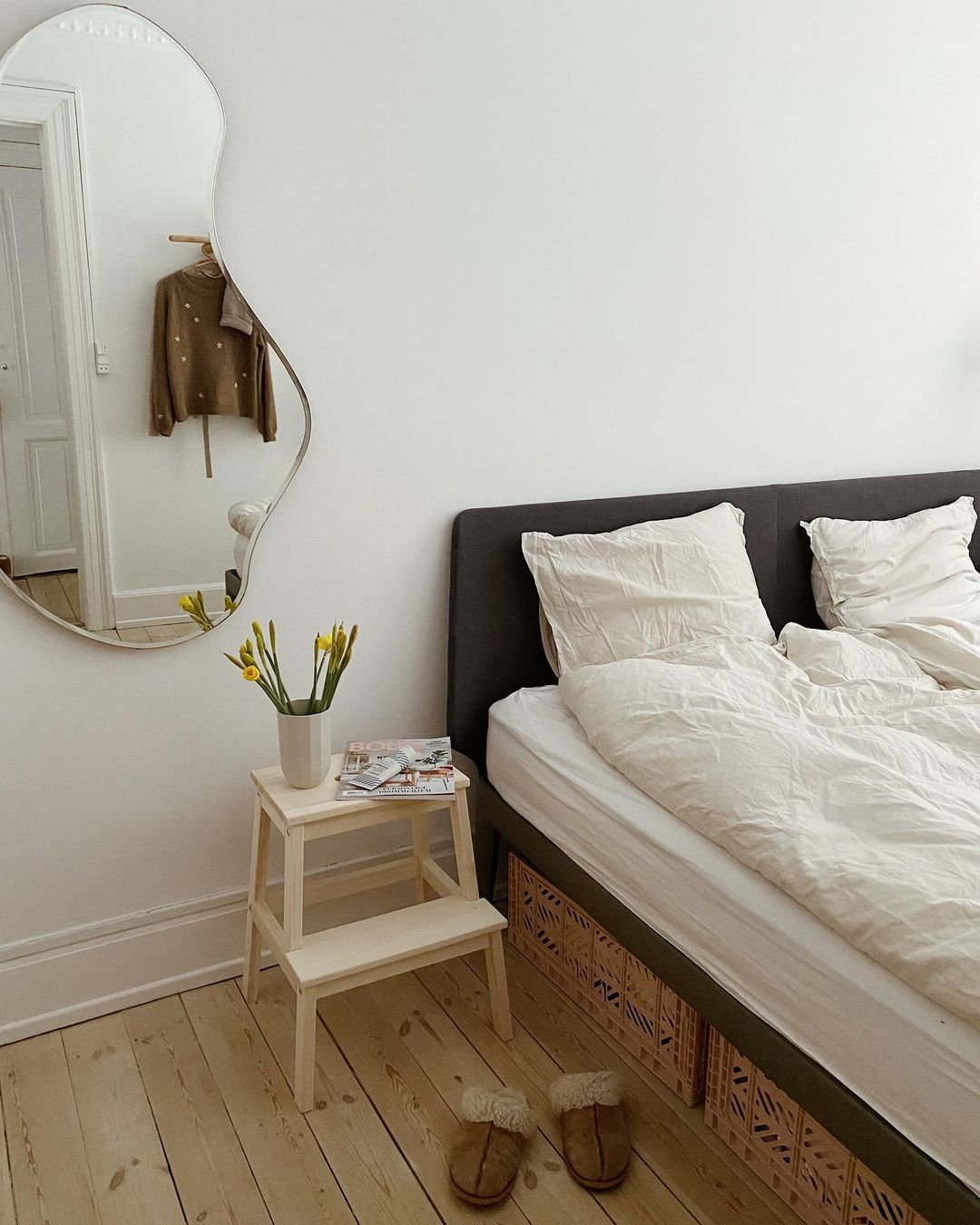
Their bedroom corner is boosted up with a Ferm Living Pond mirror. The space below the bed is used as a storage space thanks to these very popular plastic boxes. If you are from my region, feel free to check these on Jysk.ro as you can find multiple sizes.

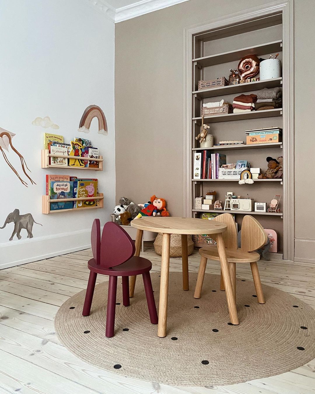
The lovely furniture for kids is from the Danish brand, Nofred, and the carpet with the dots is another beautiful piece from Ferm Living. The built-in shelf is a genius idea to gain more space in the room.

What an inspiring and lovely interior, thank you Line to letting us into your home!

Do not forget to come back around the weekend (pfuu, not again Zsuzsi, your parents-in-law are coming in the weekend, when are you going to have time to write another post on the blog? you’ve promised this article for the past weekend and today it’s Tuesday…rolling eyes) for another warm interior from northern Alabama. Yepp, you heard me well, I’m jumping to another continent, this is going wild 🙂


Photo credits: @merimeri.dk – shared with her friendly permission
Continue Reading