Why I love ED’s home collection

In this week’s blog post, we travel outside of the Scandinavian region to which my readers are usually used to. We step into the wonderful world of ED’s home collection, a USA-based lifestyle brand founded in 2015 by the American comedian and Tv host, Ellen DeGeneres and Christopher Burch, the CEO of Burch Creative Capital.  

I’ve discovered ED by Ellen DeGeneres home collection a couple of years ago and I spotted instantly a few pieces that I could place almost anywhere in our home. You know me if something is with earthy tones, using natural raw materials and it’s handcrafted, it’s a winner to me. This is what I love the most in ED’s home collection, they managed to combine multiple styles, bohemian with minimalistic, natural with sophisticated, vintage with modern, covering a huge area of desires in terms of interior design. They have a nice collection of pillows and rugs, all very natural pieces with great color combinations.

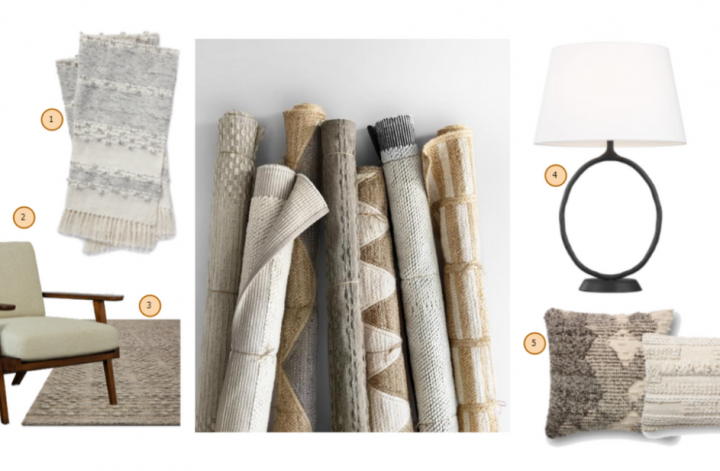
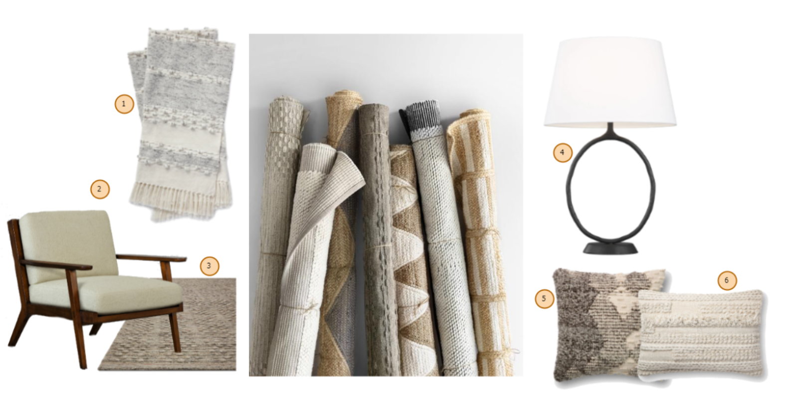
Unfortunately, they don’t ship outside of the USA yet, but you can contact them (see the FAQ section, point 16.) for considering adding your country to their international list when they’ll start worldwide shipping. I’ve created a small collage with my favorite pieces of the moment. Enjoy!


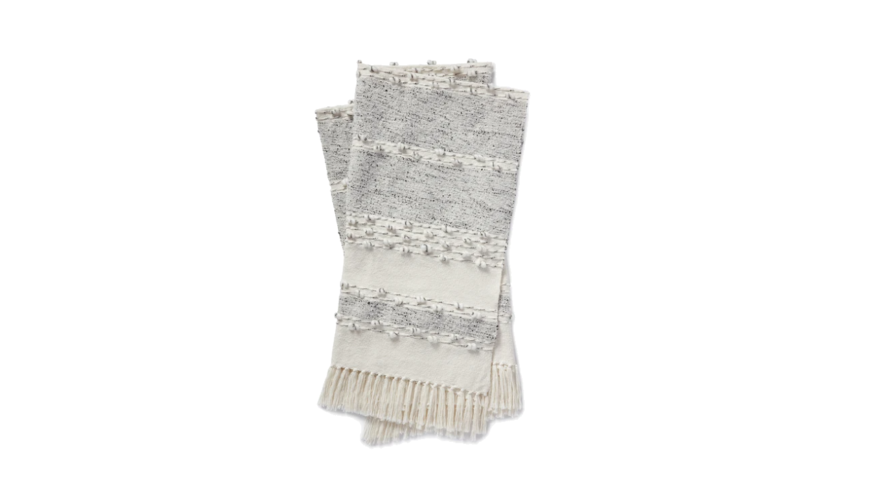
1. Akir Throw Blanket crafted by Loloi

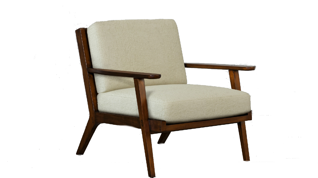
2. Mildas Chair by EJVictor


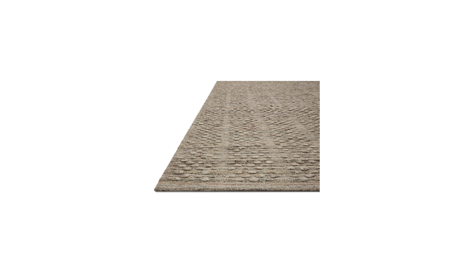
3. Burbank Woven Rug crafted by Loloi

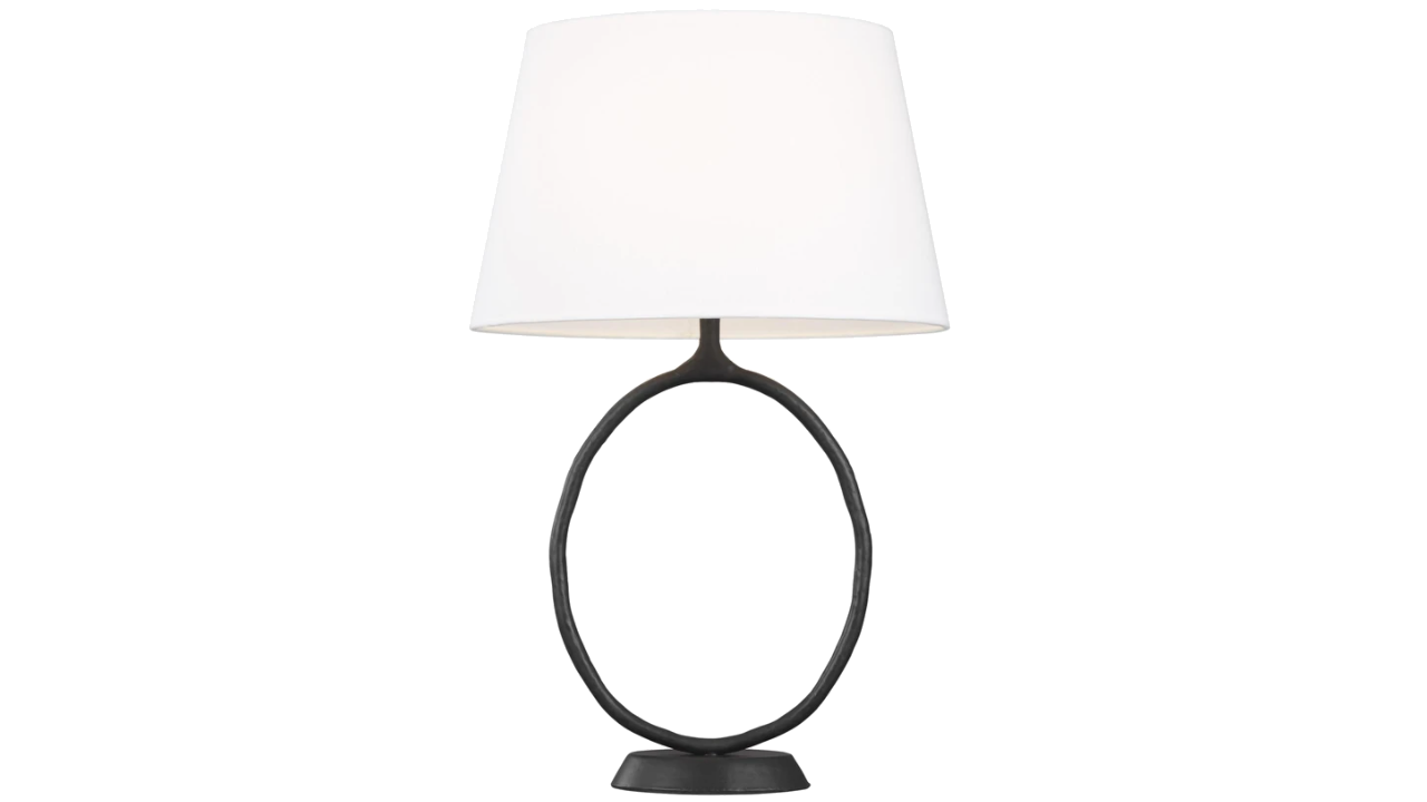
4. Indo 1 Table lamp crafted by Generation Lighting

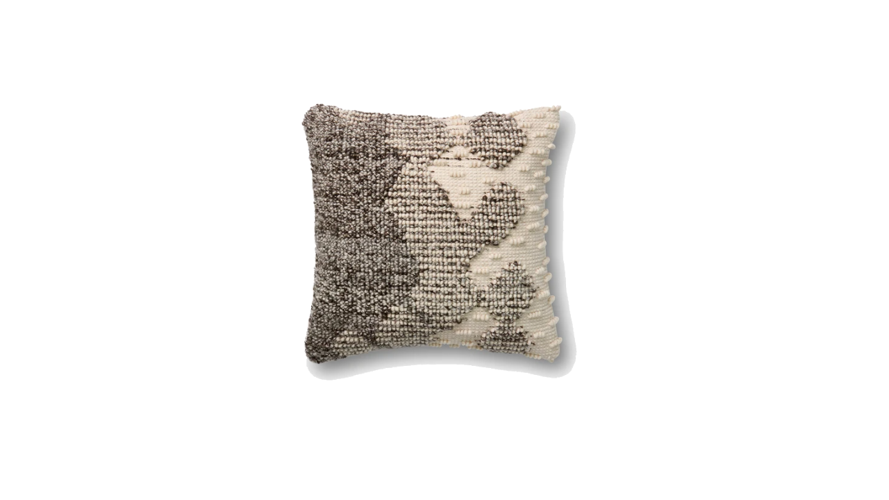
5. P4002 Looped Ombré pillow crafted by Loloi

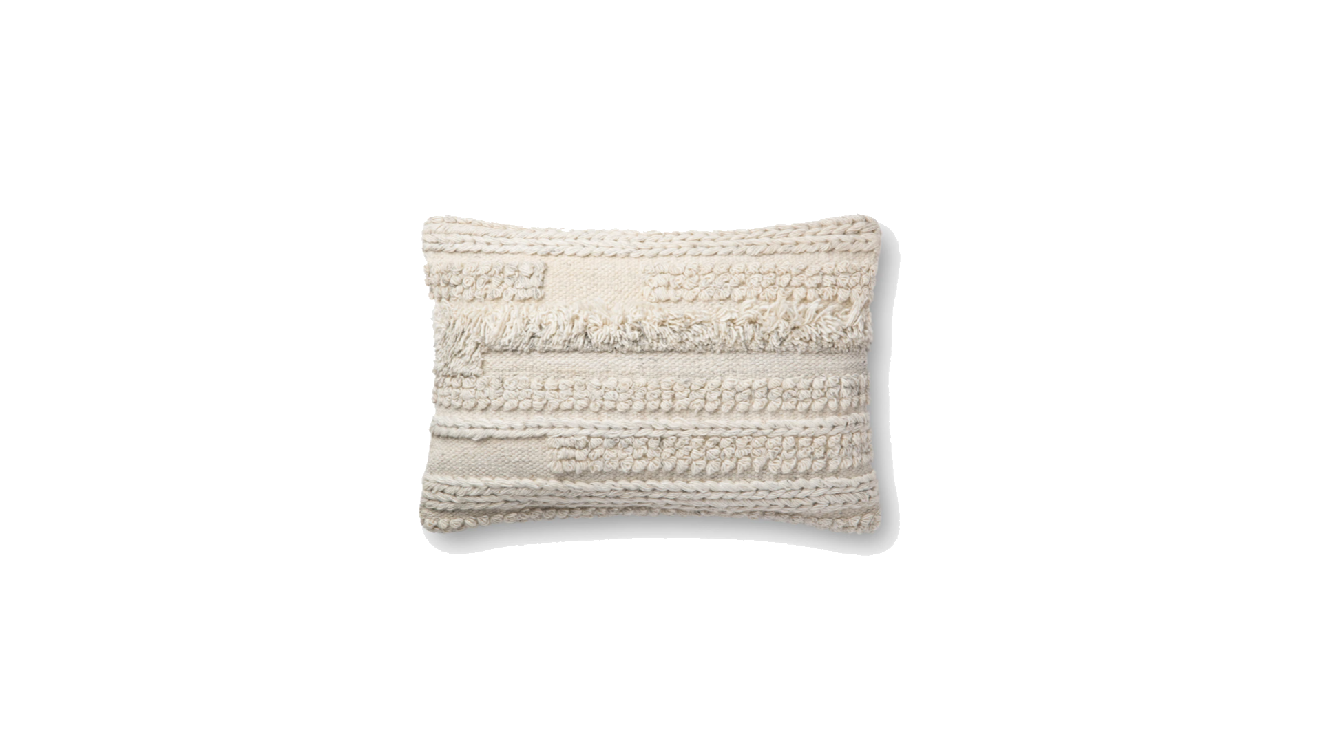
6. P4083 Braided Tapestry pillow crafted by Loloi


Photo credits: all product photos used in this collage by @ED by Ellen DeGeneres


Continue Reading

Design proposal for an Earthy nest

A few weeks ago, I managed to finish one of the most “pressuring” design projects that I have had so far. This particular project that I called Earthy nest (due to the color palette) suppose to be an apartment with a fresh, trendy look & feel, but still staying original, with as little possible commercial crap in it. The owner of this home is a young, demanding entrepreneur who meant this apartment for renting it out. Since he has a very sophisticated taste for vintage pieces and art, my Scandinavian obsession had zero value in this case. The budget for the interior design was €10.000 without the construction expenses. For a 2 rooms apartment without too much luxury, this budget is pretty ok…even if I needed to turn upside down the internet to find the right things I imagined for it.

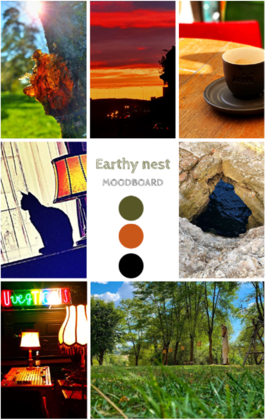
As a first step, I always start the design process by asking the “customer” to send me some personal photos having the same vibe as the potential feeling he wants to achieve in the apartment. The below mood board was created exclusively with the pictures received from the owner. After I scanned the collage with a color palette generator, it ended up with these 3 dominant colors. What a beautiful palette of earthy tones 🙂

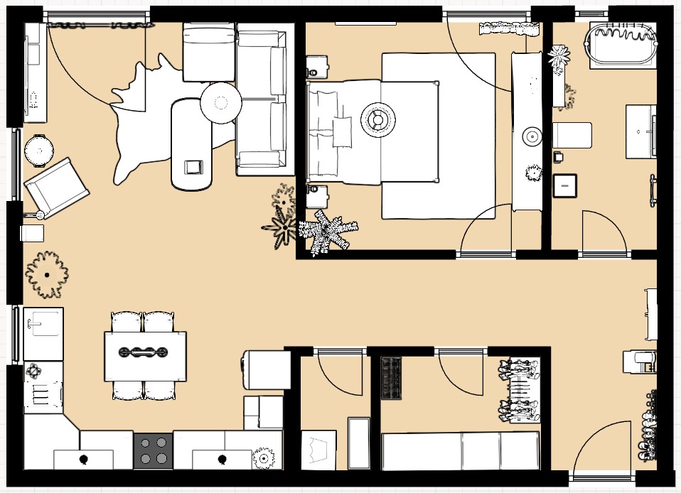
The next step is to do the 2D plan to see what where to fit. Since this apartment has a wardrobe and a pantry, I managed to keep everything decluttered, I truly hate overcrowded homes with too much furniture here and there.

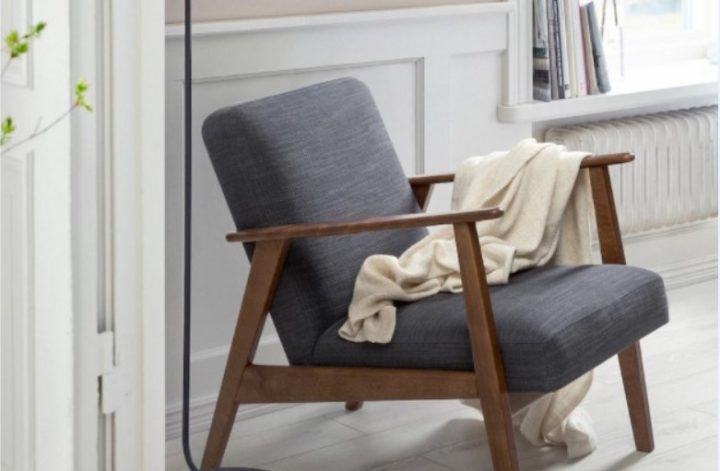
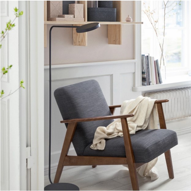
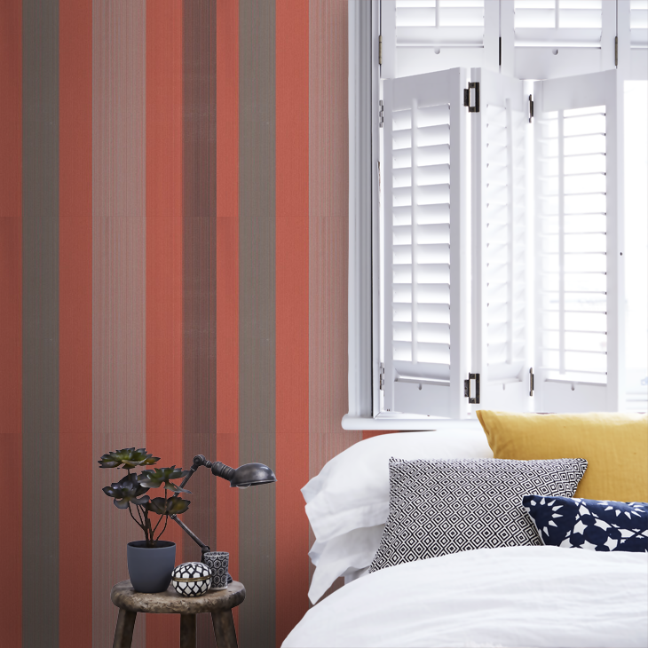
For the living room, I had 2 requests from the customer: to have a green sofa in the sitting area and apply white brick wall decoration on one of the walls. I’ve managed to use a few vibrant colors too, like the mustard yellow lighting and the blinds with rust color and grey. I created a reading corner as well with the gorgeous EKENÄSET Ikea armchair. To have some industrial vibes, I used a black FJÄLLBO TV cabinet from Ikea.

In the bedroom, there was a single requirement of having something with red or burgundy color for reflecting passion and love. I’ve used the red Farrow & Ball Chromatic Stripe wallpaper for the wall behind the bed. This way, I managed to meet the customer’s expectations, avoid overcrowding of the room and create a great focal point in the bedroom.

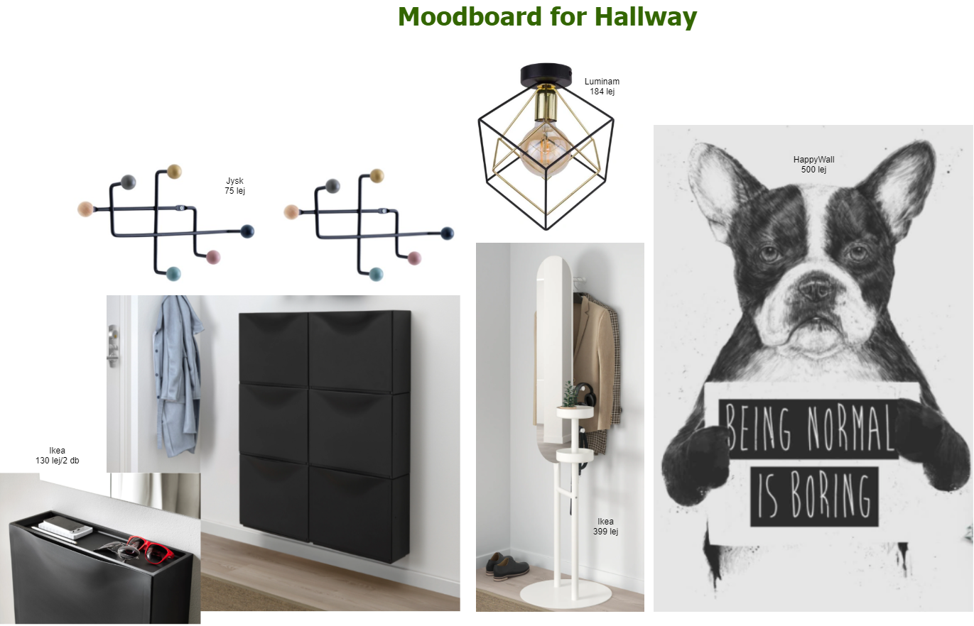
For the hallway, I’ve let my imagination go wild a bit by proposing a bold, hipster wallpaper from HappyWall. They can print customized wallpapers based on the buyer’s need, so you can set the width and the high you need. We have one too from them in my husband’s home office, and I’m super happy with the choice we made 2 years ago. I have to admit, although this seemed a good idea, this one did not go through the customer’s acceptance criteria, and we agreed that he will choose something else when getting to this point.

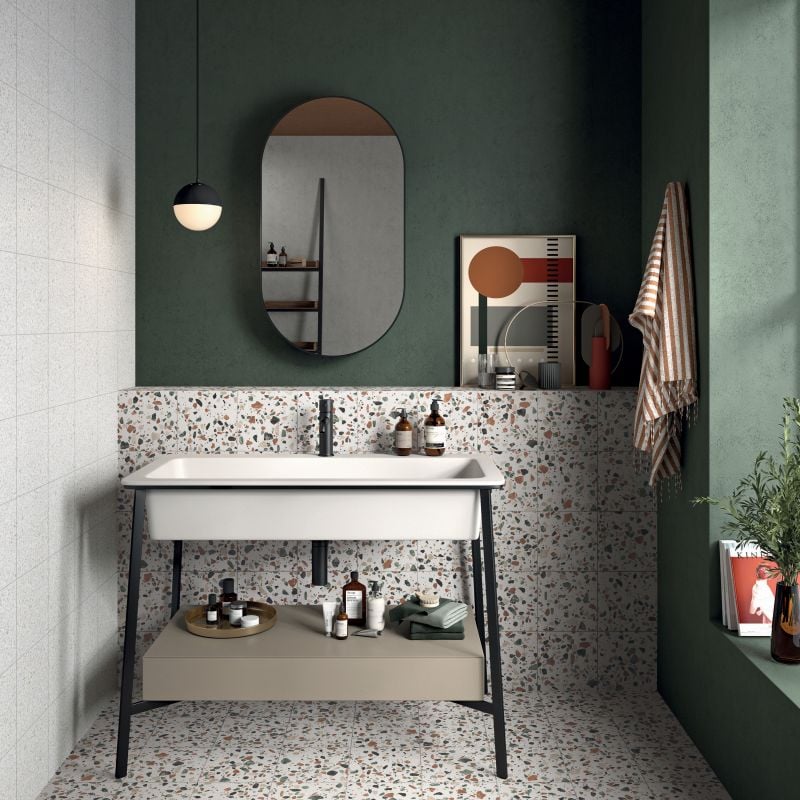
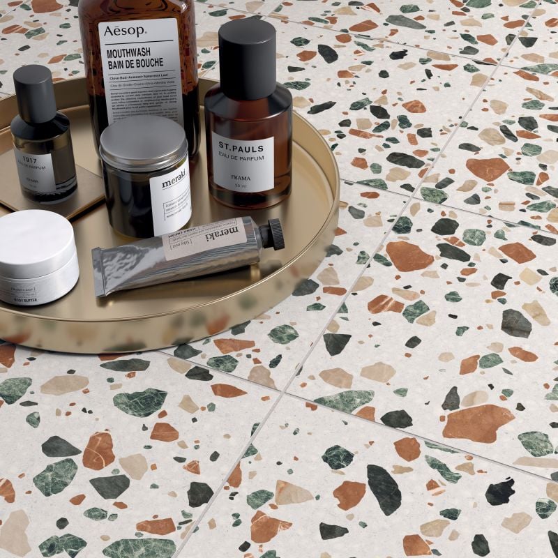
The bathroom was a real challenge in terms of finding a nice, not very common tile. This green-orange Terrazzo tile seems like a good fit to combine the moss green wall color. To avoid turning the bathroom into a cold interior, we’ll put tiles till mid-high (max. up to 1.5 m) on the wall and paint the rest in this earthy green. The customer is not 100% sure yet if he wants a bathtub or a shower, so we left that topic opened till the construction works start.

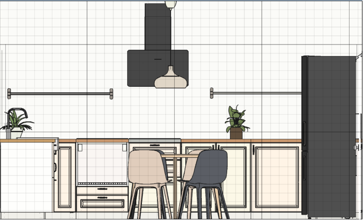
For the kitchen to create an airy feeling, I’ve recommended an open shelving approach instead of having top cabinetry. The furniture will be dirty white combined with black electronic equipment. The dining table will be in the middle of the kitchen for the impression of an existing kitchen island.

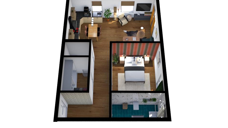
And of course, as usual, there is no design without a 3D plan to show around how the apartment will turn into a home. Navigating in the house it helps a lot to get the overall idea and to see the proportions of the furnished interior. I use Floorplanner as a planning software and it’s always helping me to turn into a realistic idea of what I actually want with an interior.

This home is not ready yet, it will take a few months till I can return to the blog with a photo shooting tour about the end results. I hope you like the proposal and I do believe that everything will turn 10 times nicer in the reality like on my mood boards.


Photo credits: 1., 2. & 3. focalpoint.ro, 4. Ikea.com, 5. Wallpaperdirect.com, 6. focalpoint.ro, 7. & 8. Alchemist.ro, 9. & 10. focalpoint.ro

Continue Reading

A beautiful apartment with a dark red thread

One of the basic interior design rules is to use a red thread through an apartment/house. This can be either a color, a style, an element that is recurring in every room of the interior. The idea is to assure continuity by connecting the rooms through this red thread. This week I’m choosing a home tour with a dark red thread. Although I’m not very into dark colors and dark interiors, there are quite a few that captured my attention in the past.

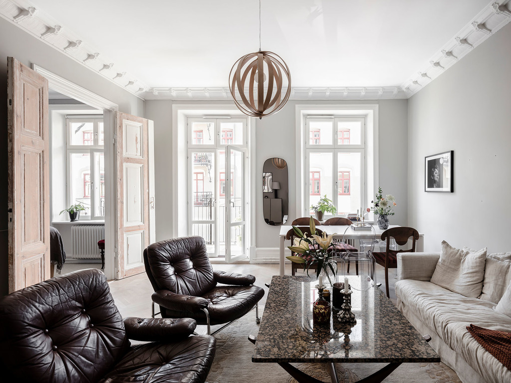
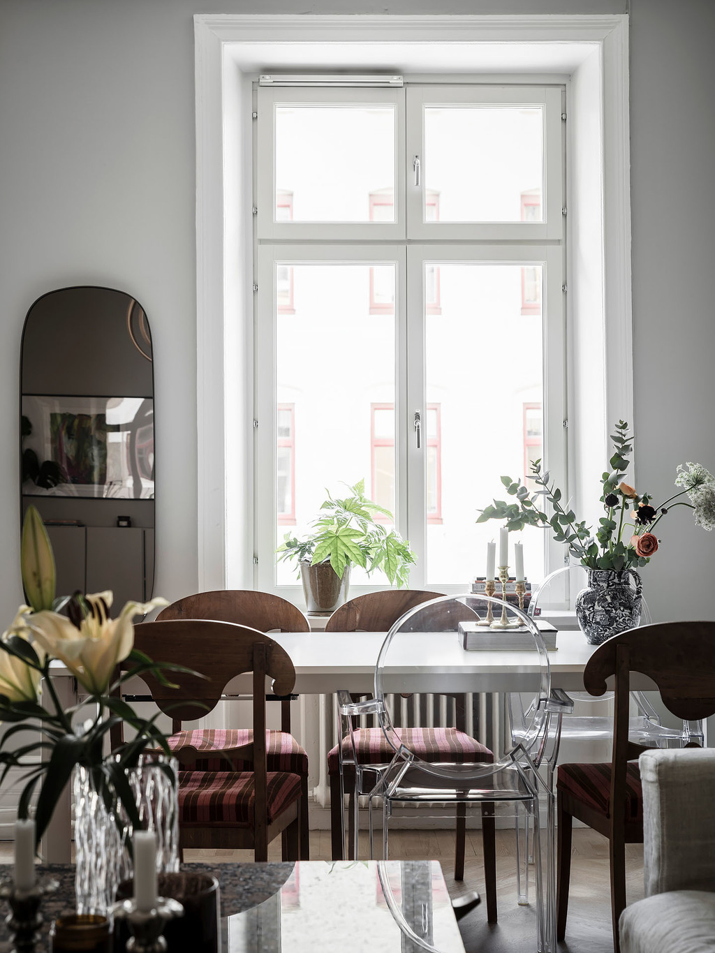
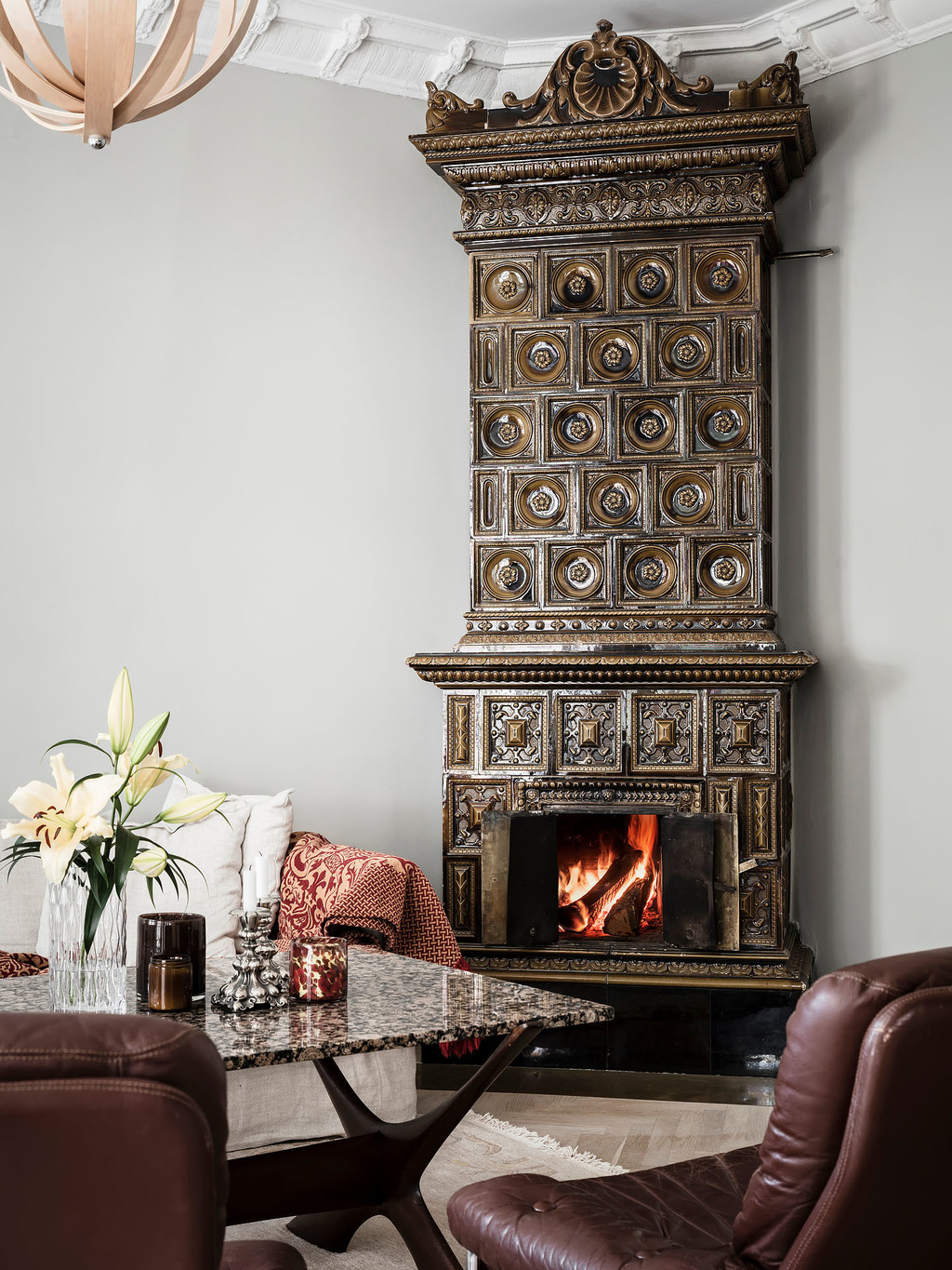
This 67.6 m2 apartment in Göteborg has a calm vibe due to the dark elements here and there. The living room’s focal point is definitely the dark tiled stove and the 3m high ceilings that let the room shine in its entirety. I spot a Ghost chair at the dining table that mixes styles boldly. The dark marble coffee table adds a dramatic feel to the area.

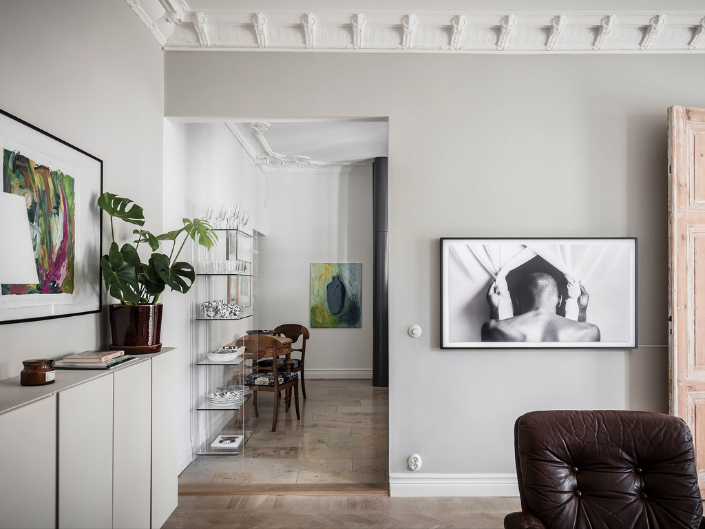
The apartment’s structure is kind of circular, from the living room you can go to the kitchen, and behind the kitchen is the bedroom from where you can end up in the dining area. I love the glass shelf system that lets prevailing some nice ceramics.

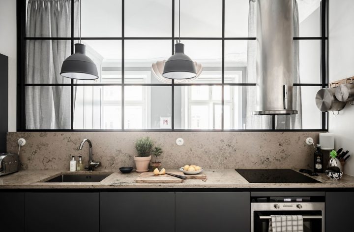
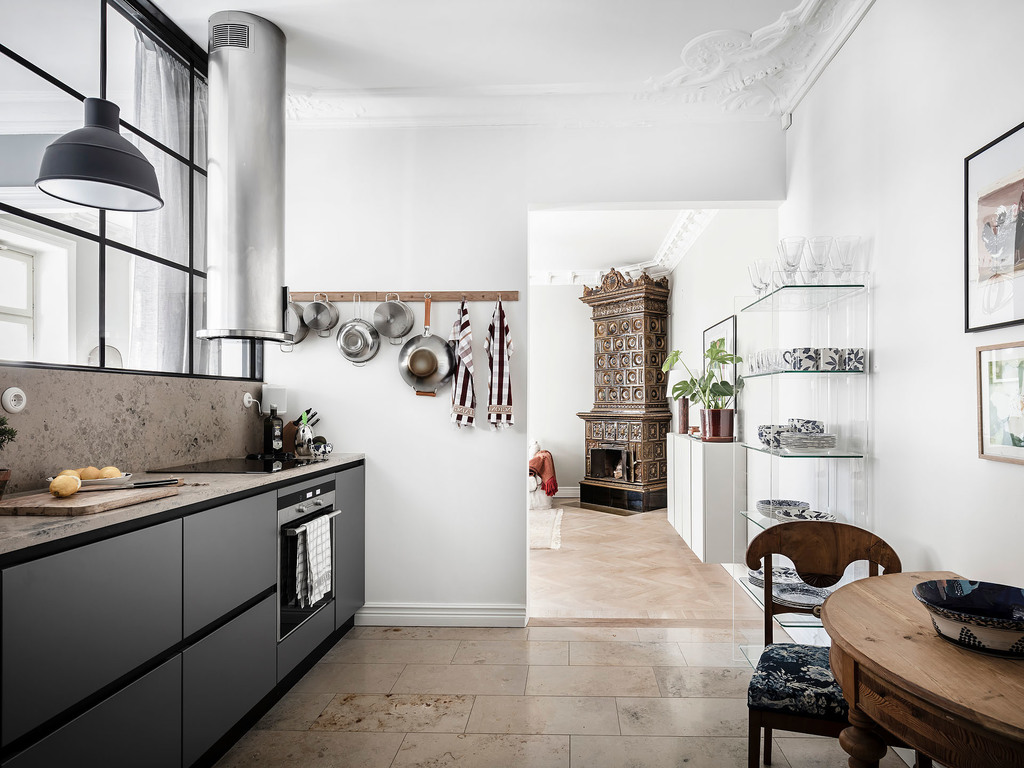
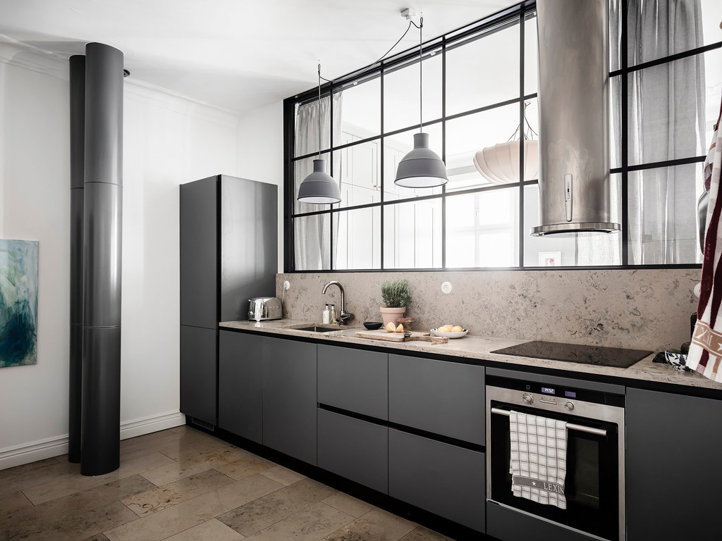
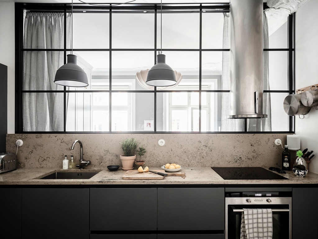
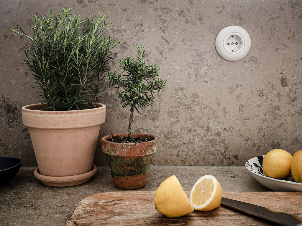
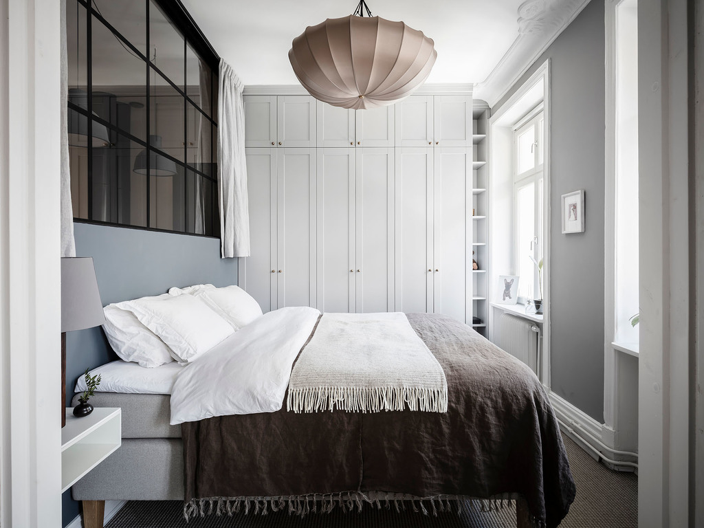
The kitchen is simply marvelous with the minimalistic lines of matte cabinetry design by Kvik. The limestone countertop is a winner of the whole place. I like to industrial window solution that lets the natural light flowing in through the bedroom. What a great trick of solving the lack of a real window.

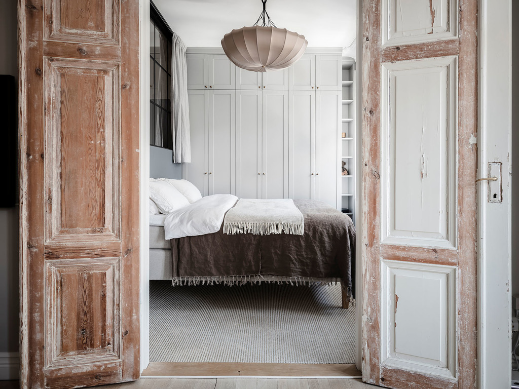
The bedroom is simple, but it has it all, style, store, simplicity, elegance, you name it. The bottom-to-top closet has a lot of storage space without making the room crowded. The ceiling light is one of Gong’s masterpieces, the MO-003S- Benitier Silk Ceiling. I discovered this brand recently, and ever since I love all their lightings. Leaving the double doors unfinished adds a great contrast to the place.

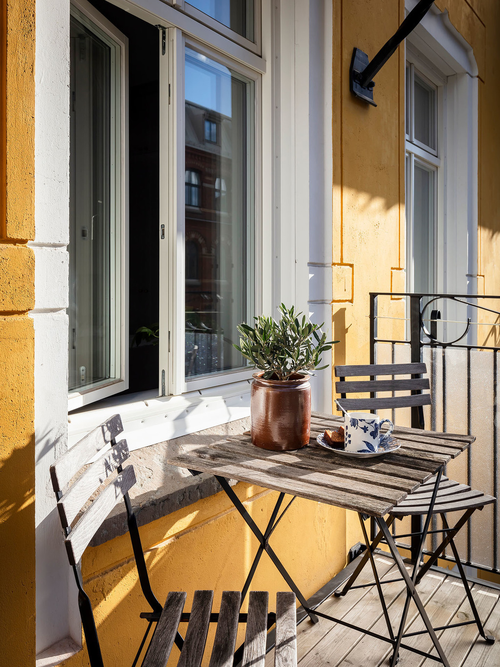
And as I mentioned many times, outdoor spaces are super important to Swedish people, so this apartment has a tiny balcony too making sure that the lucky owner can go out getting some fresh air while admiring Skansen Kronan and Skansberg.


Photo credits: shared with the cordial permission of Entrance

Continue Reading

Summer vibes with Zara Home

This is the first article since I have my blog, where I’m writing about a brand. Although this world is full of brands producing marvelous interior design products, somehow, naturally, I start with Zara Home. We have a few nice pieces from them in our home, and I love every one of them. They are affordable, working with natural fabrics and materials, using earthy tones and minimalistic vibes, not to mention that many of their products have vintage vibes too. And if you follow me, you know that I’m in love with vintage pieces.

I made a list of the items I love the most from their Summer collection 2021.

1. Foldable chair
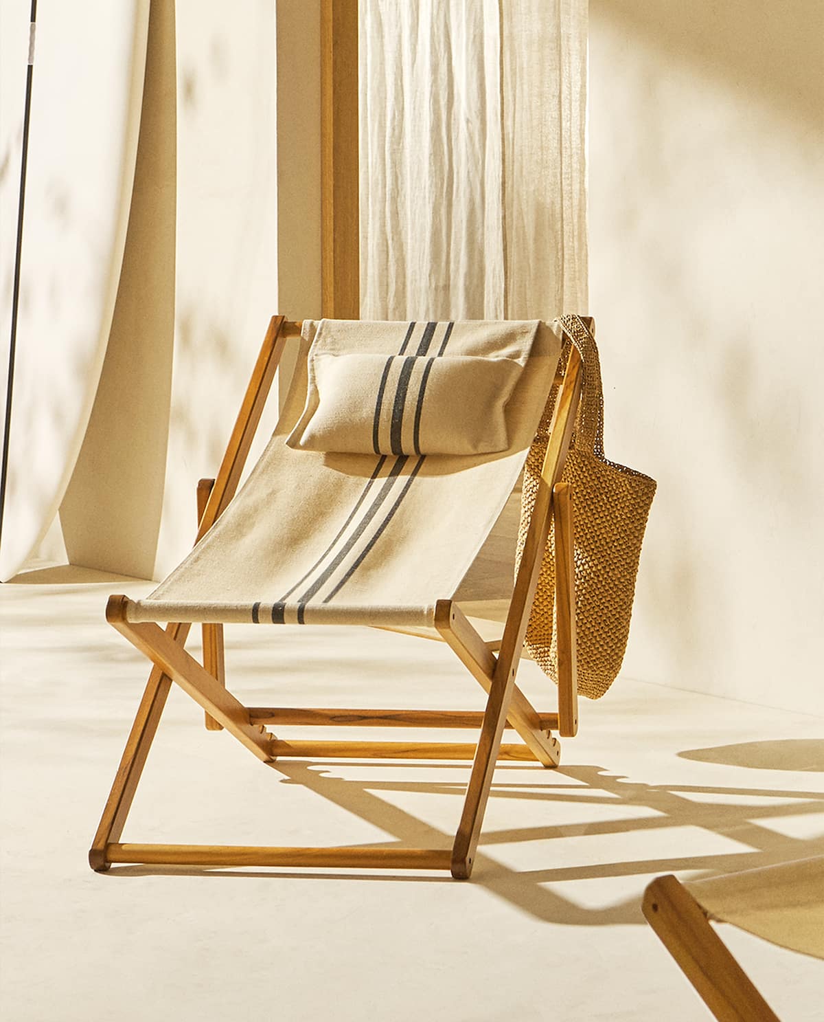
This is my number one from their current collection, with its vintage shine and natural texture it’s a real winner when it comes to exterior furniture for summer. One of the biggest advantages is when something is foldable and can be stored in smaller places when the season is over. This chair reflects the hot sunny vibes, and it could look nice in our yard (still in the design phase, looking forward to starting the construction). In case you’ve fallen in love with it and you want to purchase it, pay attention as the top header cushion is not included by default, you will have to buy it separately.

2. Beach umbrella

Ah, what a beauty, and it goes hand in hand with the foldable chair. The beach umbrella is a necessity when staying in sunbathe, you should never ever go to the beach without protection, besides the sun lotion cosmetics you should always have something to get shadow too. And why not do this with style? This umbrella in sandy color can assure a +40 SPF protection which might be handy in the full summer season. It comes in 2 sizes along with a cover that makes its transportation easy.

3. Ever green tableware
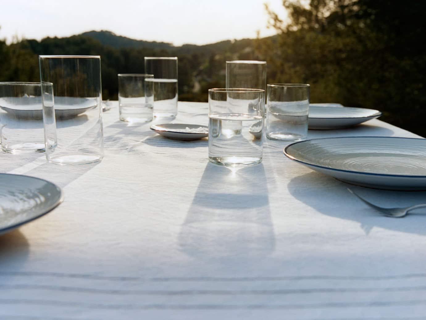
I’m listing 2 of my current favorites, but I linked the entire Zara Home tableware collection, they are literally having the most beautiful tableware sets in the universe. Regardless if it’s a breakfast, lunch, or dinner set, still with their attention to details, fine lines, color palette, and materials, Zara is the winner for me. You can find everything, minimalism, vintage, modern style, holiday vibes, this is what I love the most at Zara Home…being able to remain loyal to their fine, elegant simplicity.

4. Fruit baskets
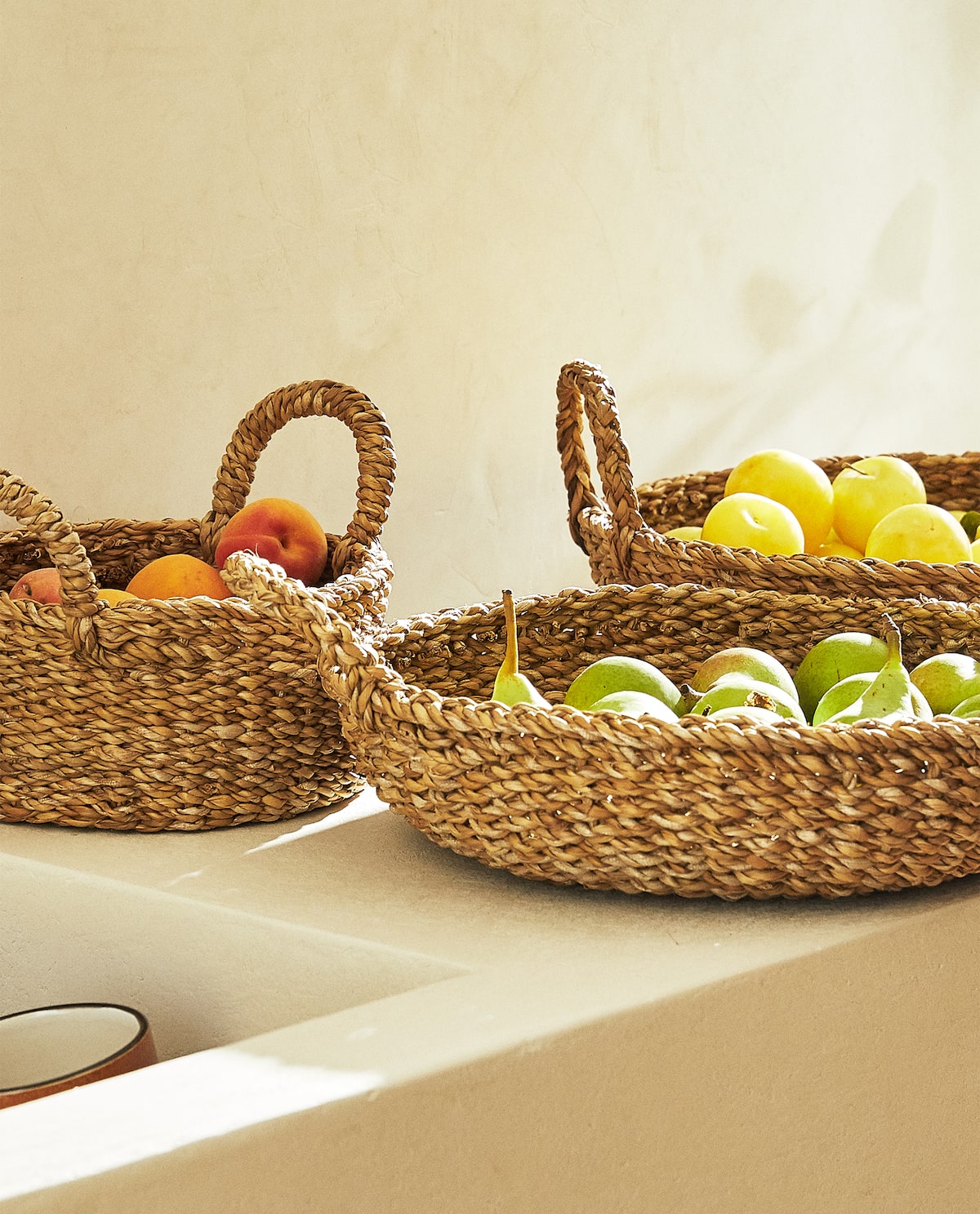
I could fill our home with baskets and still not getting fed up with these beauties. Baskets can come in every shape, color, and material in my humble opinion. Fruit baskets can be handy these days if you spend time outside having dinner with your friends. Zara Home has an entire collection of baskets basically for everything, fruit baskets are a good investment, during summer for cherry, strawberry, and watermelon, during winter for orange, banana, and grapefruits. Your choice!

5. Cushions
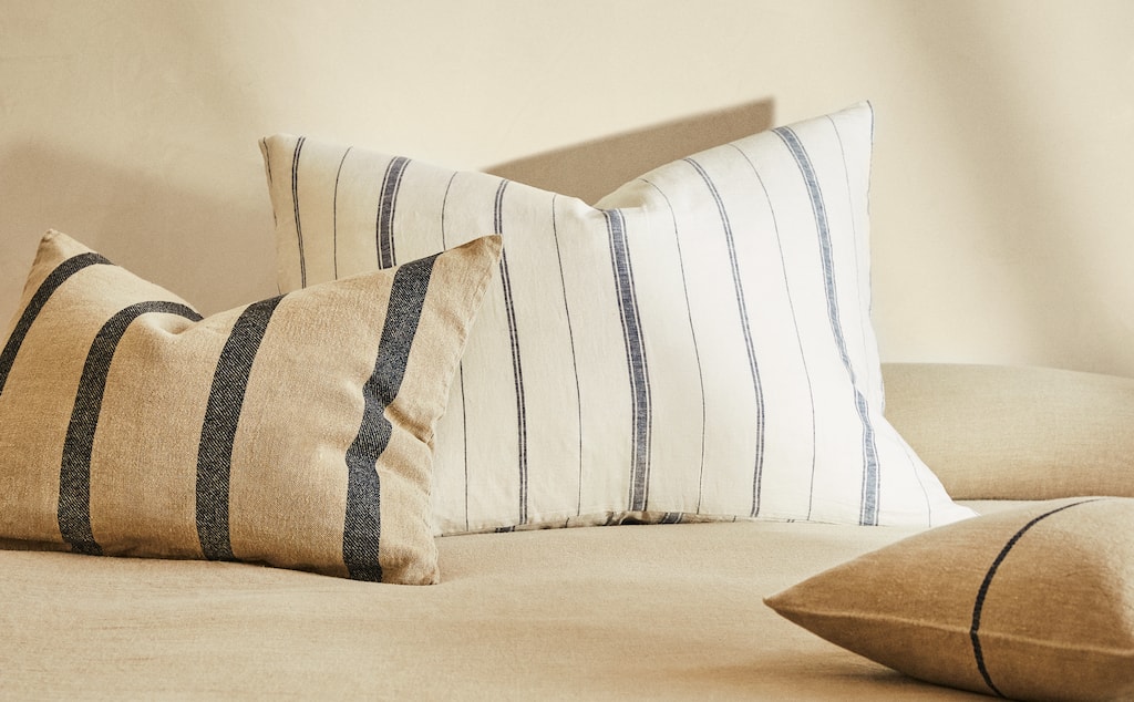
Cushions all over the place, inside, outside, it doesn’t matter, as long as everybody can get comfy with the beautiful Zara Home cushions. They have every style, but now I’ve chosen the ones with the summer vibes. These linen cushions can be found in many shapes, sizes, and combinations of colors and lines. I love the earthy colors and playful lines, and the linen textile turns these pillows into must-have items.

If you are not a Zara Home fan yet, please start to love their products right in this second. In my region, they have a physical store in Cluj Napoca in the VIVO! shopping mall, but you can easily buy online basically everything. I think I’ll come back with a similar article about Zara around Christmas, as they can turn winter holidays into a fairytale.

Photo credits: Zara Home – thank you for letting me share these picture!
Continue Reading

Benita Larsson’s minimalistic world

Ok, I admit it, officially I became obsessed with Benita’s YouTube channel. I’ve discovered her wonderful, minimalistic world 2 weeks ago, and since then watching any of her videos is the most relaxing activity of the moment. She is an online marketing specialist (heh, no wonder why her social media channels have such a nice vibe) and a video content creator in her free time. Benita lives in Stockholm in a 2 rooms apartment with a small backyard that she turned into an urban jungle. Every 2nd Tuesday she shares a video about her everyday life, routines, her apartment, wardrobe, cleaning habits, and all this is focusing on Scandinavian, minimalistic principles. 

Just a heads up, if you start watching her videos, you realize that your home is full of crap, and you should start decluttering right away. Without any exaggeration, Benita’s videos can be with therapeutic effects, suddenly you understand that you have way too many things in your home, and you could be just fine with only the 20% of the stuff you have right now.

Below you can find a nice tour of her minimalistic home, explaining why white color is so common in Scandinavian homes. 


She also has an Amazon shop where you can find her favorite products and things she purchased or has in her apartment. If you see something you like in her videos, feel free to check this page, and most certainly you’ll find the item. Just as I did, I saw in her fridge organizing video the roller for face, and I bought one for myself. It’s already in the fridge, cooling down, and it’s so great to roll it over my face on these hot summer days. Love it!


Photo credits: Cover image – @benitalarsson

Continue Reading

An interior with eye-catching wallpapers and signs of patina

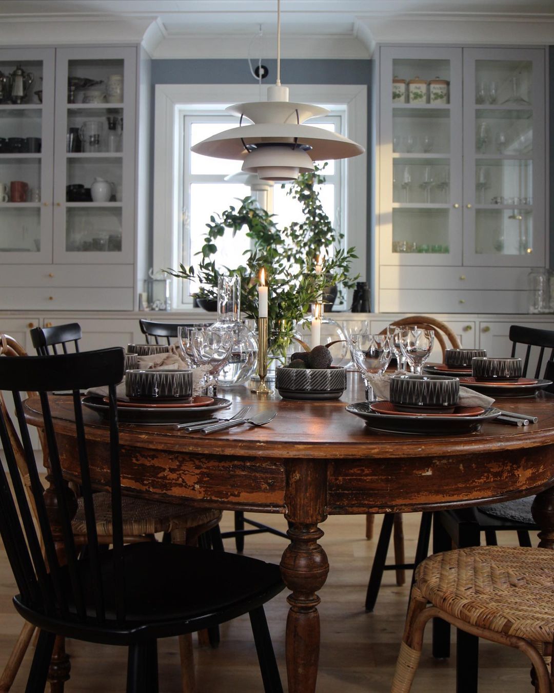
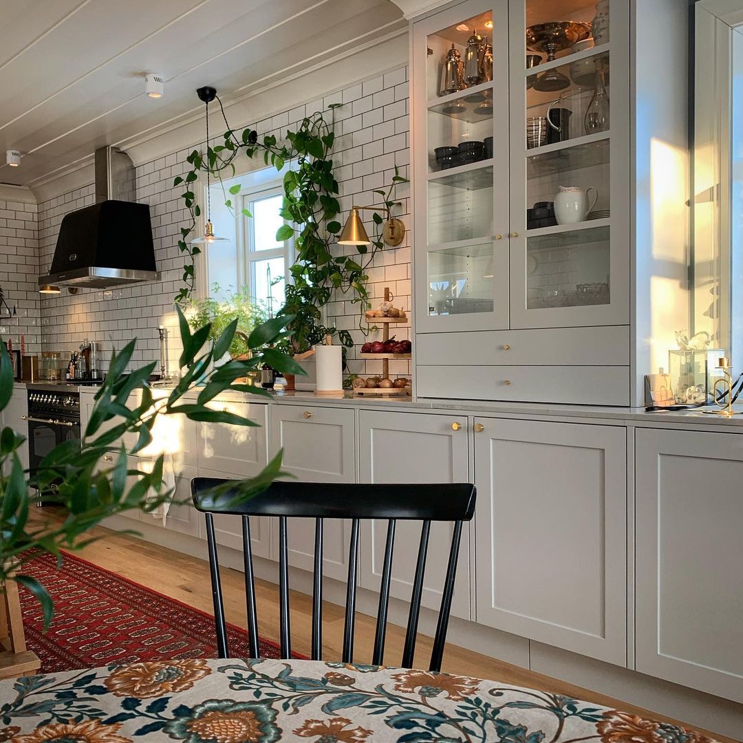
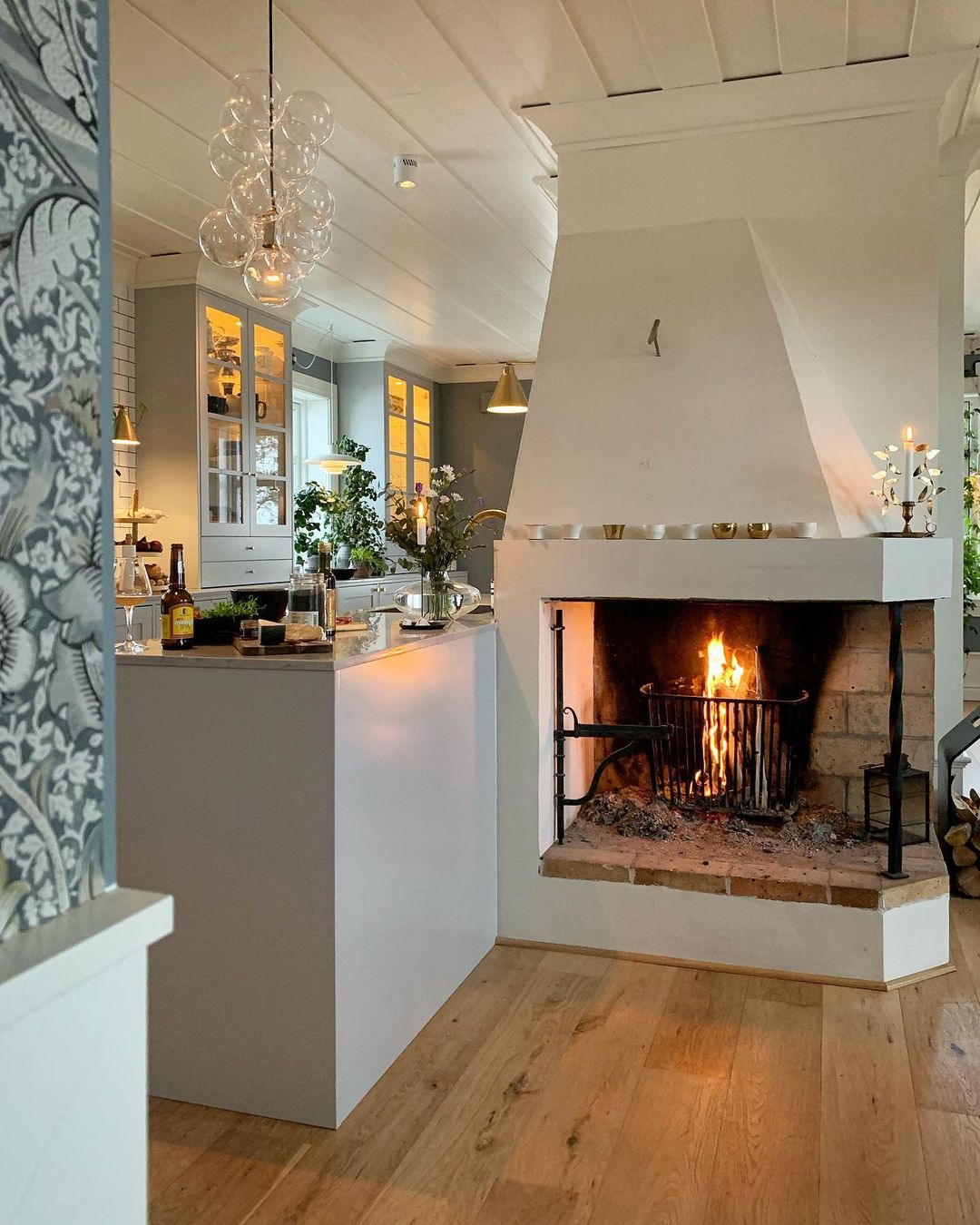
When I started following Jessica Lindberg on Instagram, it was around Christmas when everything was surrounded by magic. I remember clearly the first post I saw, it was a short video with her kitchen playing some French music in the background and the wood cracking at the fireplace. She and her family have 2 houses, one in Skåne County, the southernmost region of Sweden, and the other one in Norrbotten, the northernmost county or the country. What a great way of keep traveling across the whole of Sweden, I could imagine living in almost every corner of that country.

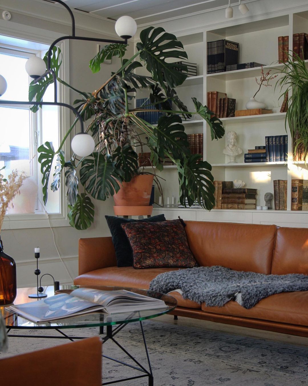
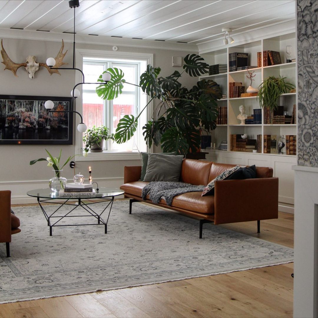
Jessica’s living room has multiple focal points, I could not decide which one I like the most. This huge Monstera deliciosa called also the Swiss cheese plant (love this name!) is all over the place, shining with its beauty and assuring the greenery feeling in the room. The chocolate brown sofas are another great piece, I’m not very into leather but these ones look great with their metal legs. Ikea has an ecological leather sofa too (maybe with a lighter color) that I like very much, I even used it in one of my projects. The ultimate focal point of this room it’s the Samsung Frame tv on the wall with always different art set on the screen…never ever assume that I wouldn’t spot a Frame television in a room.

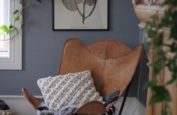
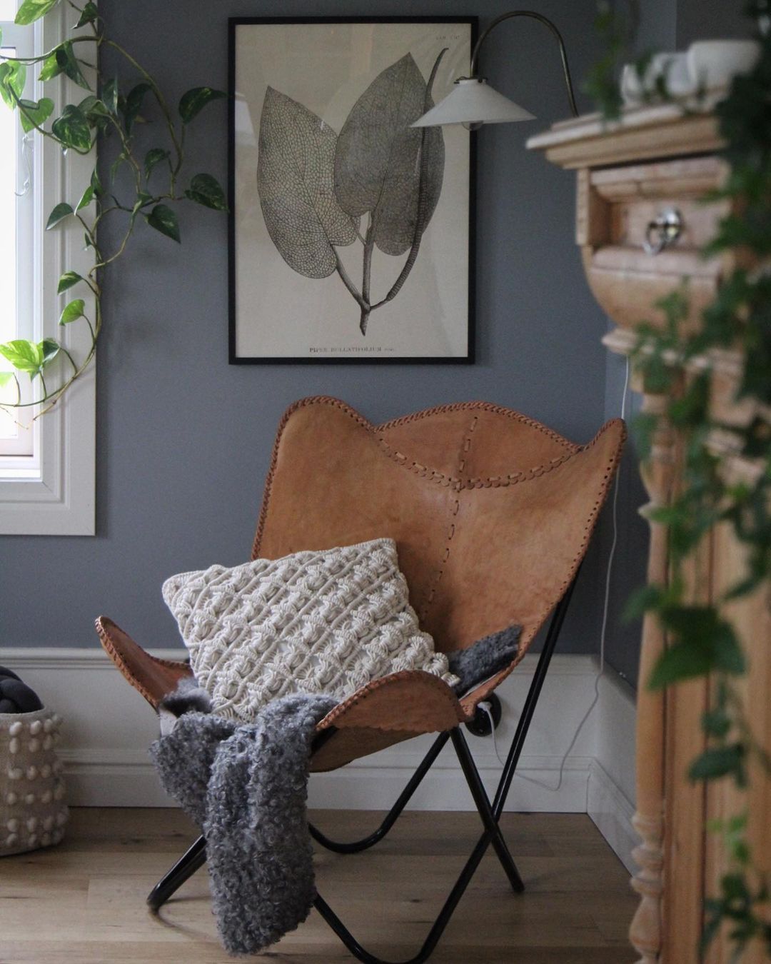
What would be a room without a reading corner? This iconic Butterfly chair was purchased by Jessica in Morocco during a trip and bringing home from the far East. I adore the leaves’ graphic art on the wall, it looks so pure. I wonder from where this is.

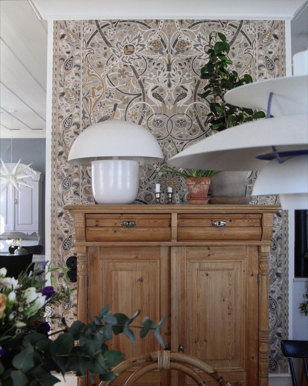
Boom, double impact…two iconic pieces (above) on the same square meter, the white Carl-Johan lamp by Olsson & Jensen on the drawer and a PH 5 pendant by Luis Poulsen hanged above the vintage dining table. It is simply adorable how the patina is shining on this table.

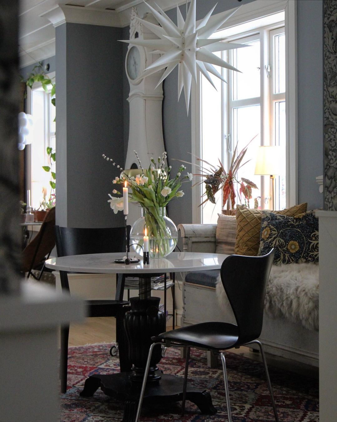
Another great little spot in the kitchen area is this coffee corner that looks perfect for the morning coffees and the afternoon 5 o’clock teas. The Series7 black chair designed by Arne Jacobsen in 1955, produced now by Fritz Hansen, and the white floor clock next to the window show respect to the history of interior design.

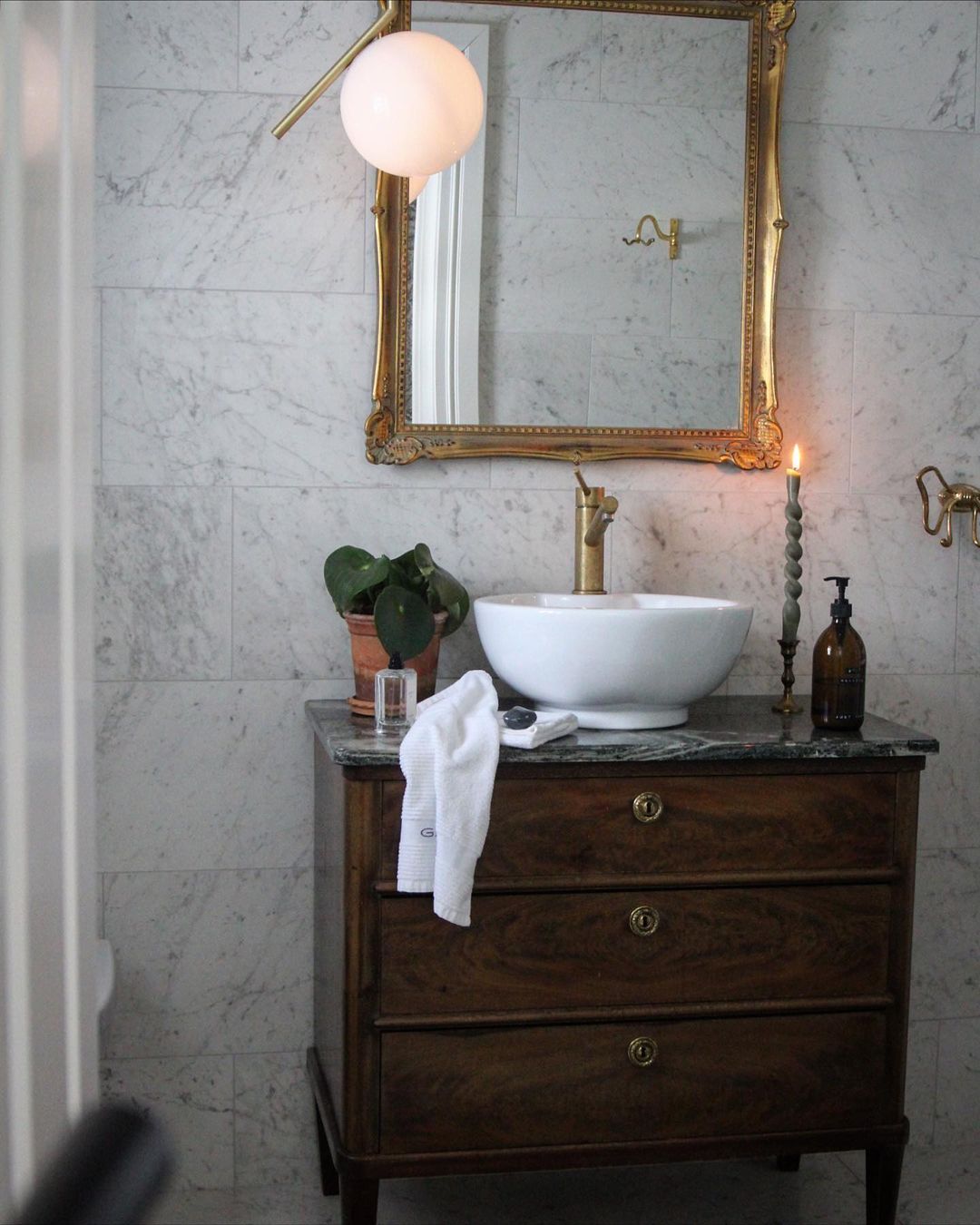
Look at that sage green candle, isn’t that a great detail in the bathroom?

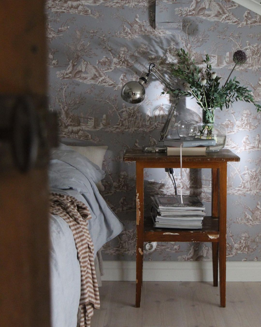
I specifically love homes where I see courage combining new with old, showing patina of furniture’s and using iconic pieces of interior design history. Jessica has it all, and I’m so grateful to her for letting me showing you around.


Photo credits: Jessica Linberg IG @rangas_etc – shared with her friendly permission


Continue Reading