A Parisian home tour at art gallery owner Fanny Saulay

My obsession with beautiful homes is not limited to Scandinavian interiors. When I see an English classic or a romantic French interior, I’ll fall in love just as fast as with a hygge Nordic nest. This week’s video home tour is about a beautiful Parisian apartment full of art, vintage furniture, and iconic design pieces. No wonder how the owner managed to have this magical combination of arts in her home, as Fanny Saulay is the owner, together with Olivia de Fayet, of the New Generation Art Gallery Wilo & Grove from Paris. These two ladies managed to take the concept of an art gallery up to another level, having the beautiful Wiloft showroom looking like a welcoming homey interior.

Fanny lives in this apartment located on the Ile de la Cité in the city center, together with her husband, Thomas, and their golden-retriever, Latte. Their eclectic home is full of iconic chairs, wall arts, vintage findings from flea markets, and a lot of custom-made, unique furniture. The Herringbone pattern of the parquet is an ultimate touch to the real Parisian vibe of the interior. I’ve never seen an apartment with so many famous chairs. Just as a heads up you will see the Orange slice chair by Pierre Paulin and the iconic Eames Lounge chair & ottoman by Charles & Ray Eames in the living room, the Plywood Group DCW chair by the same famous designer couple in the hallway and in the bedroom. In the same room you can spot a Coconut chair by George Nelson from 1955, and the dining table is surrounded by different Eames chairs by Vitra.


If you would like to see/buy some beauties from the art gallery owned by Fanny, feel free to check the Wilo & Grove online store, and in case you would like to read more about her home, here you have another great article by The Socialite Family.


Video credits: ParisianVibes YT channel
Cover photo credits: ParisianVibes


Continue Reading

Another week in Hamburg, another home tour from Germany

TGIF! Finally! My favorite day of the week because the weekend is here, and a new home tour gets up on my blog. While digging deeper on Instagram, by coincidence, I found another beautiful apartment in Hamburg. So 2 weeks in a row, we stay in Germany for interior inspirations…of course with Scandi vibes. I am grateful to Steffi for letting us inside their old house built in 1910, taking a tour, and admiring their home full of refurbished and new pieces. On top of the many mixing ideas, we also get some DIY inspo for personalized candles, more on this here, it’s a cool idea of getting unique pieces on your coffee table.

Steffi lives in this house with her husband and their 3 children, no wonder why their home looks so joyful, happy, and homey. I like those interiors that show you also the “natural face” of things, instead of looking so neat from every corner of it. The children’s room was a “must-show” item when I was deciding on pictures. But let’s take the tour and admire the details.

The hallway looks amazing with its original floor and the vintage drawer. Check out those door jambs, must be from the previous century for sure. In the living room, there is a lot of natural light which is an instant winner. I sport an Arum wall lamp in the corner by Ferm Living.

The DIY candles I’ve mentioned earlier. These were made by Steffi’s children, no wonder why they look so funky. Some real unique pieces.

The dining area is between the kitchen and the living room, full of natural light as well. The real focal point is the Wishbone chairs, of course. As I mentioned many times, my favorite chairs. This family managed to purchase these, one by one, and they were super happy when things started to get together. After all, these chairs are not cheap, so we’re talking about some investments here.

Reading corner next to the kitchen and dining room, or more a “stop by” spot of the place for a good coffee or a book…what a great way to hide the radiator and boost it up with a gallery wall.

Open shelving in the kitchen with a lot of great coffee cups. Below is the children’s room in its natural way of being. I see an Apple Papple poster on the wall by Fine Little Day, this is a popular piece of art in Scandinavian homes.

The stairs were sanded and refurbished till they get their original look back. I say these look marvelous, with the white wall and handrail. The bedroom has a great few, especially in the spring. I spot here a vintage drawer and a Sinnerlig Ikea pendant.

The bathroom is fantastic, with the old drawer below the sink, with its grey&white tiles and the minimalistic white cabinet that gives some modern vibes to the place. What a great way to mix different styles.

If you liked this tour, do not hesitate to check out Steffi’s IG feed as she has a nice backyard too, and many other beautiful spots in her home.

That’s it from me this week, my friends, see you next week with another home tour, this time with a local treasure, a cabin from Maramureș 😉


Photo credits: @heyheyhaus – shared with her friendly permission


Continue Reading

A 170qm German interior with Scandi vibes

This week, my friends, we are traveling away from the Scandinavian region. I found a beautiful interior in Hamburg with some Scandi vibes that turned into a “must-see” home to me. This 170 sqm home belongs to Anne Dirfard, an interior blogger and digital creator of the 170qm Instagram feed and 170QM blog.

I love the dark colors on some of the walls that add more depth to the rooms. The tiles in the kitchen are one of my favorites. These were very trendy in my region in the ’70-’80, especially that you could not find other models ;). Their vintage vibes are undeniable, and to be honest, I’m not sure why these are no longer popular here (I might have a hint, but that would be too rude to tell about on the blog). The dining areas in the kitchen and next to the living room (what a luxury, having two dining areas) are charming due to the mix of chairs, such a cool thing to use to add extra charm. In the living room, the sage green wall adds accent to the Tv area, and we all know how hard it is to design the proper Tv area. I’m not sure what is the focal point of the reading corner, the sage green armchair, or the Formakami pendant, up to you to decide on this.

Is there anything that captured your attention? There are so many in my opinion, that it’s hard to choose one, for example, the dark blue wall in the hallway, the powder pink sofa in the living room, the vintage closet, or the storage above the door in the kids’ room, or the minimalistic bedroom. The kids’ room is a winner to me. I love those children’s rooms that show creativity by adding original pieces, like this one having that nice vintage closet. Did you observe by any chance the glass cabinetry full of treasures? We have one too (I know I take shitty photos, my next project is to attend an interior photography course) in our kitchen, and this is where I keep all my loveable ceramics. So happy to have it 🙂

Hope you like the tour, I definitely do!


Photo credits: Anne Dirfard IG @170qm – shared with her friendly permission


Continue Reading

A bright apartment with a cute bathroom

When searching for inspiration for my blog, sometimes it happens that I find interiors where I love everything. This is the case with this 48 sqm Stockholm-based apartment too, I love every corner of it. The white Scandinavian Shaker Kitchen with its doors made of solid pine and painted with linseed oil is a timeless design that will “resist” as a strong focal point in the world of interior design. Those tiny golden buttons totally convinced me to love this bright kitchen. The open shelves go hand in hand with the pine floors and add a natural tone to the place. It might be funny, but what I love the most is the radiator, what a great vintage piece. I hate nowadays radiators, we have the same in our house, but they are ugly as hell.

What a nice idea of combining a small desk with the bedroom, turning the home office into a cozy corner. The white drawer is an Ikea piece, with golden handles/buttons that make the whole furniture much nicer than the original one. We have it too in our bedroom, but we kept it with the black buttons, now I wonder, maybe it would be a good idea to change those. The beige office chair is from Ikea too, totally fitting into the natural tone of the room. The walls are painted into transparent pink from Jotun‘s Lady Collection.

This is the sweetest, the tiny little bathroom I’ve recently seen on the world wide web. If this house would be empty, having only the bathroom, I would be totally into it to buy it. The kitchen is a great extra, a real beauty too, but when I saw the bathroom I knew, I must share this on my blog. Nothing kitschy, with its simplicity combined with a touch of pink (I bet you didn’t observe the top line of pink tiles 😉 ), this bathroom with its bathtub is everything you need. It’s the definition of coziness.

As usual, there is an outdoor space too, a small terrace to get some fresh air and let the natural light flowing into the apartment. Tiny spaces never scare away Swedish people, they can turn these into some hygge corners. This small terrace is a nice spot to have a glass of wine at night staring at the stars or having a cup of coffee in the morning sunbath. Either way would work for me.
This apartment was for sale for a few days, but till I managed to get some time to write my blog post, boom, it got solved. Anyhow, admire it as it’s a great source of inspiration.


Photo: Johansson
Styling: Lindholm

Photo credits: Historika Hem, shared with kind permission.

Continue Reading

Design proposal for an Earthy nest

A few weeks ago, I managed to finish one of the most “pressuring” design projects that I have had so far. This particular project that I called Earthy nest (due to the color palette) suppose to be an apartment with a fresh, trendy look & feel, but still staying original, with as little possible commercial crap in it. The owner of this home is a young, demanding entrepreneur who meant this apartment for renting it out. Since he has a very sophisticated taste for vintage pieces and art, my Scandinavian obsession had zero value in this case. The budget for the interior design was €10.000 without the construction expenses. For a 2 rooms apartment without too much luxury, this budget is pretty ok…even if I needed to turn upside down the internet to find the right things I imagined for it.

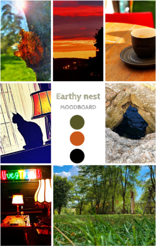
As a first step, I always start the design process by asking the “customer” to send me some personal photos having the same vibe as the potential feeling he wants to achieve in the apartment. The below mood board was created exclusively with the pictures received from the owner. After I scanned the collage with a color palette generator, it ended up with these 3 dominant colors. What a beautiful palette of earthy tones 🙂

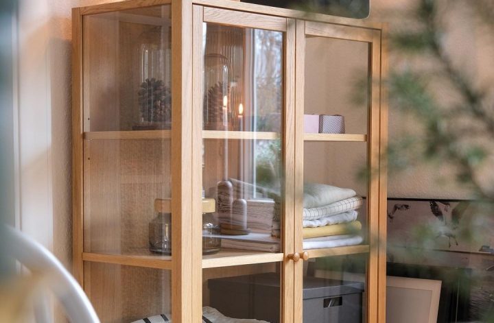
The next step is to do the 2D plan to see what where to fit. Since this apartment has a wardrobe and a pantry, I managed to keep everything decluttered, I truly hate overcrowded homes with too much furniture here and there.

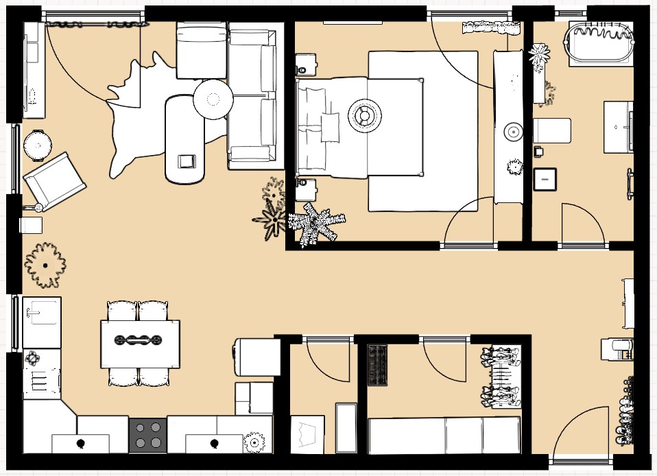
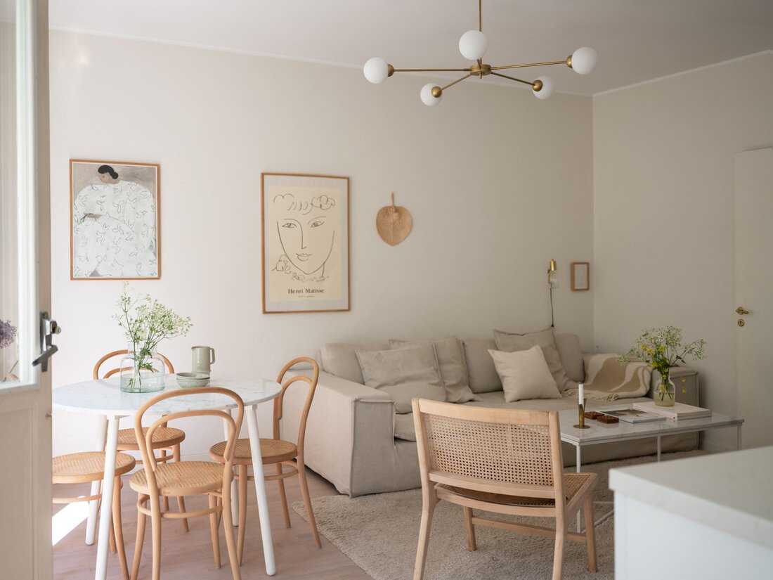
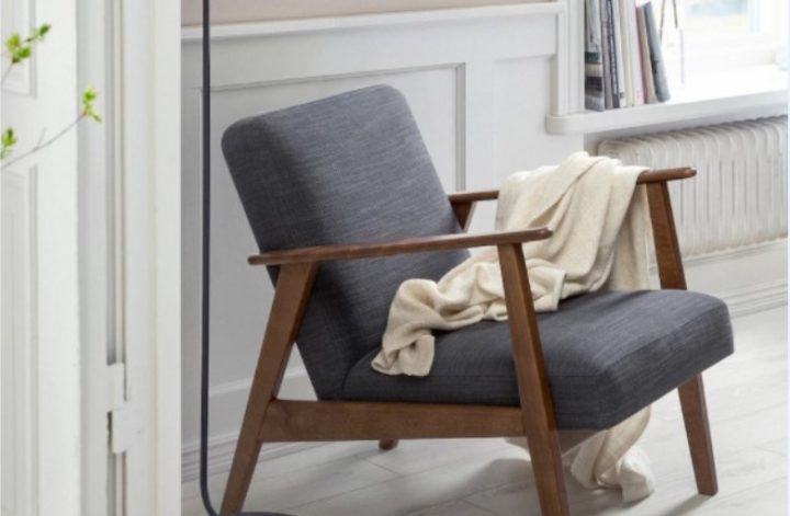
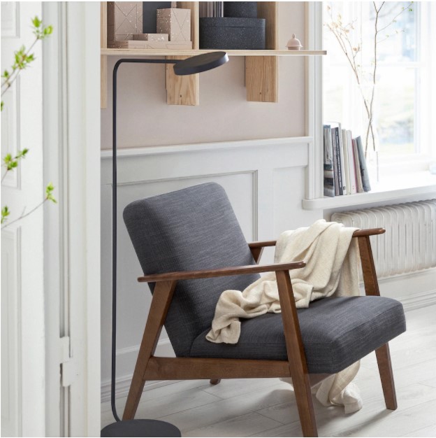
For the living room, I had 2 requests from the customer: to have a green sofa in the sitting area and apply white brick wall decoration on one of the walls. I’ve managed to use a few vibrant colors too, like the mustard yellow lighting and the blinds with rust color and grey. I created a reading corner as well with the gorgeous EKENÄSET Ikea armchair. To have some industrial vibes, I used a black FJÄLLBO TV cabinet from Ikea.

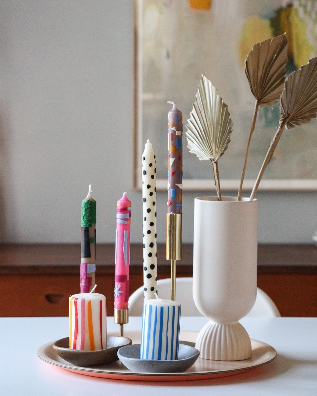
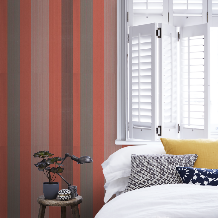
In the bedroom, there was a single requirement of having something with red or burgundy color for reflecting passion and love. I’ve used the red Farrow & Ball Chromatic Stripe wallpaper for the wall behind the bed. This way, I managed to meet the customer’s expectations, avoid overcrowding of the room and create a great focal point in the bedroom.

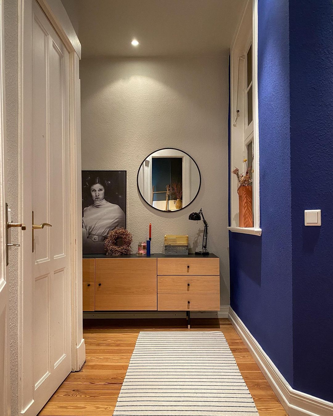
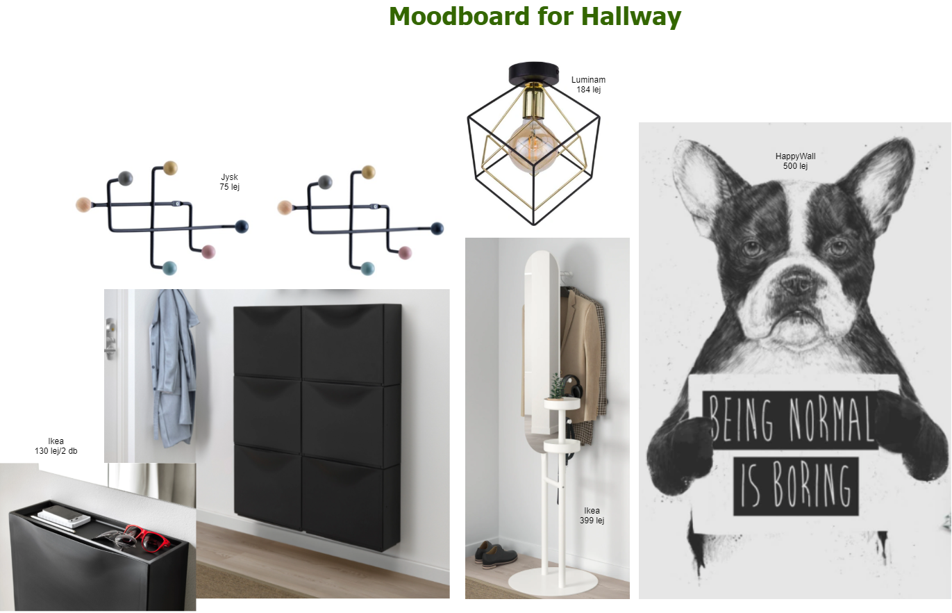
For the hallway, I’ve let my imagination go wild a bit by proposing a bold, hipster wallpaper from HappyWall. They can print customized wallpapers based on the buyer’s need, so you can set the width and the high you need. We have one too from them in my husband’s home office, and I’m super happy with the choice we made 2 years ago. I have to admit, although this seemed a good idea, this one did not go through the customer’s acceptance criteria, and we agreed that he will choose something else when getting to this point.

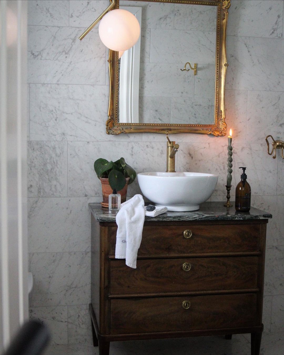
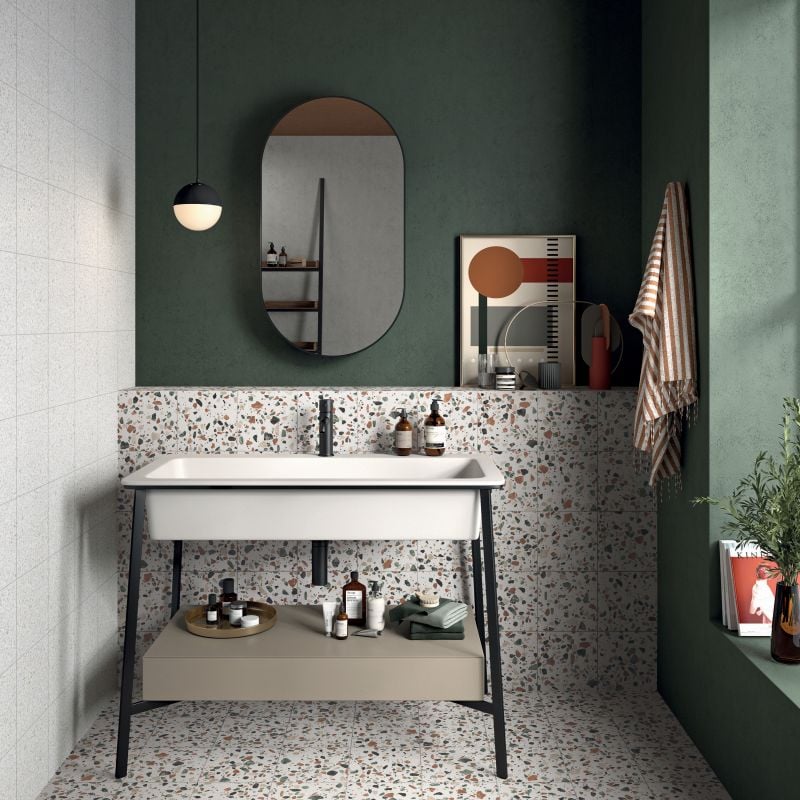
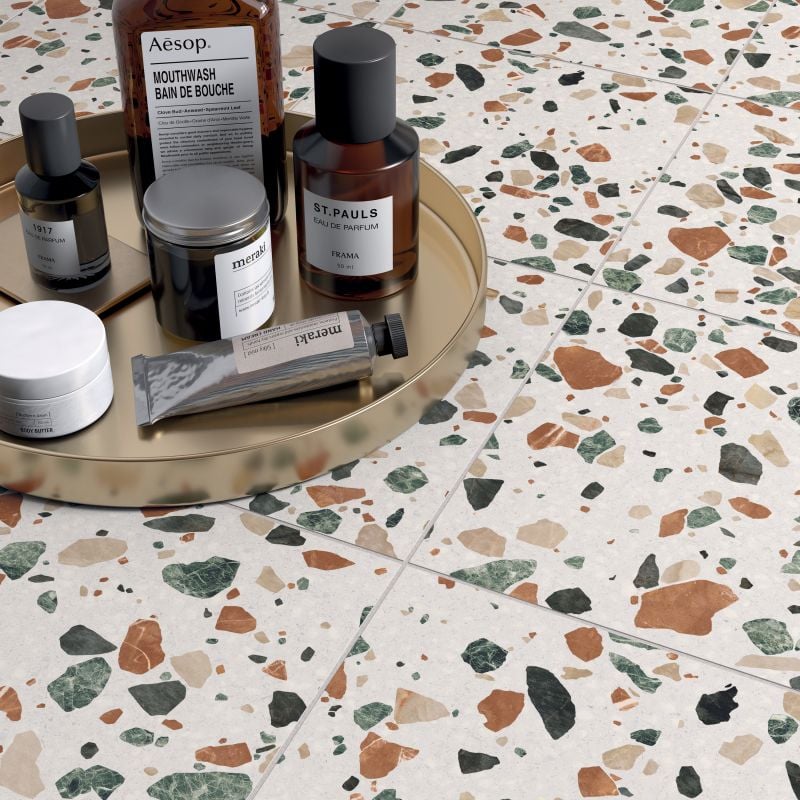
The bathroom was a real challenge in terms of finding a nice, not very common tile. This green-orange Terrazzo tile seems like a good fit to combine the moss green wall color. To avoid turning the bathroom into a cold interior, we’ll put tiles till mid-high (max. up to 1.5 m) on the wall and paint the rest in this earthy green. The customer is not 100% sure yet if he wants a bathtub or a shower, so we left that topic opened till the construction works start.

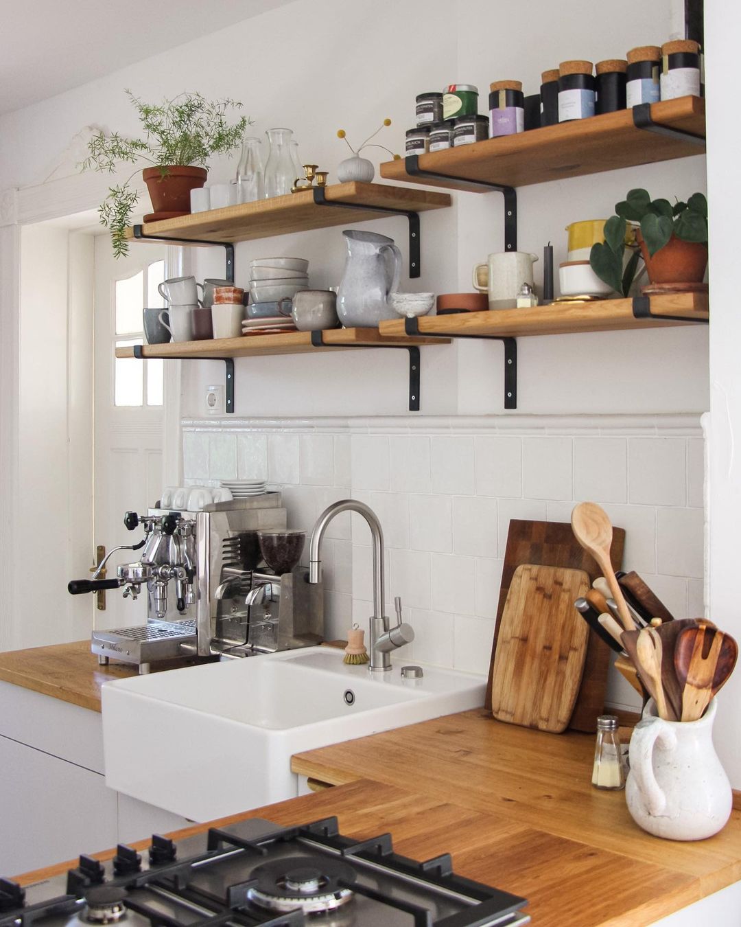
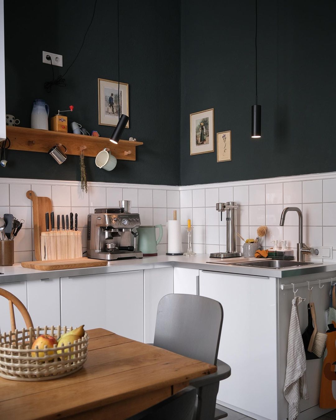
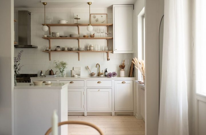
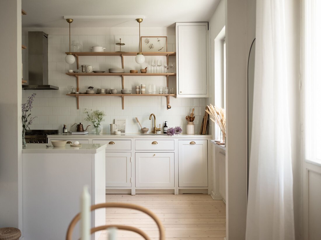
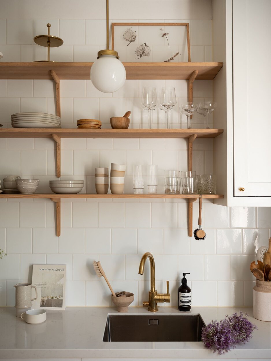
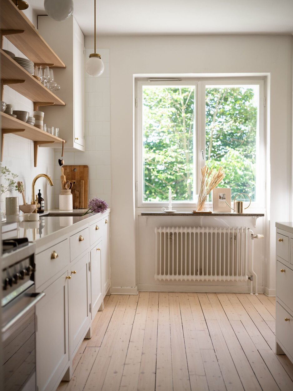
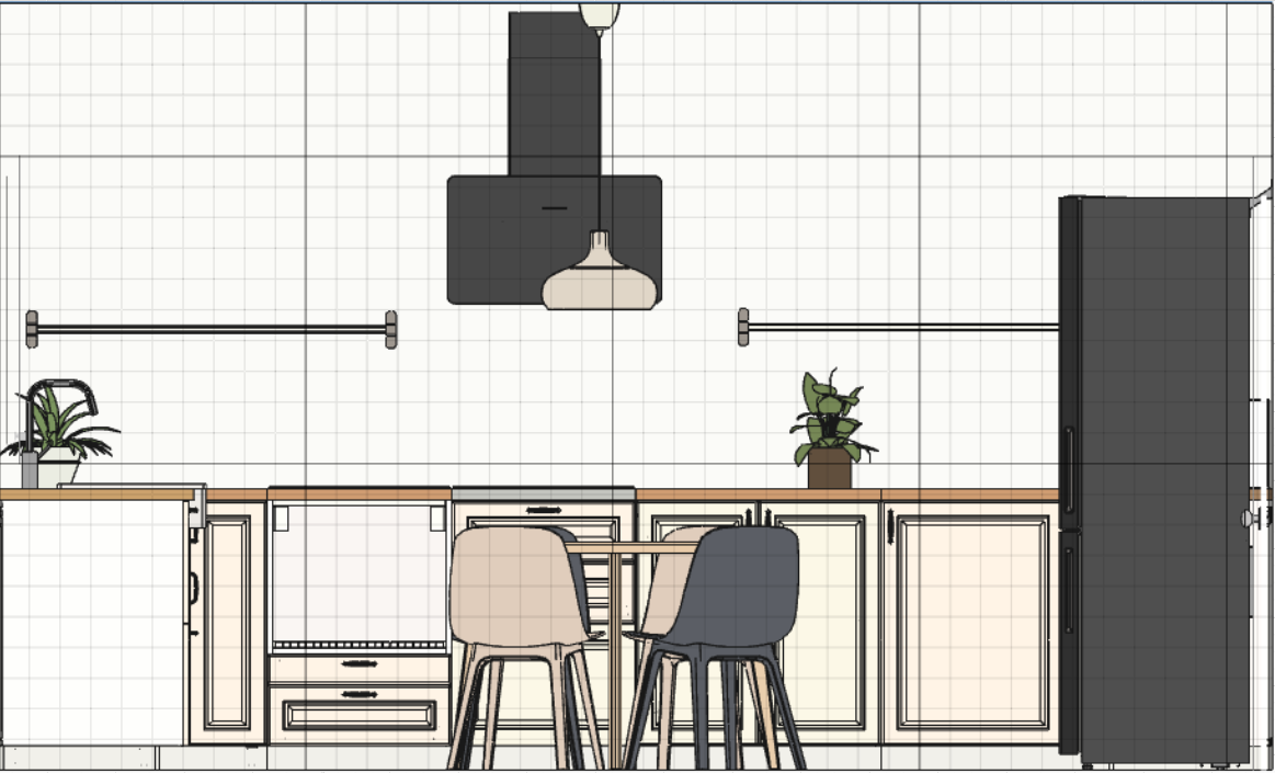
For the kitchen to create an airy feeling, I’ve recommended an open shelving approach instead of having top cabinetry. The furniture will be dirty white combined with black electronic equipment. The dining table will be in the middle of the kitchen for the impression of an existing kitchen island.

And of course, as usual, there is no design without a 3D plan to show around how the apartment will turn into a home. Navigating in the house it helps a lot to get the overall idea and to see the proportions of the furnished interior. I use Floorplanner as a planning software and it’s always helping me to turn into a realistic idea of what I actually want with an interior.

This home is not ready yet, it will take a few months till I can return to the blog with a photo shooting tour about the end results. I hope you like the proposal and I do believe that everything will turn 10 times nicer in the reality like on my mood boards.


Photo credits: 1., 2. & 3. focalpoint.ro, 4. Ikea.com, 5. Wallpaperdirect.com, 6. focalpoint.ro, 7. & 8. Alchemist.ro, 9. & 10. focalpoint.ro

Continue Reading

An interior with eye-catching wallpapers and signs of patina

When I started following Jessica Lindberg on Instagram, it was around Christmas when everything was surrounded by magic. I remember clearly the first post I saw, it was a short video with her kitchen playing some French music in the background and the wood cracking at the fireplace. She and her family have 2 houses, one in Skåne County, the southernmost region of Sweden, and the other one in Norrbotten, the northernmost county or the country. What a great way of keep traveling across the whole of Sweden, I could imagine living in almost every corner of that country.

Jessica’s living room has multiple focal points, I could not decide which one I like the most. This huge Monstera deliciosa called also the Swiss cheese plant (love this name!) is all over the place, shining with its beauty and assuring the greenery feeling in the room. The chocolate brown sofas are another great piece, I’m not very into leather but these ones look great with their metal legs. Ikea has an ecological leather sofa too (maybe with a lighter color) that I like very much, I even used it in one of my projects. The ultimate focal point of this room it’s the Samsung Frame tv on the wall with always different art set on the screen…never ever assume that I wouldn’t spot a Frame television in a room.

What would be a room without a reading corner? This iconic Butterfly chair was purchased by Jessica in Morocco during a trip and bringing home from the far East. I adore the leaves’ graphic art on the wall, it looks so pure. I wonder from where this is.

Boom, double impact…two iconic pieces (above) on the same square meter, the white Carl-Johan lamp by Olsson & Jensen on the drawer and a PH 5 pendant by Luis Poulsen hanged above the vintage dining table. It is simply adorable how the patina is shining on this table.

Another great little spot in the kitchen area is this coffee corner that looks perfect for the morning coffees and the afternoon 5 o’clock teas. The Series7 black chair designed by Arne Jacobsen in 1955, produced now by Fritz Hansen, and the white floor clock next to the window show respect to the history of interior design.

Look at that sage green candle, isn’t that a great detail in the bathroom?

I specifically love homes where I see courage combining new with old, showing patina of furniture’s and using iconic pieces of interior design history. Jessica has it all, and I’m so grateful to her for letting me showing you around.


Photo credits: Jessica Linberg IG @rangas_etc – shared with her friendly permission


Continue Reading