Every beginning of the year the Pantone Color Institute sets the color/s of the year. Many industries are taking this color trend very seriously, furniture manufacturers, fashion designers, interior designers, textile producers set their focus to the color indicated by Pantone. The color of 2022 is out and is the PANTONE 17-3938 Very Peri. To be honest I see it as the lavender lilac, but of course, if you want to be super accurate when choosing the color for any of your projects, products, etc. just follow the color coding of Pantone.
I love this color, but I find it challenging to incorporate it into a home’s color palette, especially since this is not one of the typical Scandinavian earthy color tones that I usually promote, love, and adore in every way possible. But still, I looked around to get inspired by others’ creativity or bravery. I’m sharing strictly those ideas that I love 100% and I could go with these ideas myself.
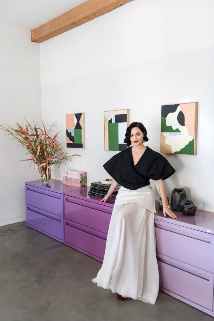
#1 Sophia Amoruso’s powder-coated office cabinetry. The former Nasty Gal CEO, current Girlboss owner, has a vintage office with a lot of re-used furniture and blue/lavender touches here and there. What a lovely way to make a colorful statement.
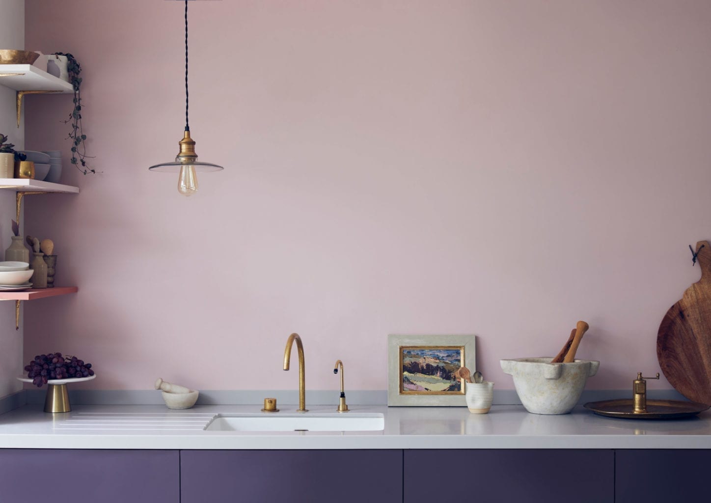
#2 Annie Sloan’s aubergine kitchen is all over the internet now, being a top match for this year’s color. Mixing Chalk Paint® in Aubusson Blue and Emperor’s Silk turned out to be a very feminine and warm combination. Apart from the great color combination, I love that there are no top cabinets, this always gives an airy feeling to the place.
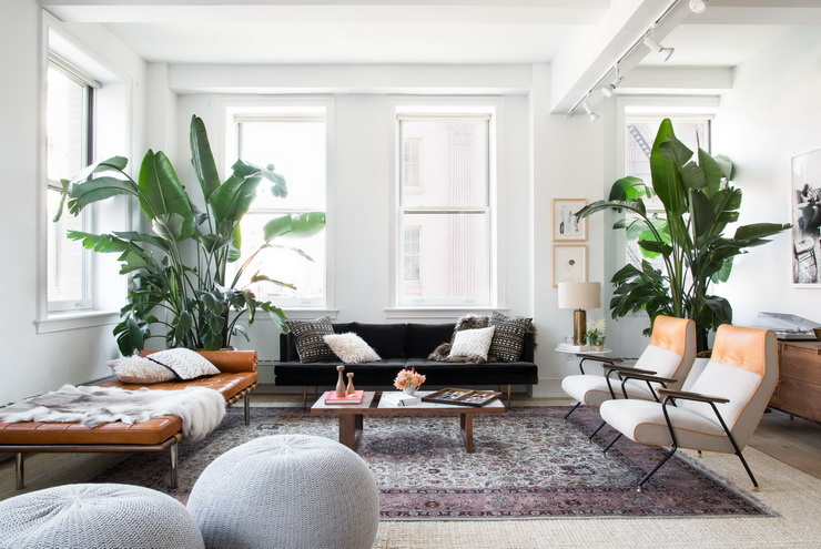
#3 You don’t have to turn your entire home into a blueish bubble gum, you can use one central element, like in this case, having a subtle rug with very peri color touches. I love the brown leather day bed and the huge plants.
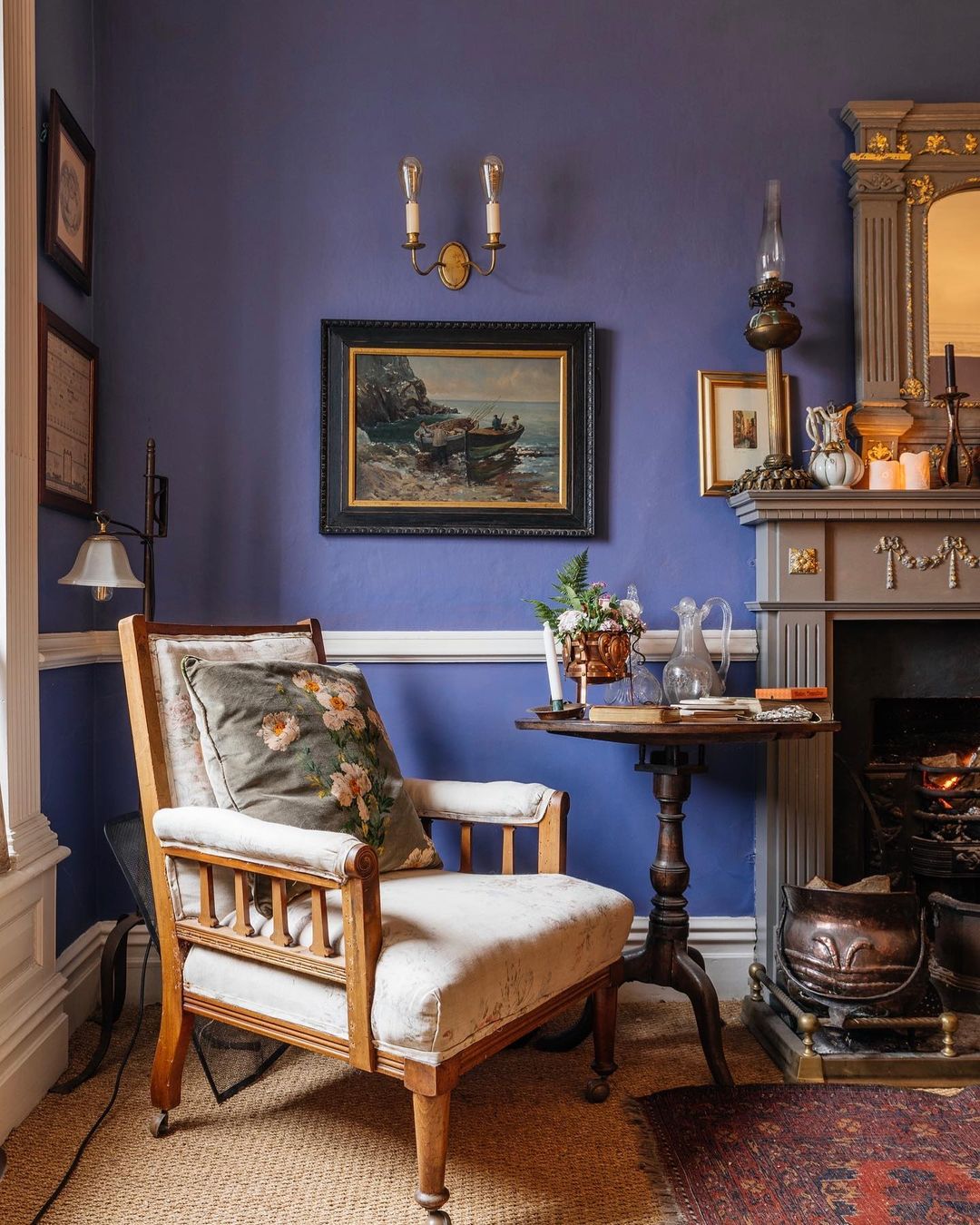
#4 If you are into English elegancy, like me, and you are bold enough, you can go with painting the walls into very peri color. Not sure what happens next year, but in a worst-case scenario, you repaint the room :)) I love how brave @emilydobbsinteriors was with these Pitch Blue walls by @farrowandball.
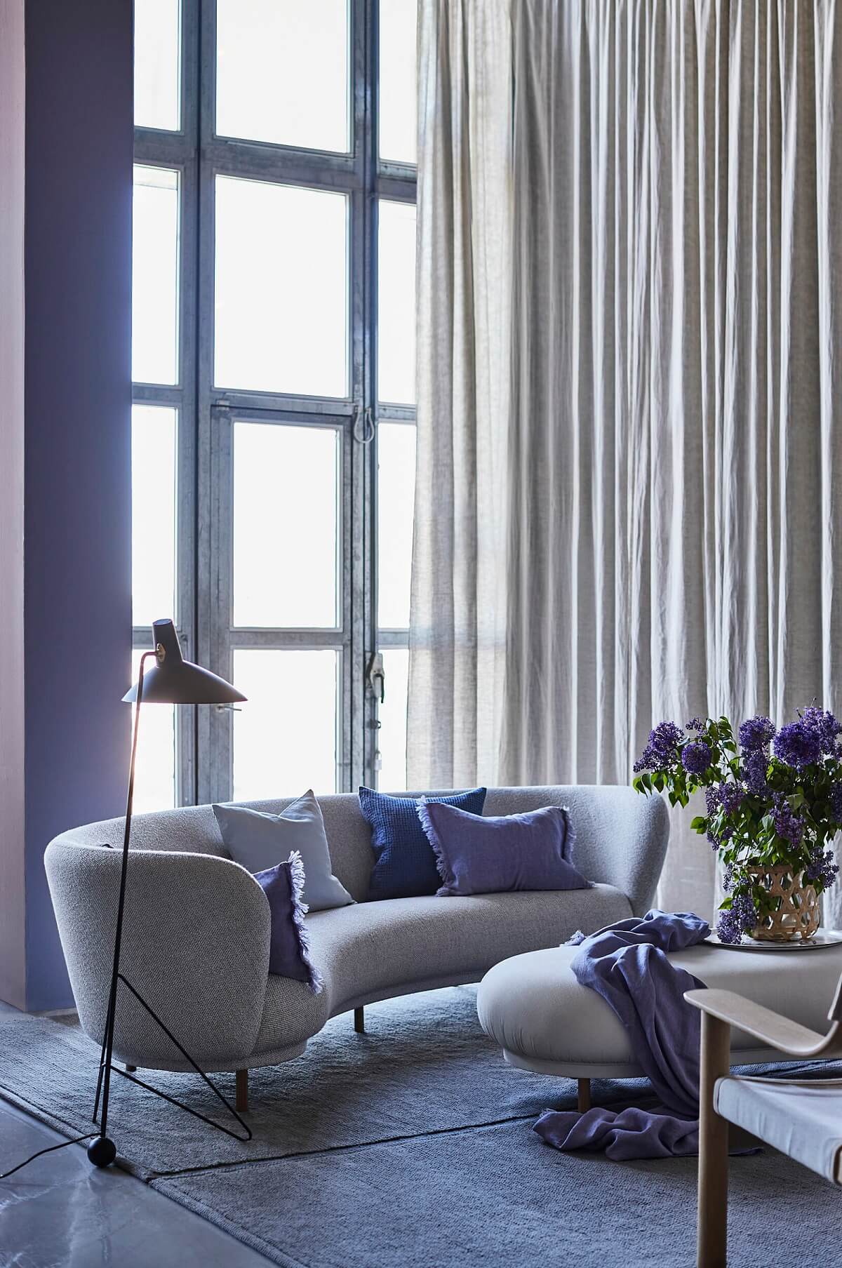
#5 The Swedish home furnishing company, Himla, has nice subtle ideas of how to add a little bit of trend to your interior. They have some high-quality, real Scandinavian linen textiles in very peri color that can add that one little touch of color to the room. Let’s just say that I love every piece that they produce, sell, promote, whatever 🙂
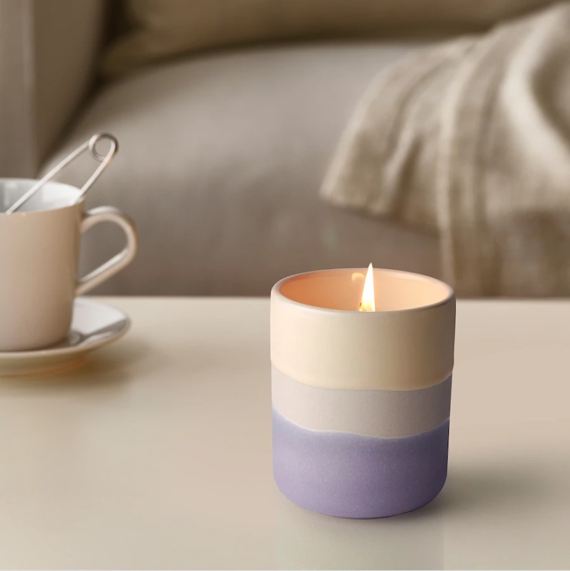
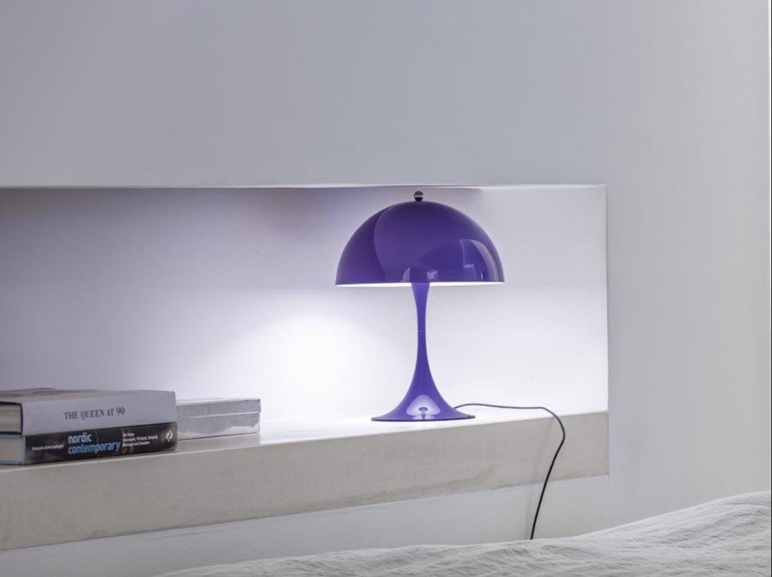
#6 Small objects are always some sort of safety measurements. Add an Ikea candle holder or a table lamp, like the Panthella Mini Table Lamp by Verner Panton for Louis Poulsen, and here you go, problem solved. I could easily go with these ideas.
Hopefully, you got some inspiration for 2022 on how to add a bit of color to your home.
Photo source: 1. Architectural Digest, Photo: Monica Wang; 2. Annie Sloan; 3. Hipcouch; 4. @emilydobbsinteriors; 5. Himla; 6. Himla IG; 7. Ikea; 8. Pamono

